Luljeta Maliqi Back to start

Logo design

Logo design that gives a brand its face

Ambero logo P’rralla logo Albadent logo MSB Elektronik logo Ace of Digital logo Panna logo Mburoja Consulting logo Go logo Bama Lux logo GraSano logo Eumesh logo InterCompany logo Zaura logo

A logo is the smallest thing a brand owns and the one people remember. Each mark here started with a question about what the company stands for, and ended with a symbol that works on a business card, a shopfront and a phone screen alike.

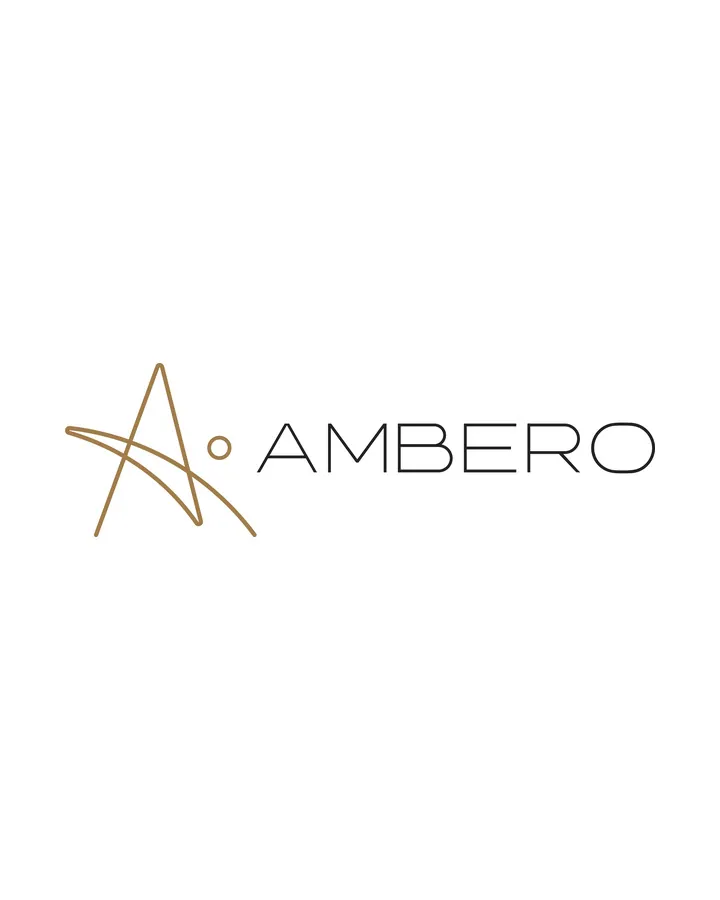
Ambero logo

Ambero

Logo & identity for a furniture and woodcraft brand.

An A drawn in one fluid line, like a curl of fresh-cut wood, with a single dot of sunlight. Amber gold, deep teal and natural timber tones carry the mark from catalogue to showroom facade.

Deliverables included the logo and construction, colour system, textures and pattern, stationery, catalogue layouts, signage, vehicle livery, workwear and digital templates.
View project
P’rralla logo

P’rralla

Logo & identity for an event and party decoration company.

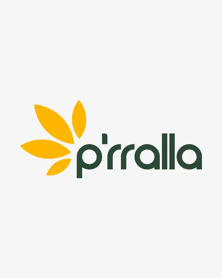
P’rralla means fairytale. A five-petal flower in warm yellow, drawn from the Queen of the Night, sits beside a rounded lowercase wordmark in deep green, with a palette taken from the gardens the company works in.

Deliverables included the logo and construction, colour palette, pattern, stationery and planner forms, signage, tags and brand book spreads.

View project
Albadent logo

Albadent

Logo & identity for a dental clinic.

A tooth drawn as one continuous loop that also reads as a smile, a heart and an infinity sign. Fresh turquoise and deep navy, with a bespoke typeface that stays clear at small sizes.

Deliverables included the logo and construction, colour palettes, stationery, patient forms, posters, signage, packaging and social media templates.

View project
MSB Elektronik logo

MSB

Logo & identity for a technical installation company.

A mark grown out of a honeycomb: overlapping arcs inside a hexagon, with threefold symmetry for the three founders. A vivid gradient for screens, solid navy for print, workwear and vehicles.

Deliverables included the logo and construction, print and digital palettes, pattern, stationery, posters, signage, workwear, vehicle livery, website layouts and social templates.

View project
Ace of Digital logo

Ace of Digital

Logo & identity with the poise of a fashion label.

A compact serif logotype with a single dot at the foot of the A: the ace. Charcoal, grey and white with one signal red, and an editorial layout system built on circles from the construction.

Deliverables included the logotype and construction, colour versions, stationery, bags and tags, editorial layouts, social templates and a photography mood board.

View project
Panna logo

Panna

Logo & identity for an architecture and construction company.

A custom geometric logotype where the A’s become roof pitches and the N’s a run of angles, so the word reads like a section through a building. Charcoal, concrete grey and white, with red and cobalt as accents.

Deliverables included the logotype and construction, colour system, pattern, stationery, brochures, signage, light boxes, billboards, website layouts and social templates.

View project
Mburoja Consulting logo

Mburoja

Logo & identity for a legal consultancy.

Mburoja means shield. The emblem takes the form of Skanderbeg’s shield and folds the letter M and the scales of justice into one symmetrical mark, in warm copper on charcoal and white.

Deliverables included the logo and construction, colour versions, pattern, stationery, folders, signage, billboards, flags, event backdrops, website layout and social templates.

View project
Go logo

Go

Logo & identity for a condom brand.

A G and an O locked into one shape, two forms holding each other. Plain black and white for the mark, neon cyan, magenta and purple for the campaigns, and the line Safe is sexy throughout.

Deliverables included the logo and construction, colour system, pattern, stationery, brochure, signage, digital templates and a campaign toolkit. Packaging and website are separate projects.

View project
Bama Lux logo

Bama Lux

Logo & identity for a tile and bathroom supplier.

Four letters set in a square, like tiles laid on a grid, with one small notch in the B as the signature. Deep navy carries the weight, orange adds the spark, and the grid extends into a pattern.

Deliverables included the logo and construction, colour versions, pattern, stationery, brochures, posters, signage, lanyards, vehicle livery and website layouts.

View project
GraSano logo

GraSano

Logo & identity for an Italian food brand.

A seed holding a rising sun, ploughed fields and a heart, drawn from the brand’s values. A hand-lettered wordmark, deep green, soft cream and earth-brown, and pencil-drawn farmland that wraps the packs.

Deliverables included the logo and construction, colour system, pattern, stationery, packaging, point of sale, billboards, vehicle livery, aprons and tableware, and social templates.

View project
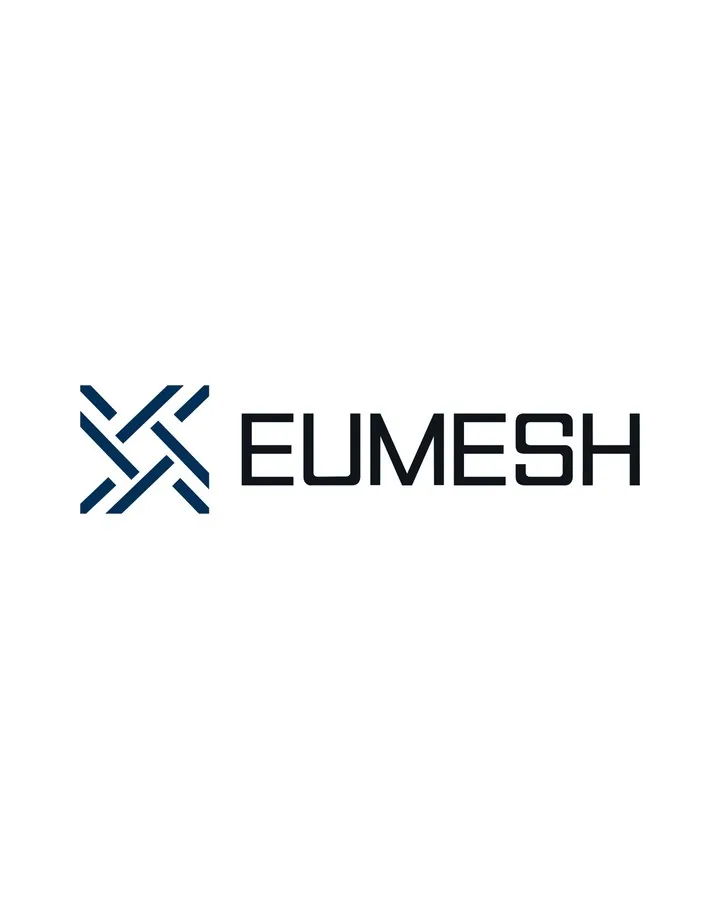
Eumesh logo

Eumesh

Logo & identity for a steel mesh manufacturer.

A symbol woven from interlocking strokes, wire crossing wire, that reads as an X, a knot and a mesh at once. Deep navy and white with one bright blue, and a bold geometric wordmark built for distance.

Deliverables included the logo and construction, colour system, pattern, signage, shipping containers, vehicle livery, workwear, posters and social media templates.

View project
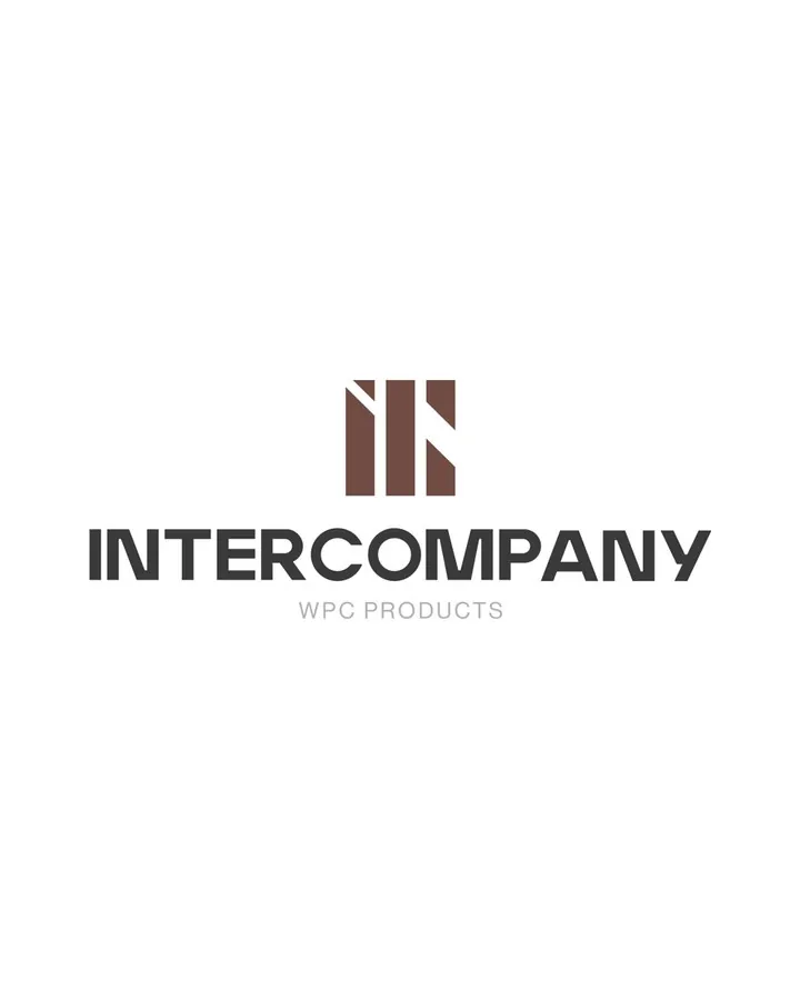
InterCompany logo

InterCompany

Logo & identity for a WPC products brand.

A mark built from the initials: upright bars cut at an angle, like boards on a facade, with one diagonal for movement. Deep timber brown, taupe and cream, and a strong, simple logotype.

Deliverables included the logo and construction, colour system, pattern, stationery, sample book, signage, exhibition stand, workwear, badges and social media templates.

View project
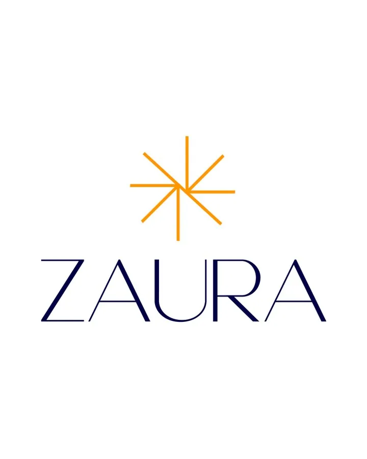
Zaura logo

Zaura

Logo & identity for a hair removal and skin care studio.

A fine, radiating star, light as a hair-thin line, with an airy high-contrast wordmark. Deep navy grounds it, warm amber gives it a glow, and off-white keeps everything soft.

Deliverables included the logo and construction, colour system, pattern, signage, packaging, towels, uniforms, business cards, gift vouchers and bags.

View project