Logo design
- Client
- Eumesh
- Year
- 2025
- Scope
- Logo, identity, pattern, signage, vehicles, workwear, social
- Industry
- Steel mesh manufacturing
Eumesh a woven mark for a company that makes strength
The brief
Eumesh manufactures steel mesh, from reinforcement for concrete to window and insect screens. The brief was an identity that says engineering first: precise, dependable and modern enough to stand out in a sector that rarely thinks about its brand.
The idea
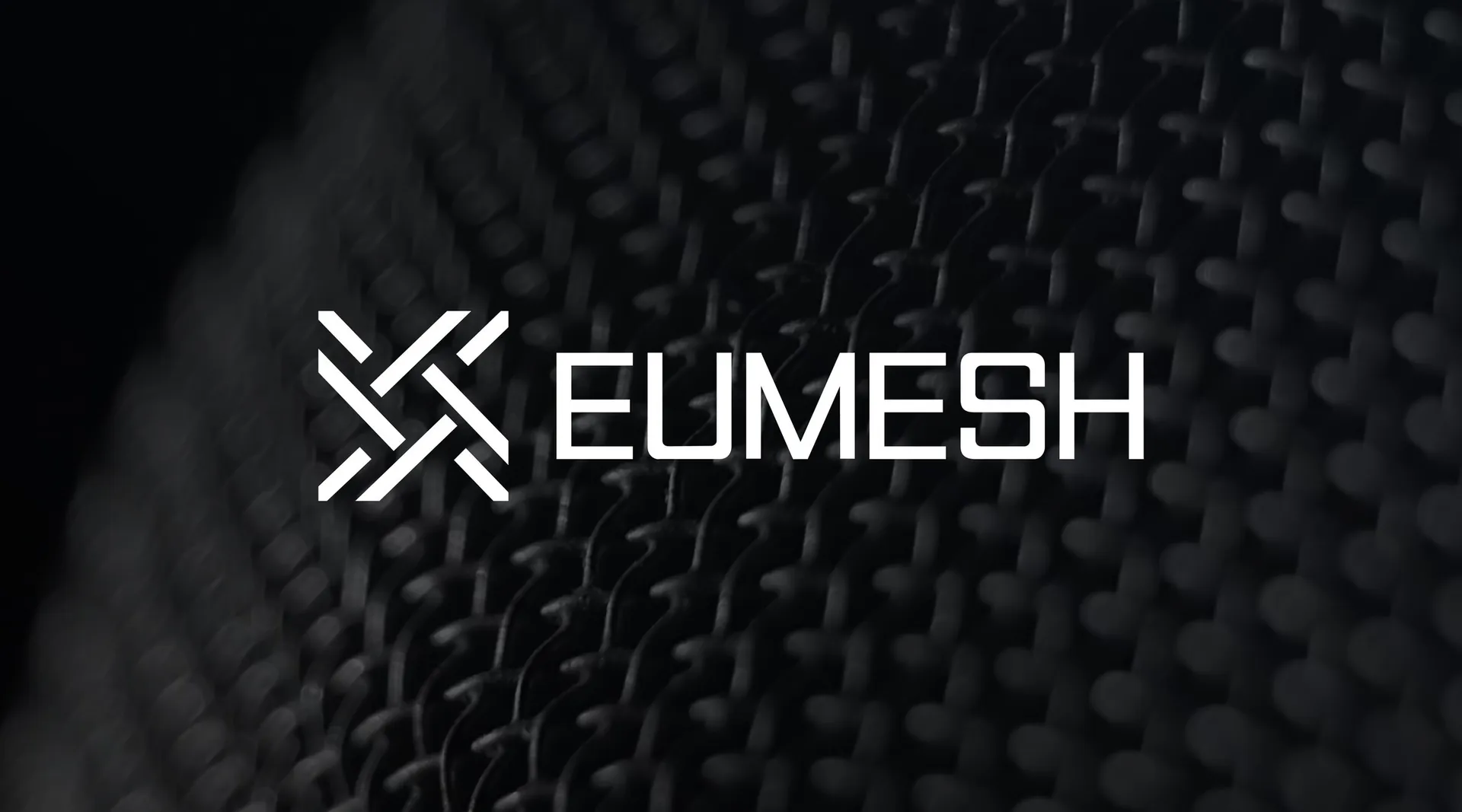
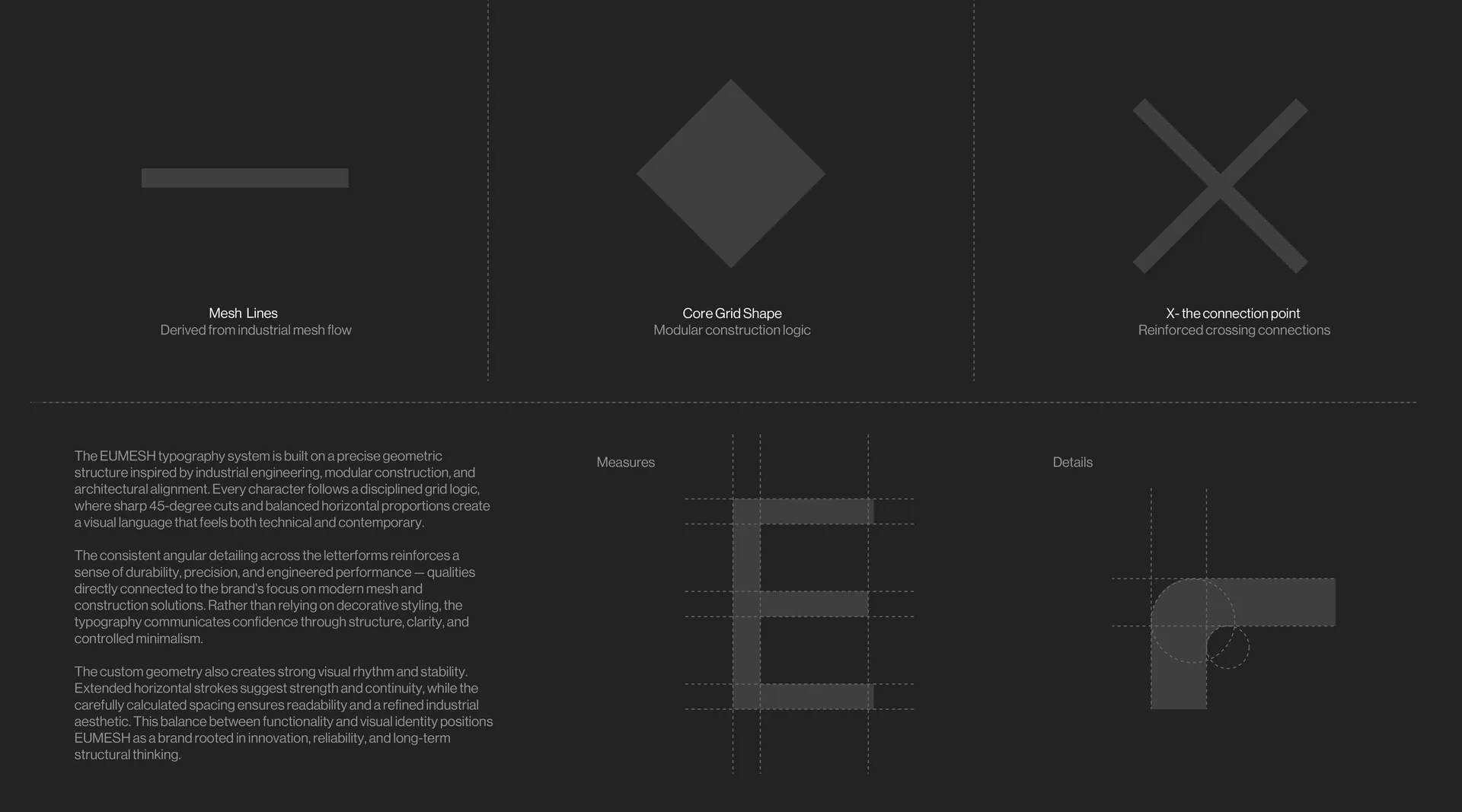
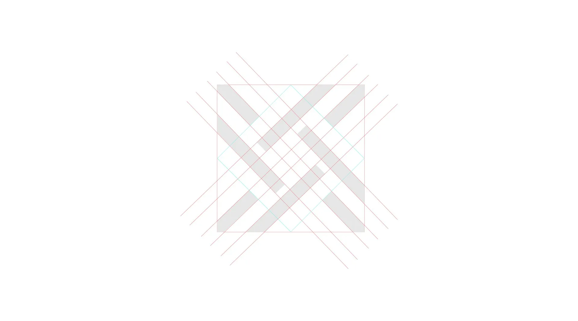
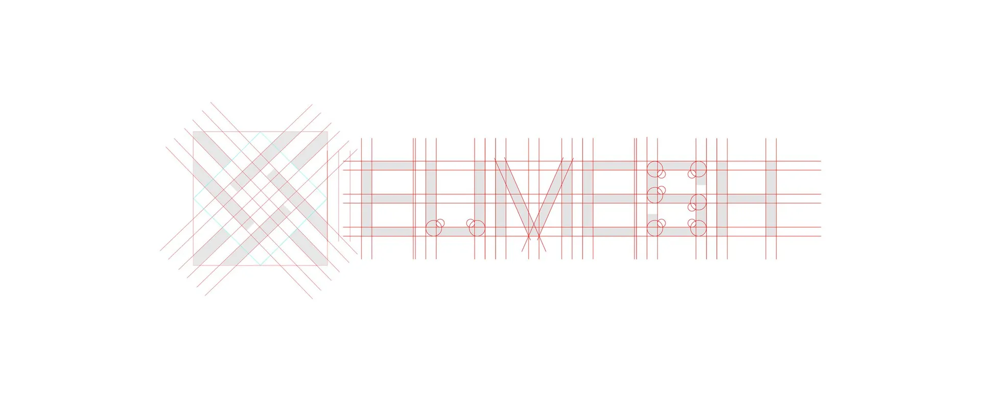
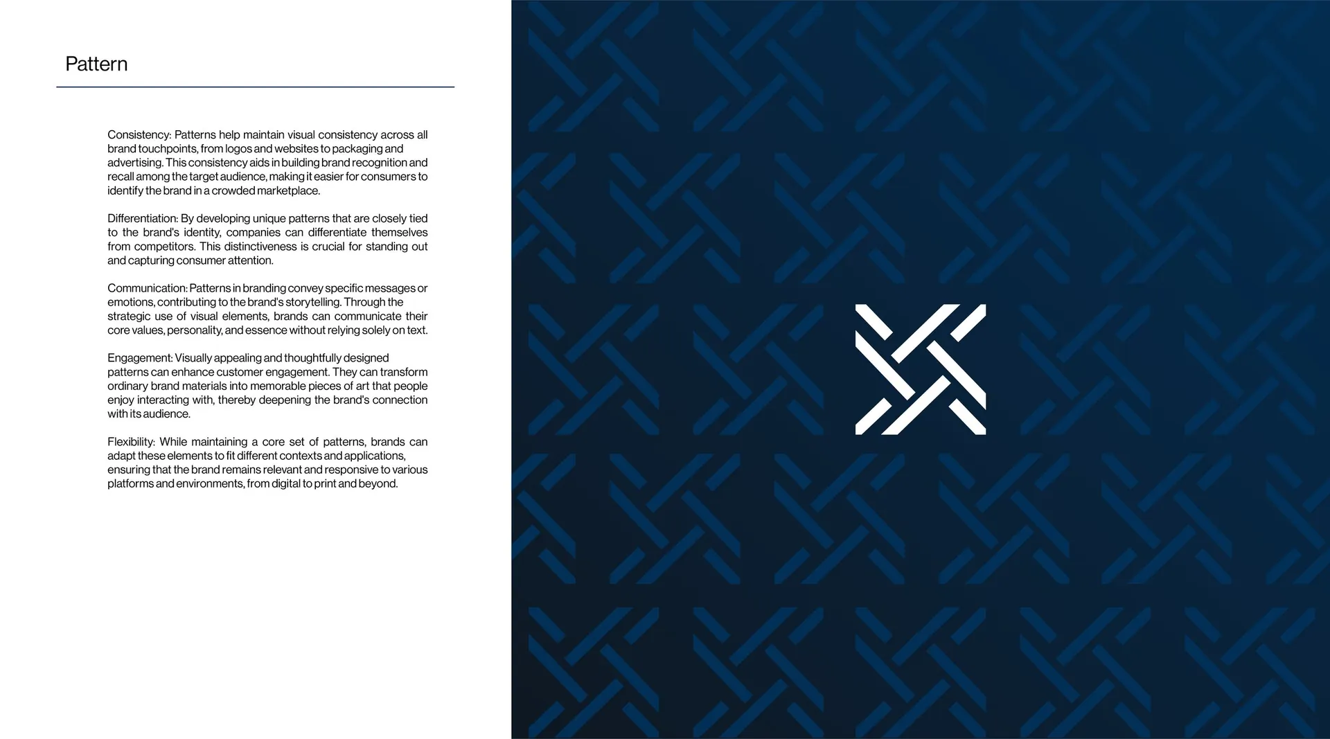
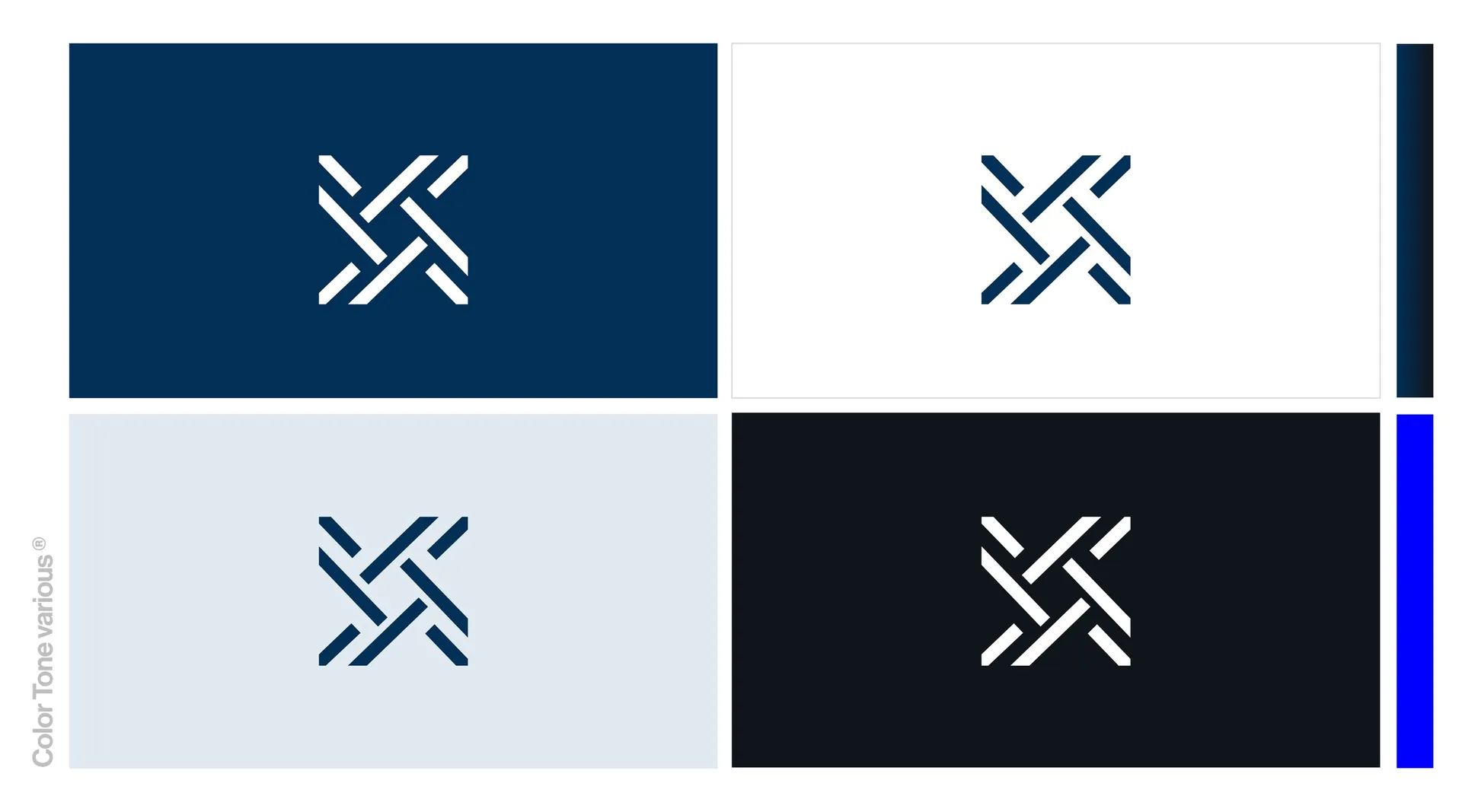
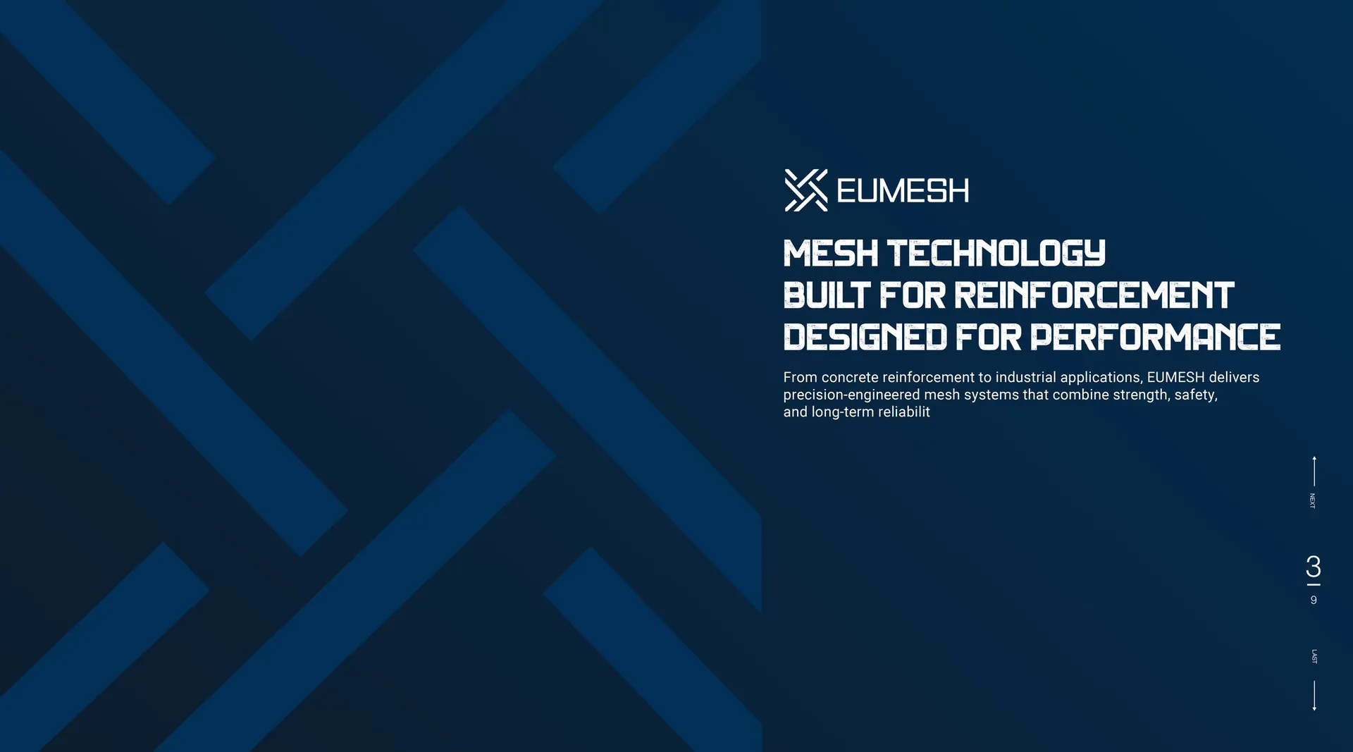
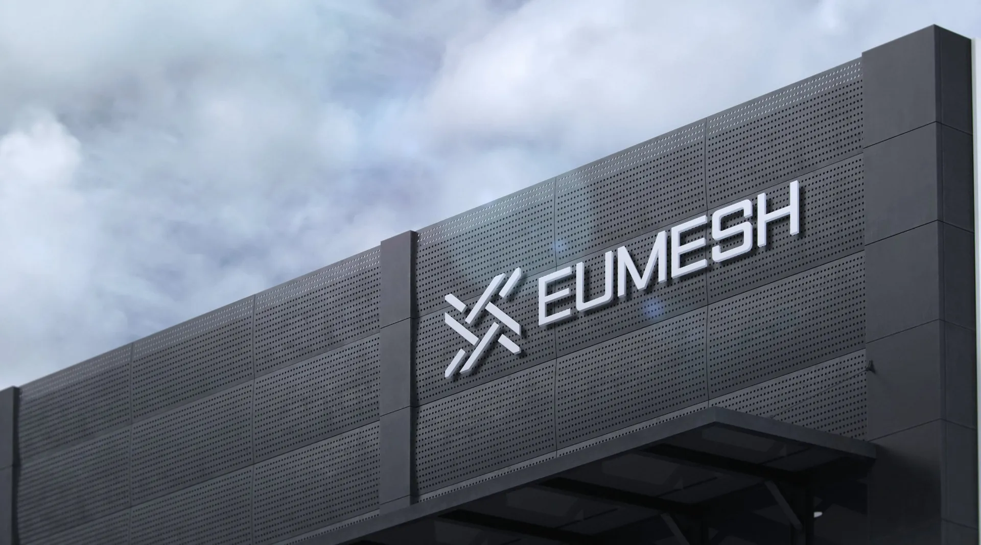
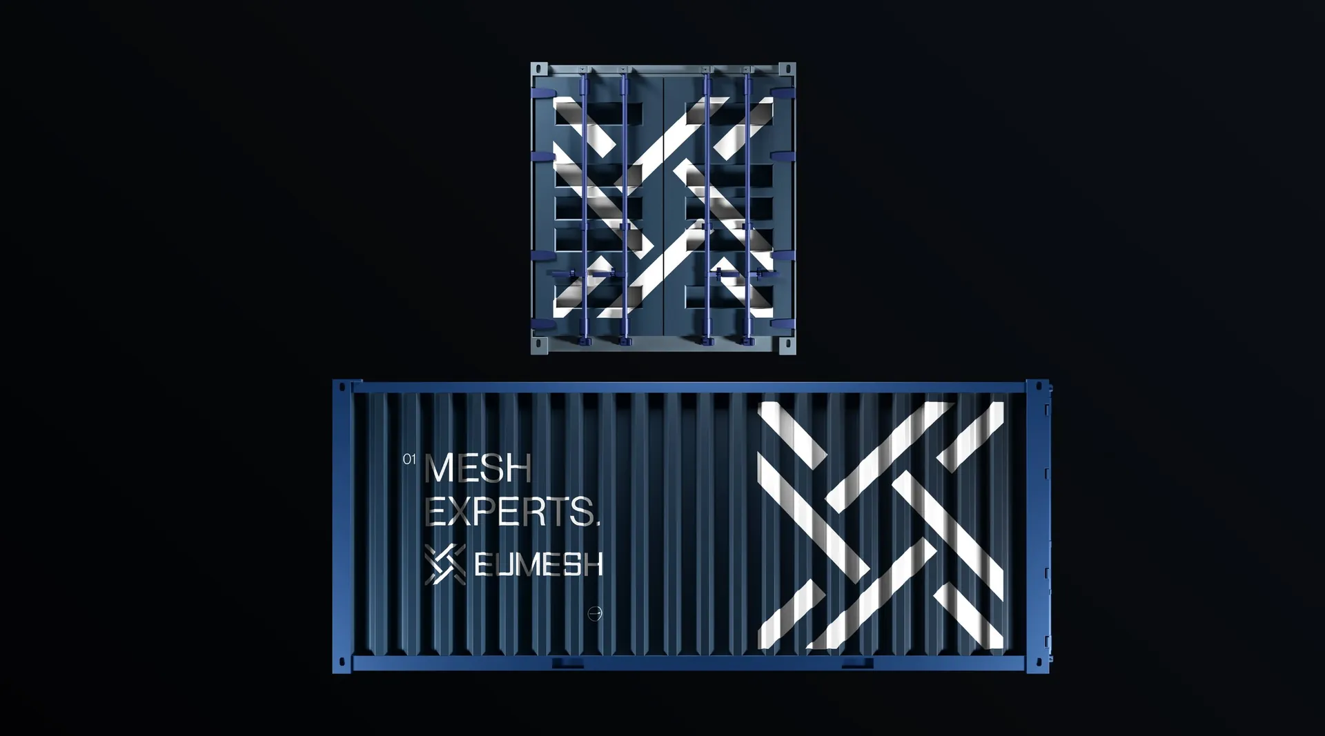
The symbol is woven from interlocking strokes, wire crossing wire, and reads as an X, a knot and a mesh at once. Deep navy and clean white carry it, with a single bright blue kept for accents, and a bold geometric wordmark stays legible on a shipping container at a hundred metres. The strokes repeat into a pattern that works as cladding, print and uniform detail.
The result
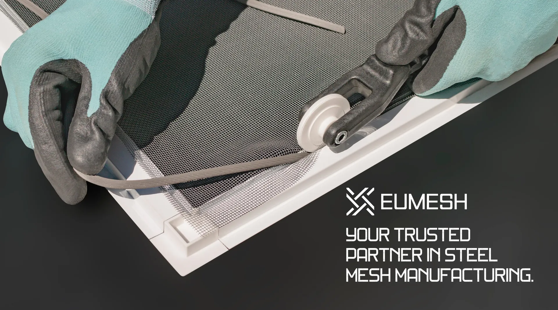
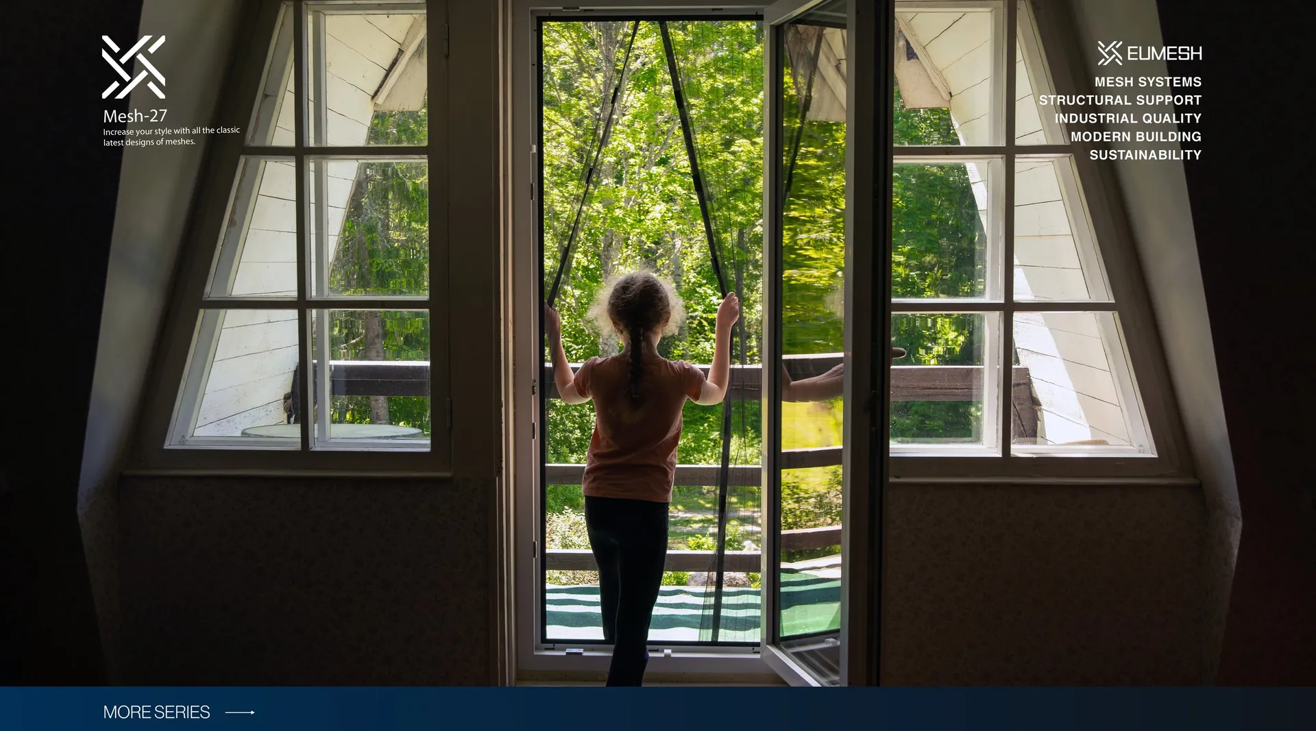
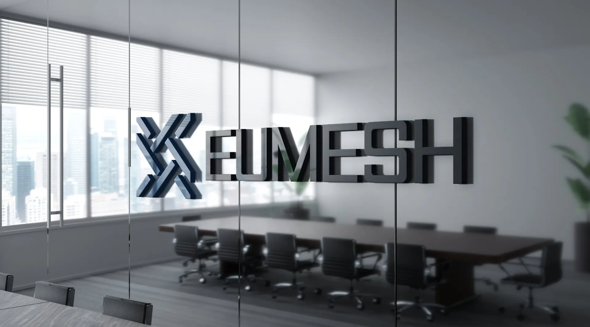
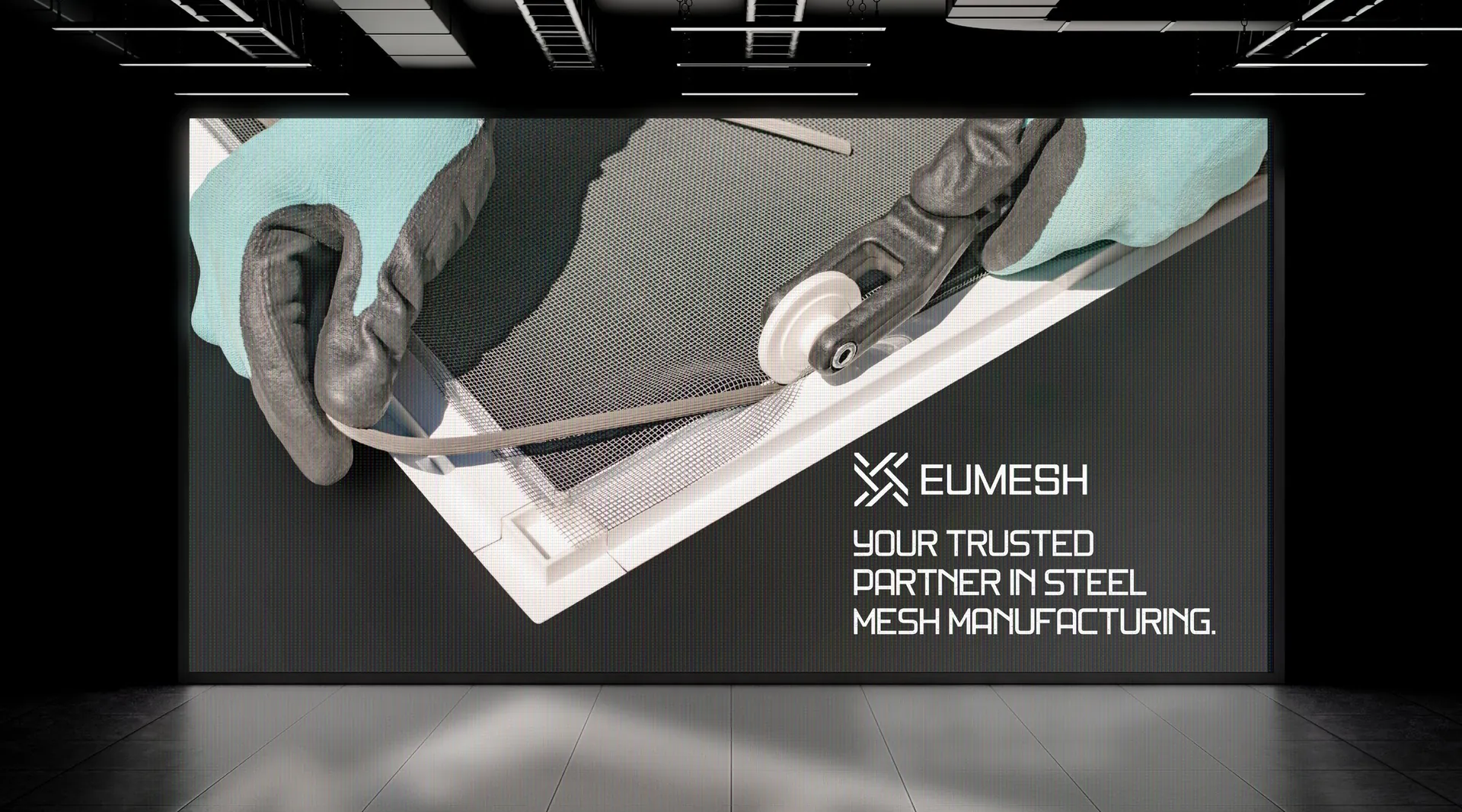
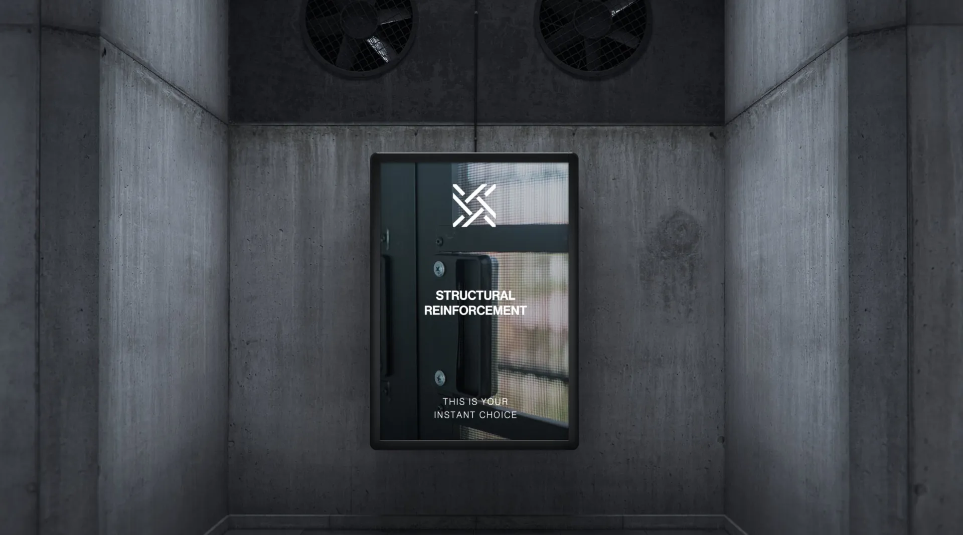
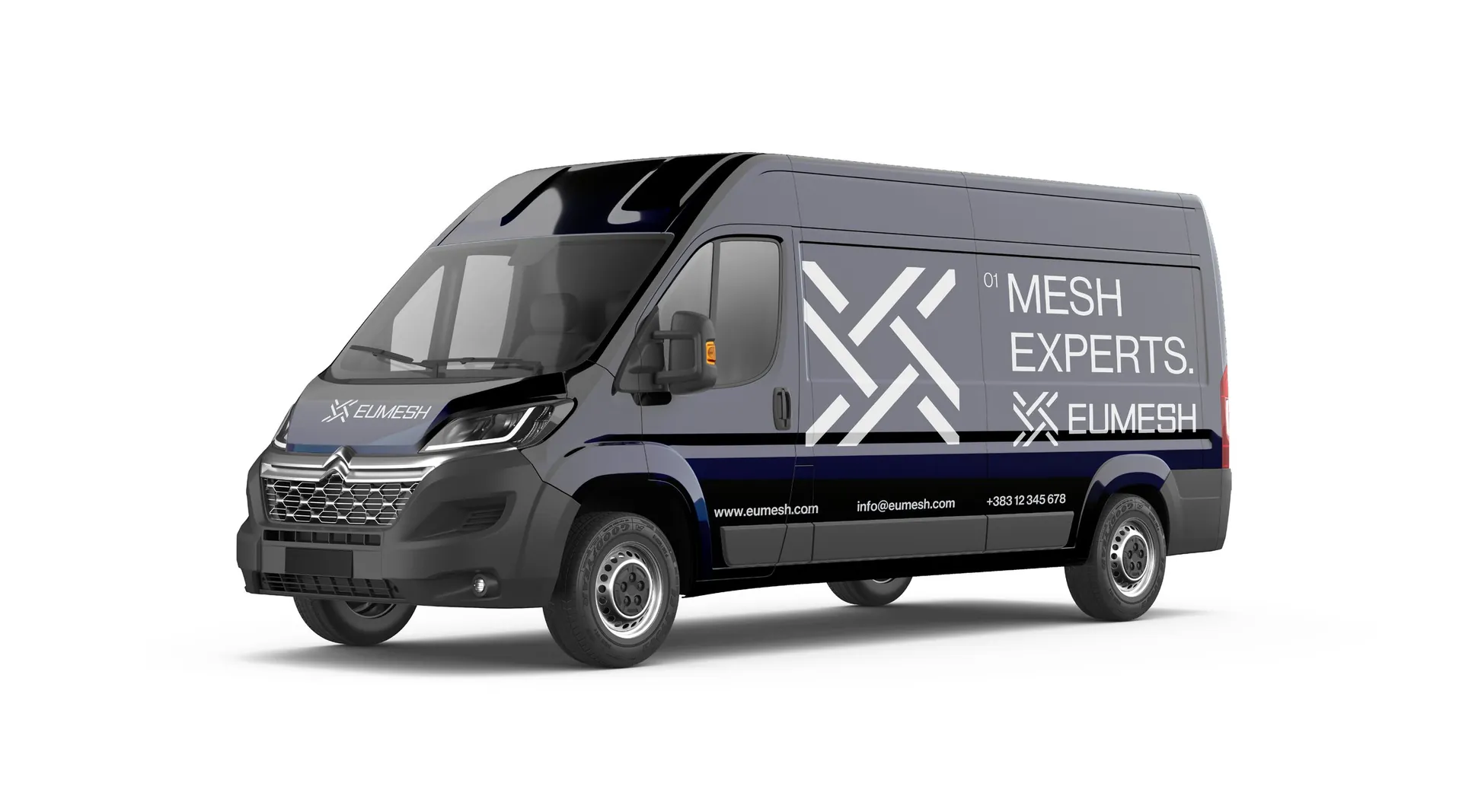
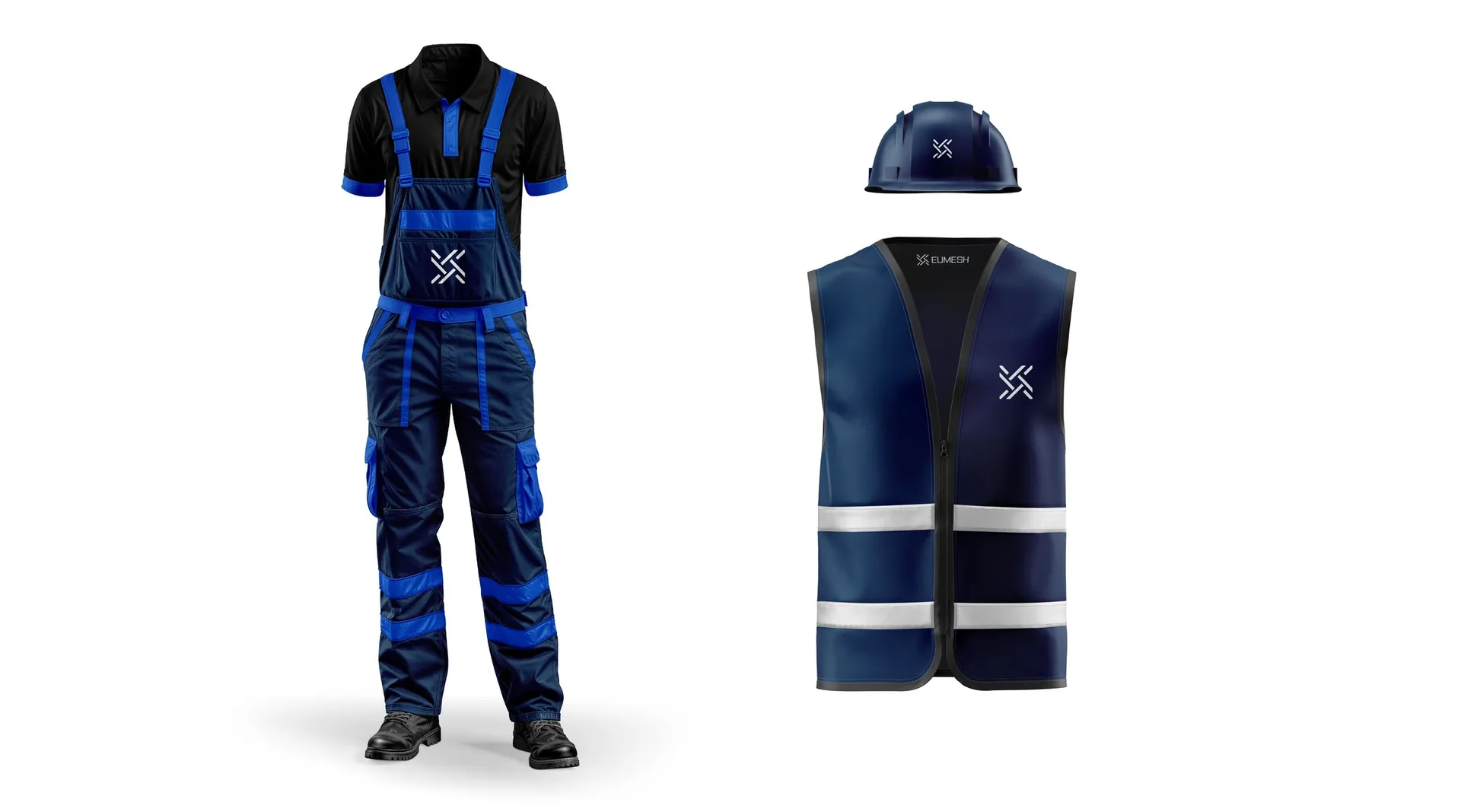
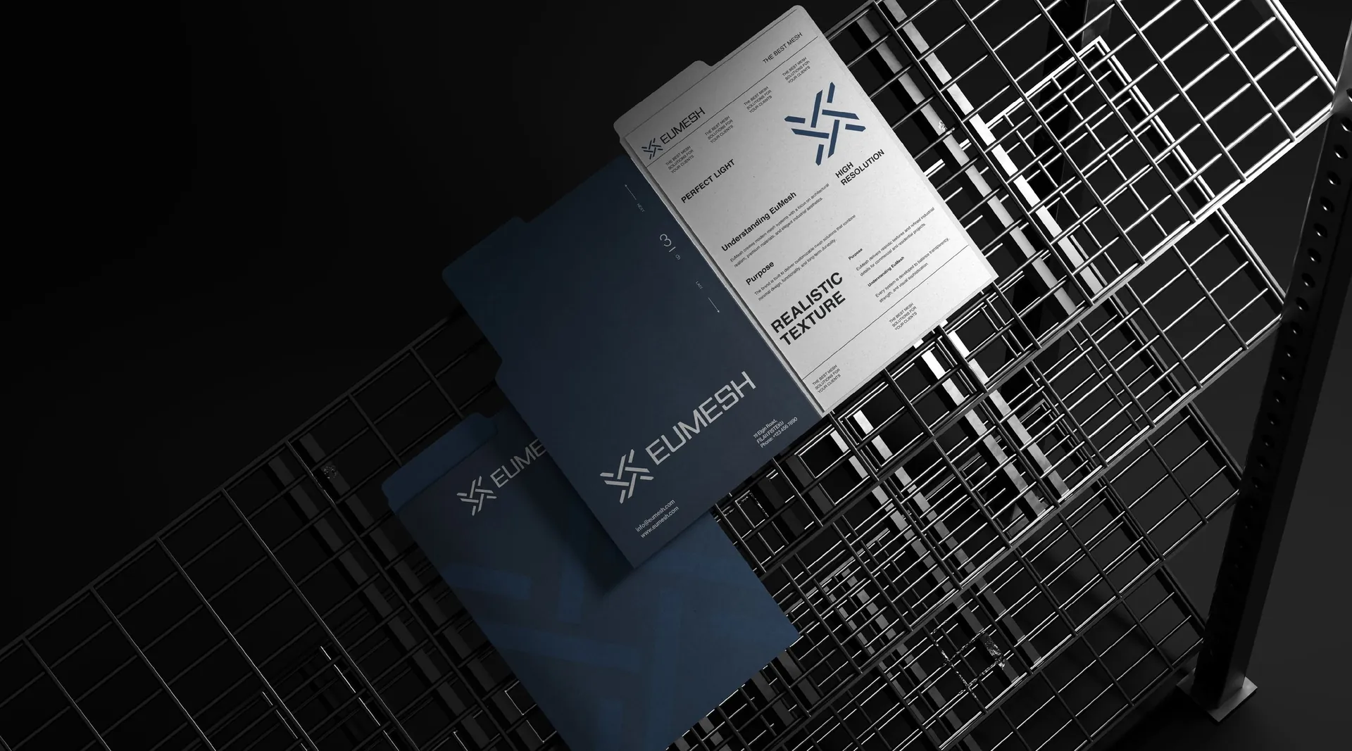
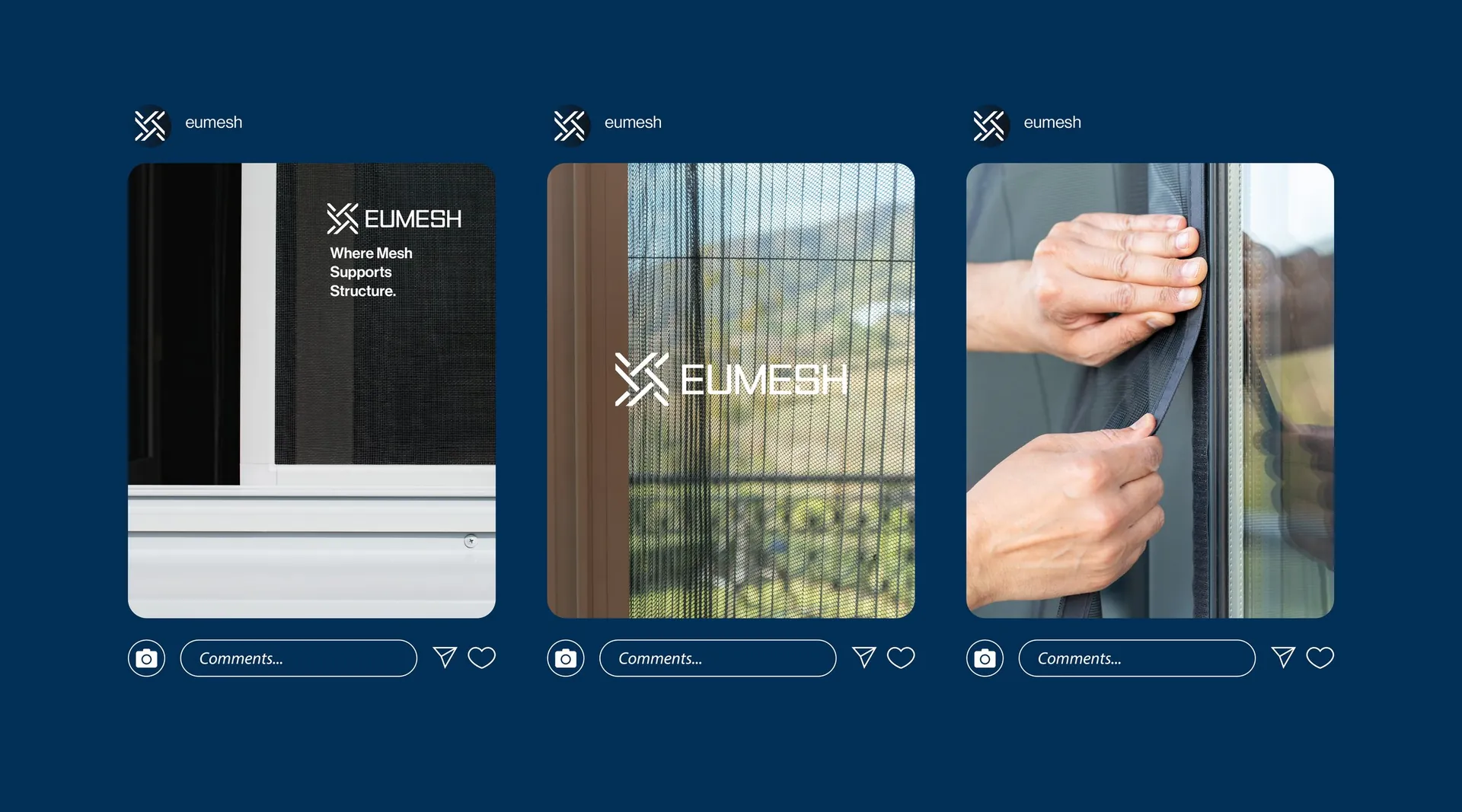
Logo and construction, colour system, pattern, business cards, posters and brochure spreads, facade and interior signage, shipping containers, vehicle livery, workwear and social media templates. Tagline: Your trusted partner in steel mesh manufacturing.

01 / 22

02 / 22

03 / 22

04 / 22

05 / 22

06 / 22

07 / 22

08 / 22

09 / 22

10 / 22

11 / 22

12 / 22

13 / 22

14 / 22

15 / 22

16 / 22

17 / 22

18 / 22

19 / 22

20 / 22

21 / 22

22 / 22