Logo design
- Client
- Panna Generalunternehmung AG
- Year
- 2025
- Scope
- Logo, identity, print, signage, digital, social
- Industry
- Architecture & construction
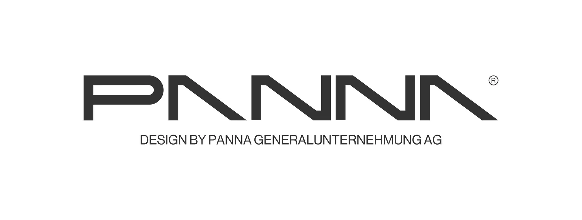
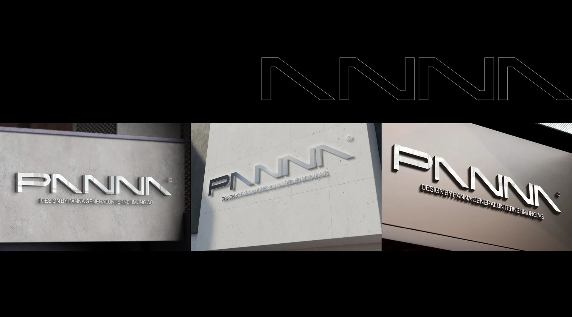
Panna an architectural mark built from four angles
The brief
Panna Generalunternehmung AG is a general contractor working across architecture, landscape architecture and interiors. The brief was a wordmark with the discipline of a building drawing, neutral enough to sit beside any project and strong enough to stand alone on a site hoarding.
The idea
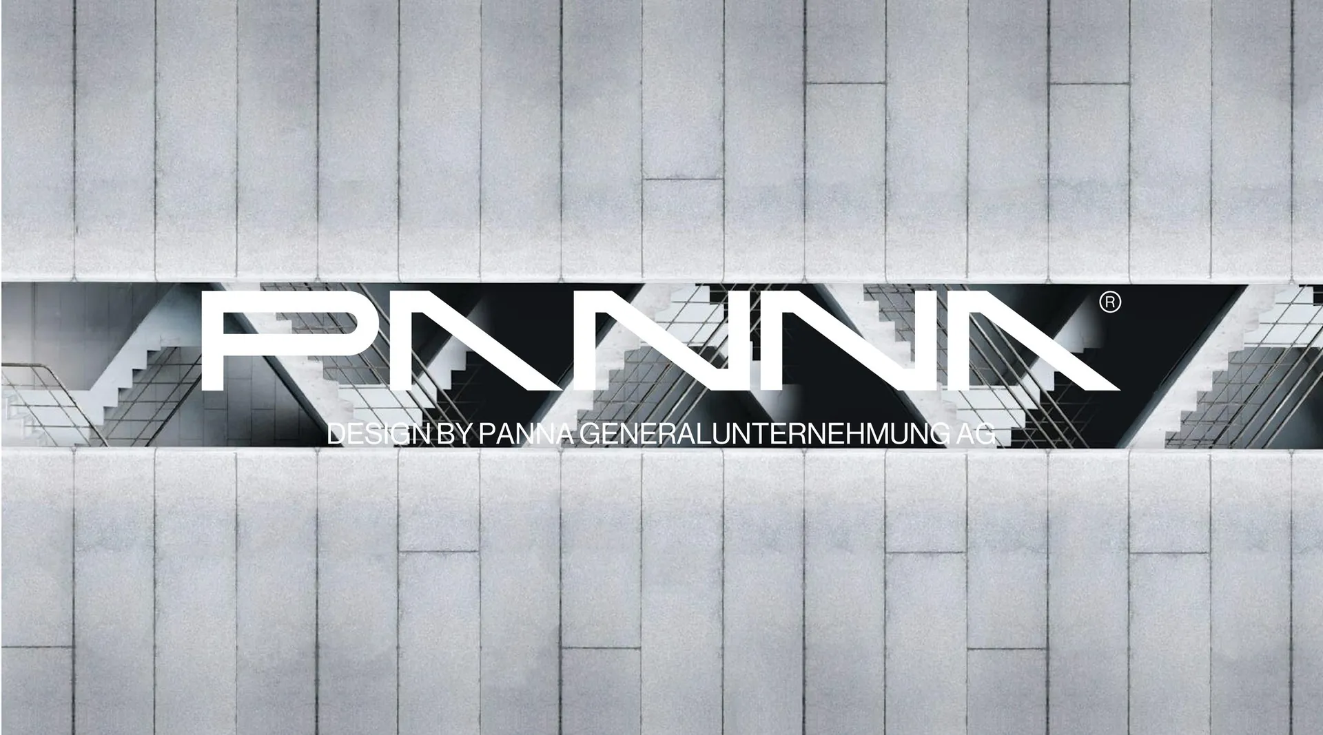
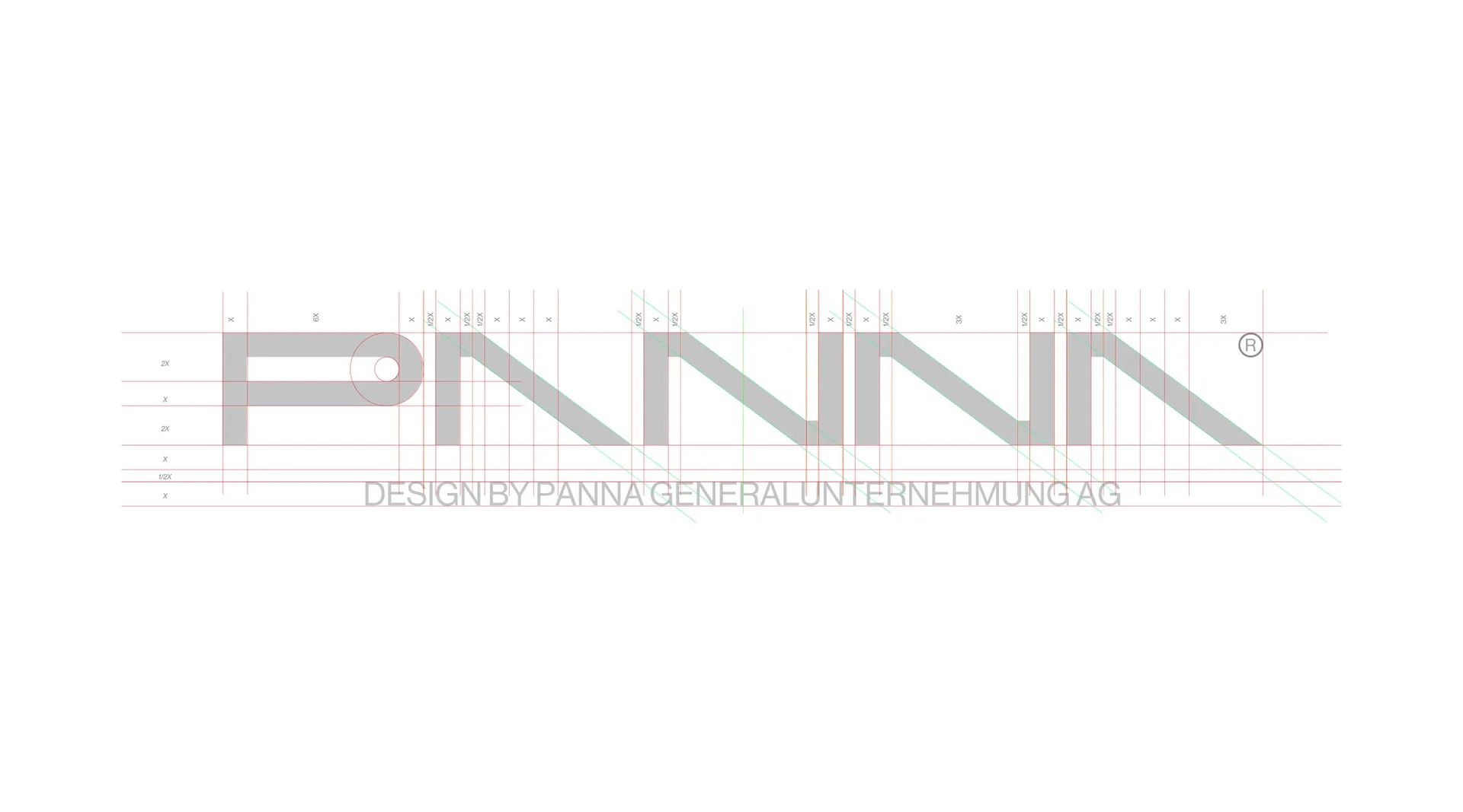
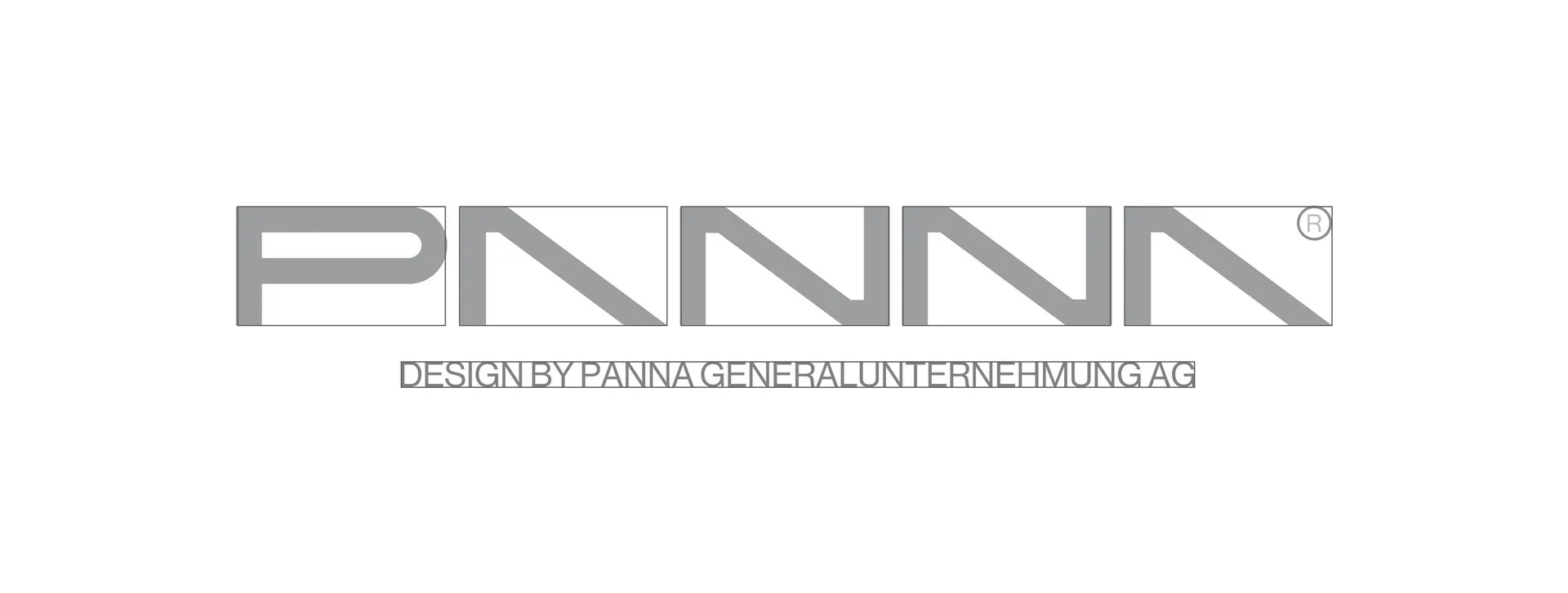
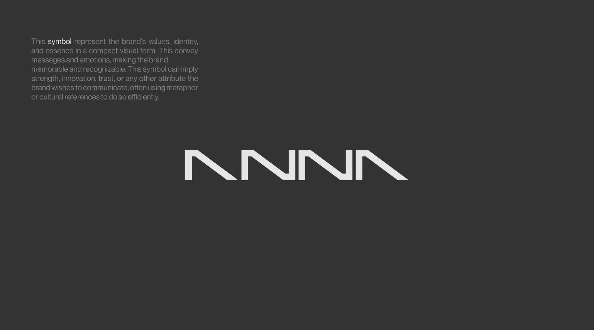
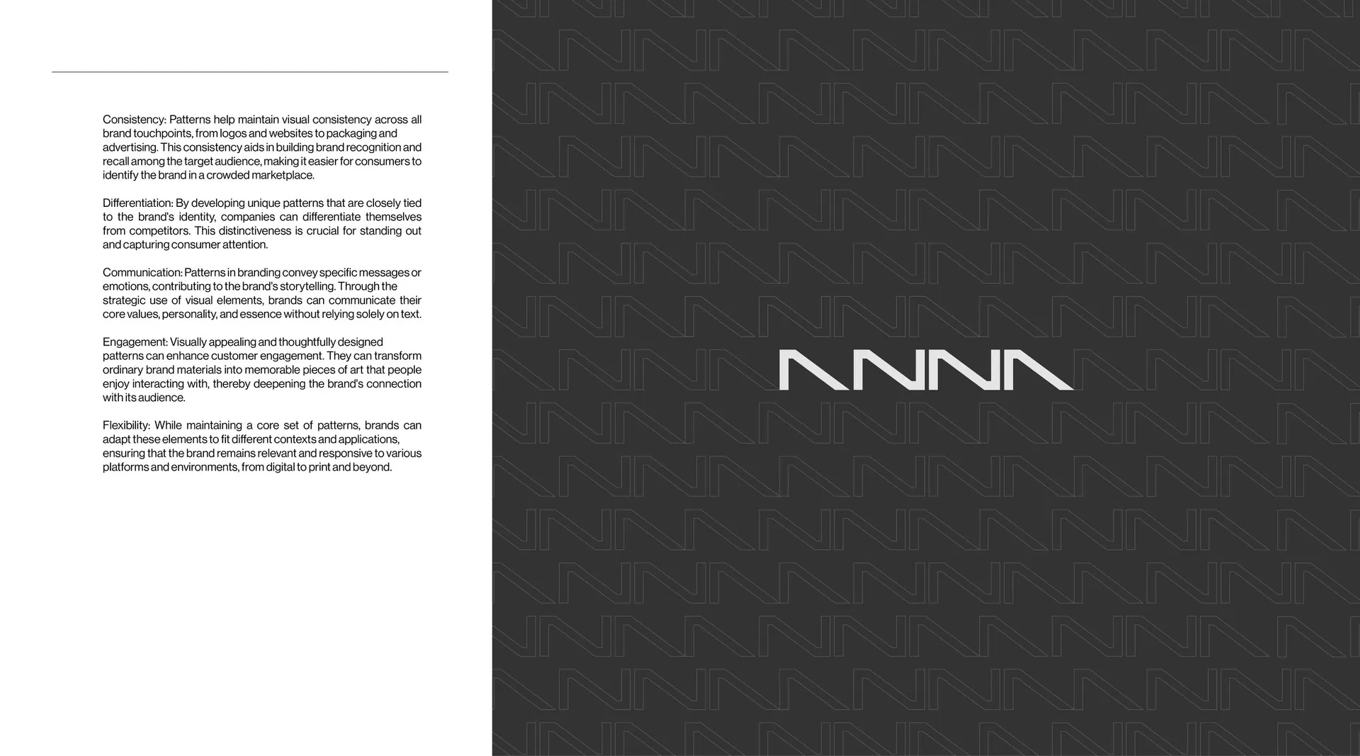
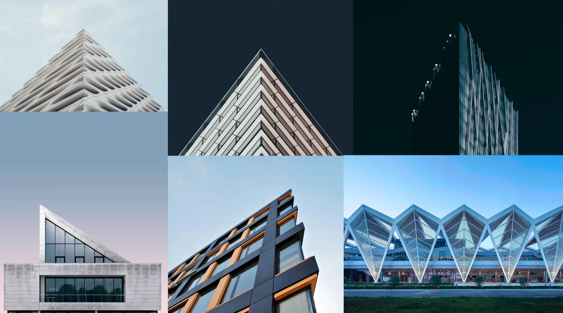
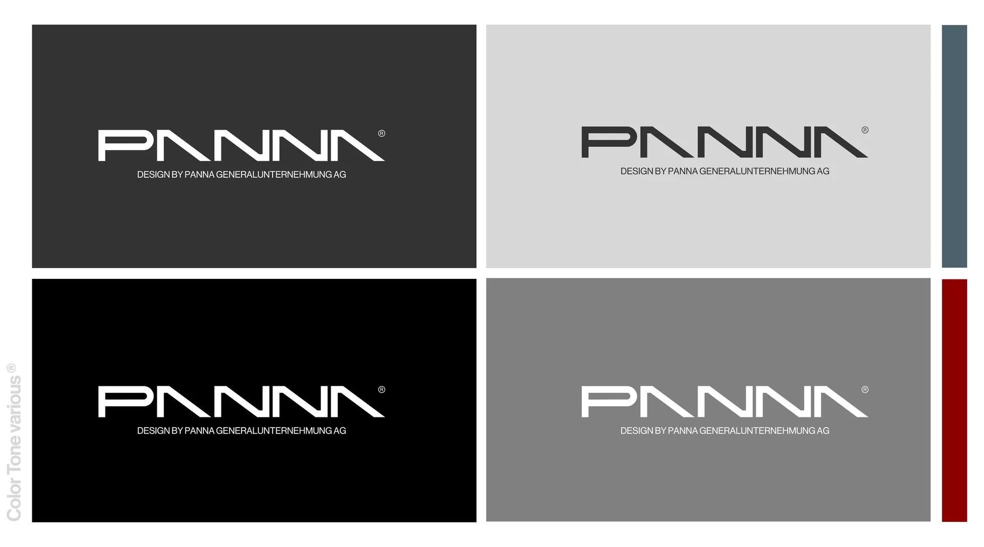
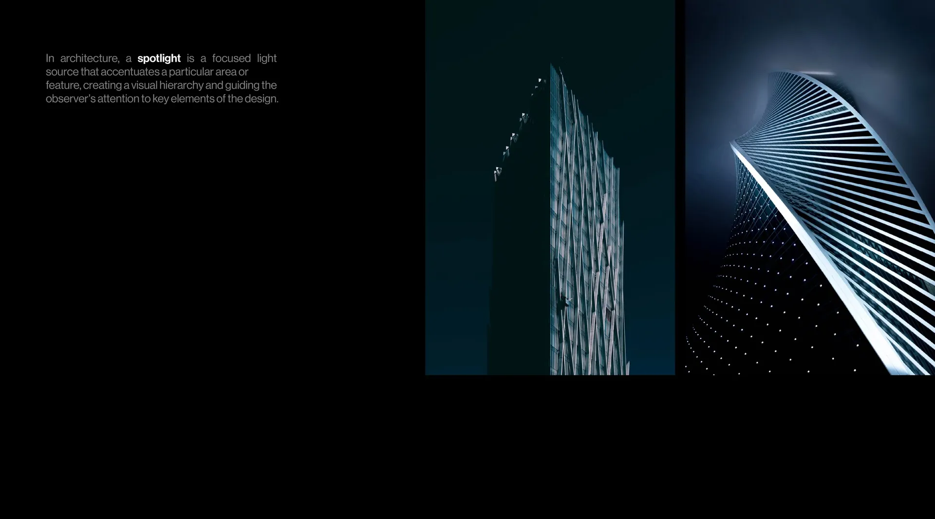
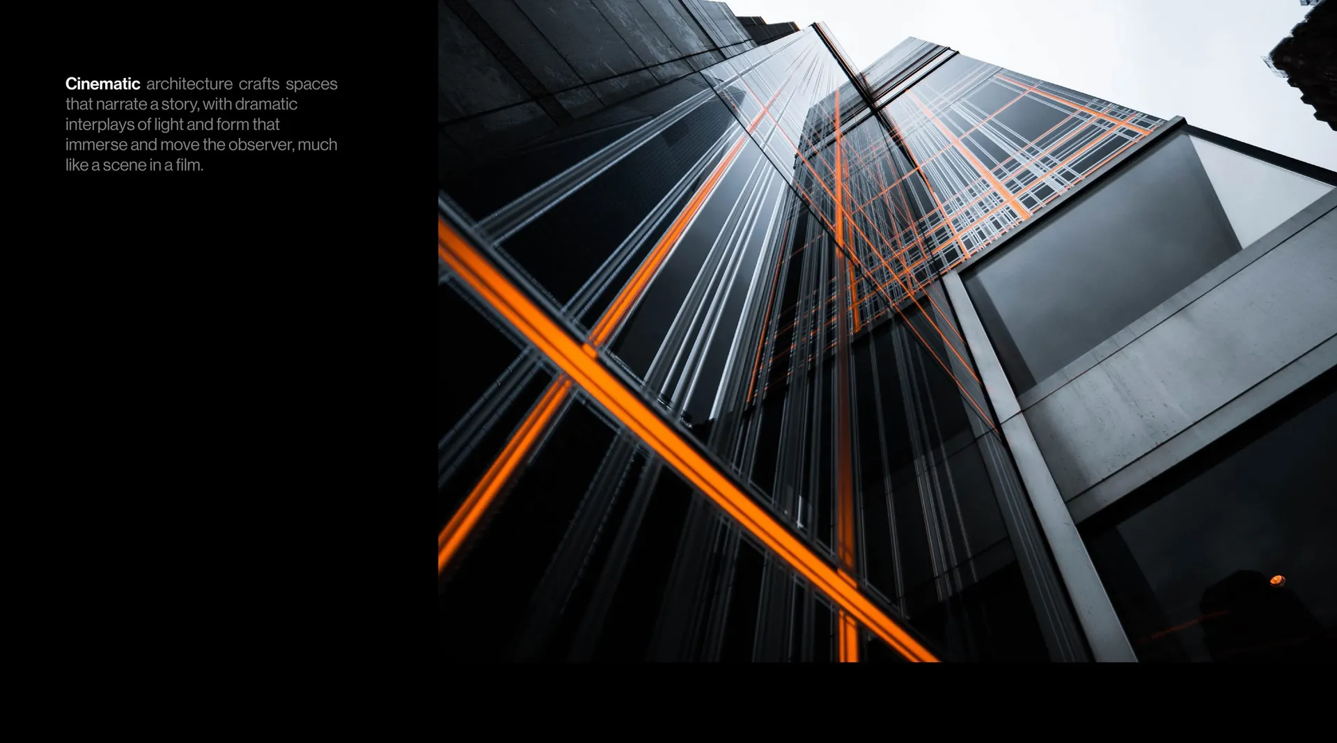
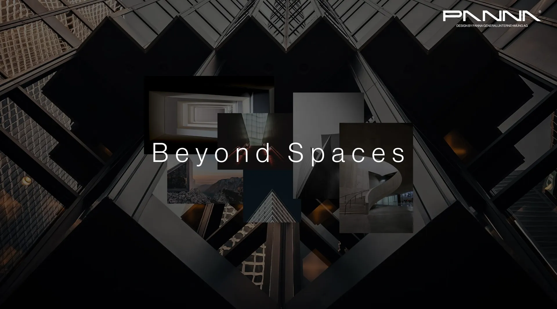
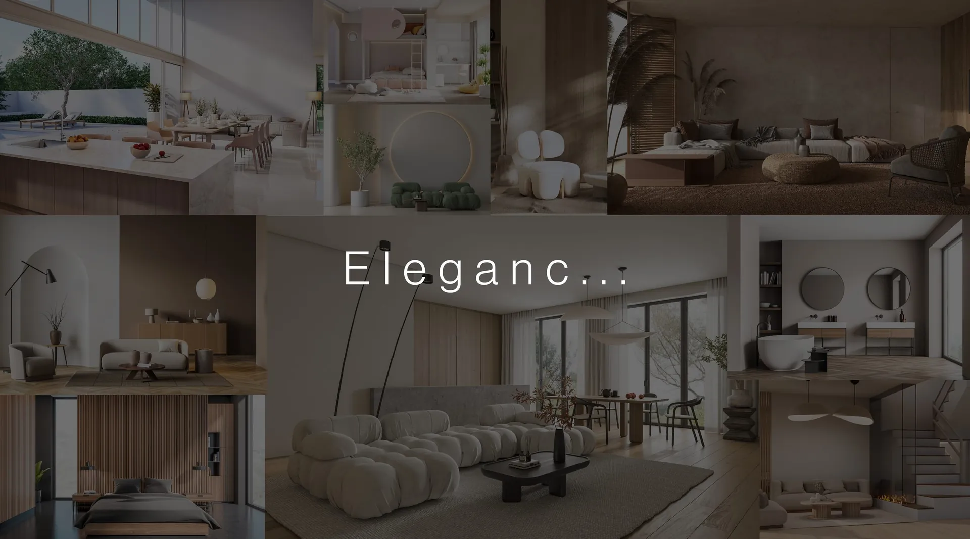
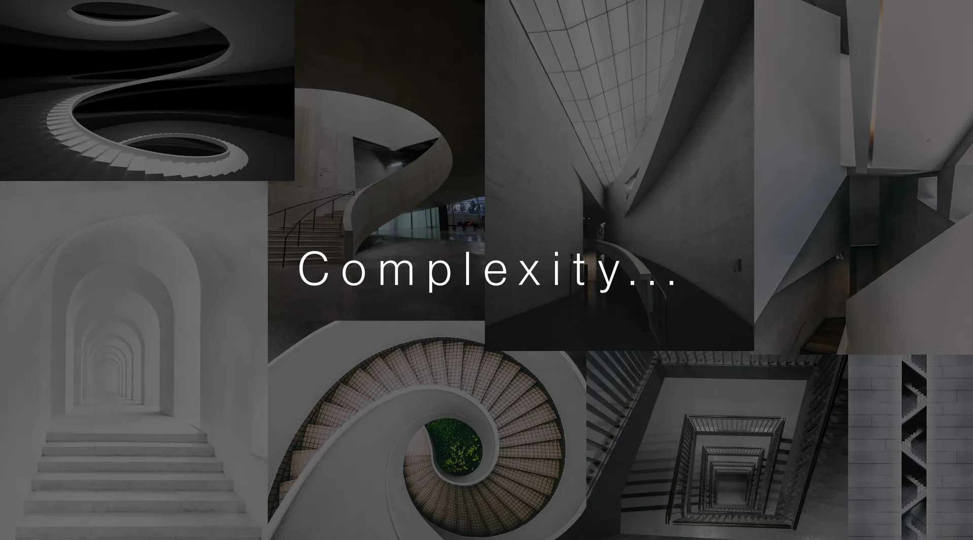
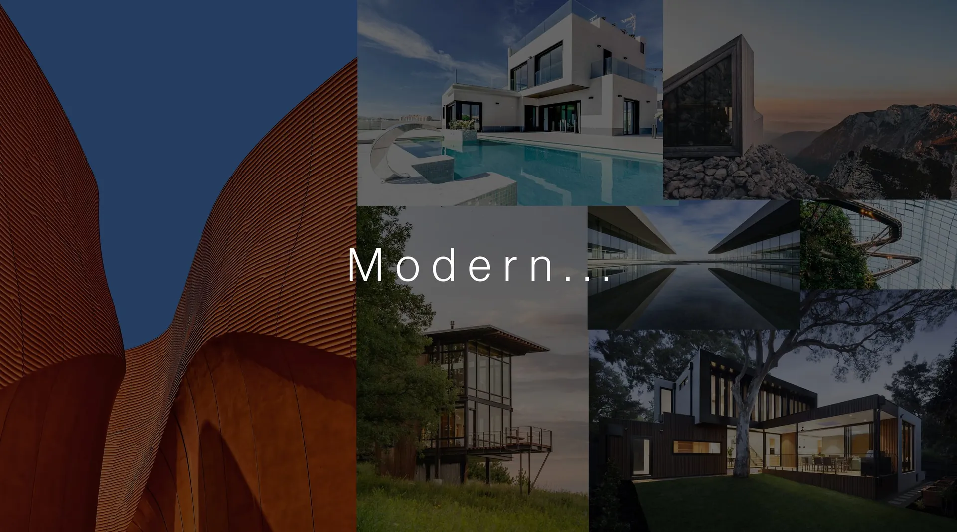
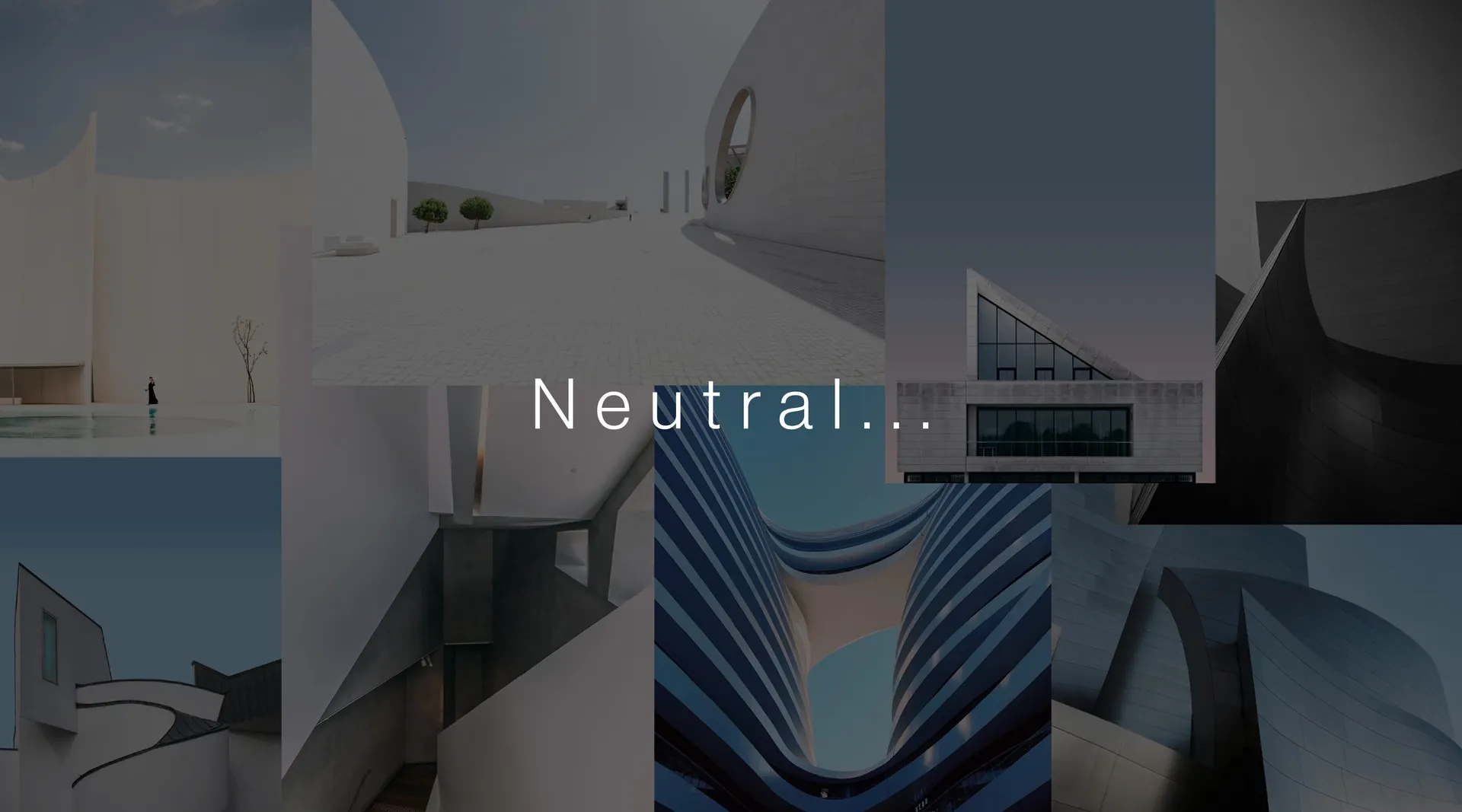
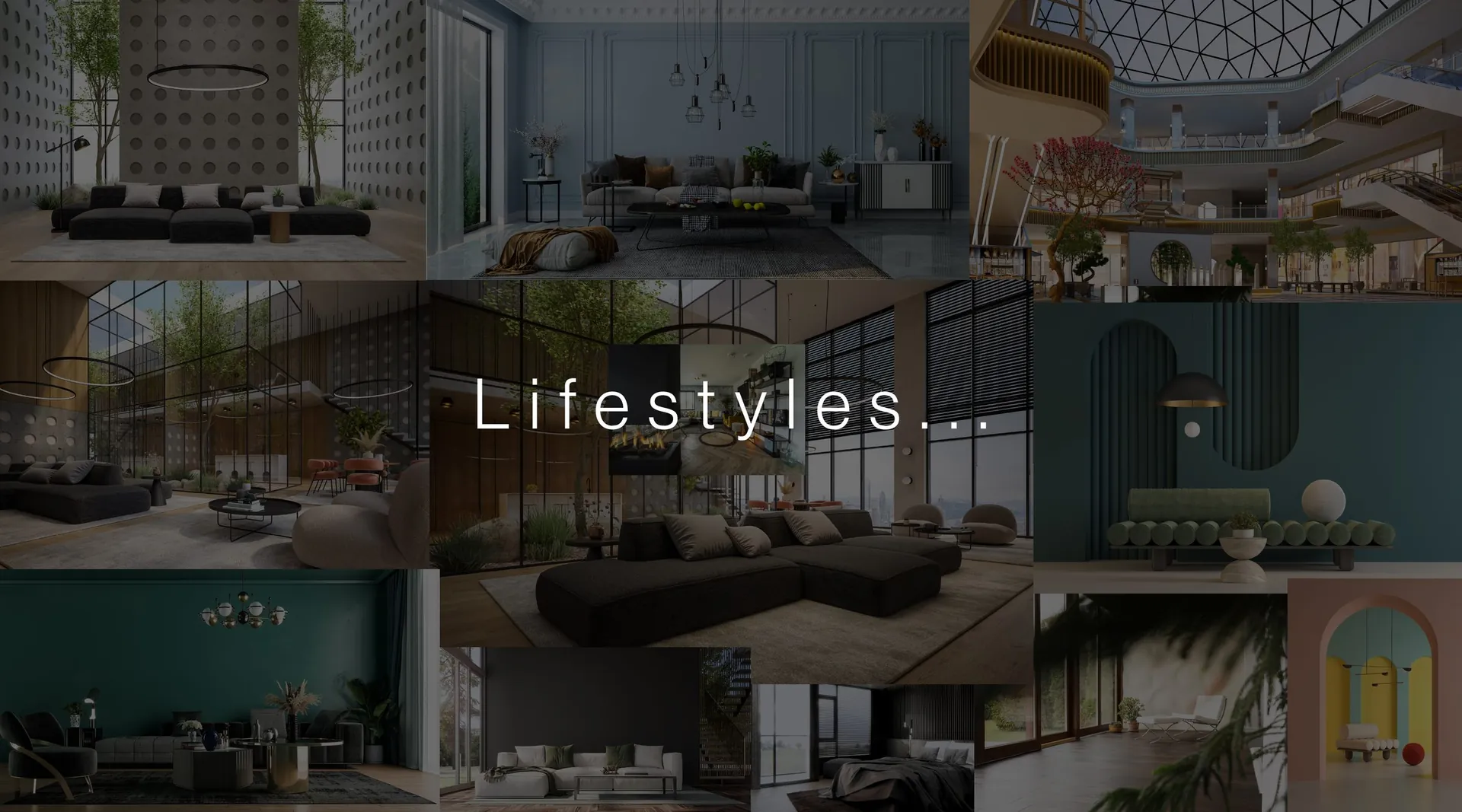
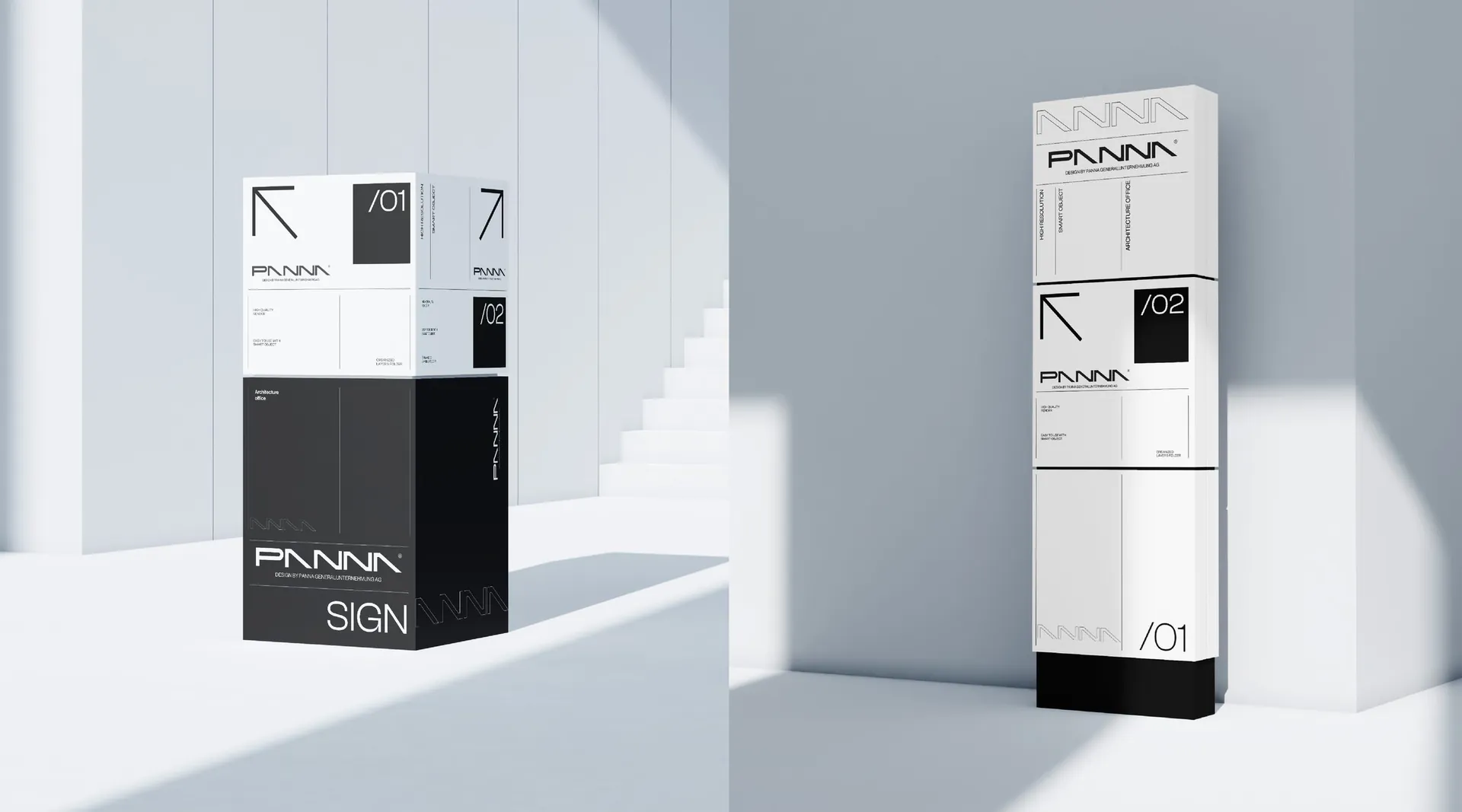
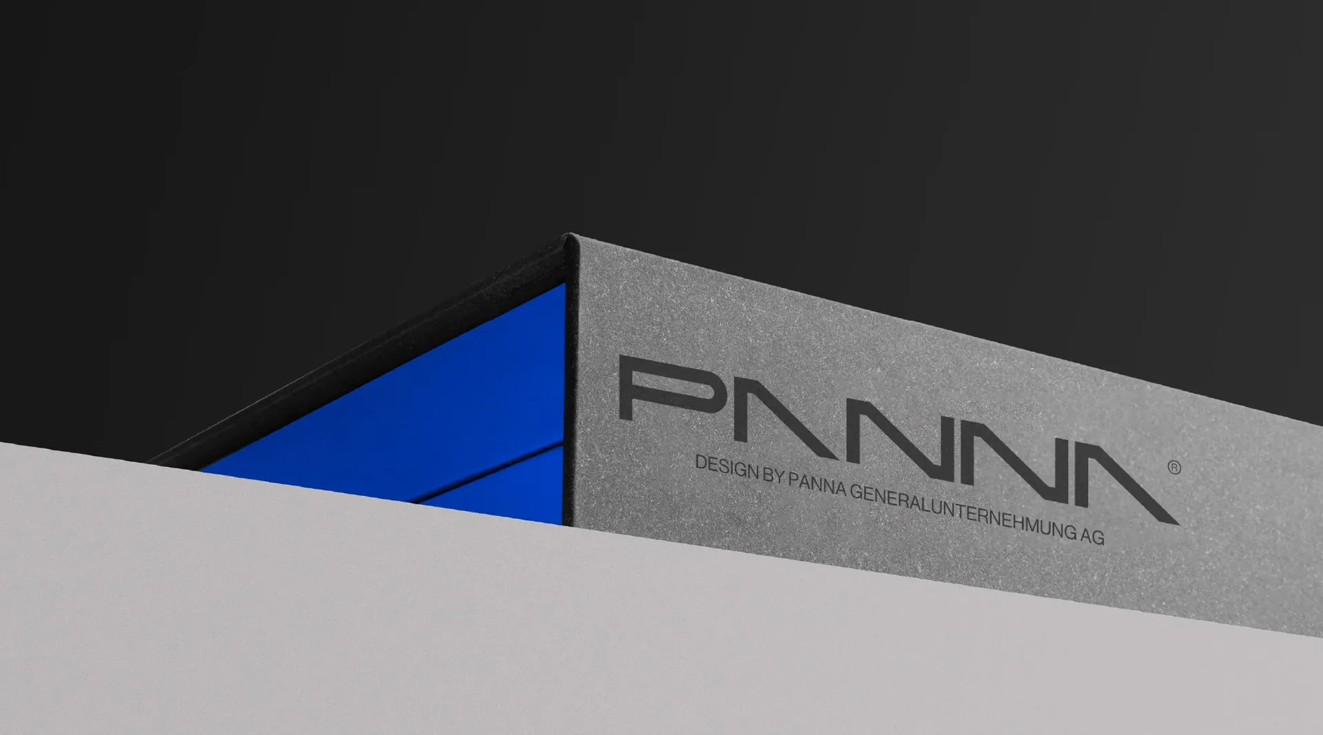
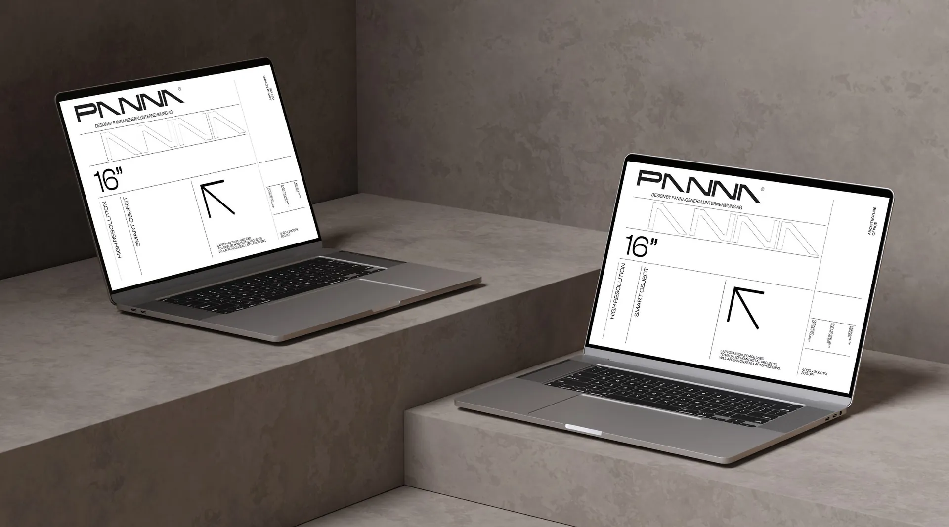
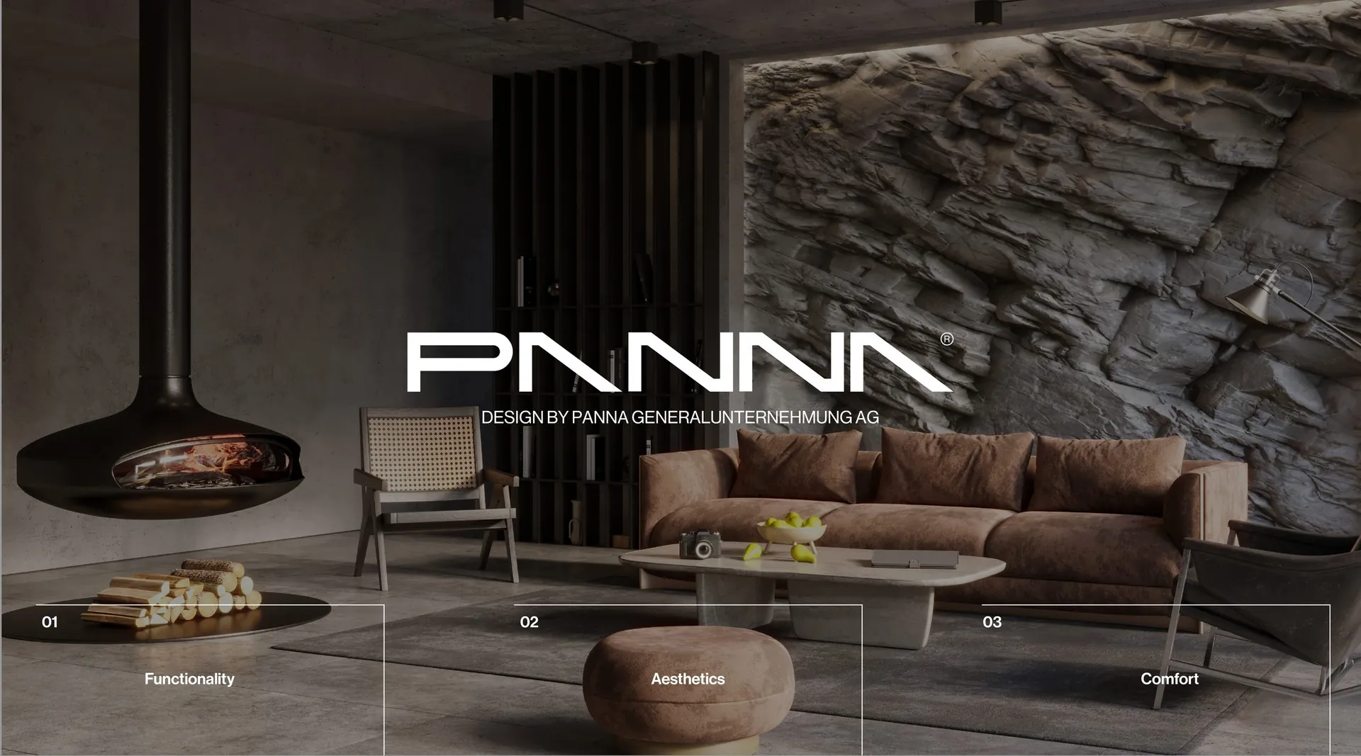
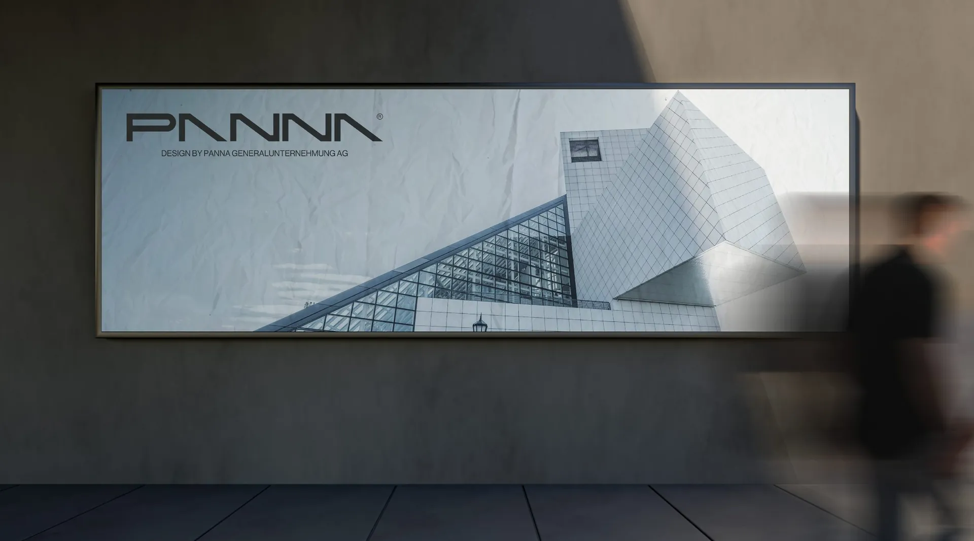
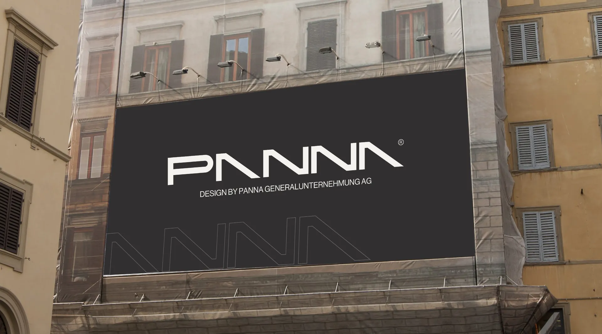
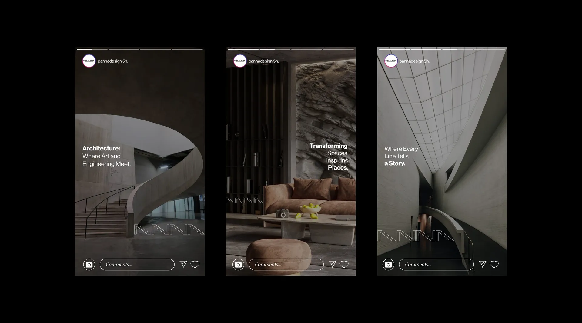
The name is set in a custom geometric logotype: the A’s lose their crossbars and become roof pitches, the N’s turn into a run of angles, and the whole word reads like a section through a building. Charcoal, concrete grey and white carry it; a single red and a cobalt blue are kept as accents. The photography moves between extremes, complexity and calm, modern and neutral, which gives the system its range.
The result
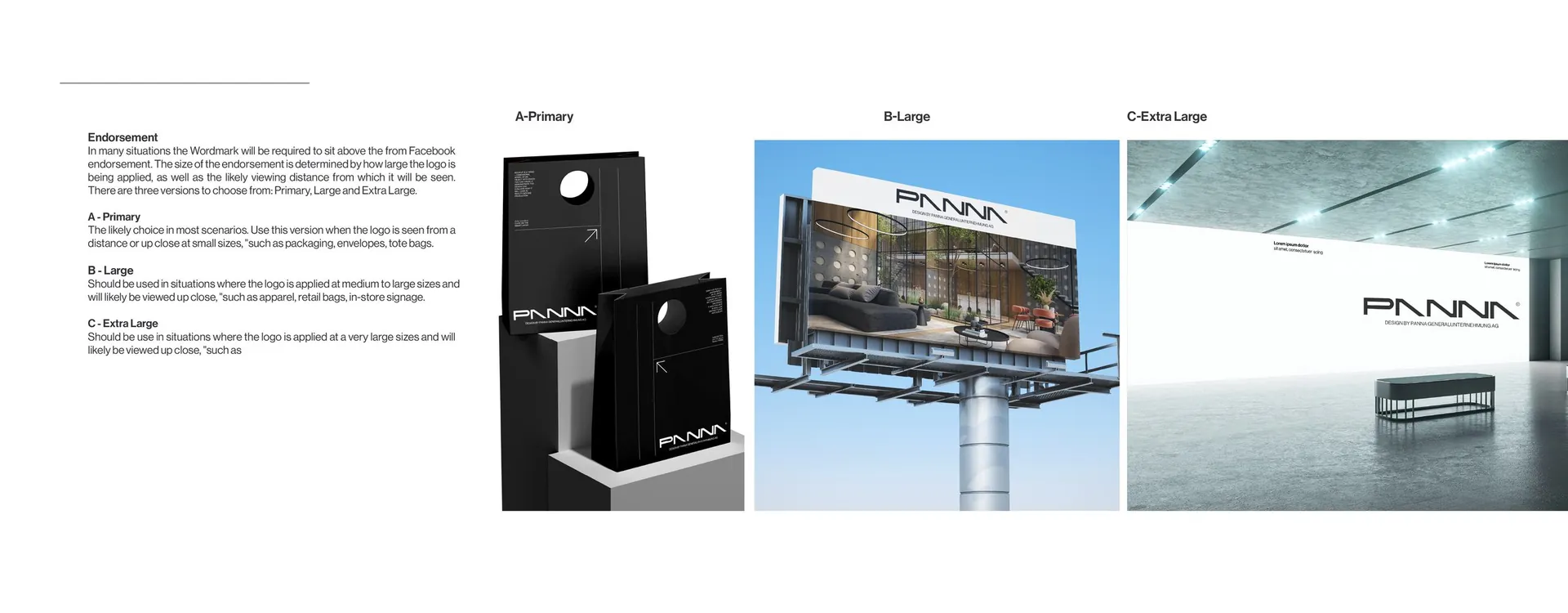
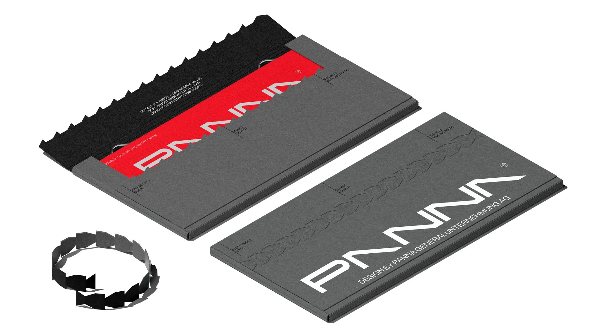
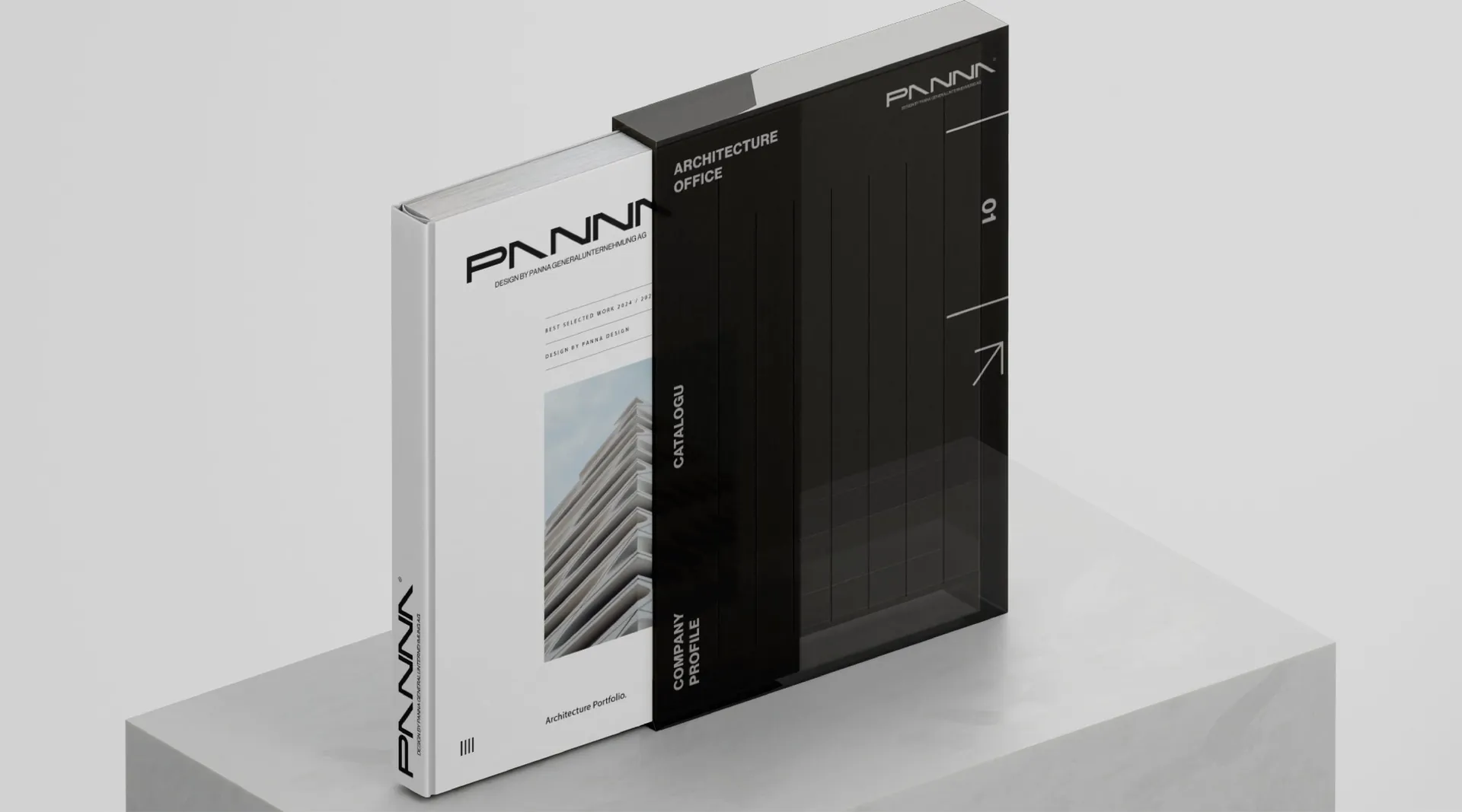
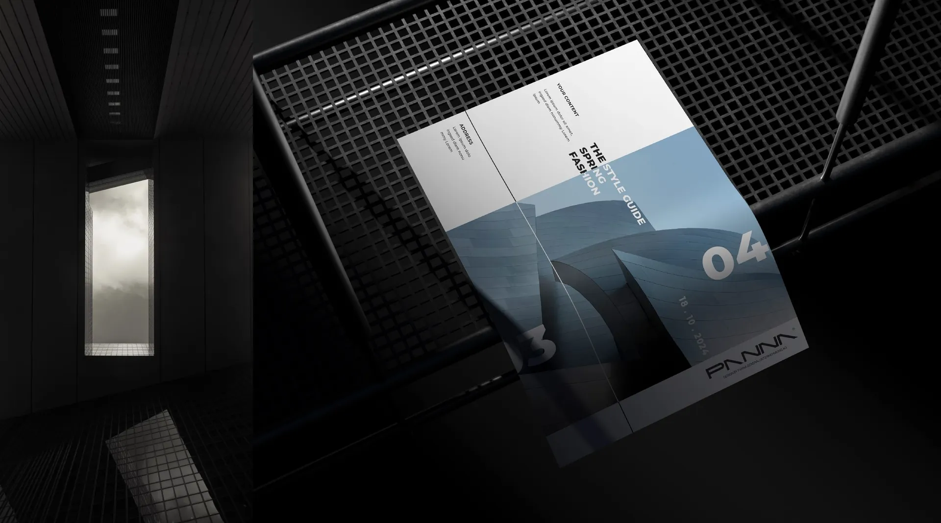
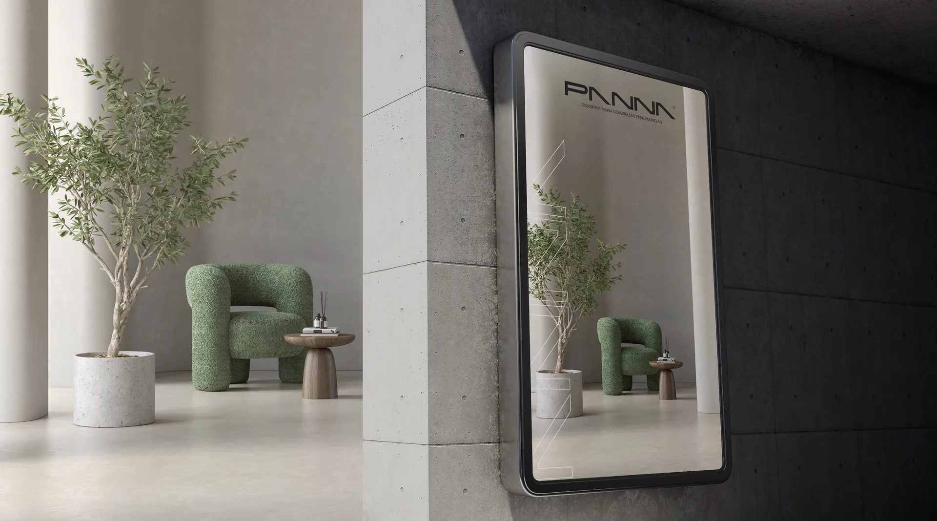
Logotype and construction, colour system, pattern, stationery, folders and brochure layouts, site and building signage, light boxes and billboards, website layouts and social media templates. The brand’s four words: Excellence. Elegance. Passion. Precision.

01 / 32

02 / 32

03 / 32

04 / 32

05 / 32

06 / 32

07 / 32

08 / 32

09 / 32

10 / 32

11 / 32

12 / 32

13 / 32

14 / 32

15 / 32

16 / 32

17 / 32

18 / 32

19 / 32


20 / 32

21 / 32

22 / 32

23 / 32

24 / 32

25 / 32

26 / 32

27 / 32

28 / 32

29 / 32

30 / 32

31 / 32

32 / 32