Logo design
- Client
- InterCompany
- Year
- 2025
- Scope
- Logo, identity, stationery, signage, workwear, social
- Industry
- WPC building products
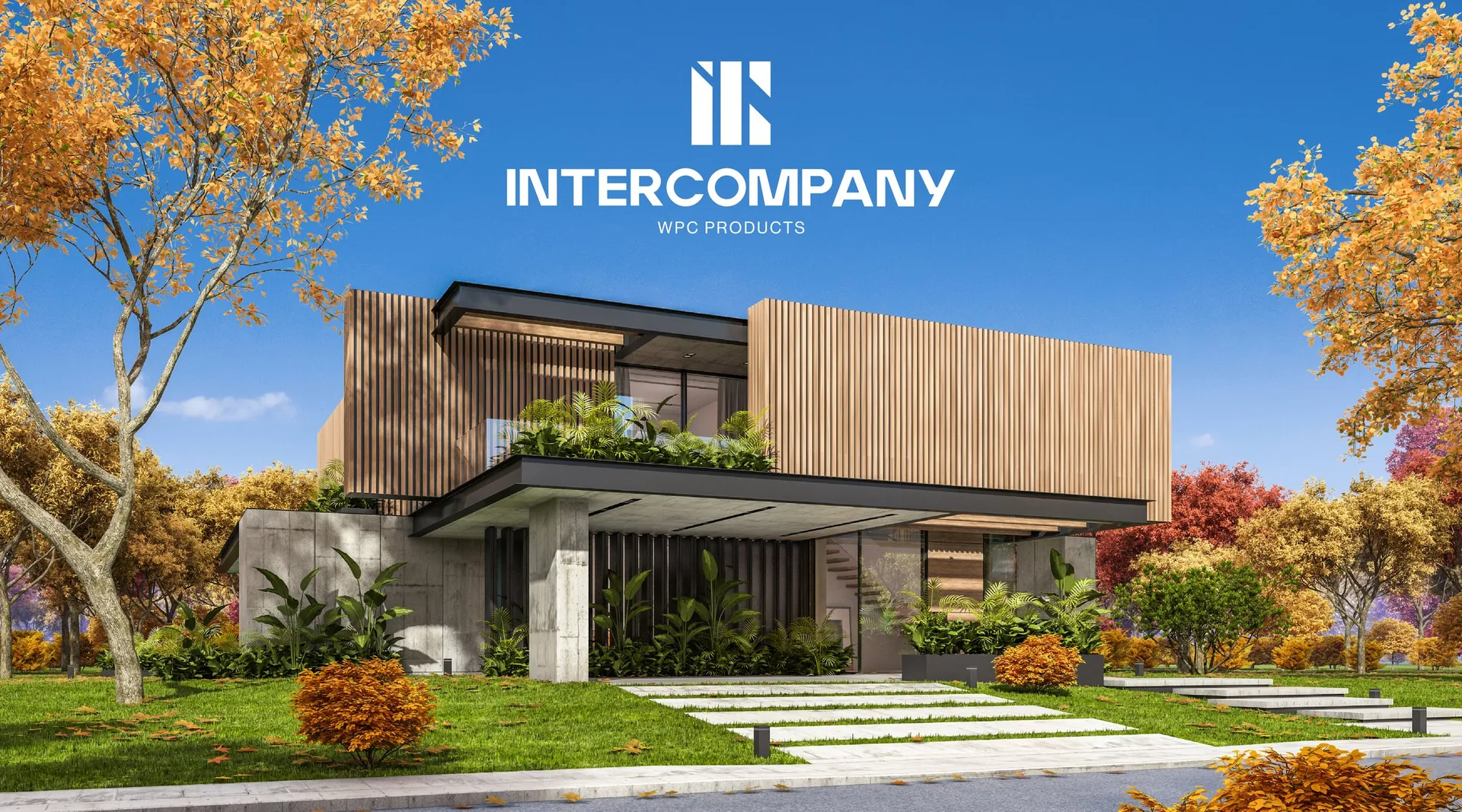
InterCompany upright lines and warm timber tones for a modern building material
The brief
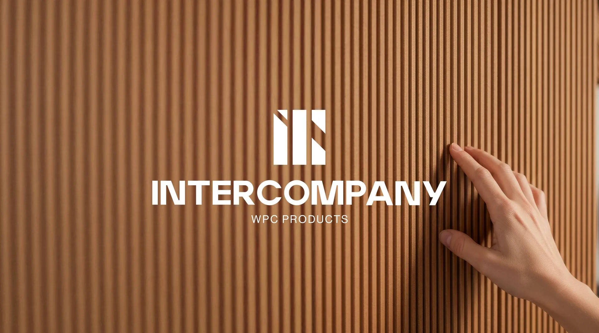
InterCompany makes WPC products, wood-plastic composite boards for facades, decking and outdoor living. The brand needed to carry the warmth of timber and the reliability of an engineered material, for architects, builders and homeowners alike.
The idea
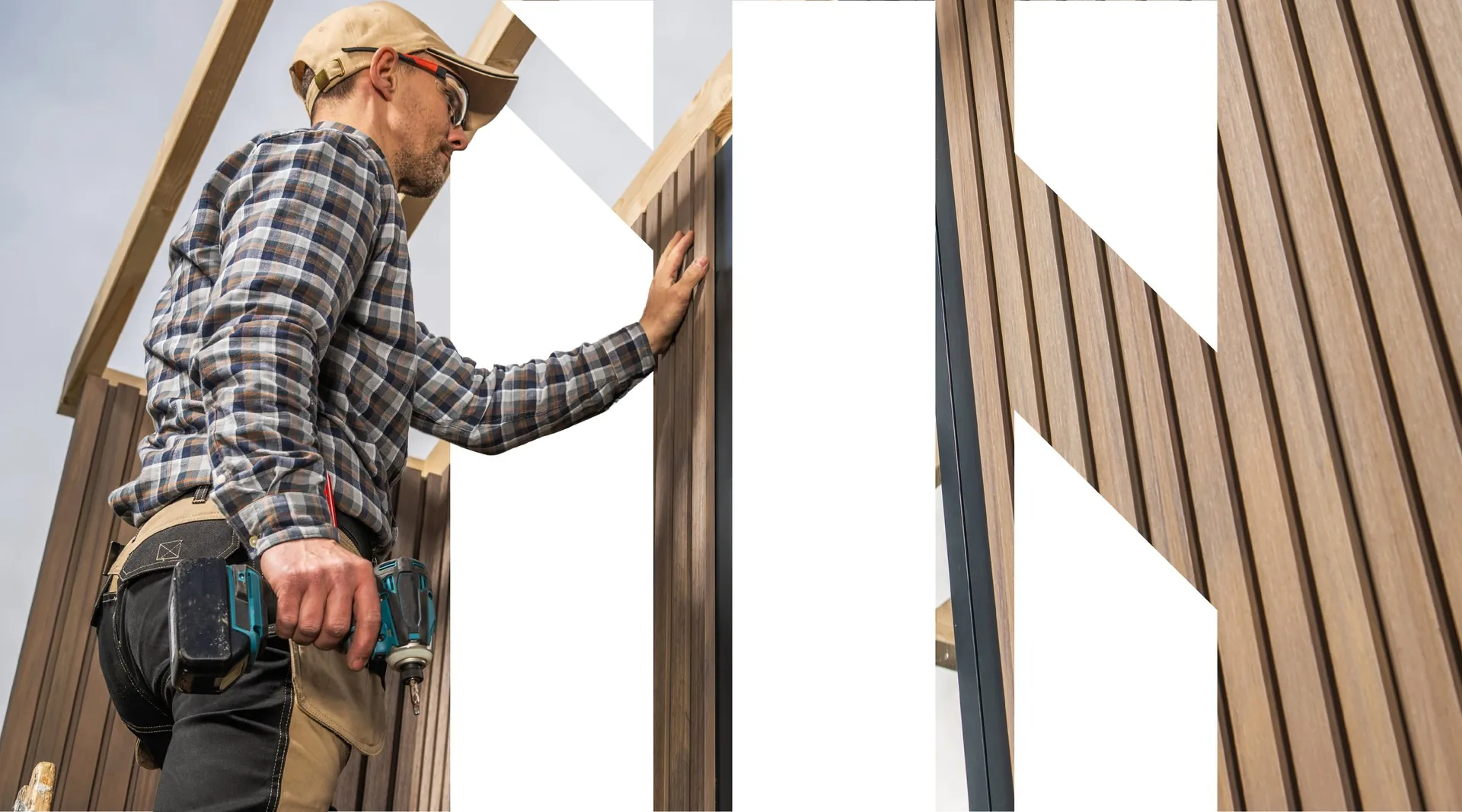
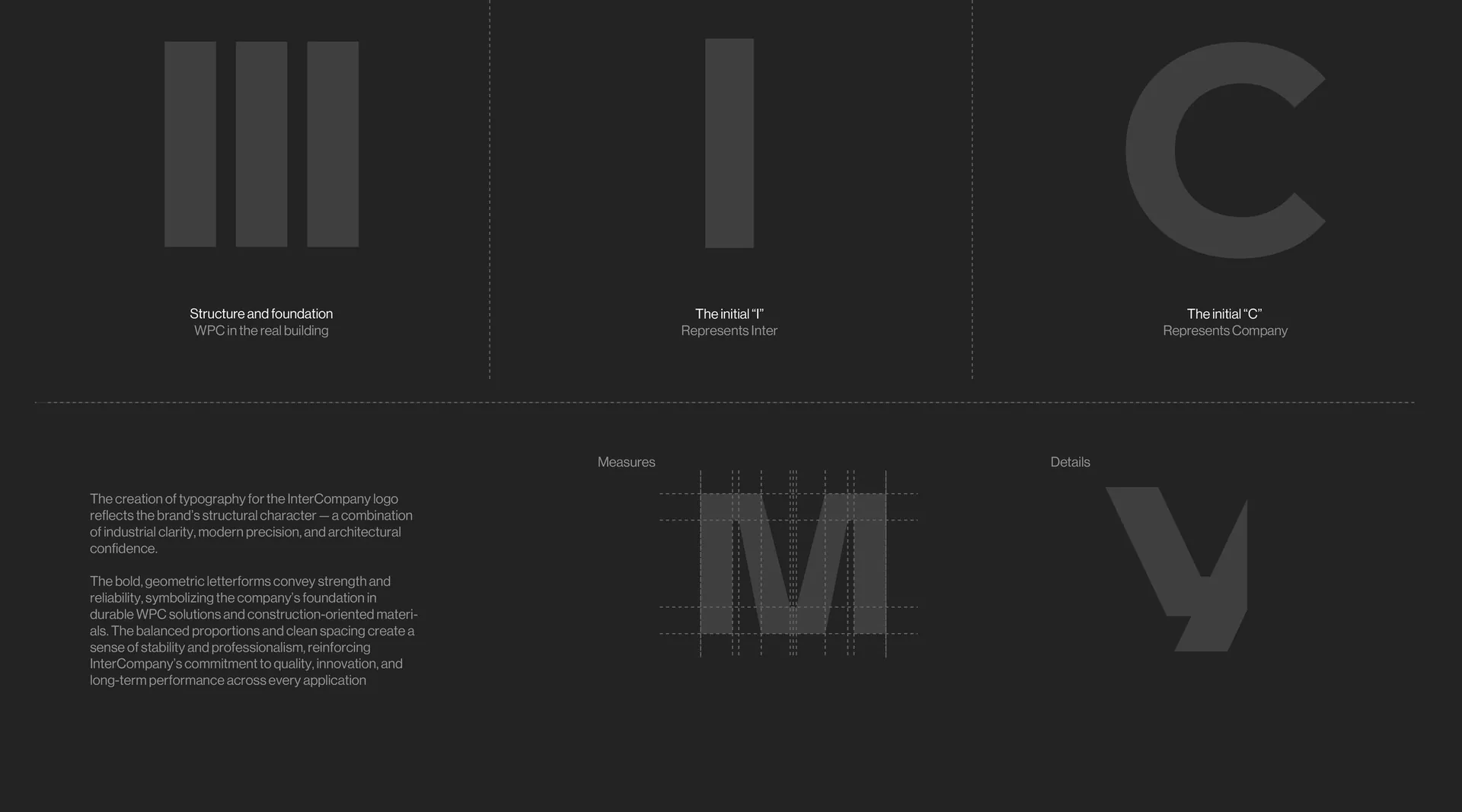
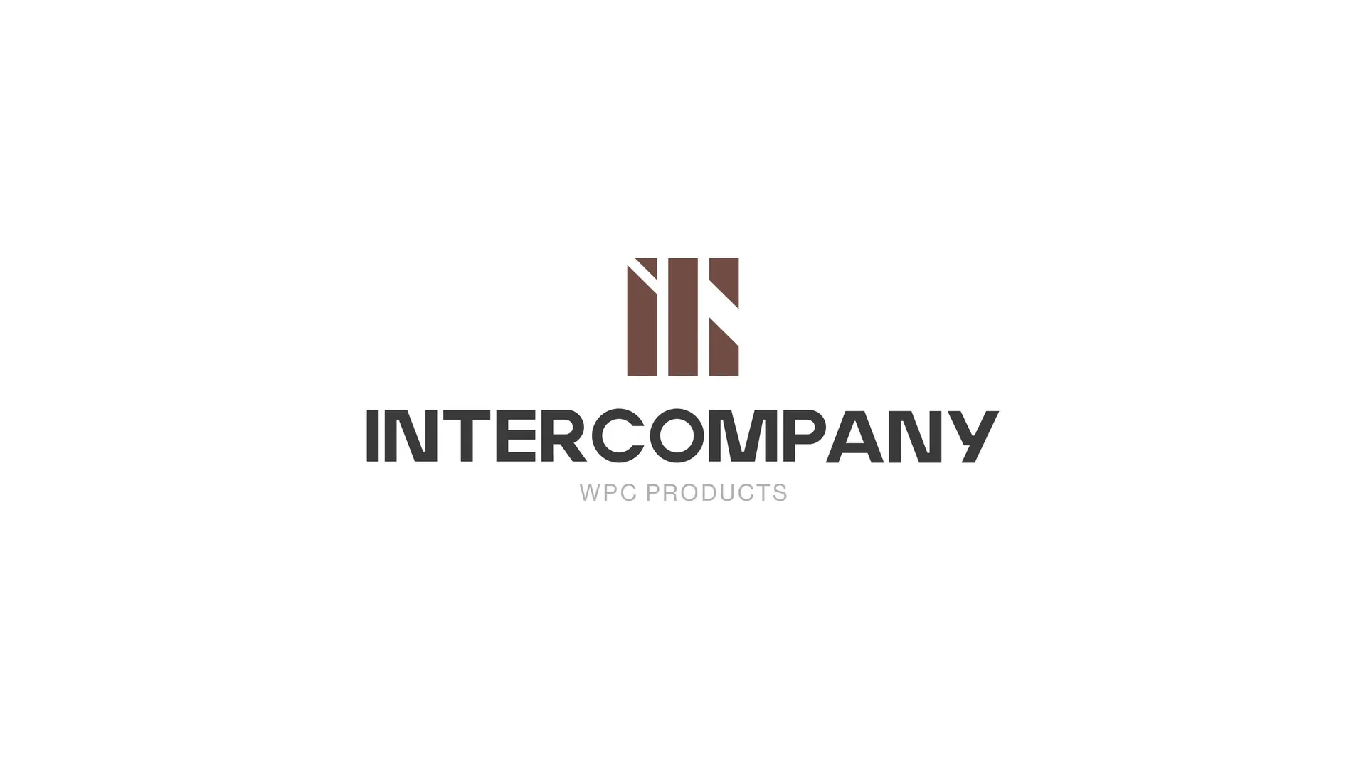
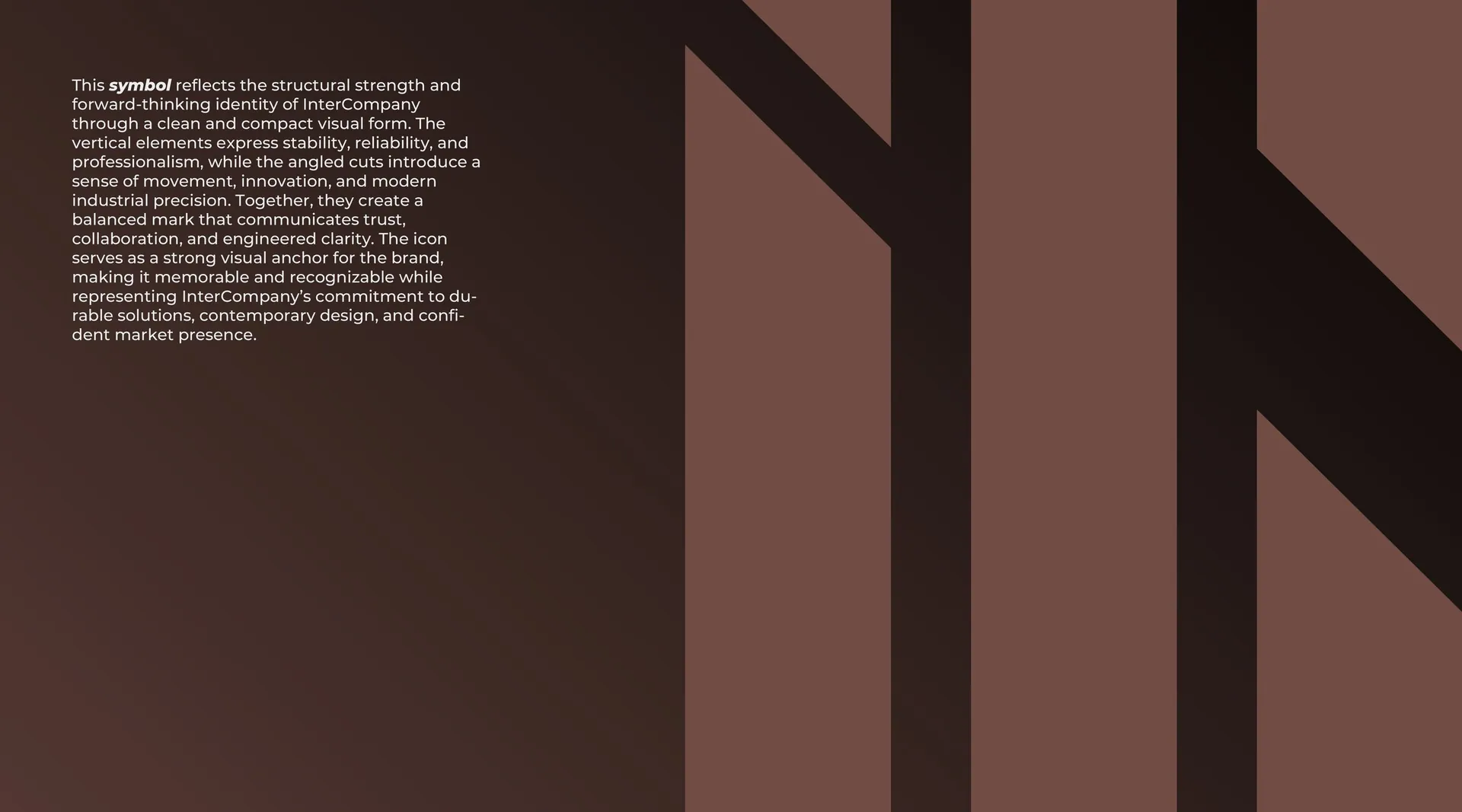
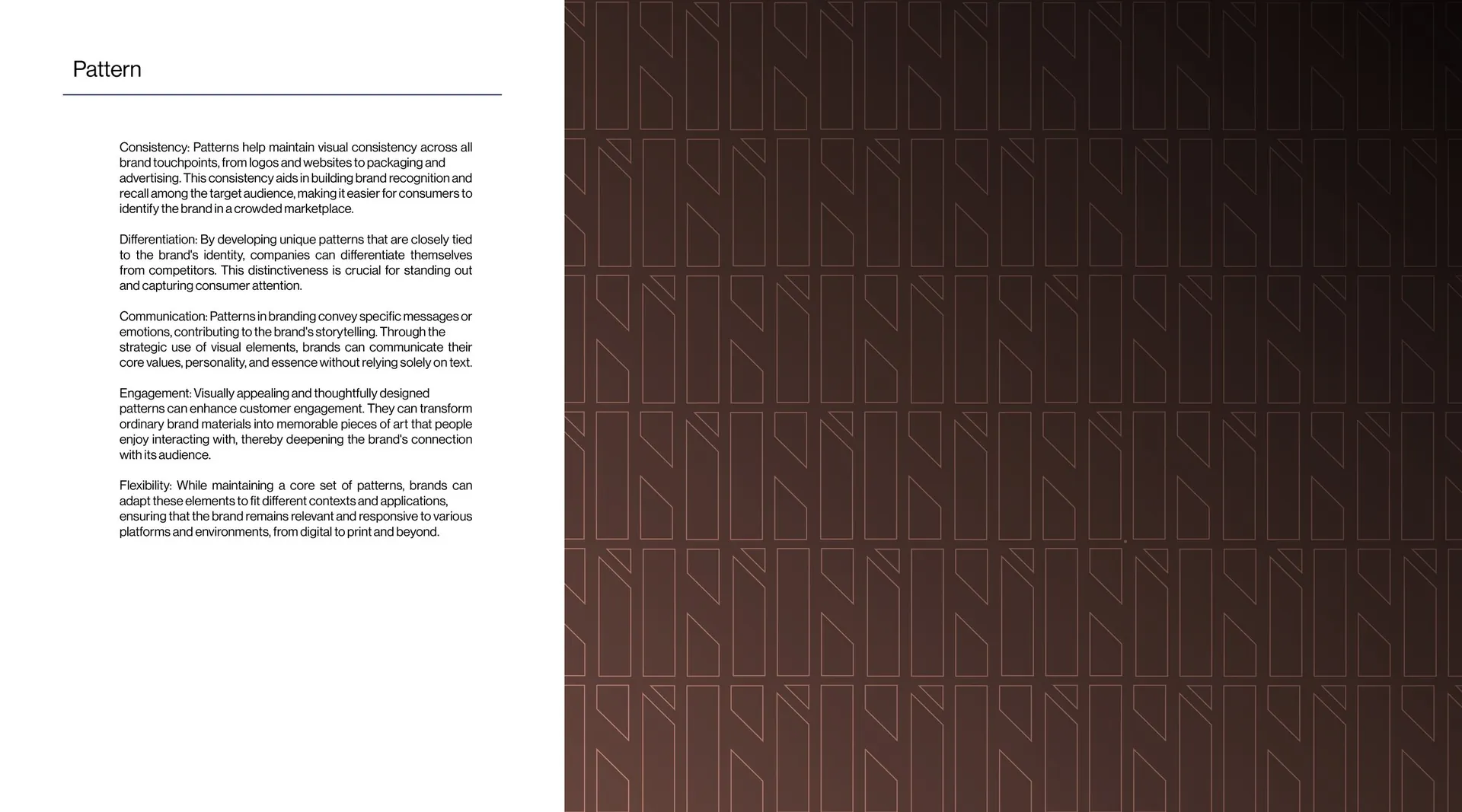
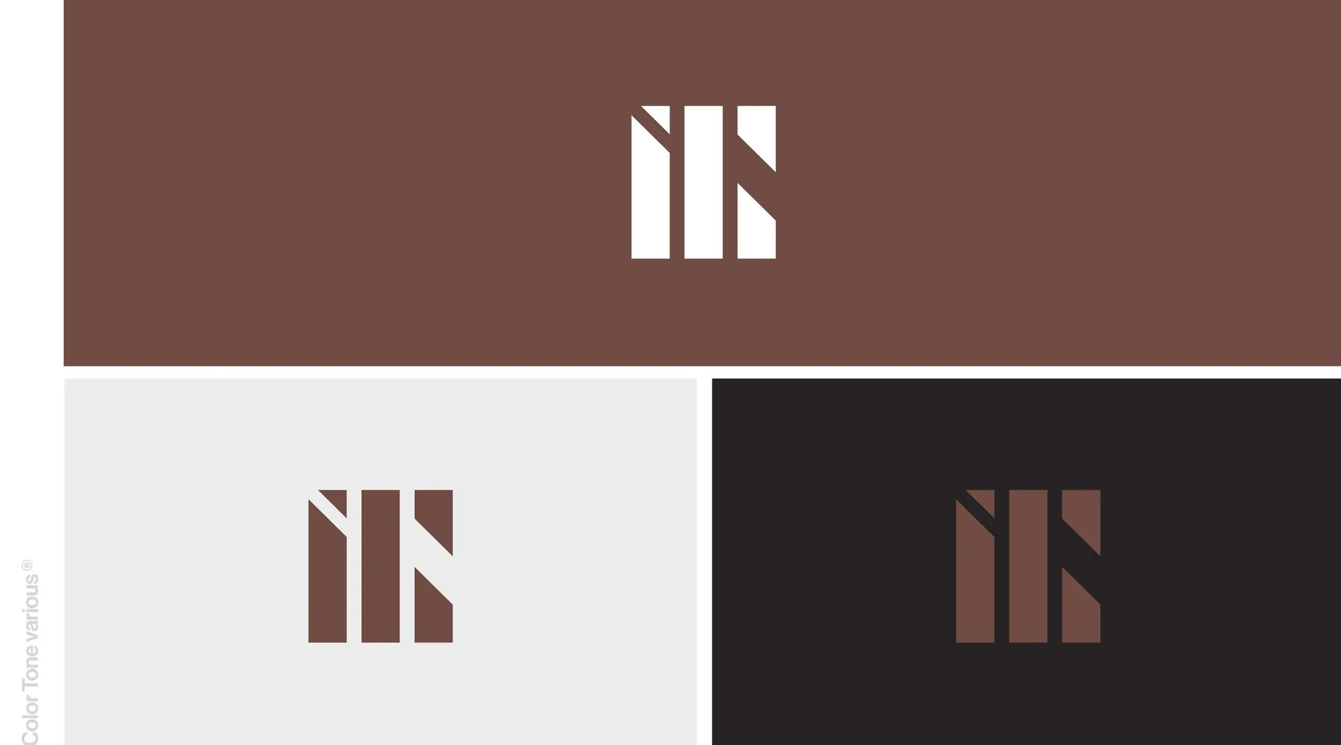
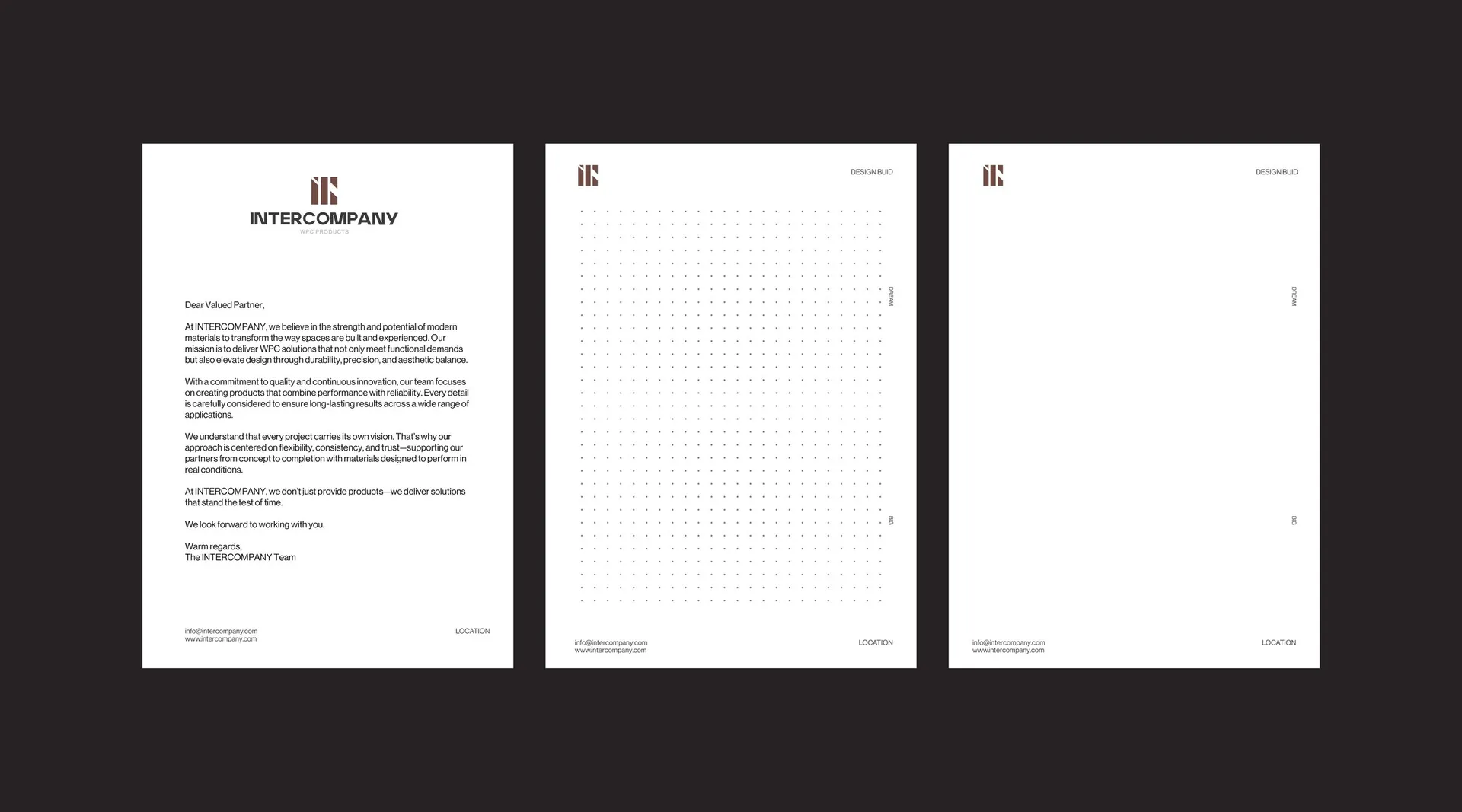
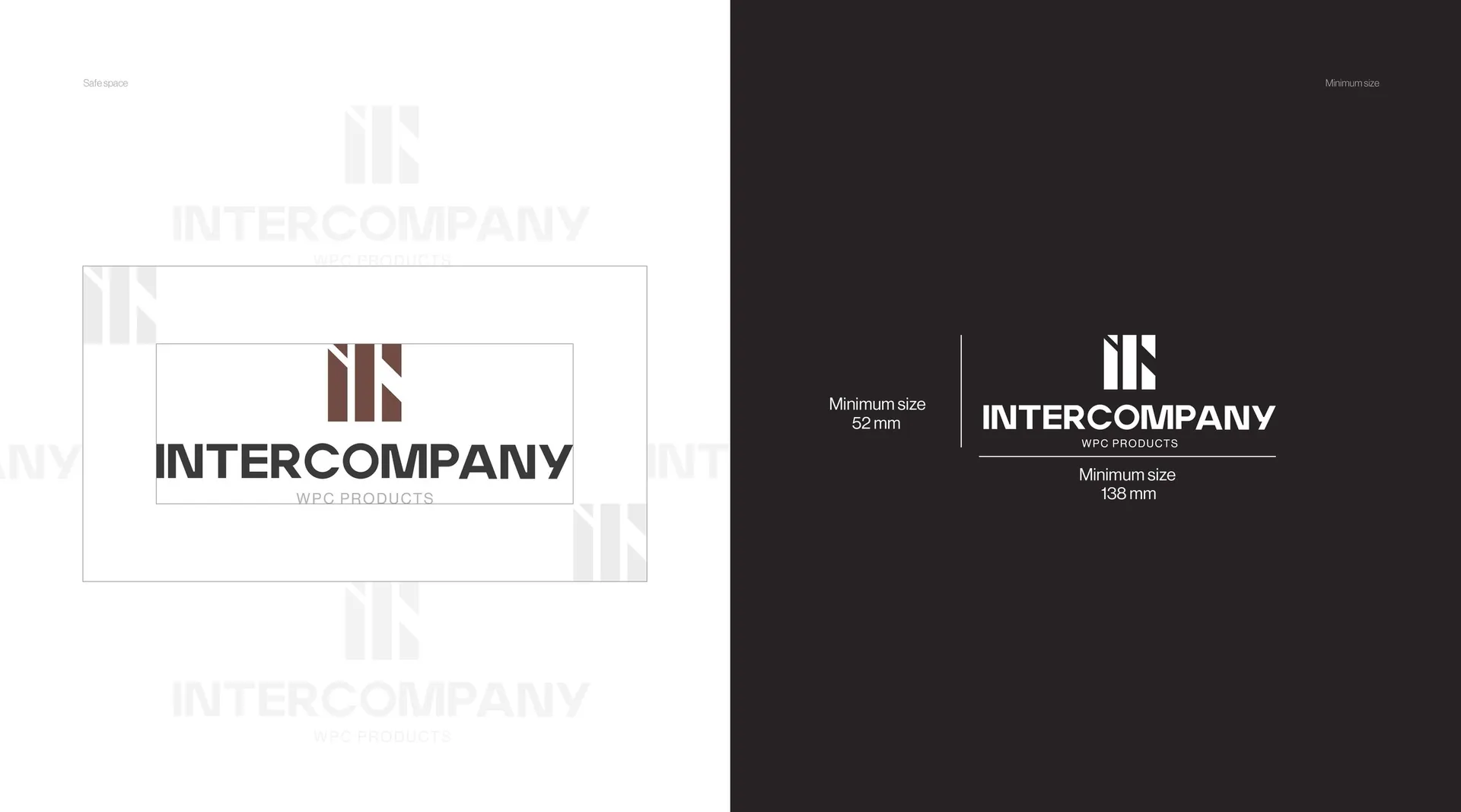
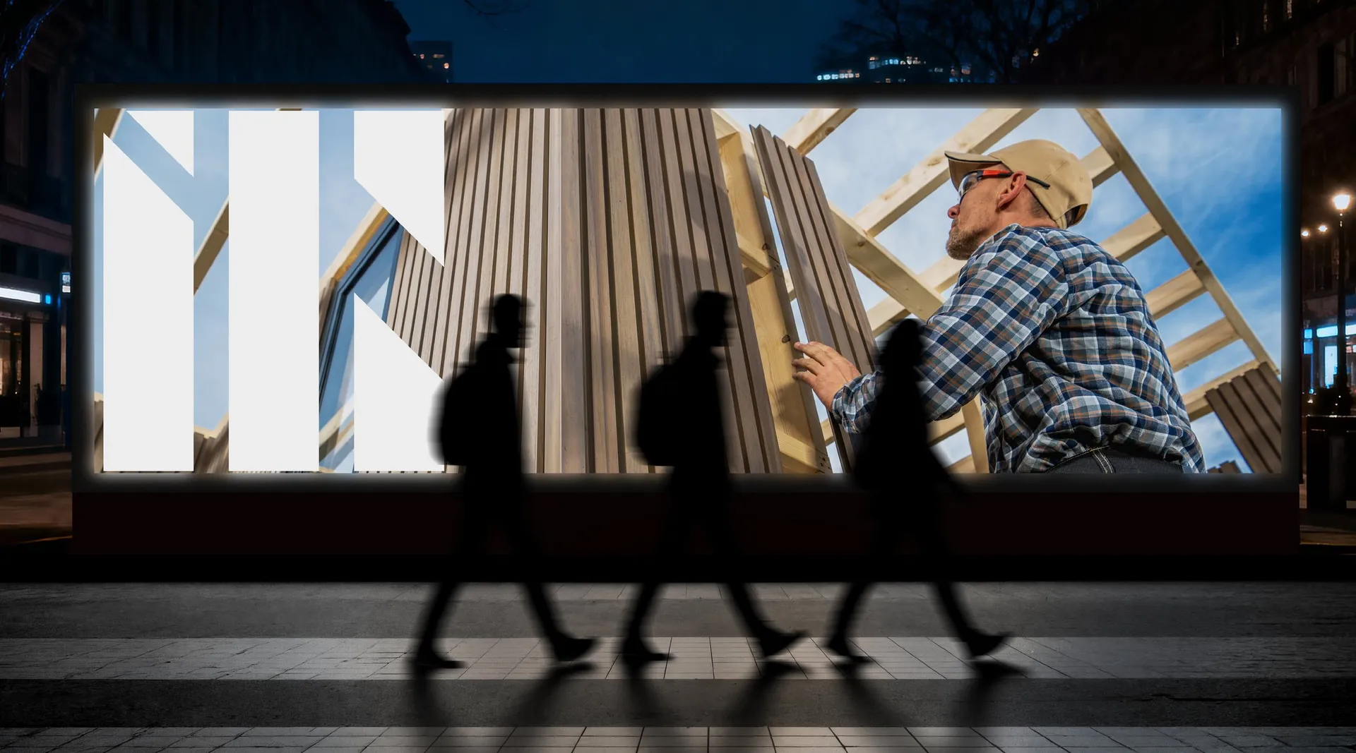
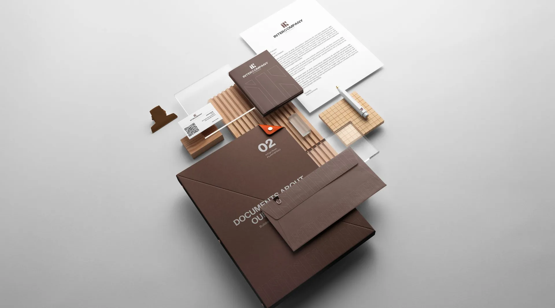
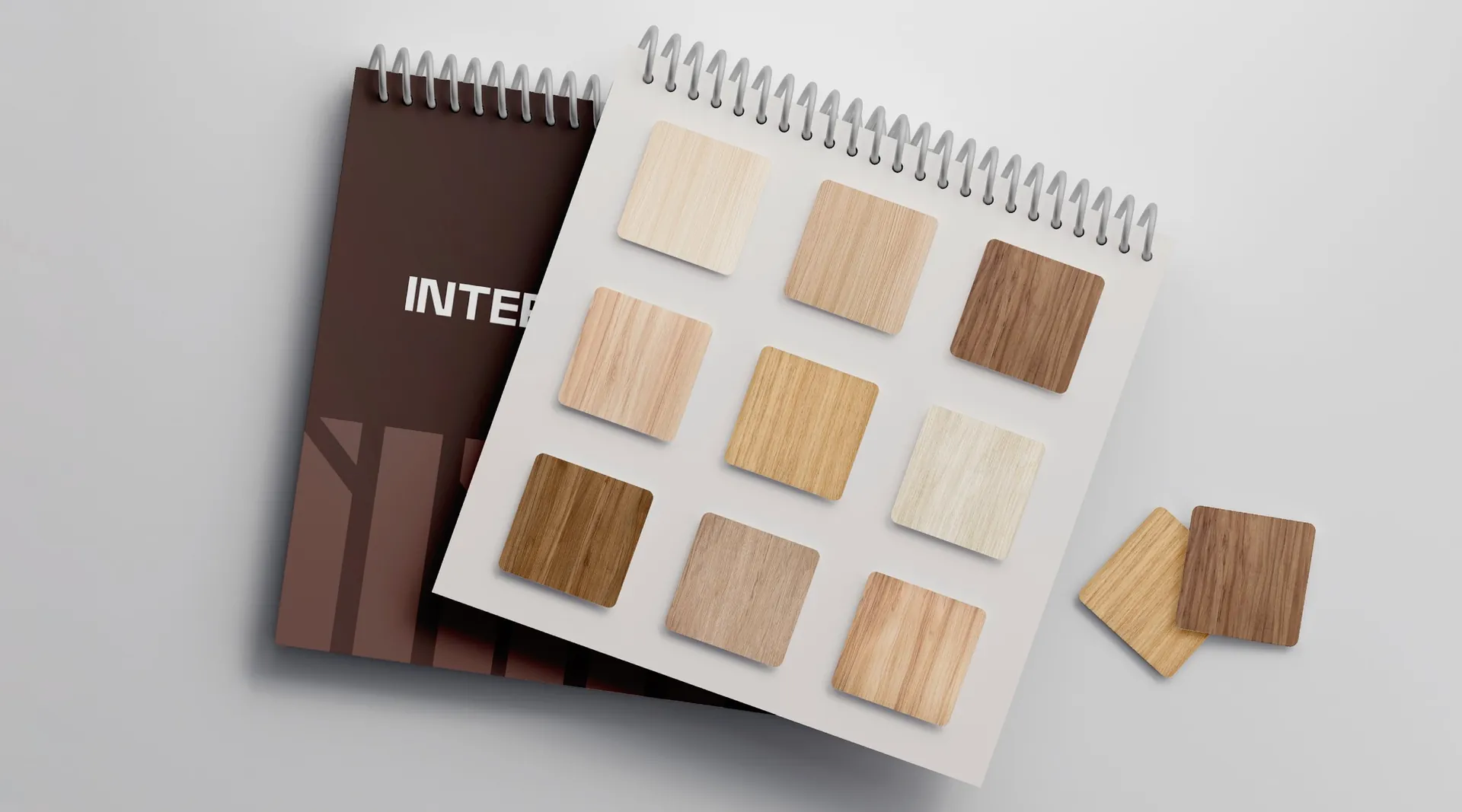
The mark is built from the company’s initials: upright bars cut at an angle, like boards set on a facade, with one diagonal that gives it movement. A deep timber brown leads the palette, with taupe and cream for calm, and a strong, simple logotype gives it weight. The bars extend into a pattern that lines folders, sample books and exhibition walls.
The result
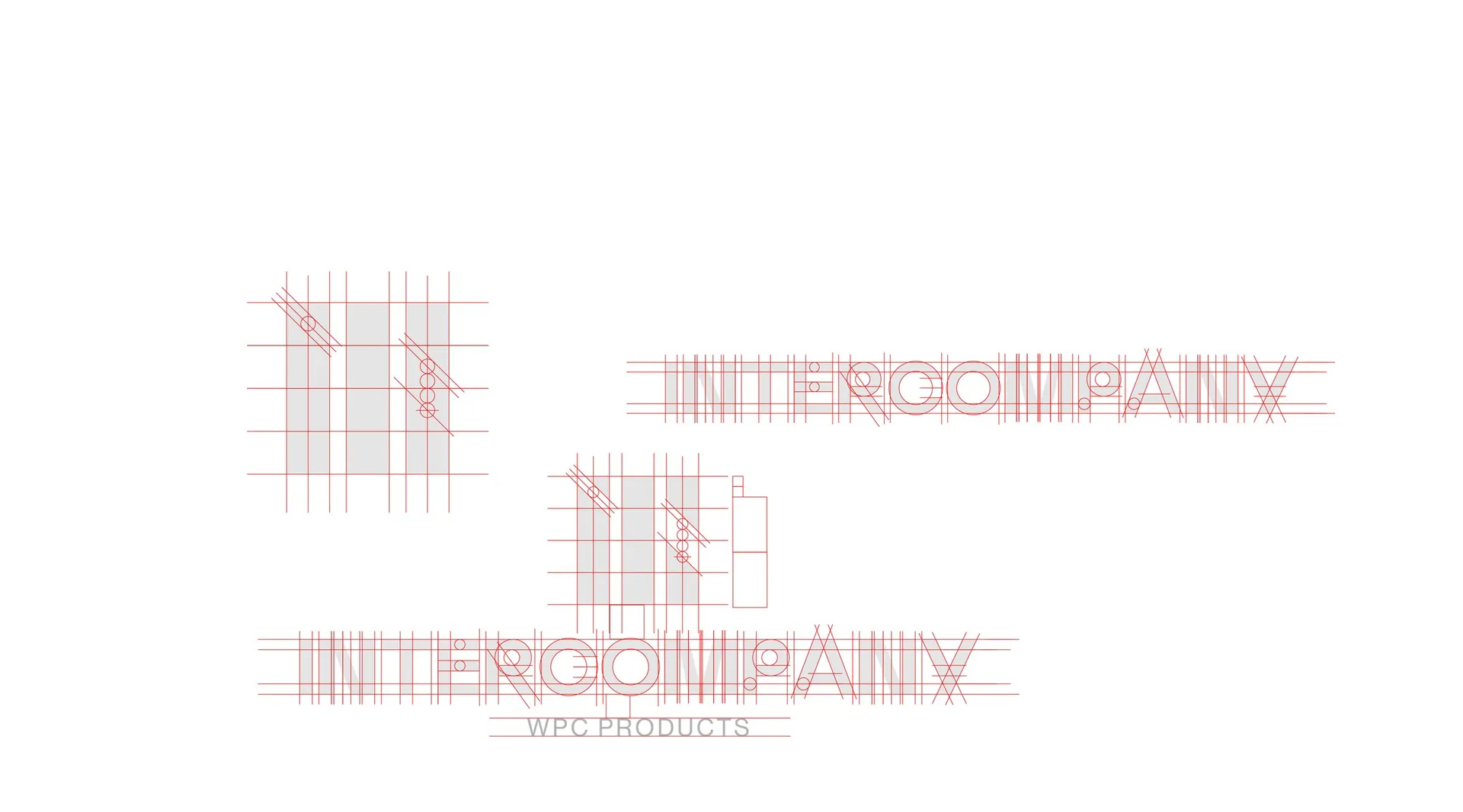
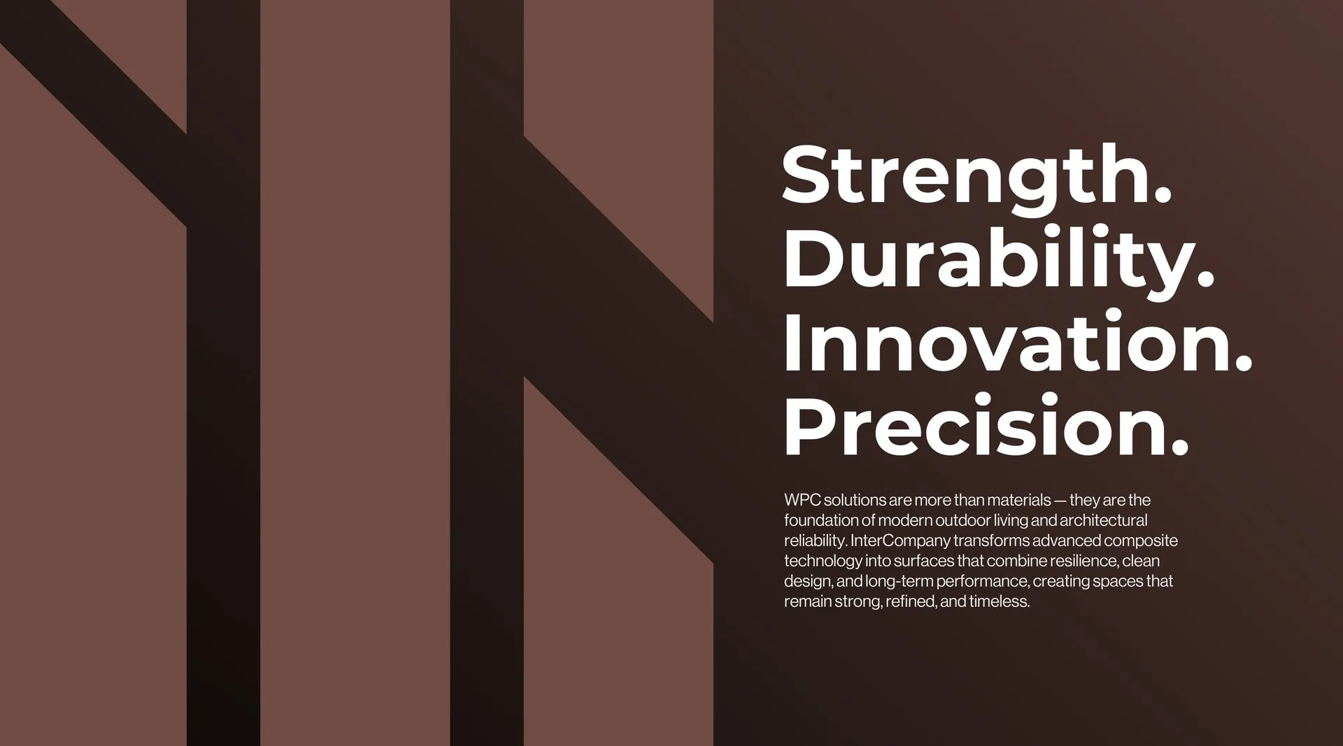
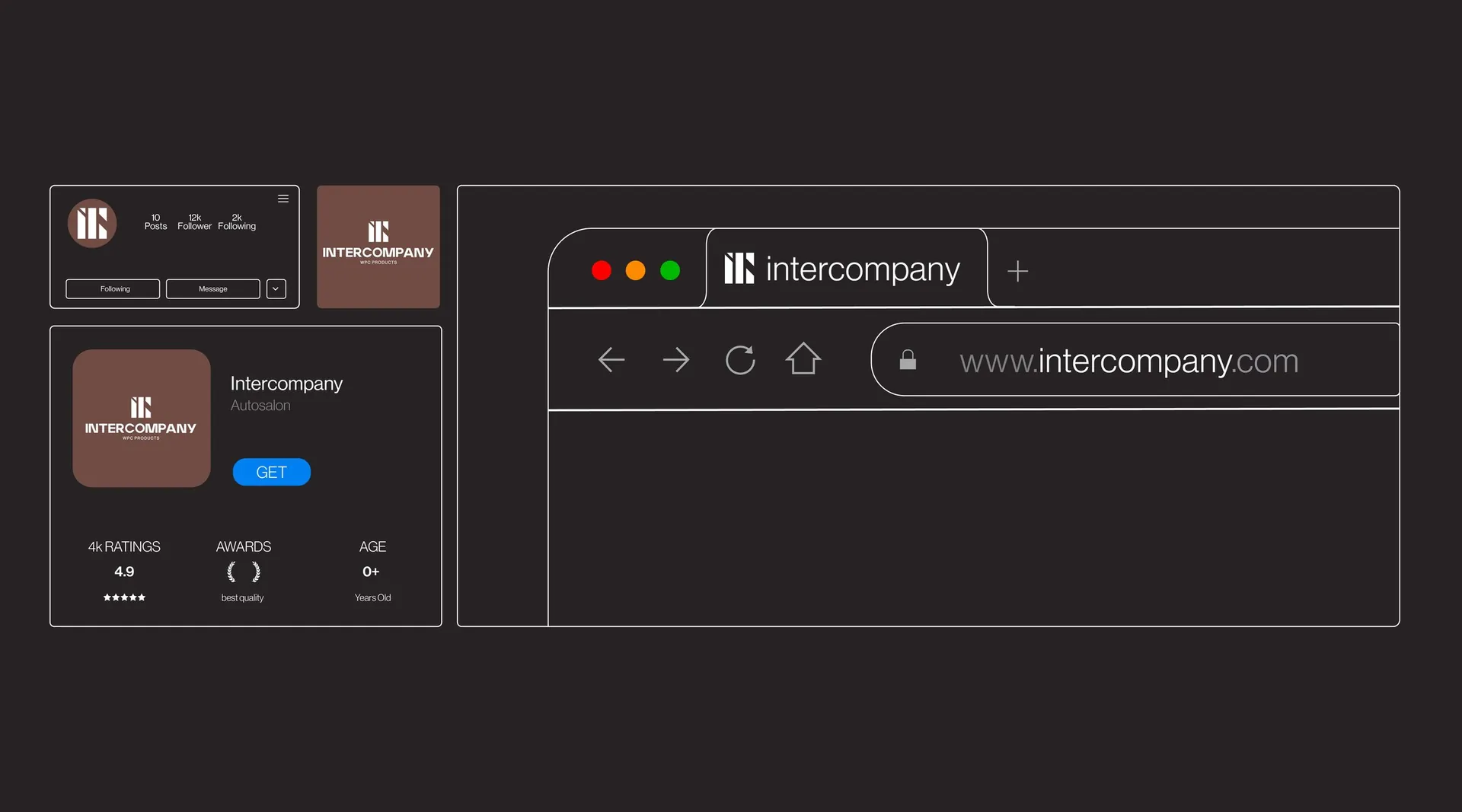
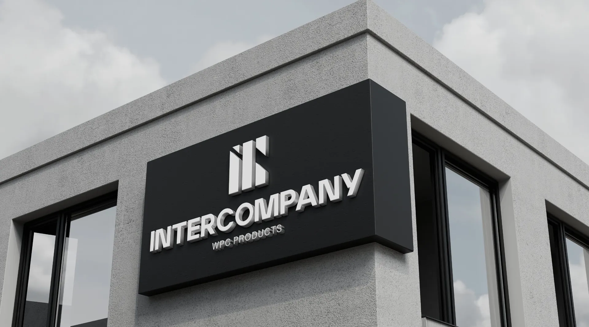
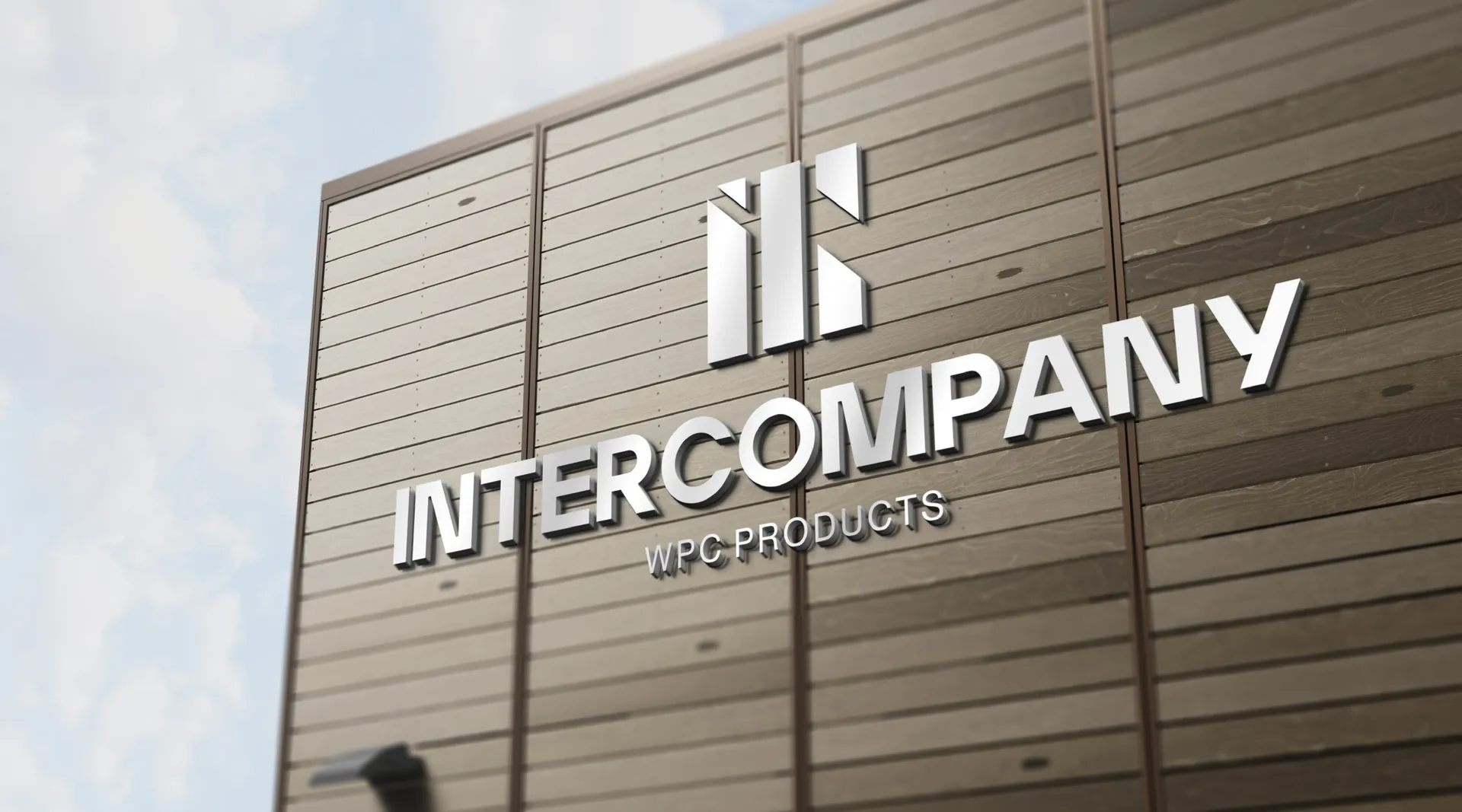
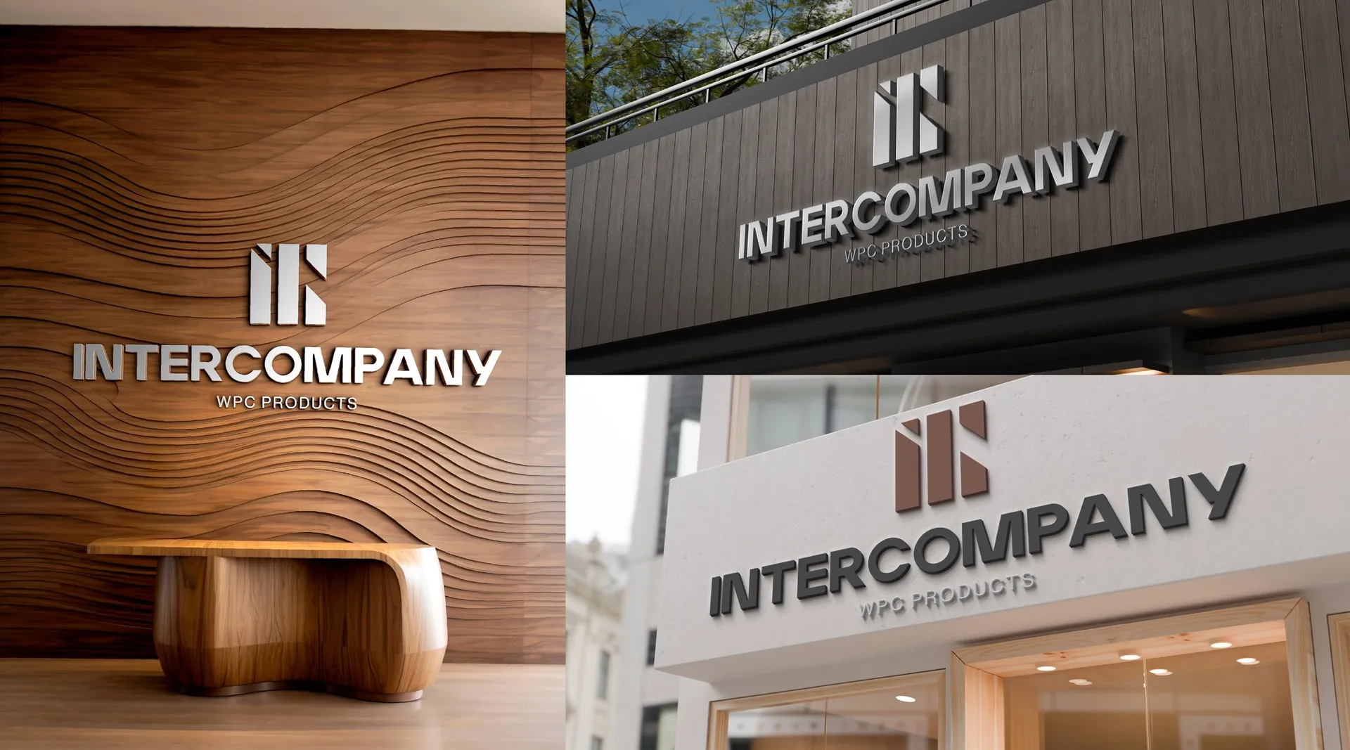
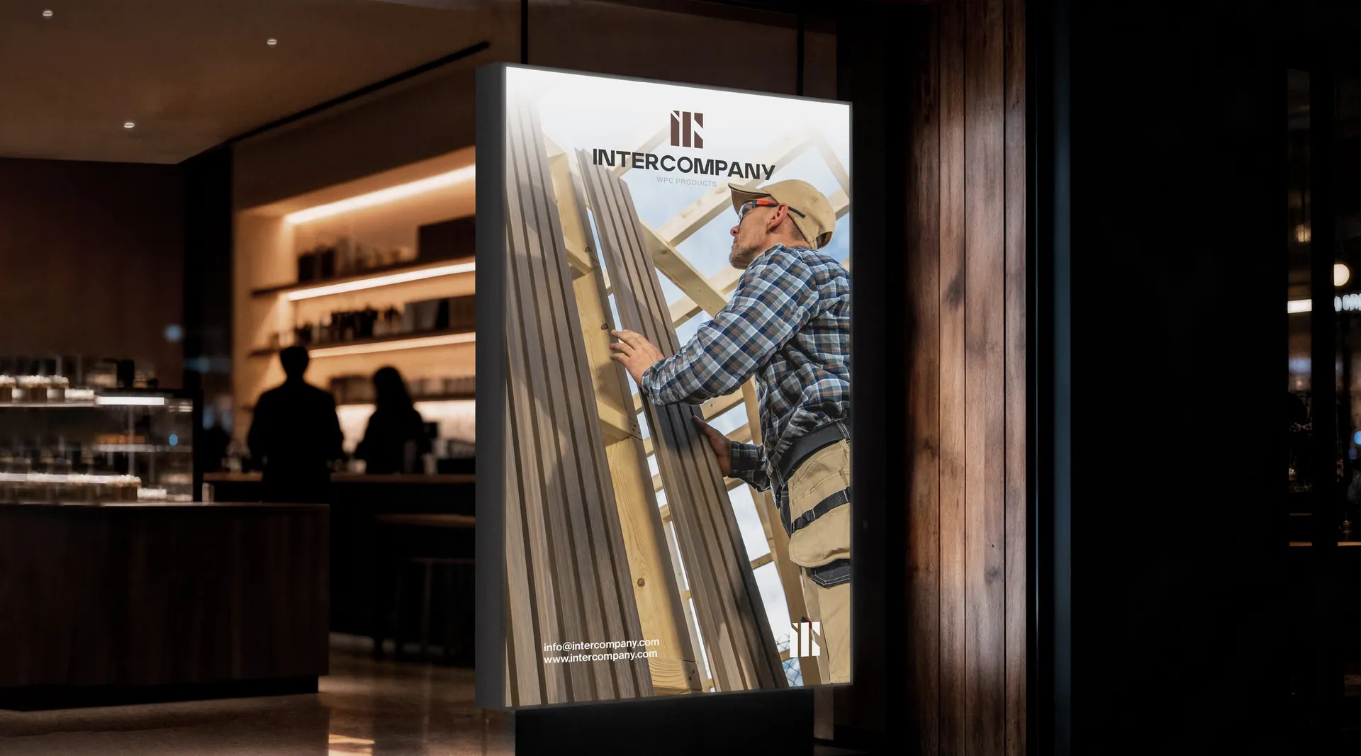
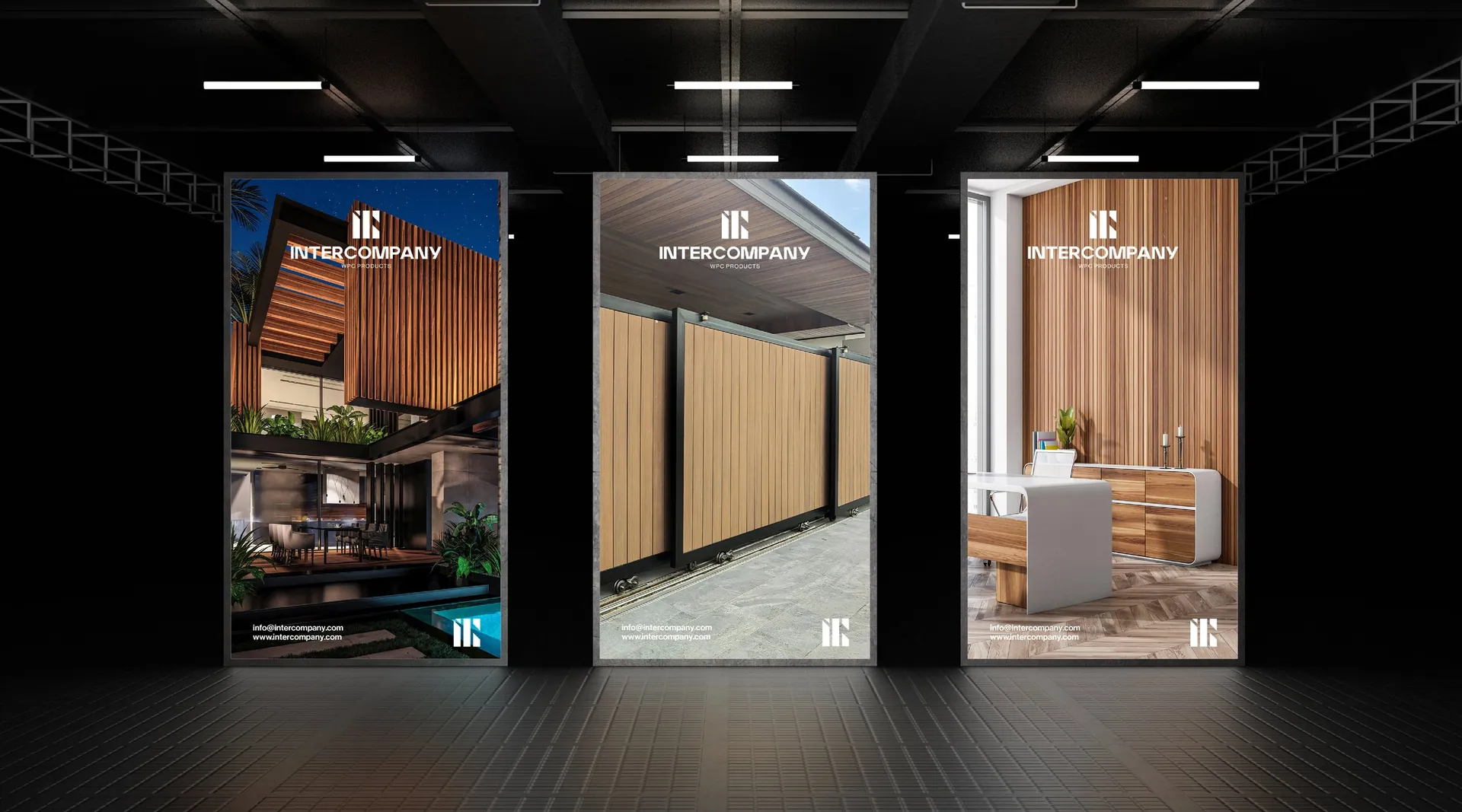
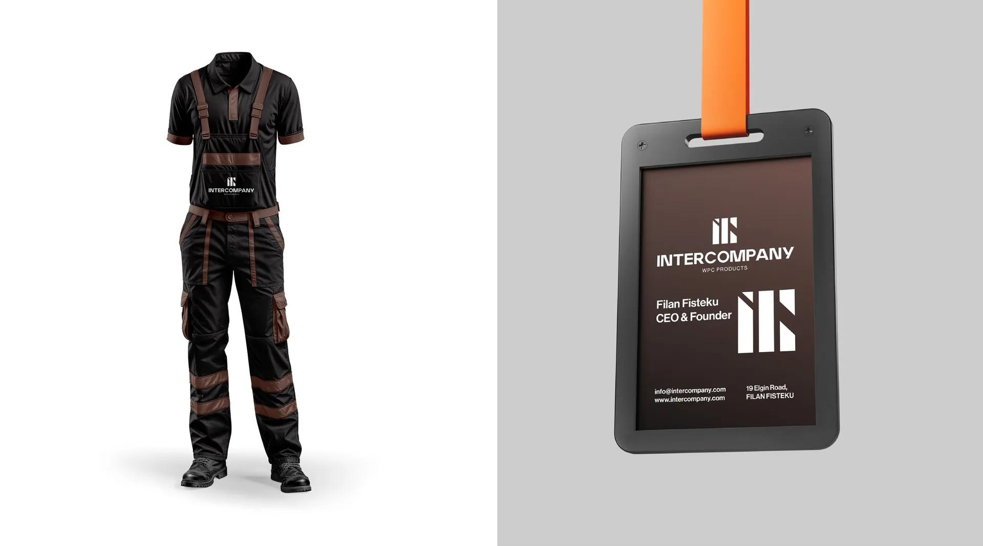
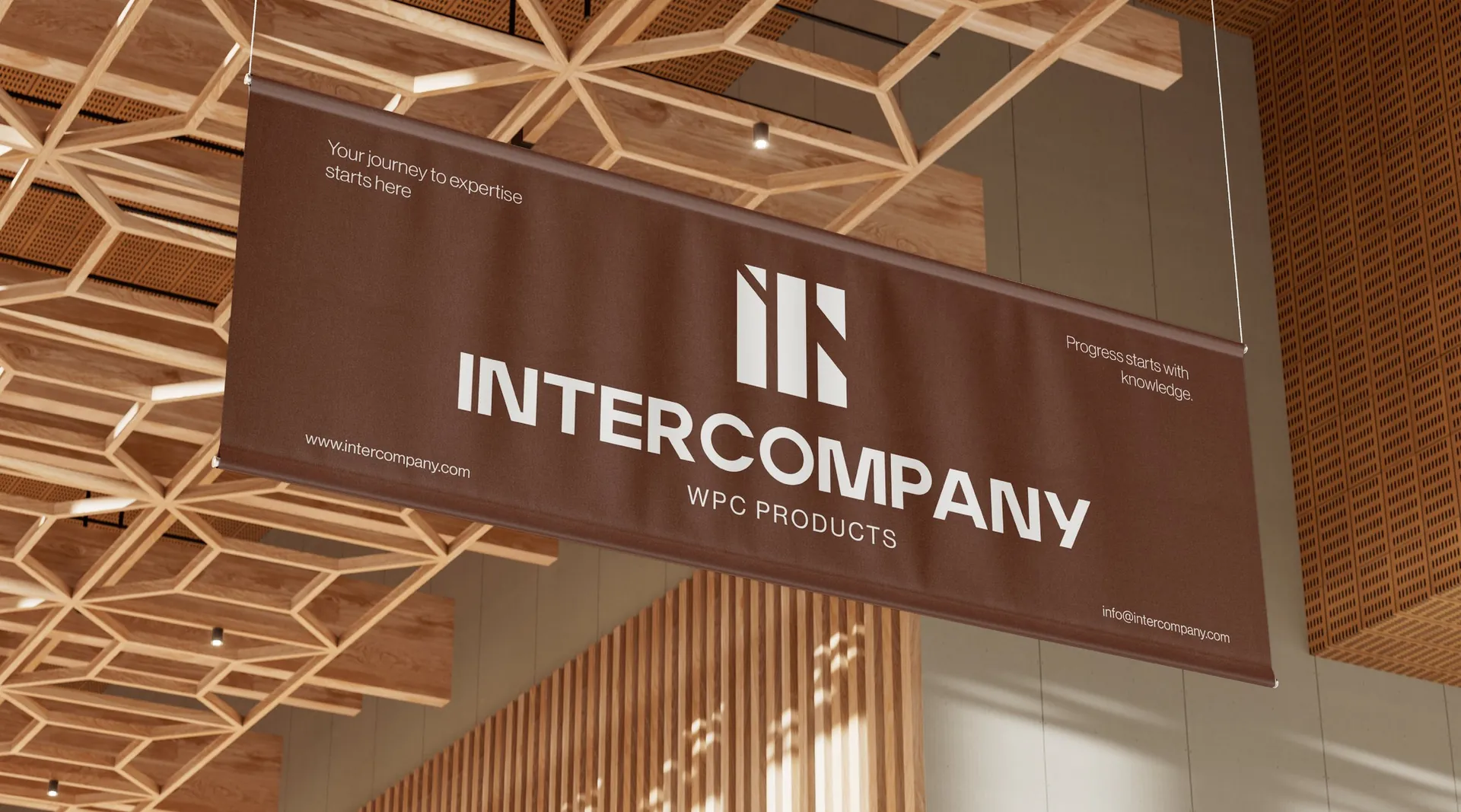
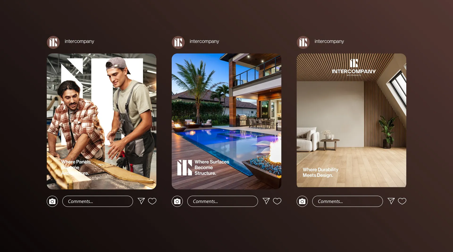
Logo and construction, minimum sizes, colour system, pattern, stationery, folders and sample book, website and app icon, facade and interior signage, posters and banners, exhibition stand, workwear and ID badges, and social media templates. Campaign line: Strength. Durability. Innovation. Precision.

01 / 24

02 / 24

03 / 24

04 / 24

05 / 24

06 / 24

07 / 24

08 / 24

09 / 24

10 / 24

11 / 24

12 / 24

13 / 24

14 / 24

15 / 24

16 / 24

17 / 24

18 / 24

19 / 24

20 / 24

21 / 24

22 / 24

23 / 24

24 / 24