Logo design
- Client
- Mburoja Consulting
- Year
- 2025
- Scope
- Logo, identity, stationery, signage, print, digital, social
- Industry
- Legal consulting
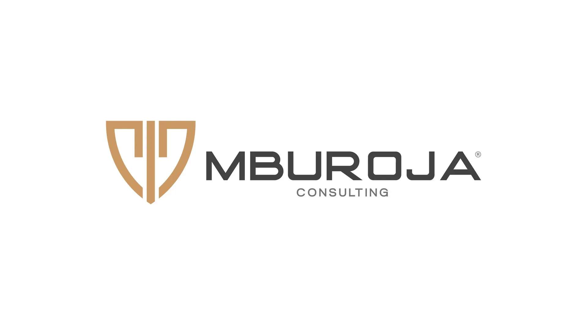
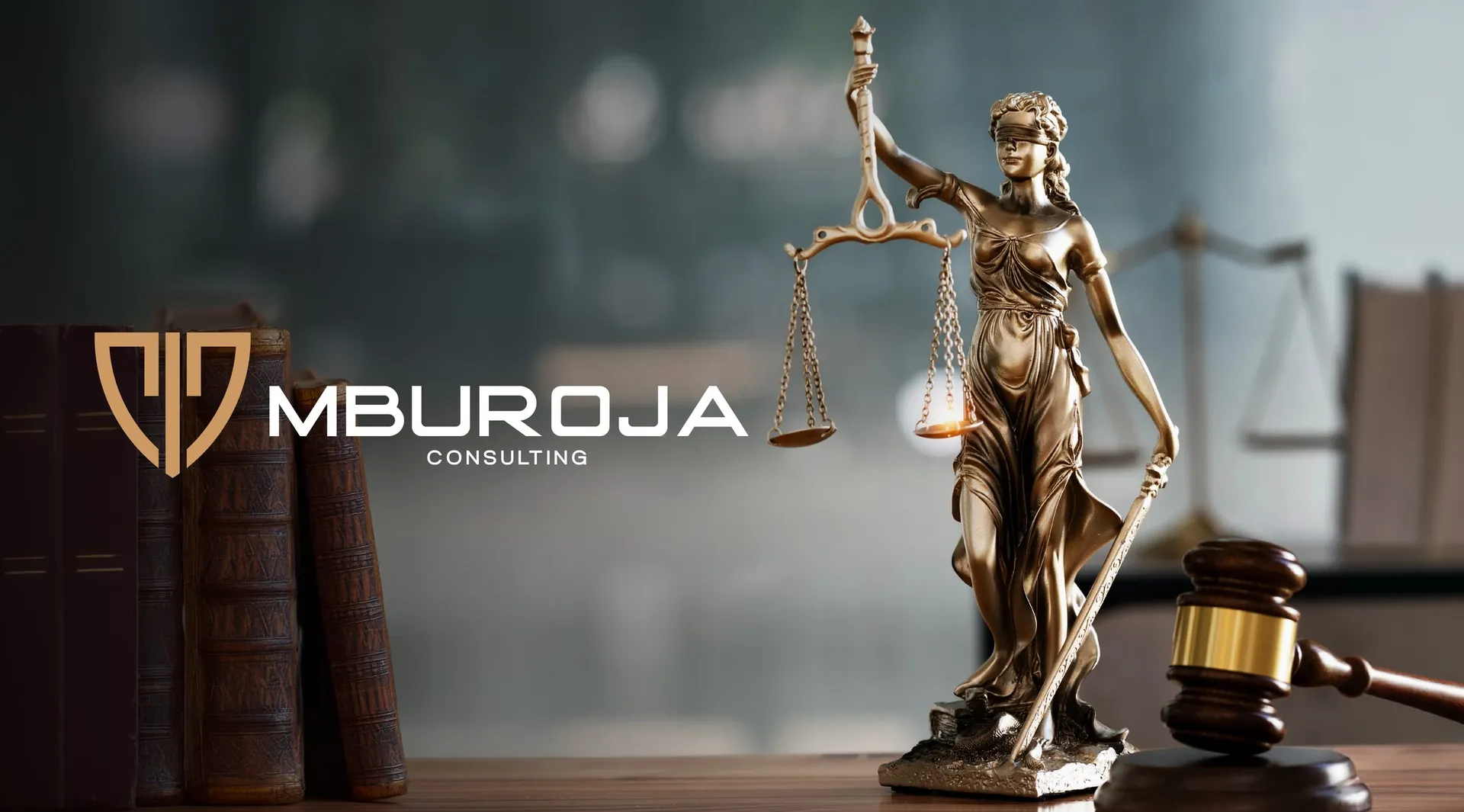
Mburoja a shield that carries the scales of justice
The brief
Mburoja means shield in Albanian, and Mburoja Consulting advises on legal and business matters. The brand had to signal protection and authority, and still look like a modern consultancy rather than an old courthouse.
The idea
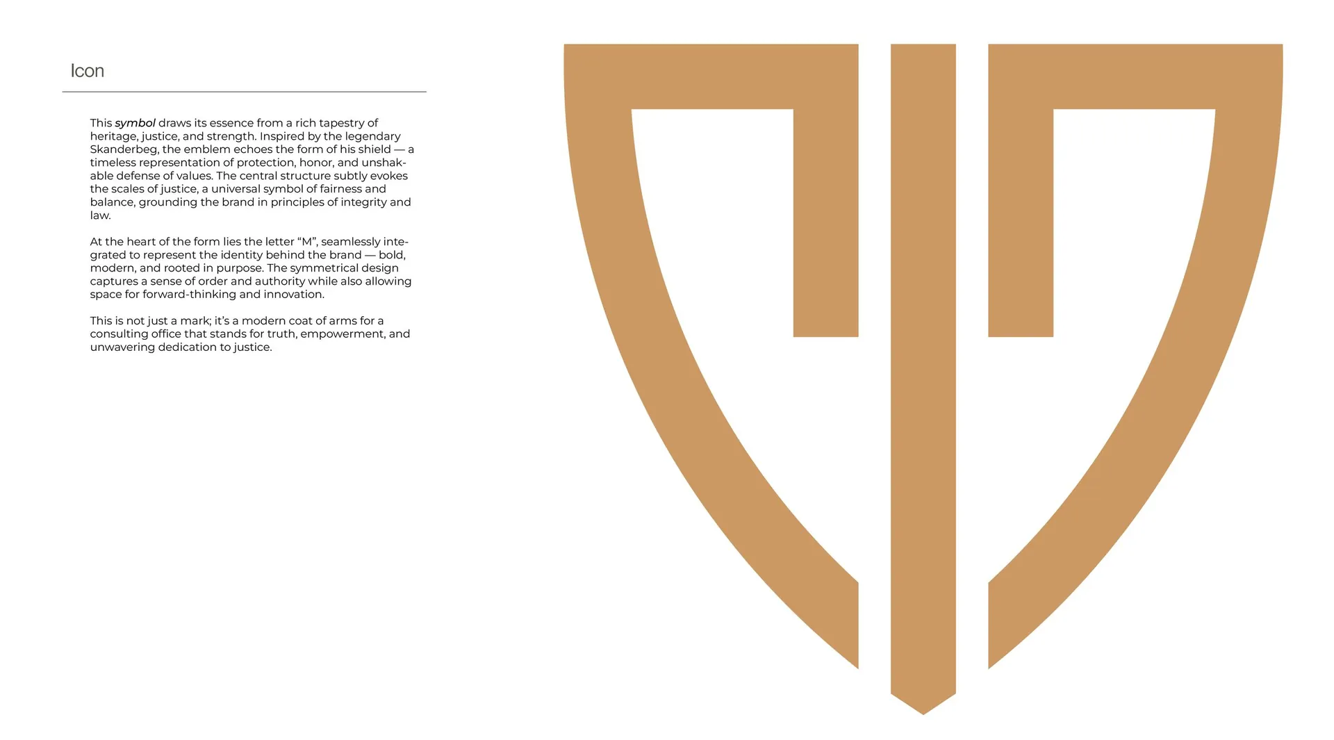
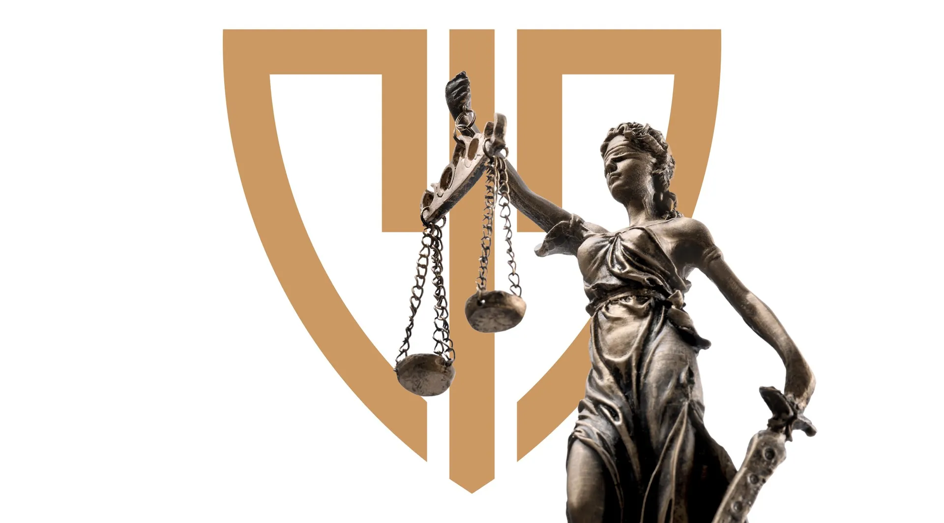
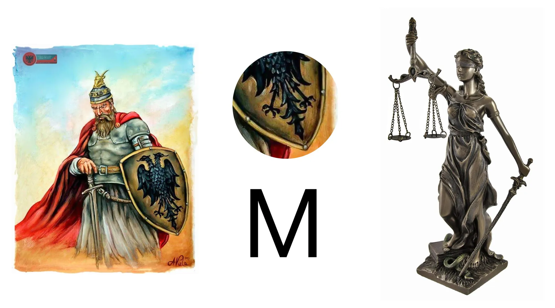
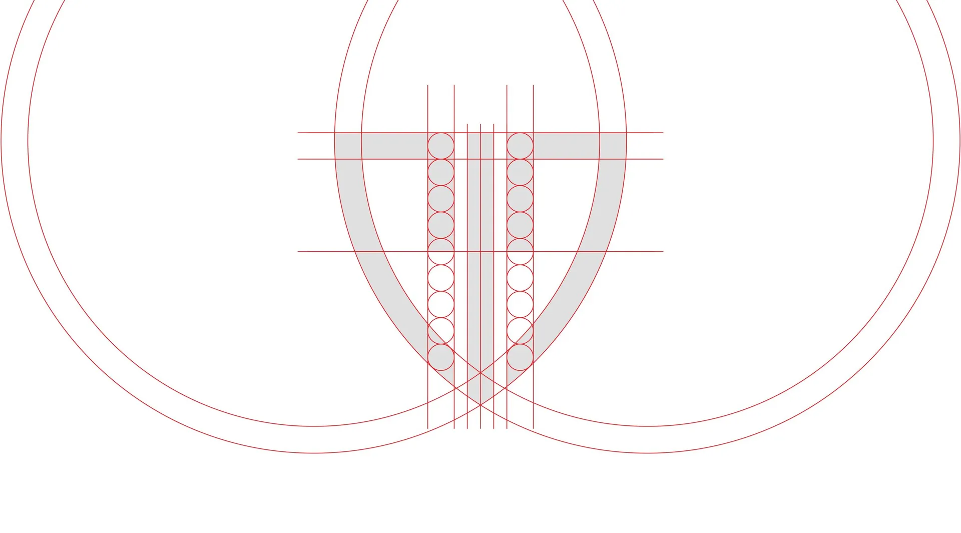
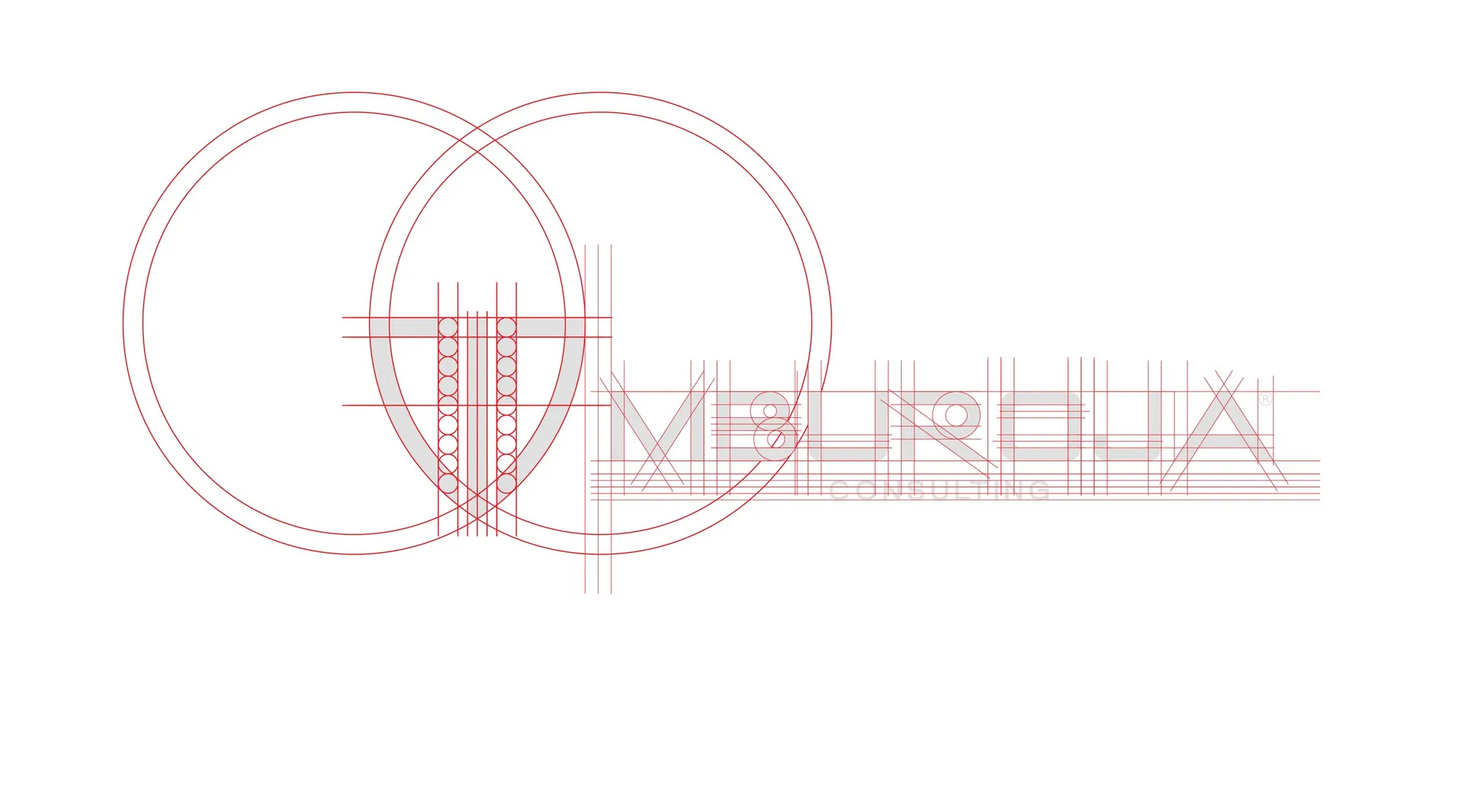
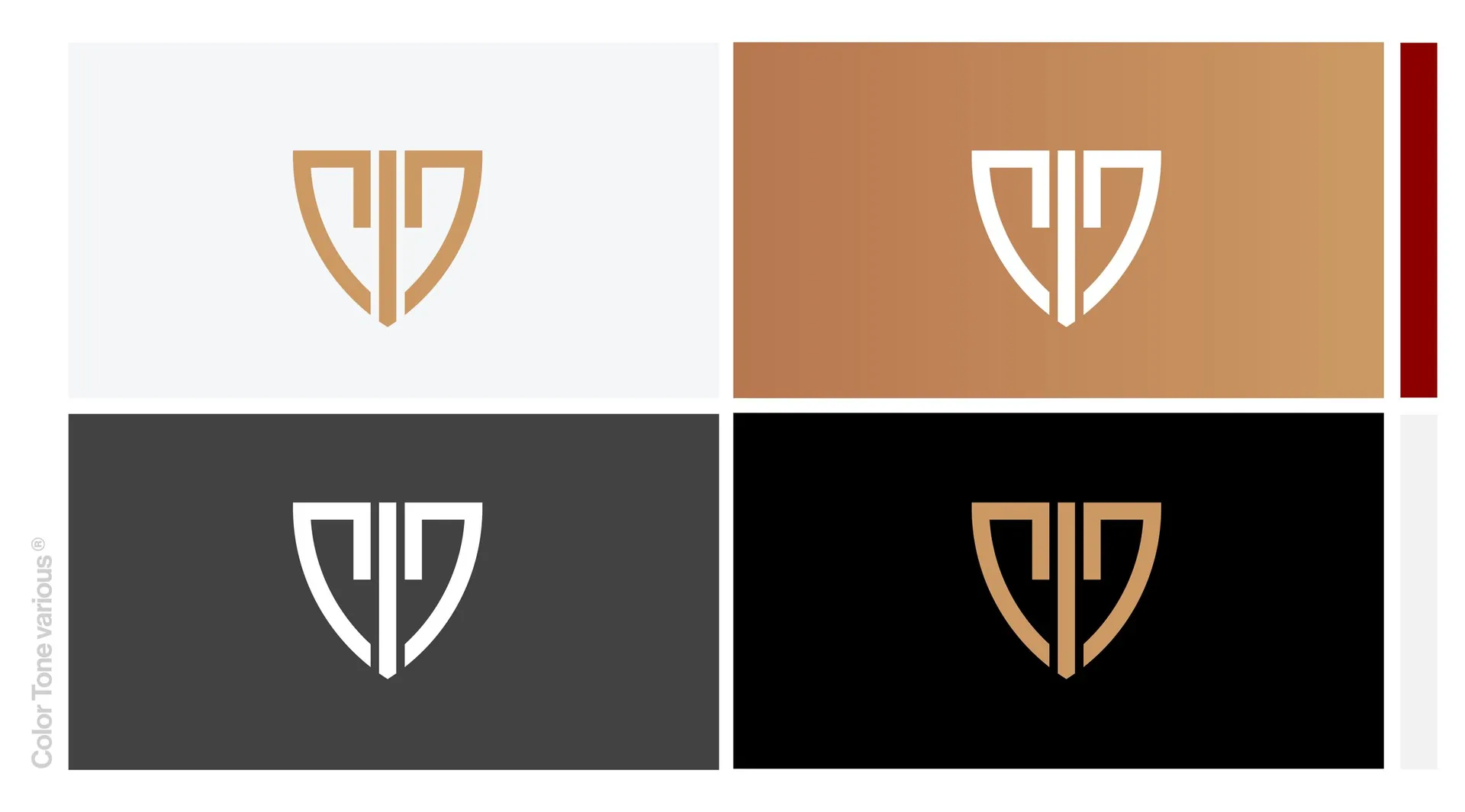
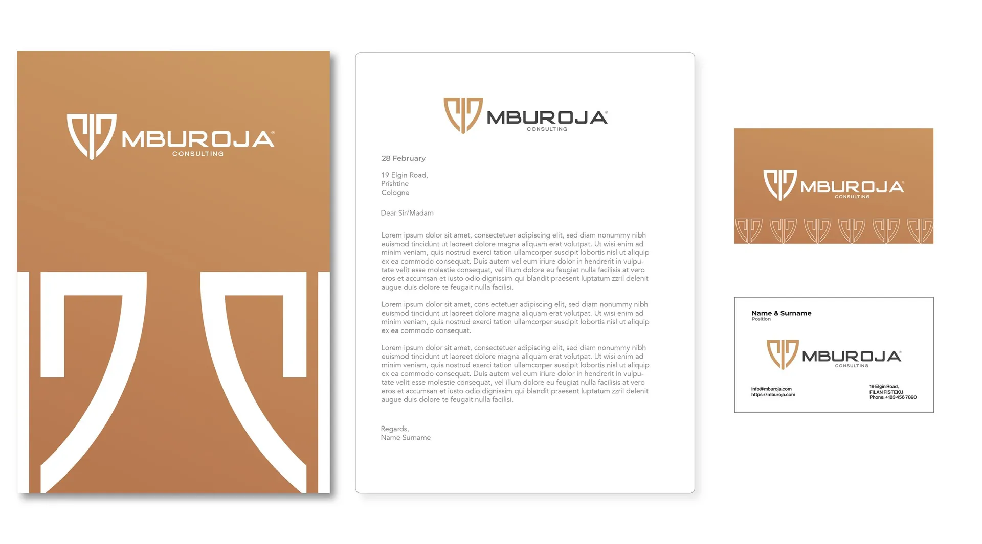
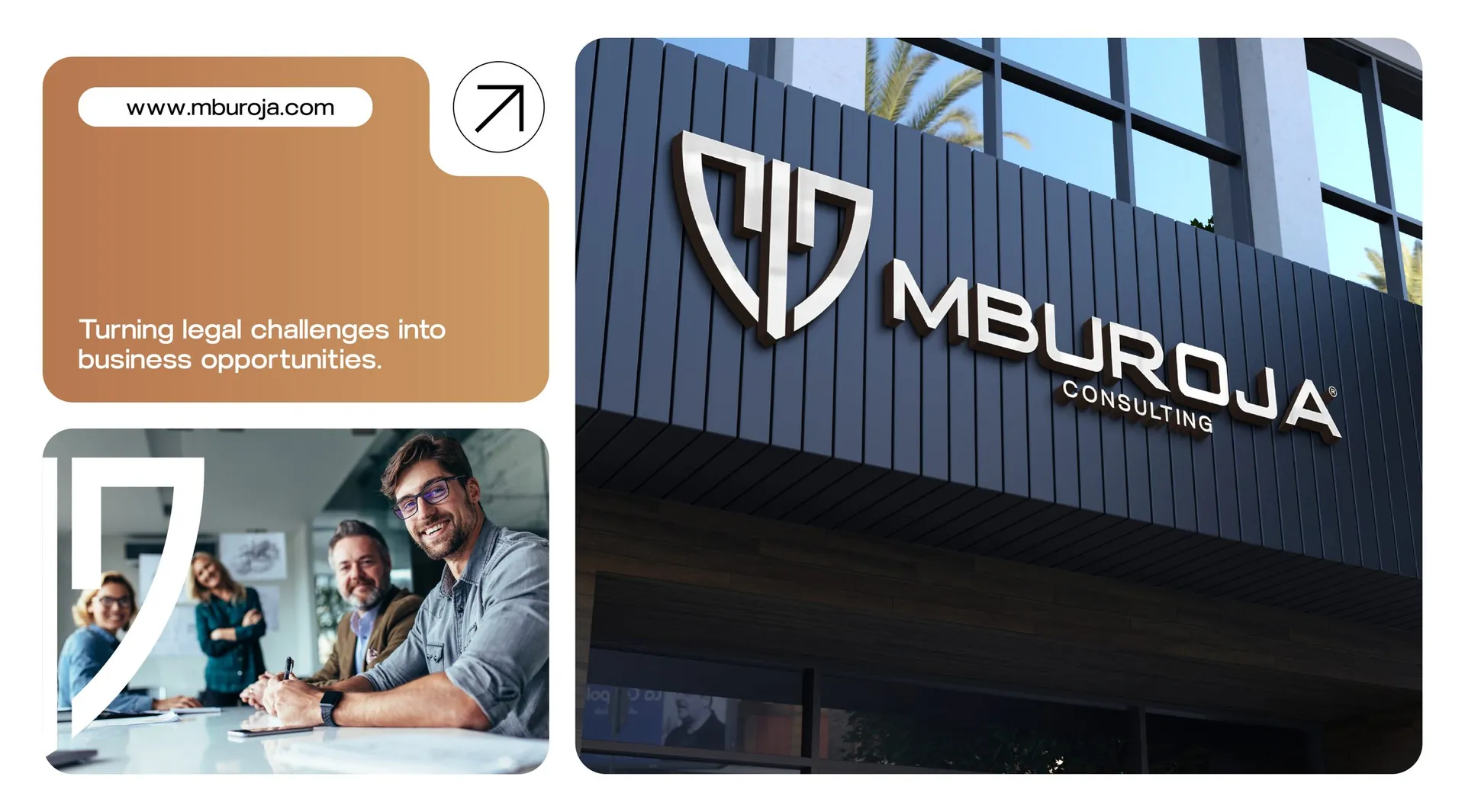
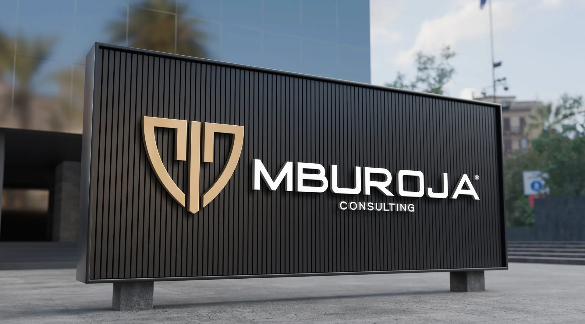
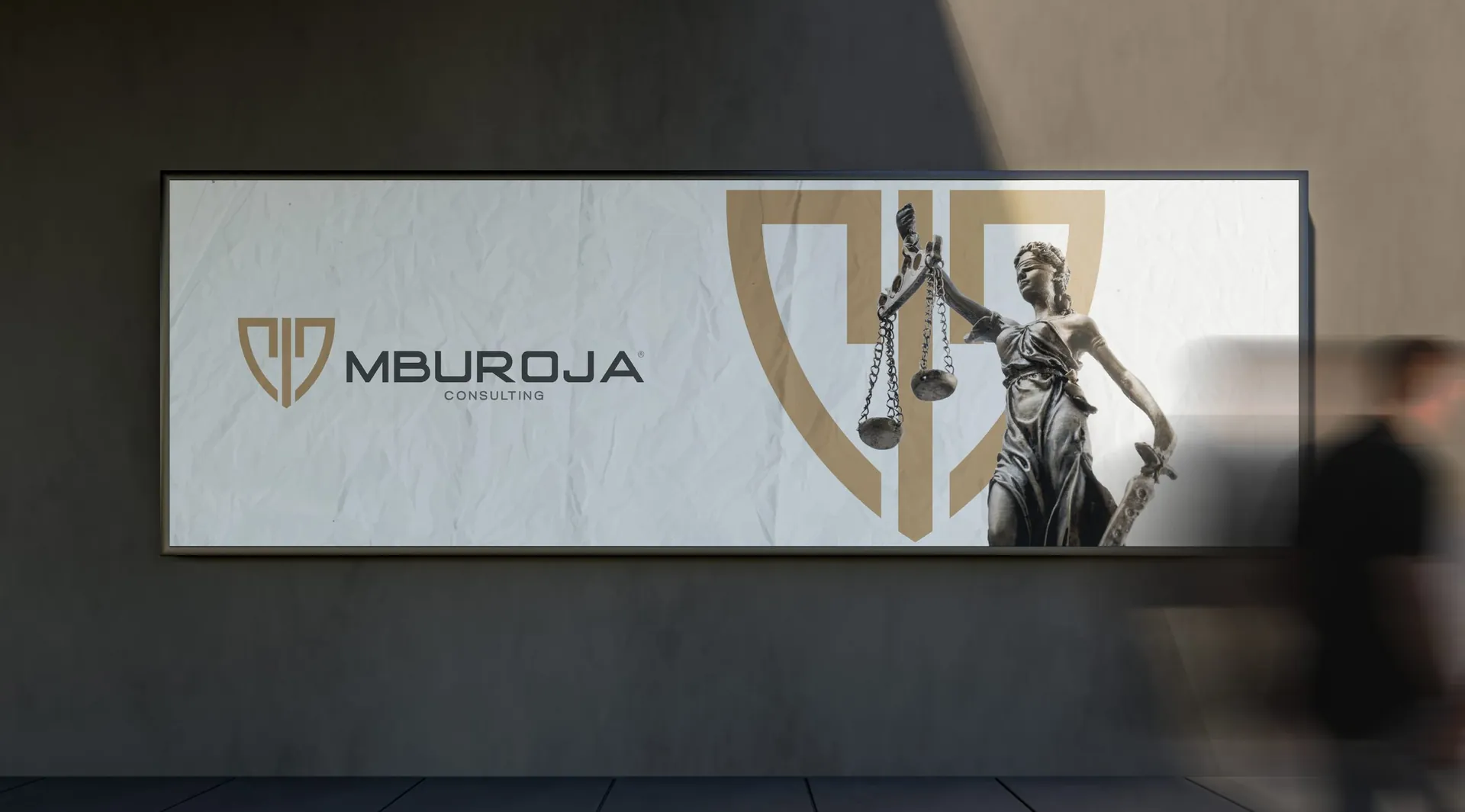
The emblem takes the form of Skanderbeg’s shield, a symbol of defence every Albanian recognises, and folds the letter M and the beam of the scales of justice into one symmetrical mark. A warm copper tone against charcoal and white gives it the weight of metal rather than the coldness of corporate blue. The wordmark is wide and even, set with the same calm.
The result
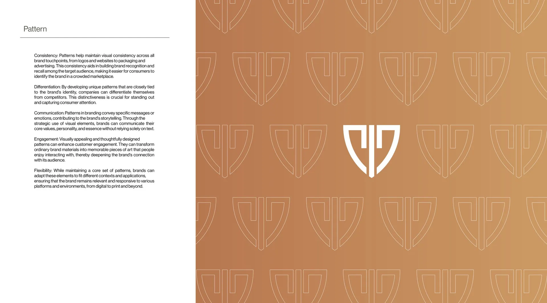
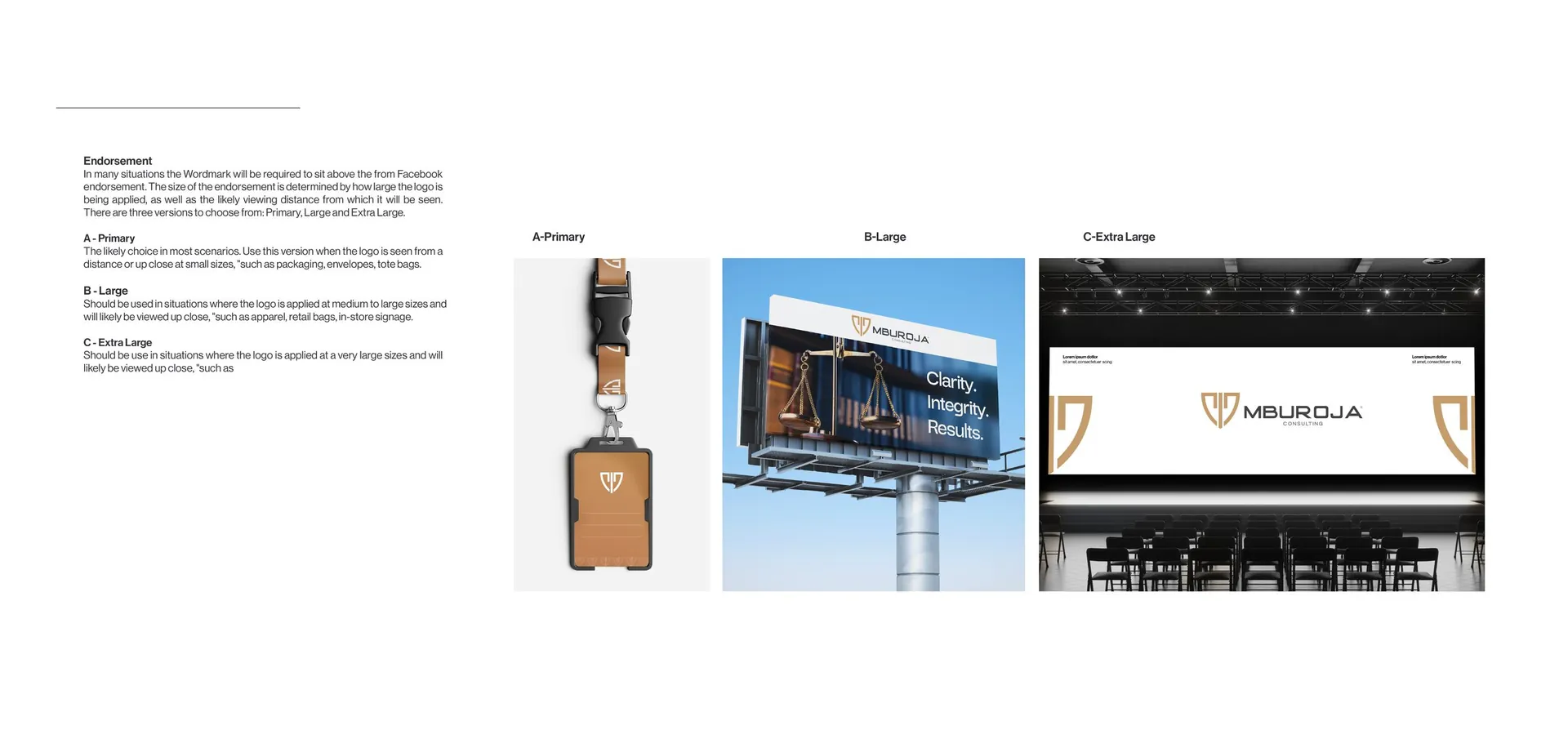
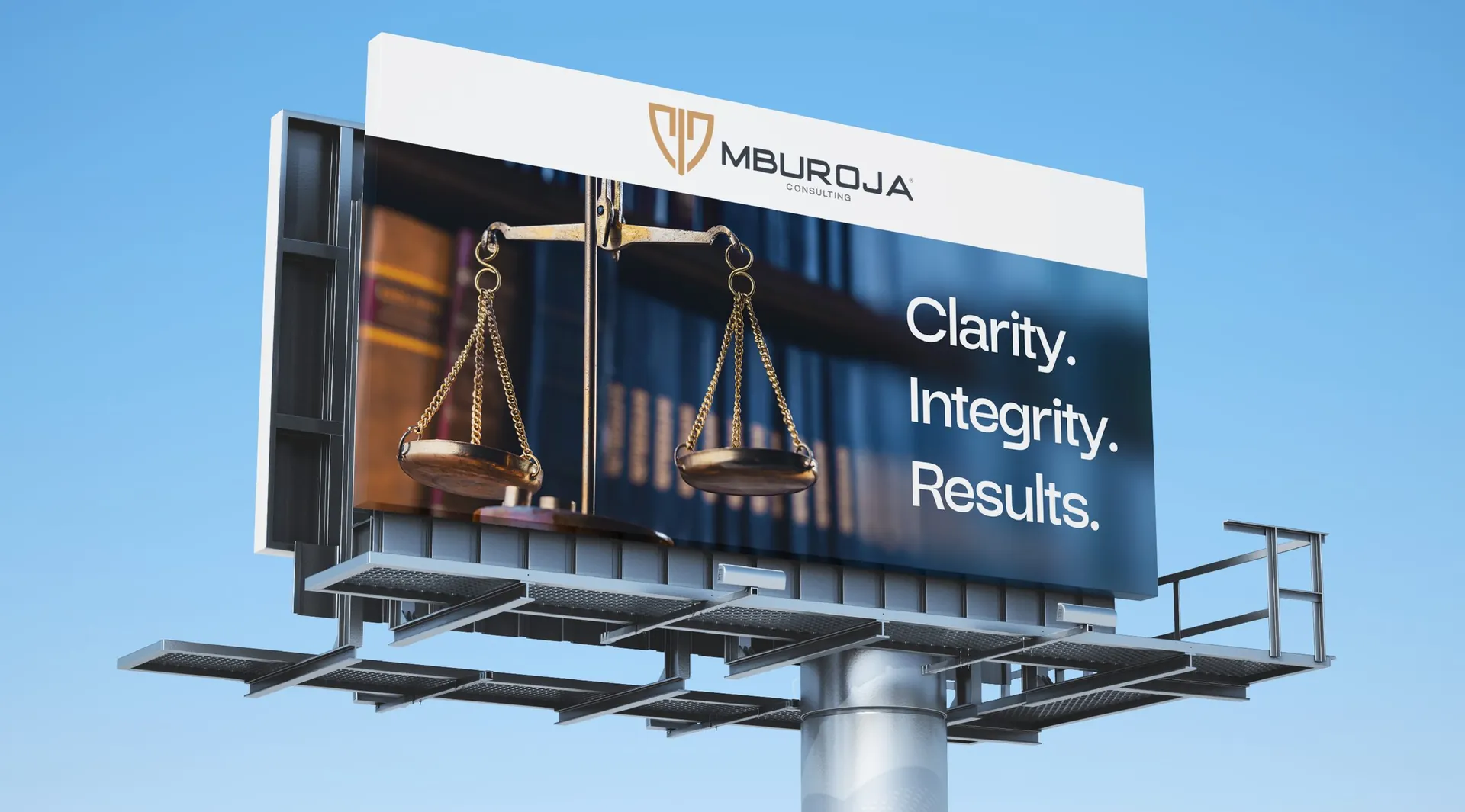
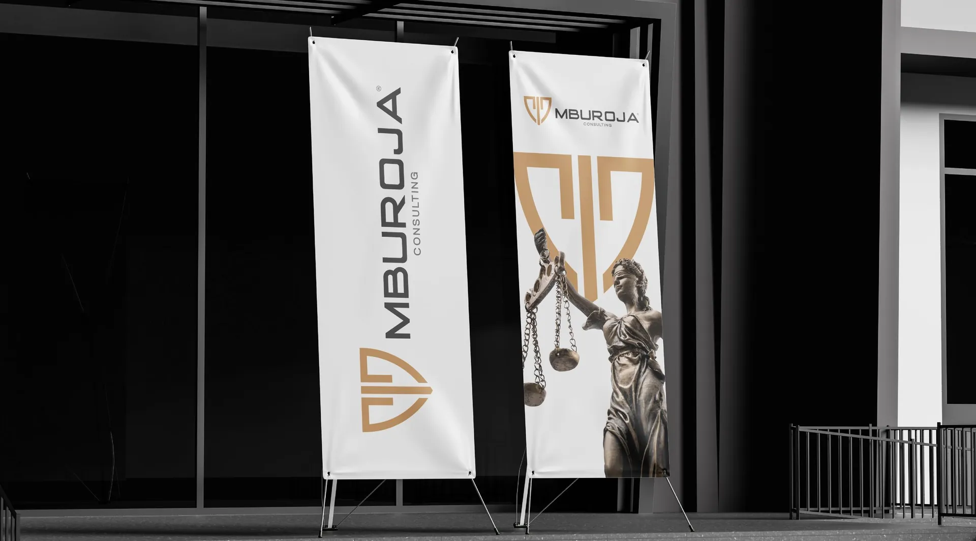
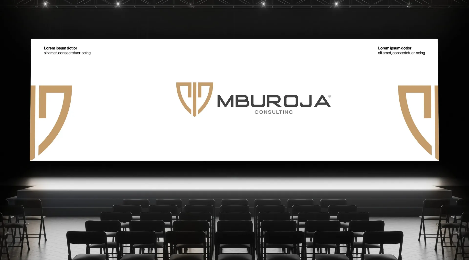
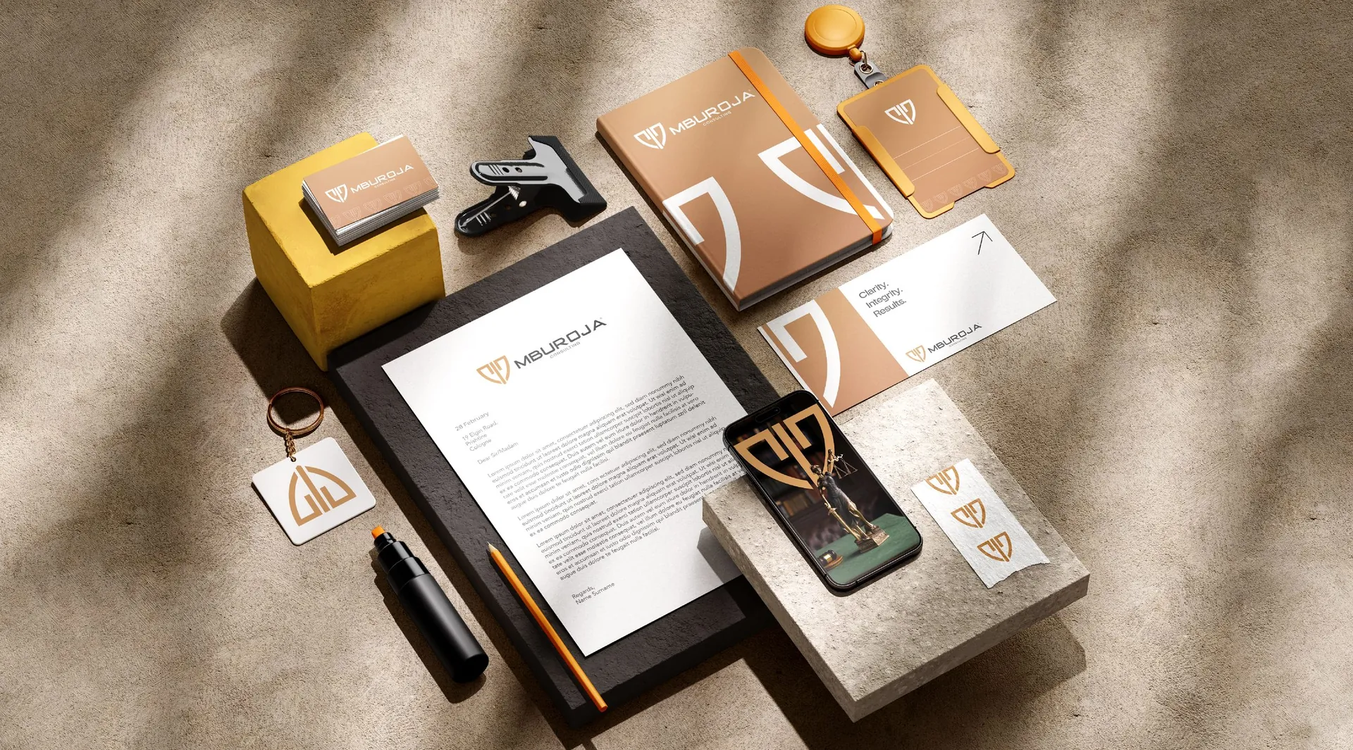
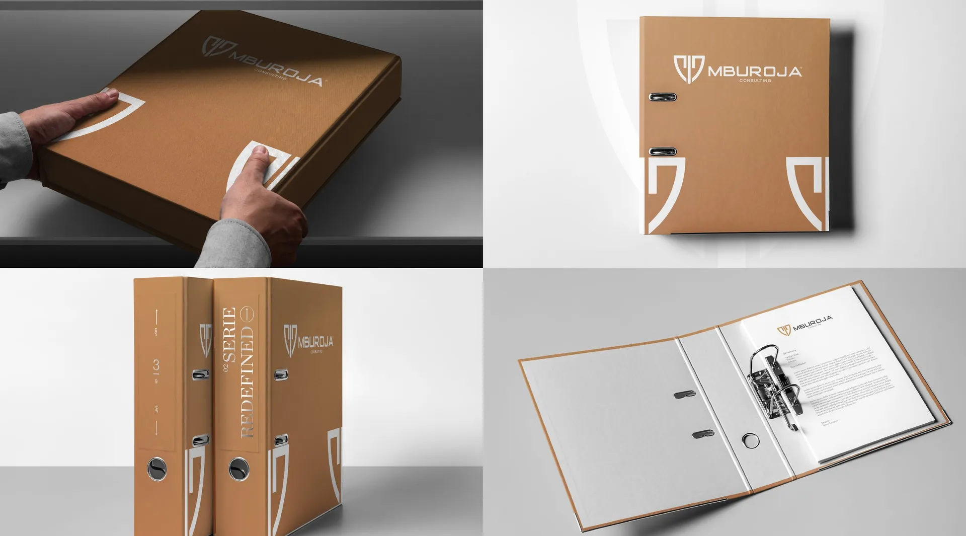
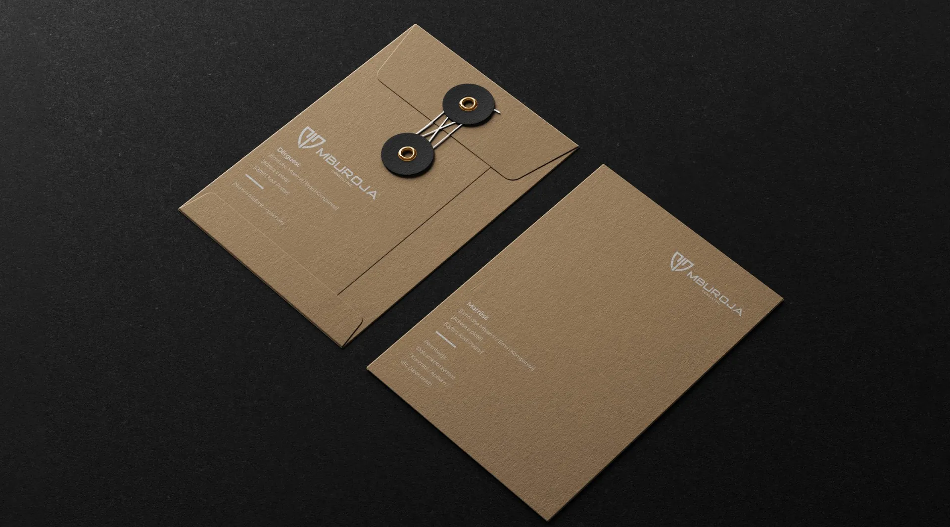
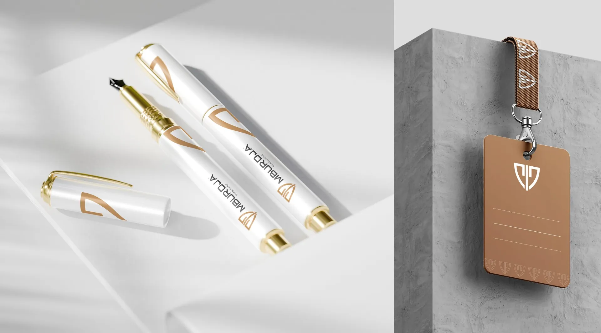
Logo and construction, colour versions, pattern, stationery, folders and envelopes, pens and lanyards, building signage, billboards and flags, event backdrops, website layout and social media templates. Campaign line: Clarity. Integrity. Results.

01 / 26

02 / 26

03 / 26

04 / 26

05 / 26

06 / 26

07 / 26

08 / 26

09 / 26

10 / 26

11 / 26

12 / 26


13 / 26


14 / 26

15 / 26

16 / 26

17 / 26

18 / 26

19 / 26

20 / 26

21 / 26

22 / 26

23 / 26

24 / 26


25 / 26


26 / 26