Logo design
- Client
- MSB Elektronik GmbH & Co. KG
- Year
- 2024
- Scope
- Logo, identity, print, digital, vehicles, workwear
- Industry
- Electronics & renewable energy
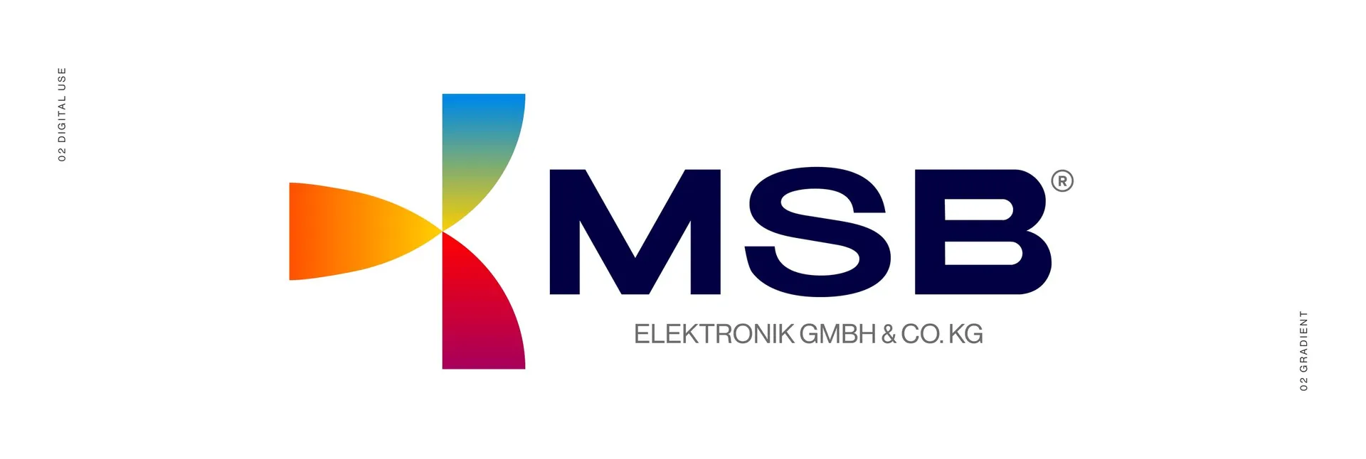
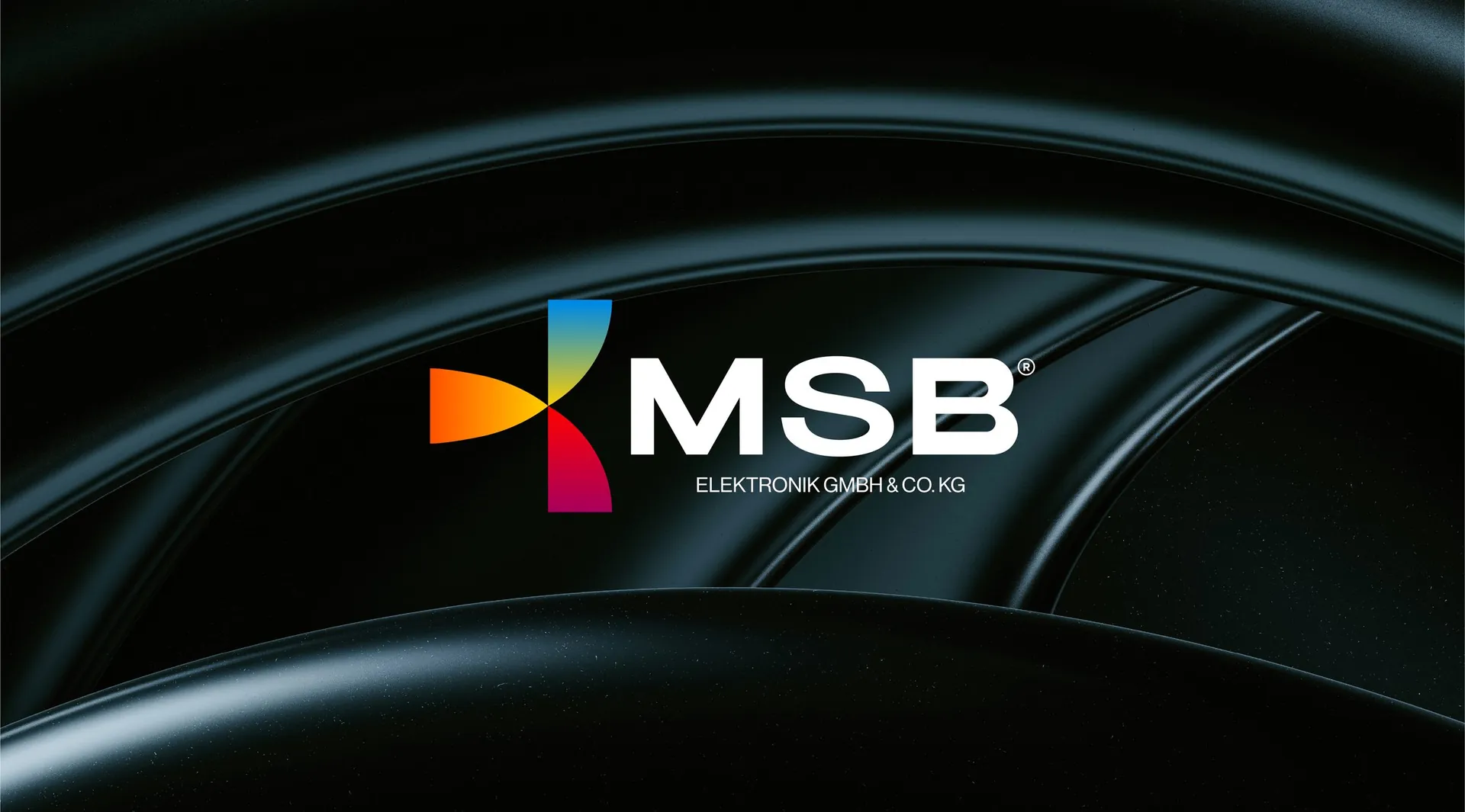
MSB three blades of colour meeting at one point
The brief
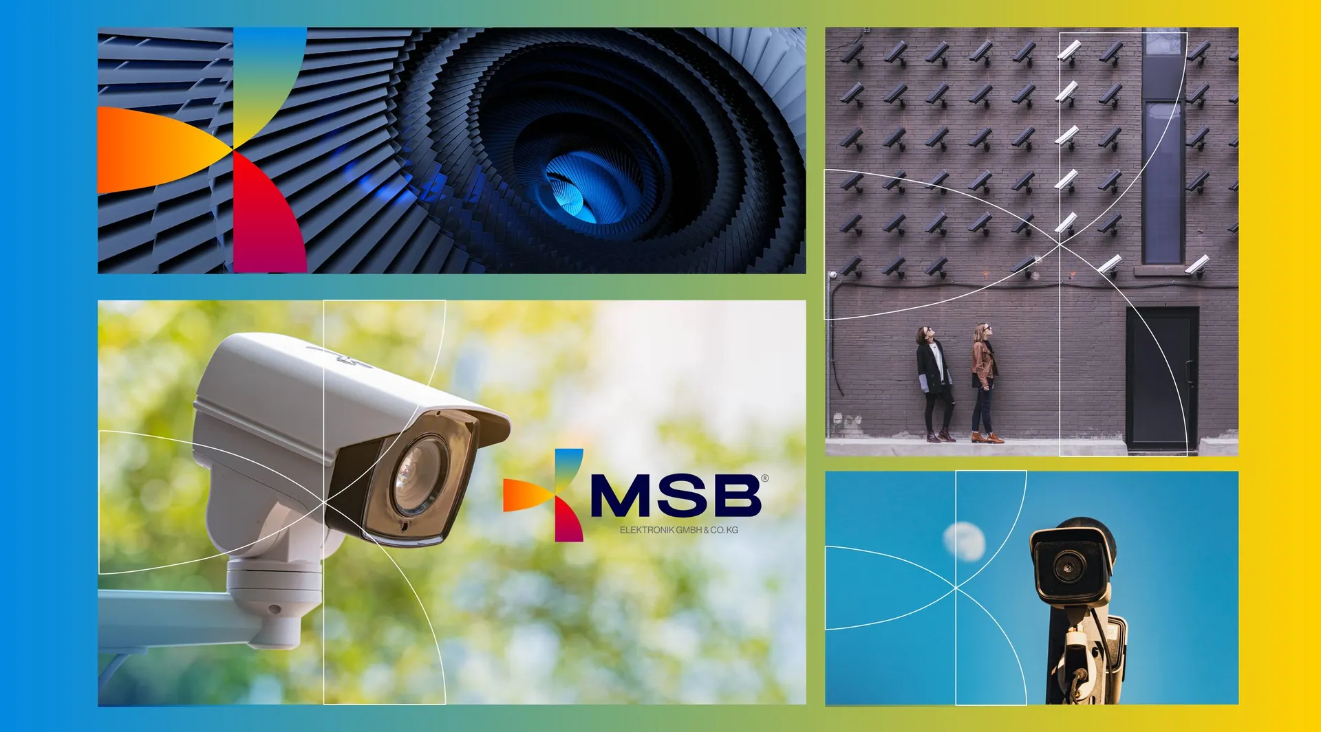
MSB Elektronik GmbH & Co. KG works across electrical, security, connectivity and safety: wind energy, network installations, CCTV, fire alarm systems. A family company founded by three brothers, it needed one identity that could hold all of those fields without looking like a patchwork.
The idea
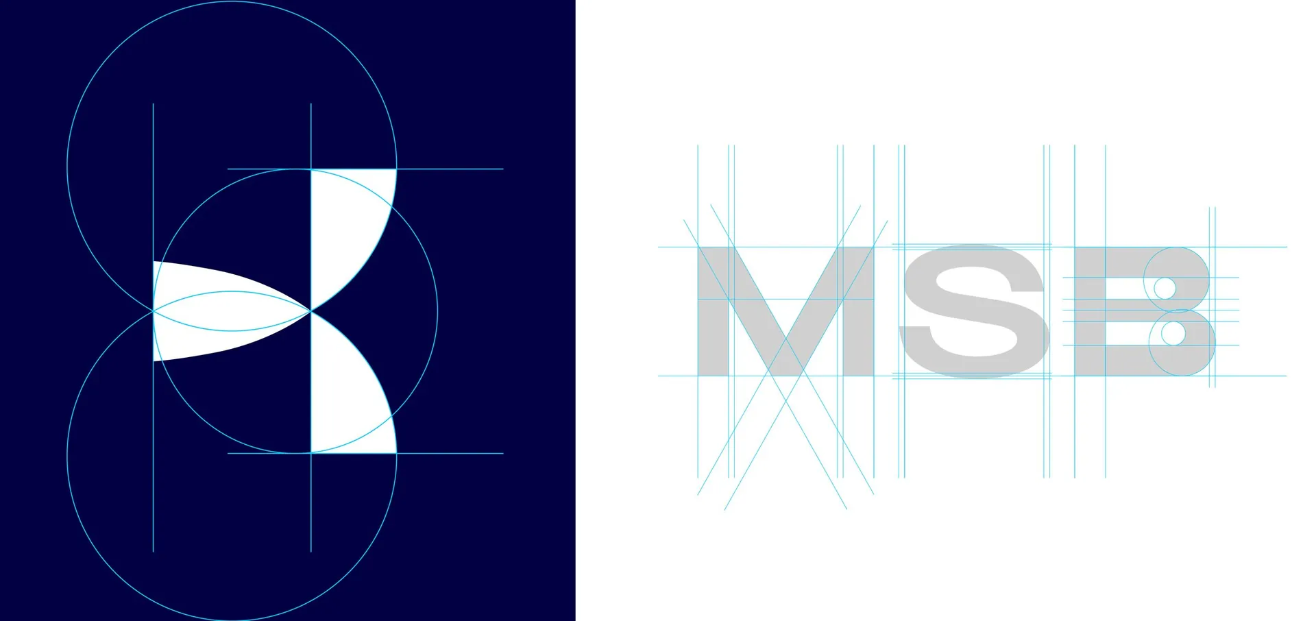
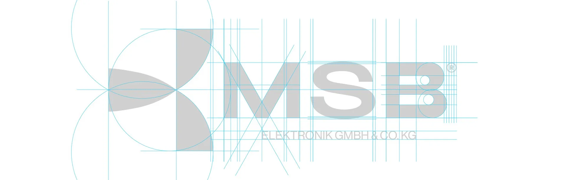
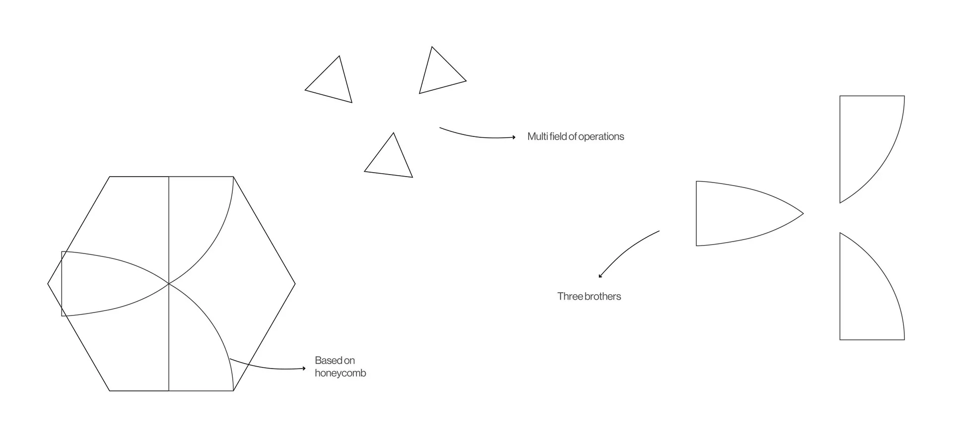
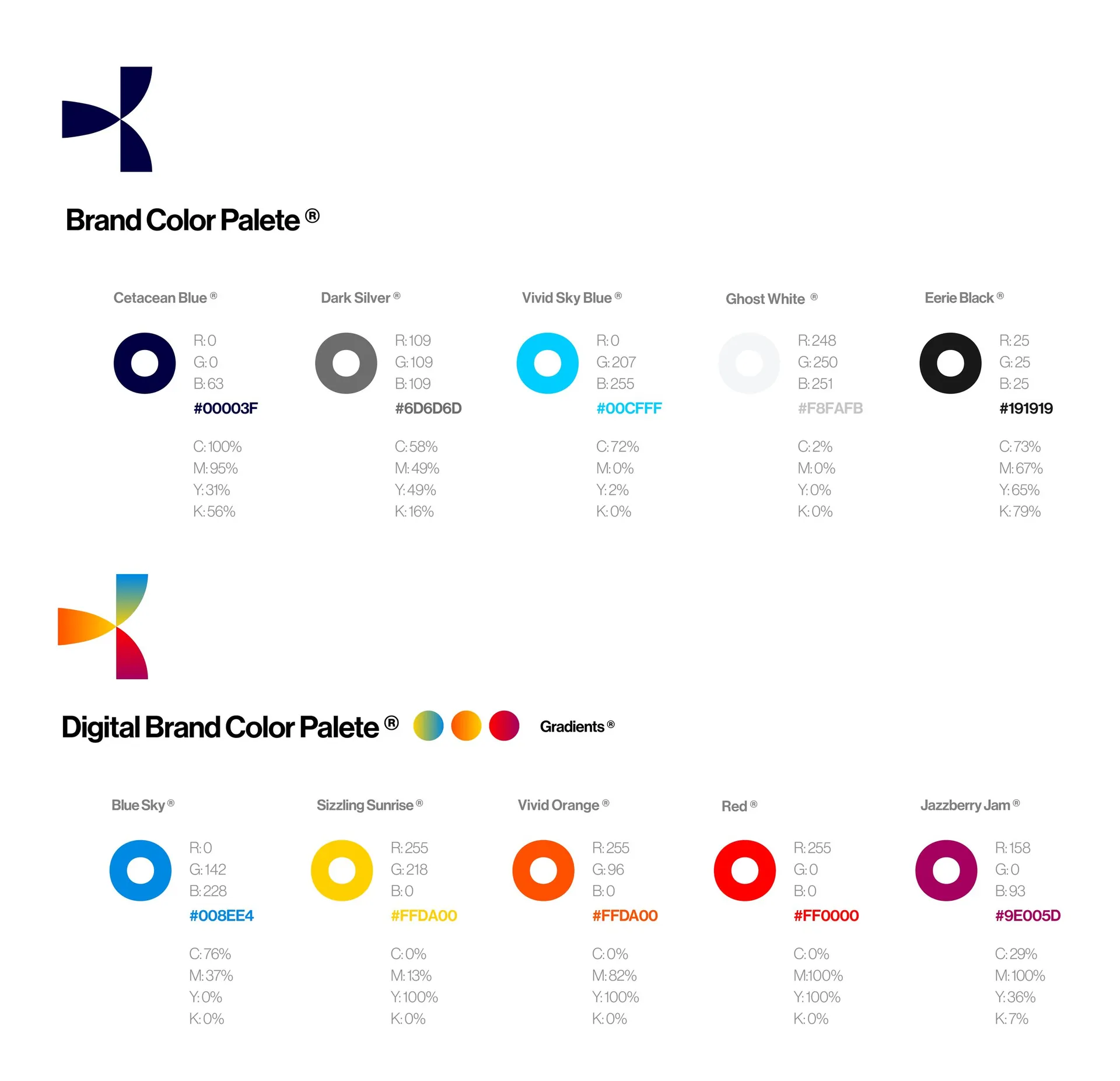
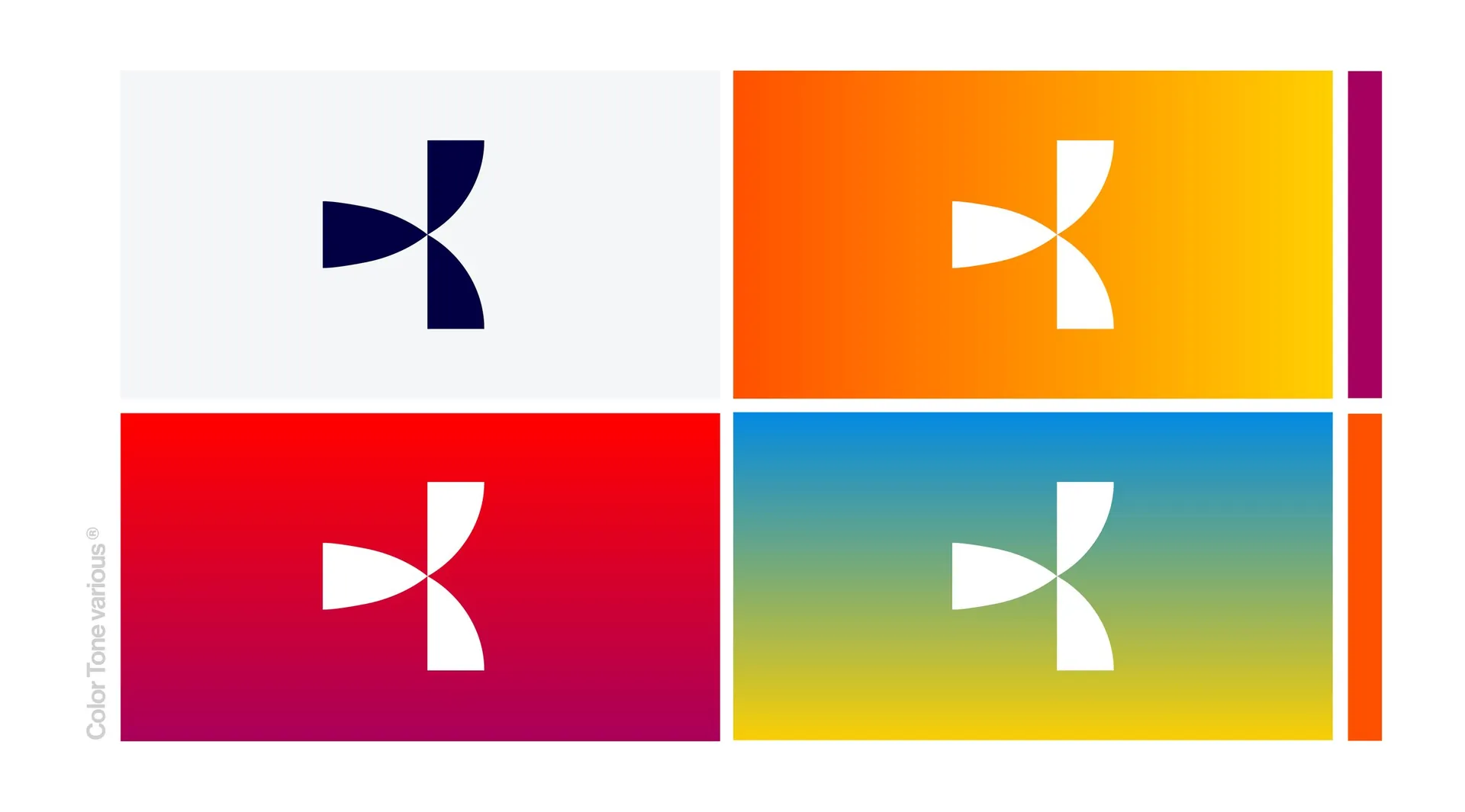
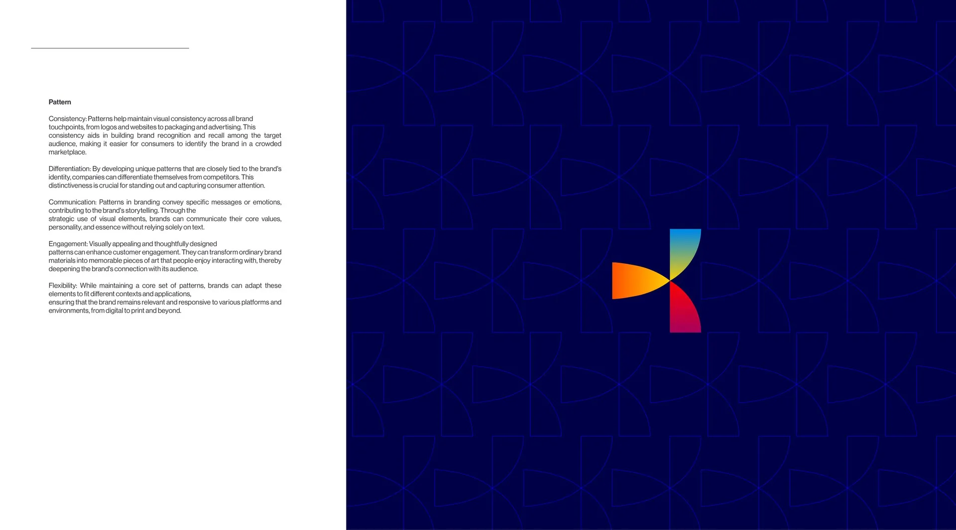
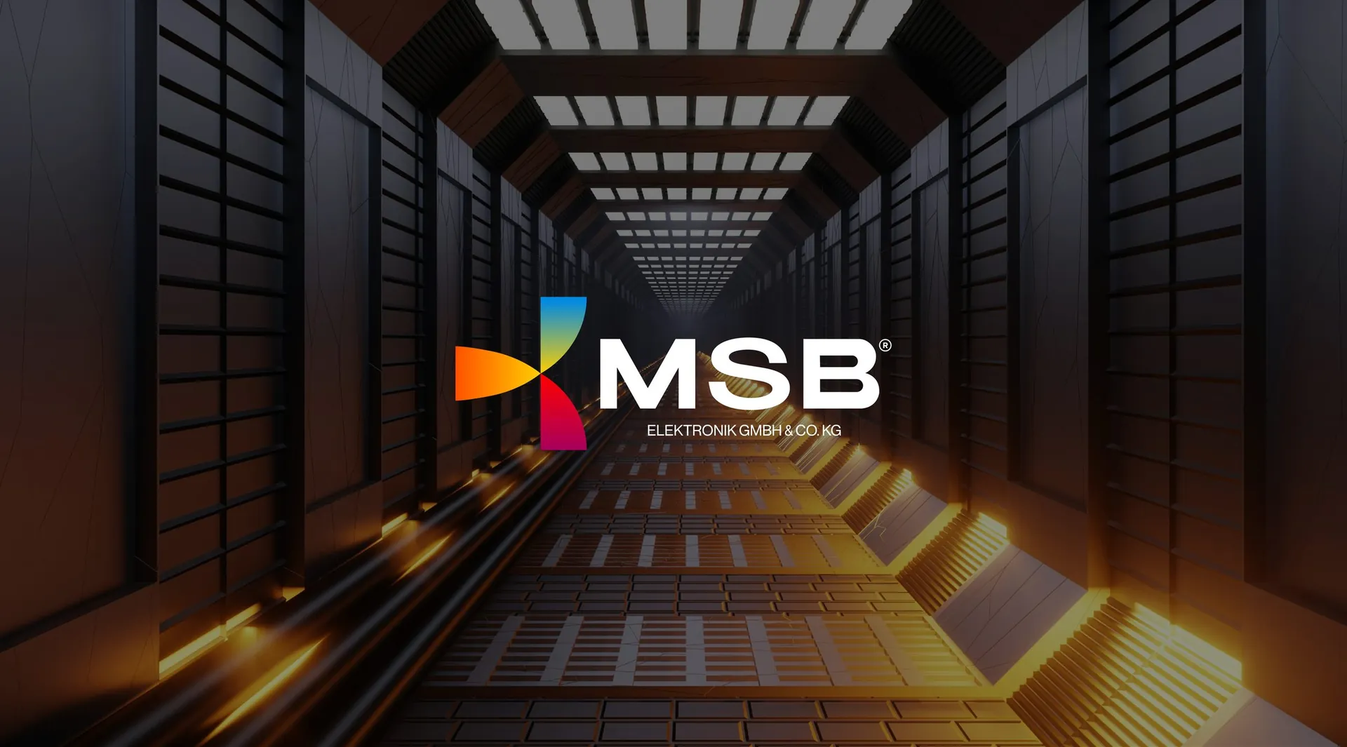
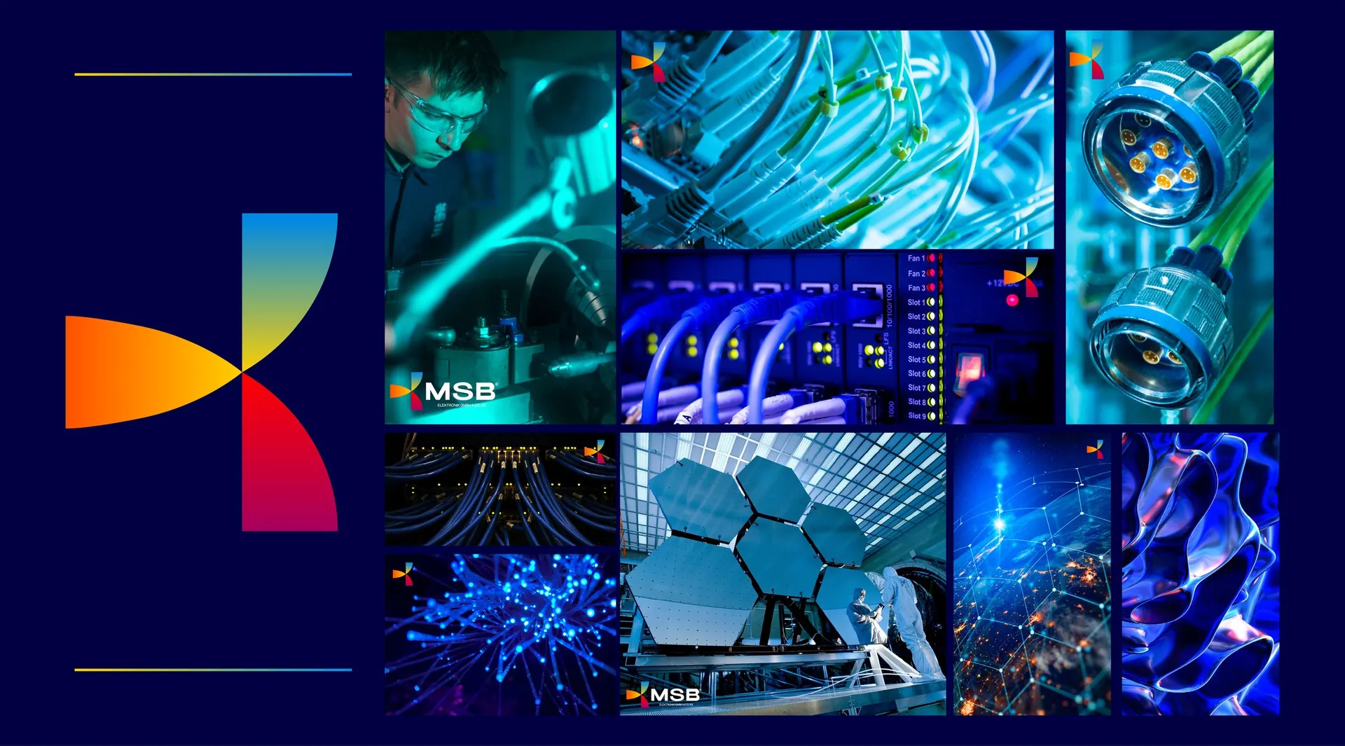
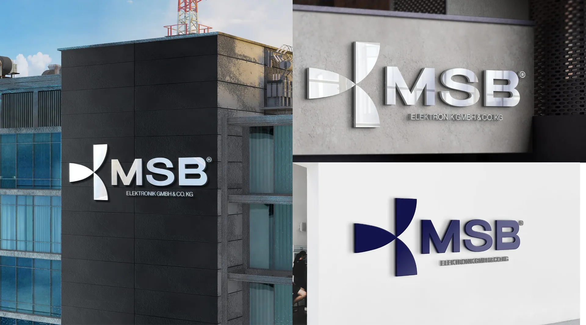
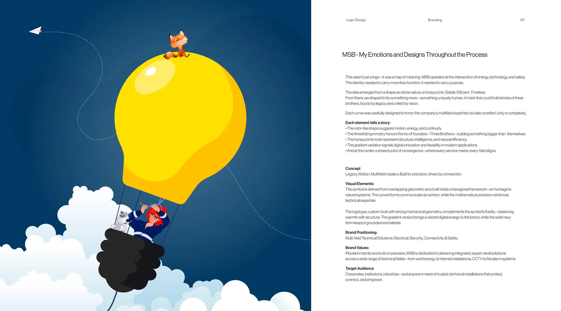
The mark grew out of a honeycomb: overlapping arcs inside a hexagon, the shape nature uses for structure and efficiency. Its threefold symmetry stands for the three founders, the rotor-like motion for energy, and the centre point is where every service meets. A gradient version carries digital energy on screens, while the solid navy keeps print, workwear and vehicles grounded. The logotype was custom-built with the same mechanical geometry.
The result
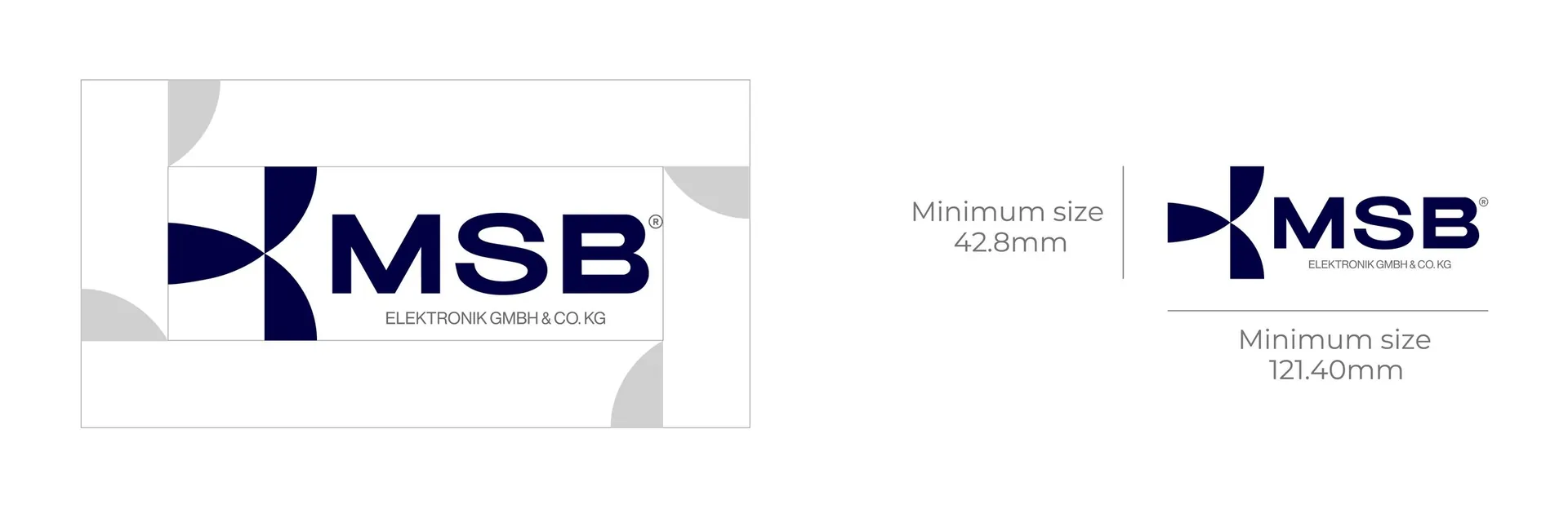
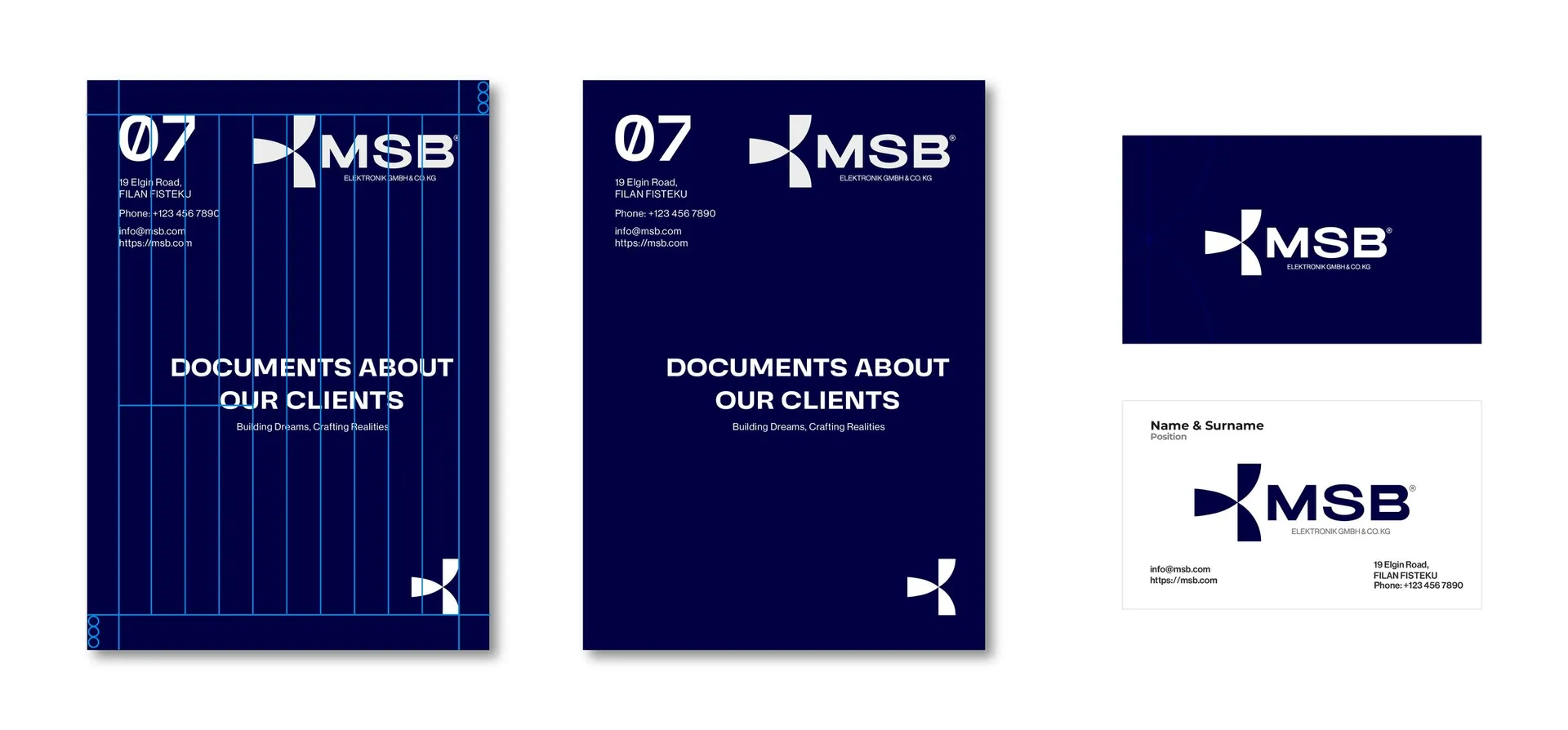
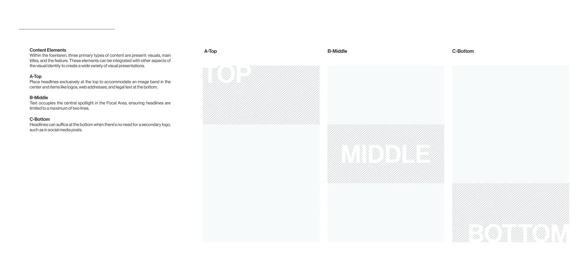
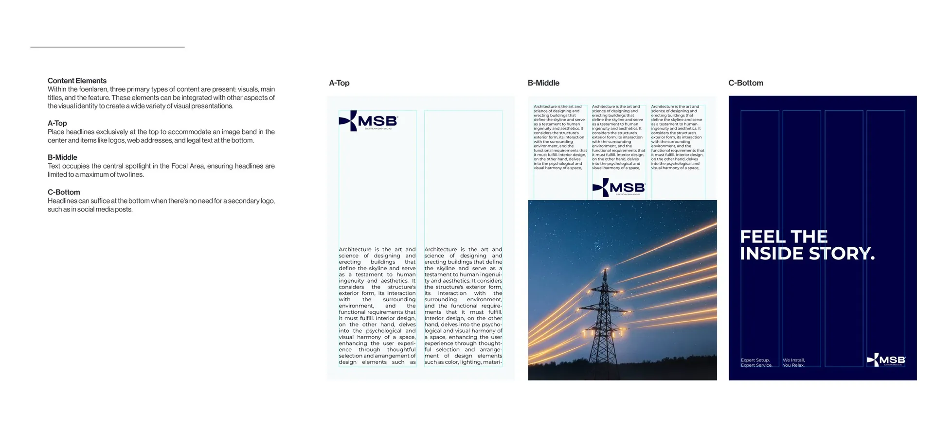
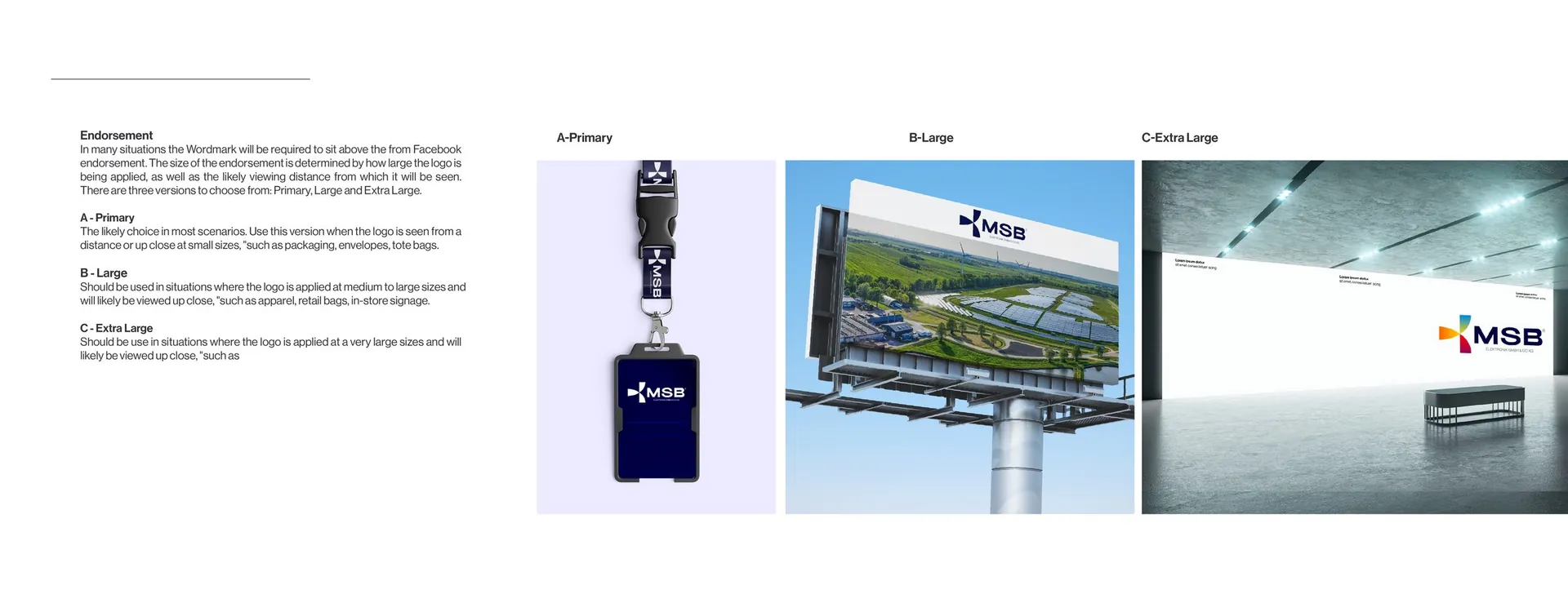
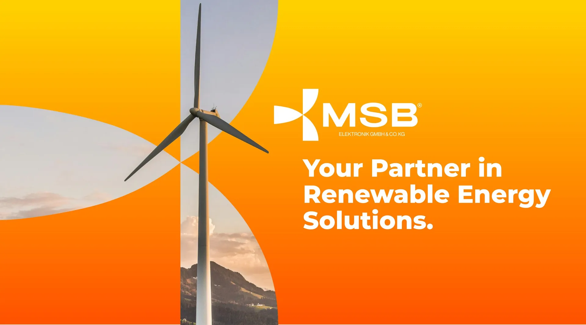
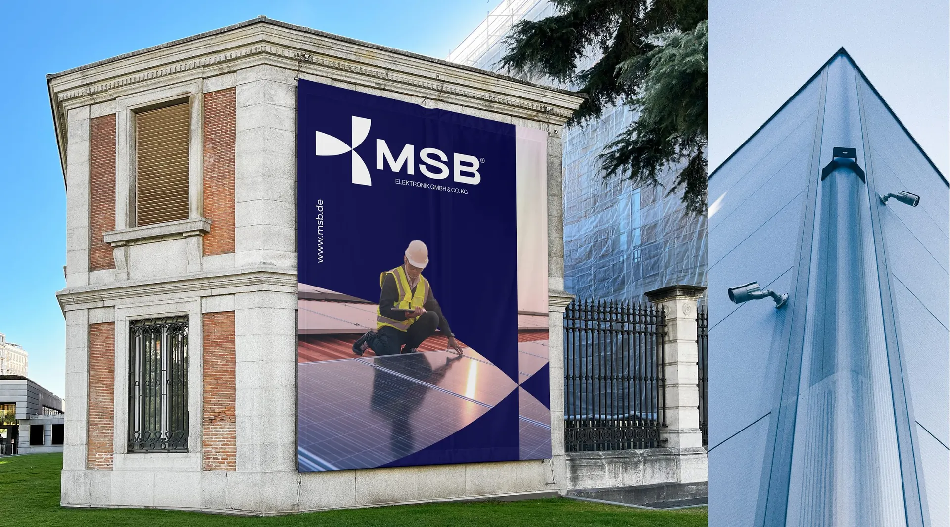
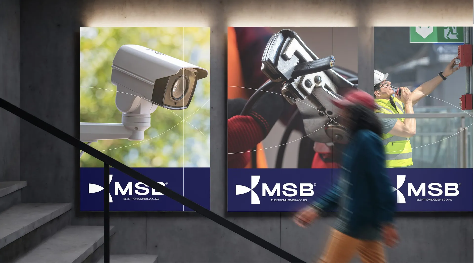
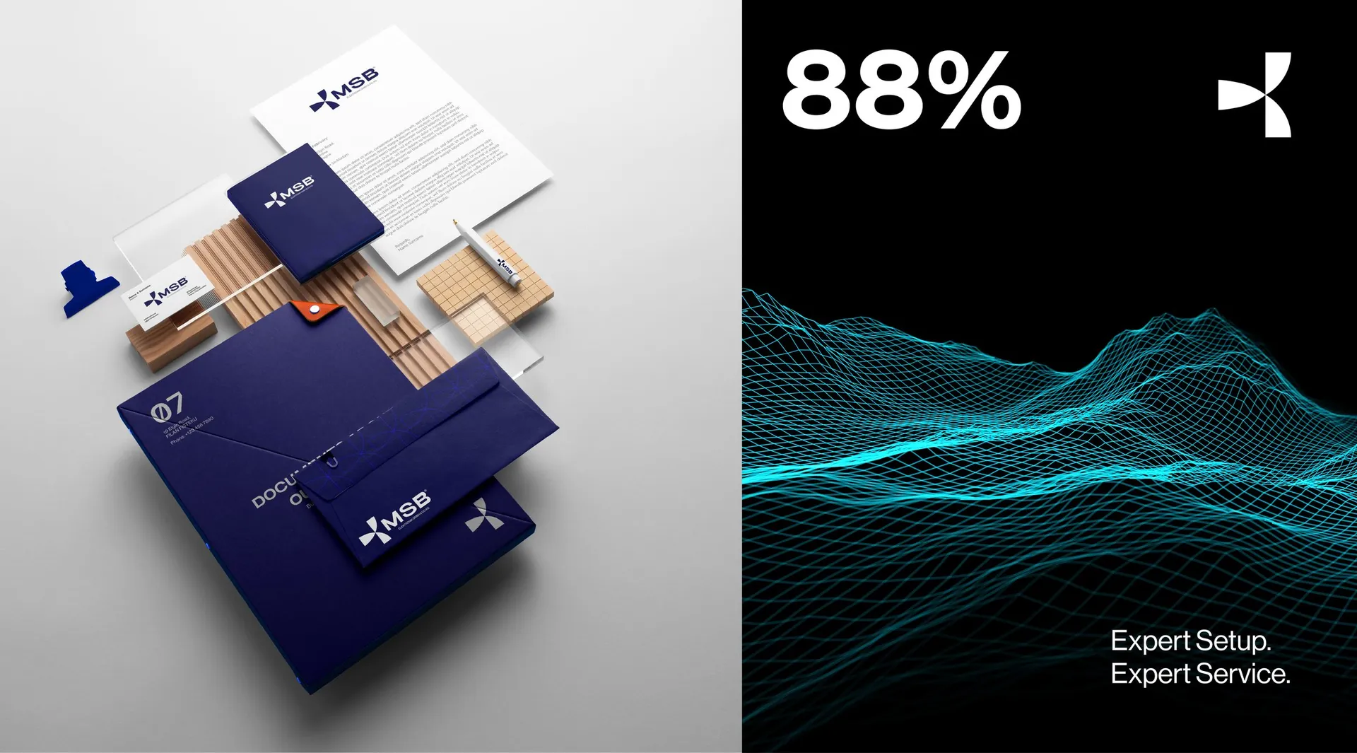
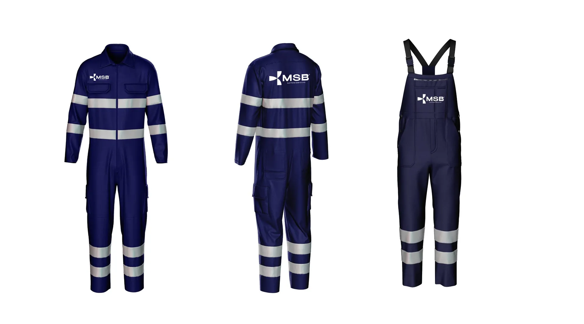
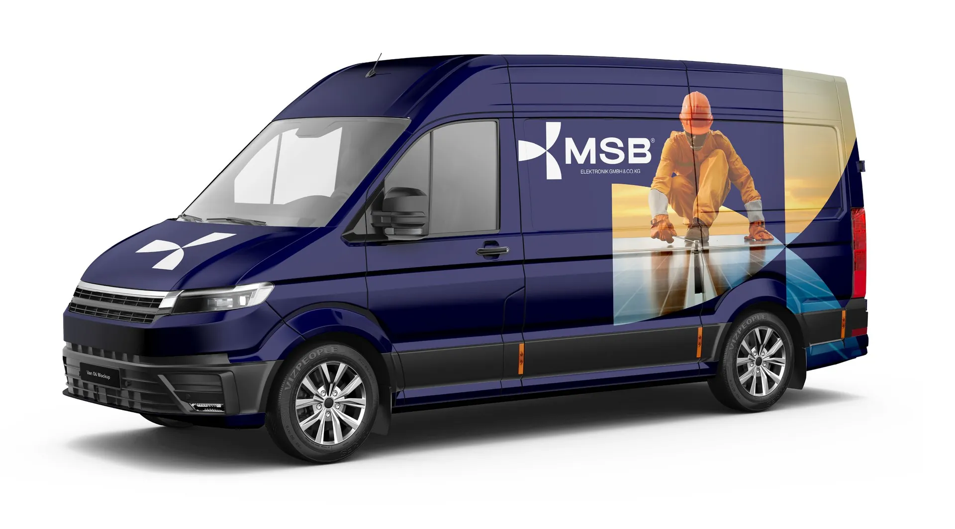
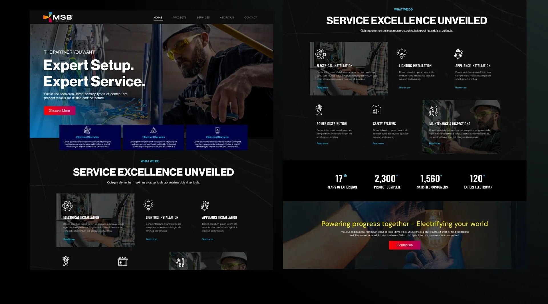
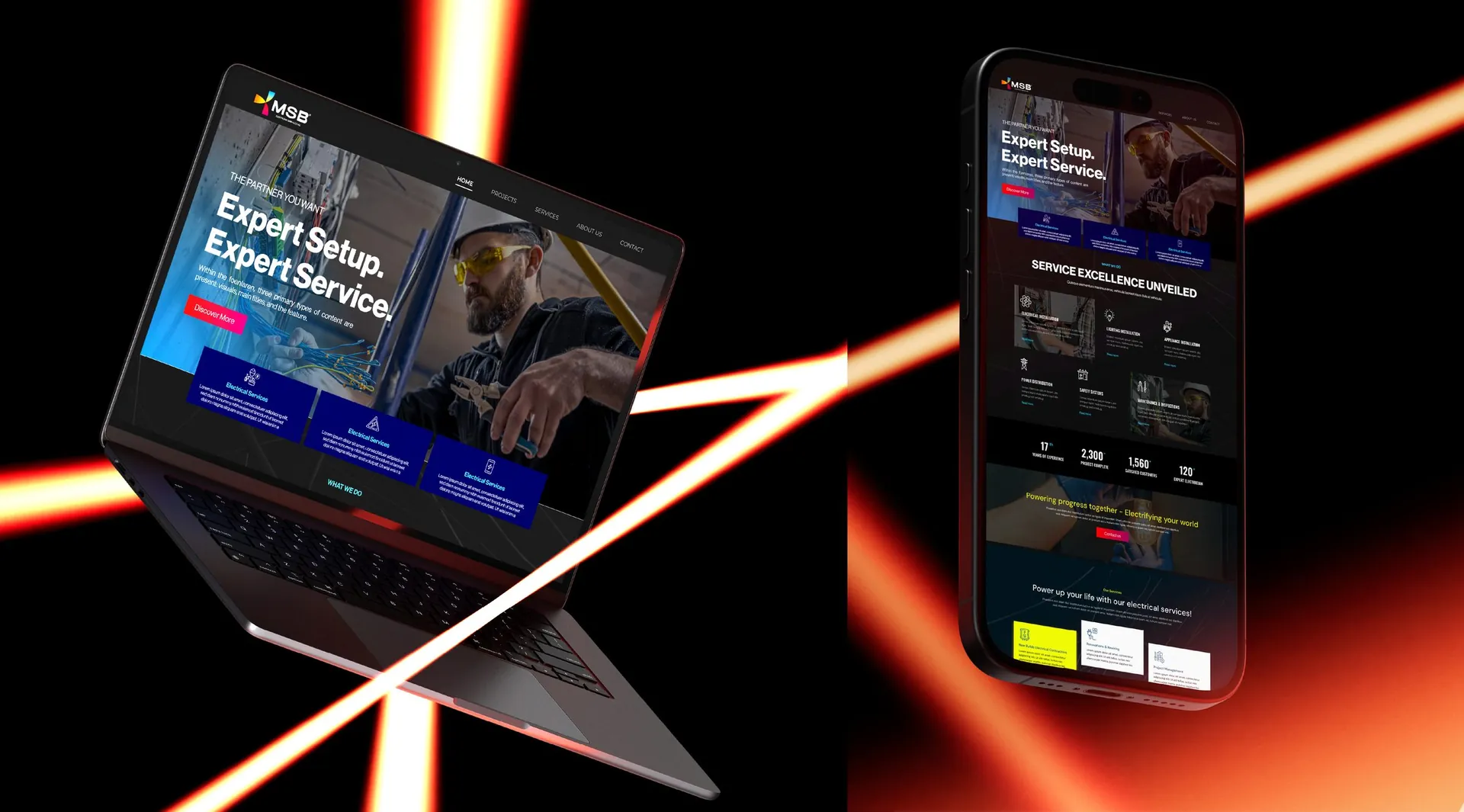
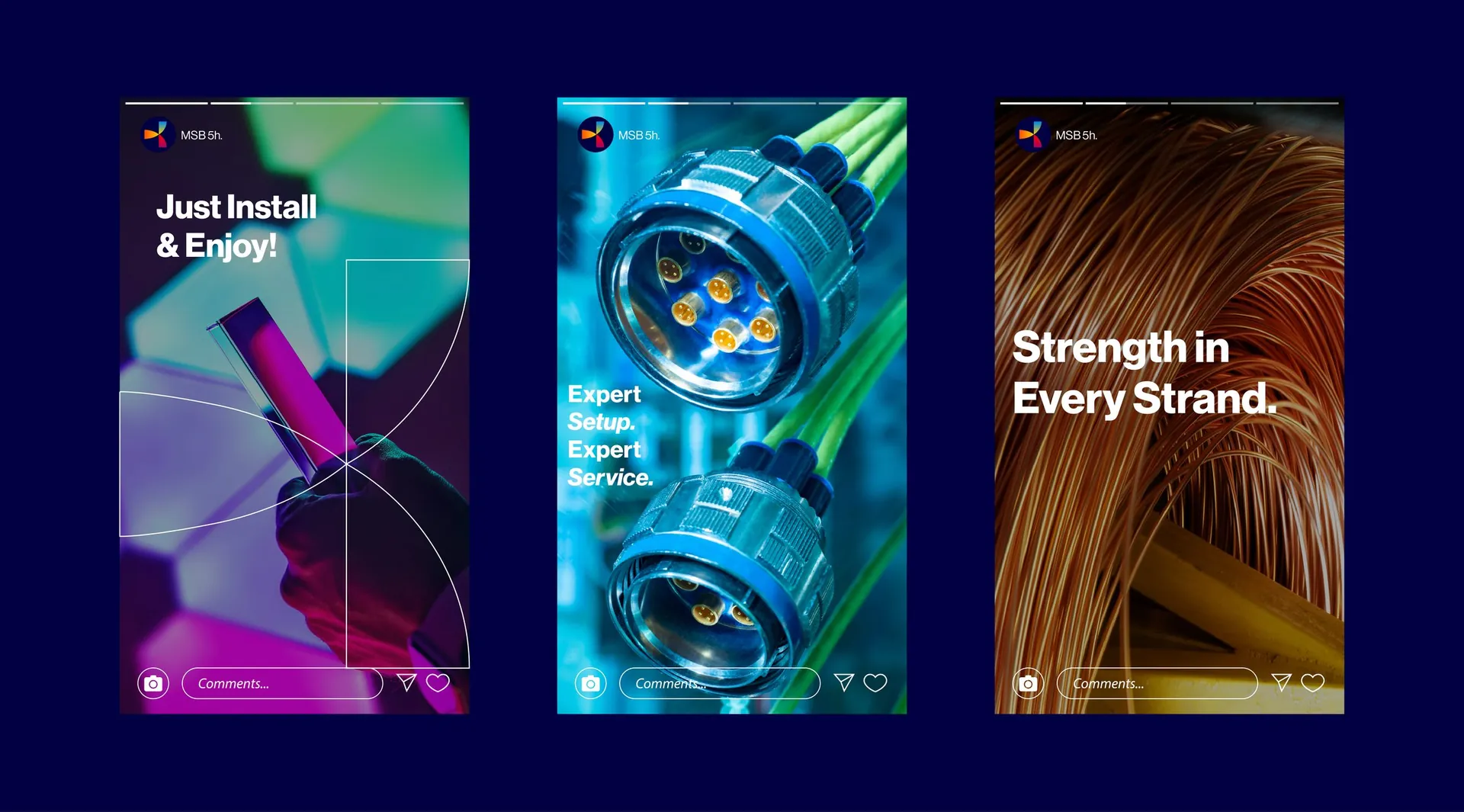
Logo and construction, minimum sizes, print and digital colour palettes, pattern, stationery, folders, posters and billboards, building signage, workwear, vehicle livery, website layouts, social media templates and the campaign line Expert Setup. Expert Service.

01 / 29

02 / 29

03 / 29

04 / 29

05 / 29

06 / 29

07 / 29

08 / 29

09 / 29

10 / 29

11 / 29

12 / 29

13 / 29

14 / 29

15 / 29

16 / 29

17 / 29

18 / 29

19 / 29

20 / 29

21 / 29

22 / 29

23 / 29

24 / 29

25 / 29

26 / 29

27 / 29

28 / 29

29 / 29