Logo design
- Client
- GraSano
- Year
- 2025
- Scope
- Logo, identity, packaging, print, vehicles, social
- Industry
- Food & agriculture
GraSano a seed, a field and a mark that grows with the brand
The brief
GraSano is an Italian food brand built on rice and beans, with tomatoes to follow. It needed an identity that feels grown rather than manufactured: honest, warm and rooted in the land, yet sharp enough to hold its own on a modern shelf.
The idea
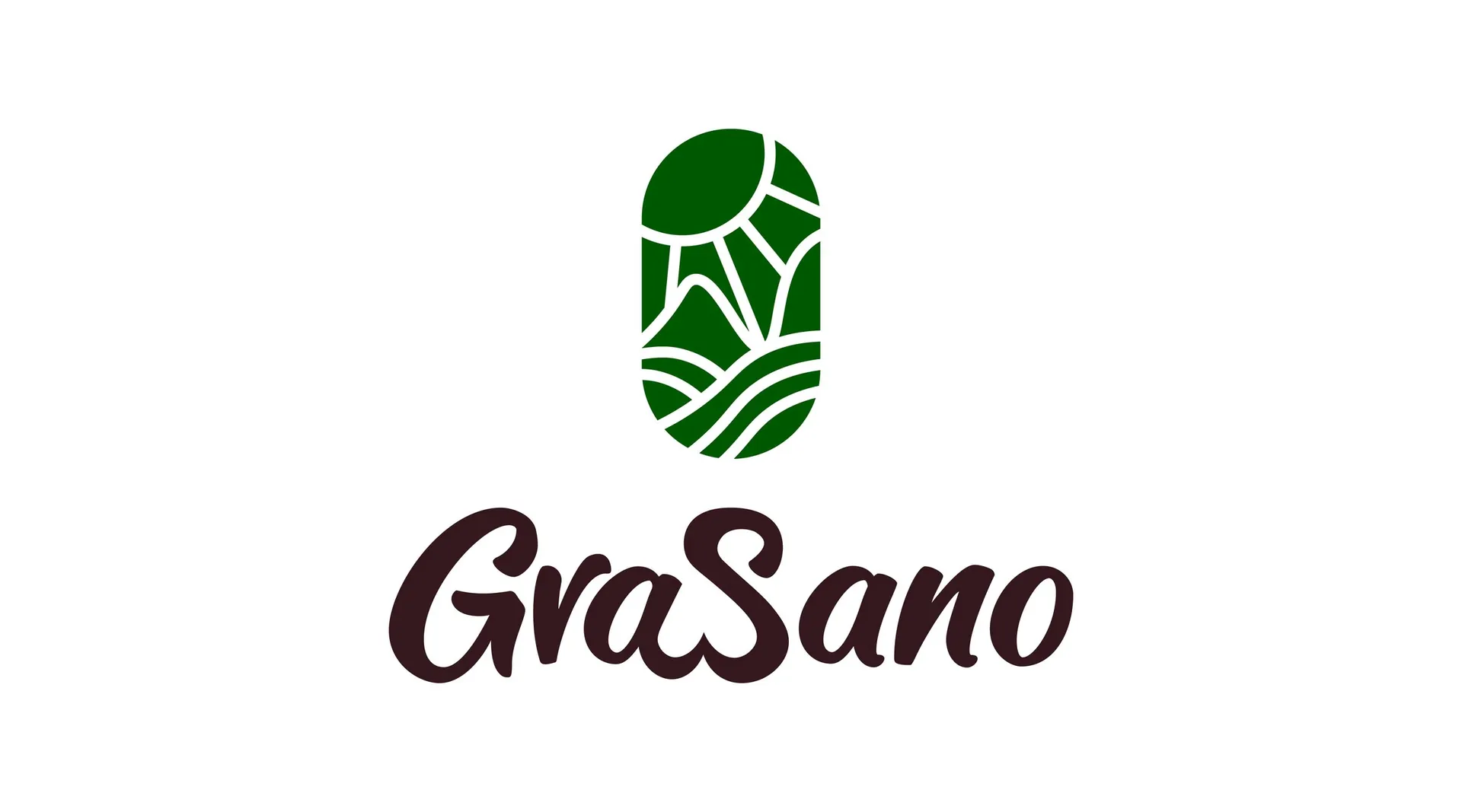
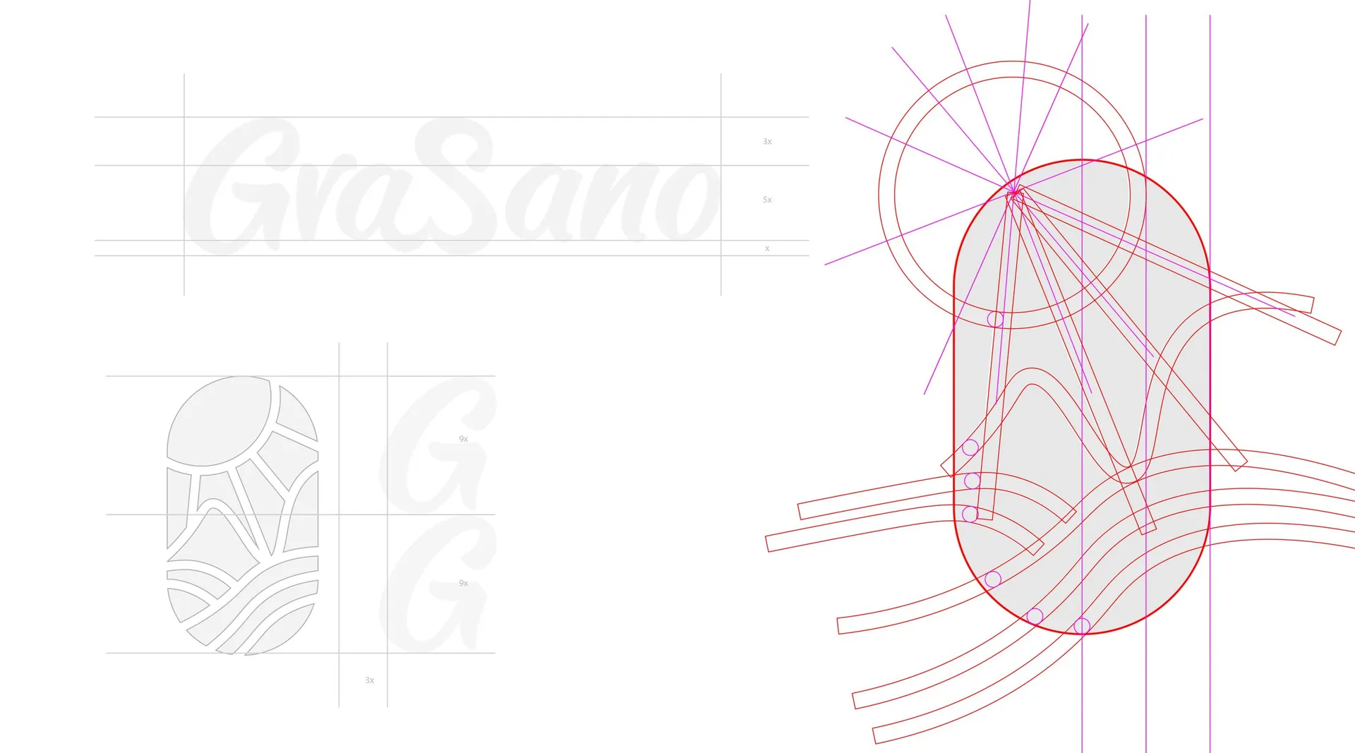
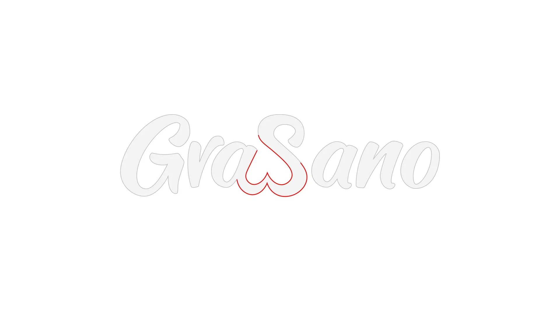
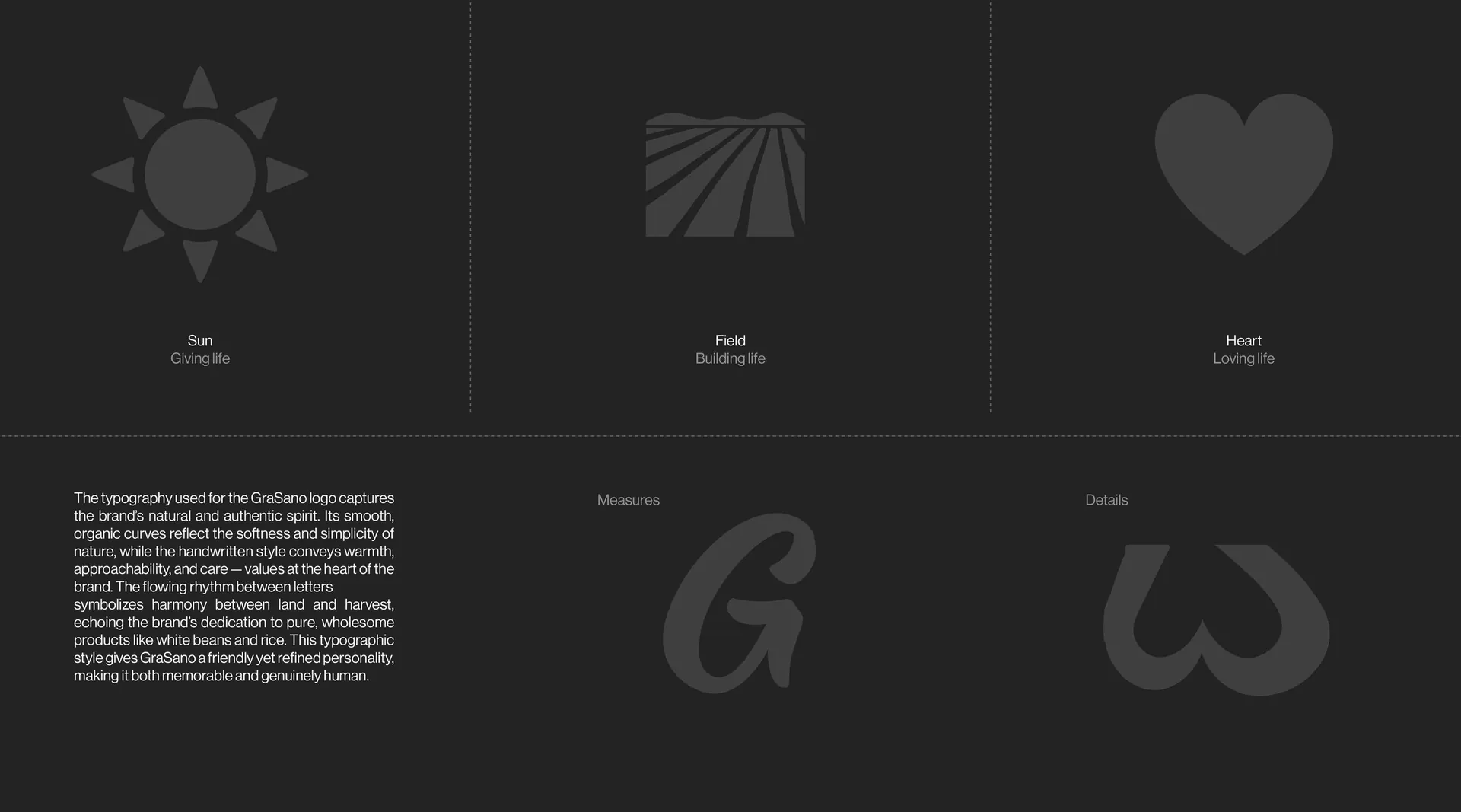
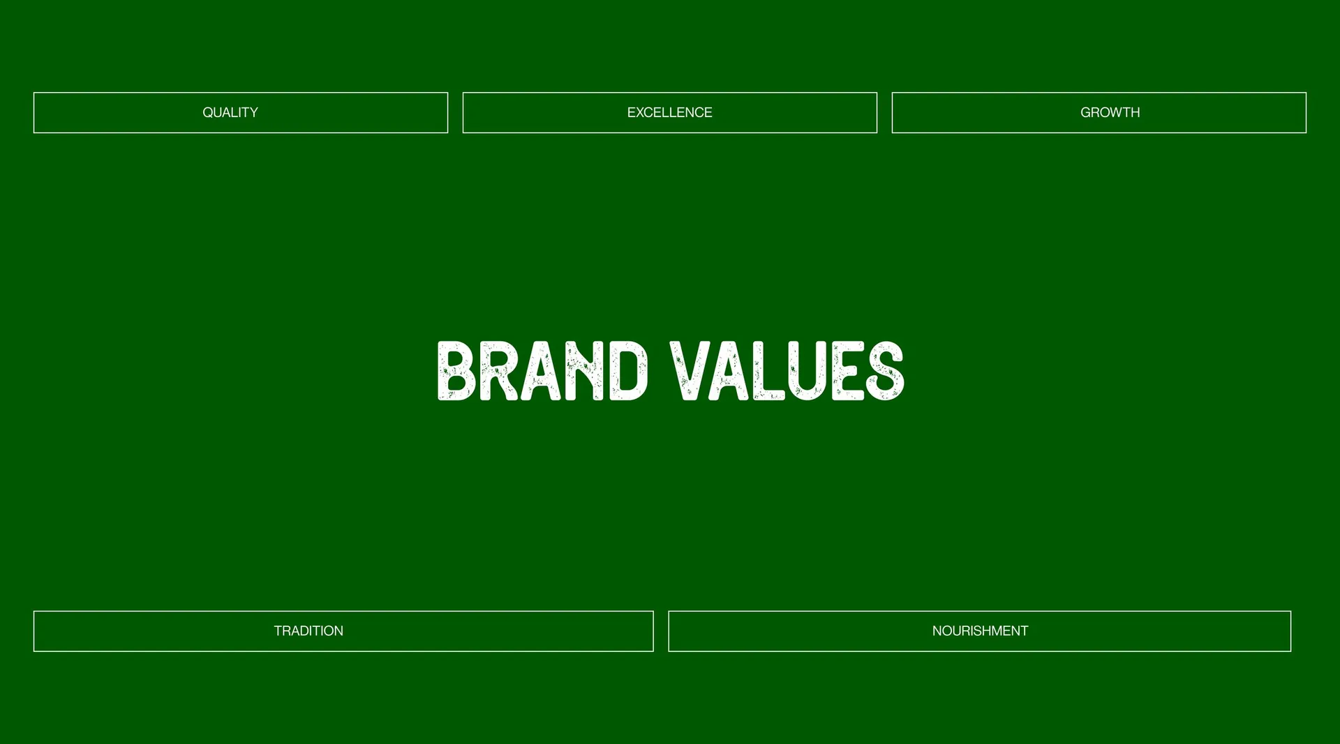
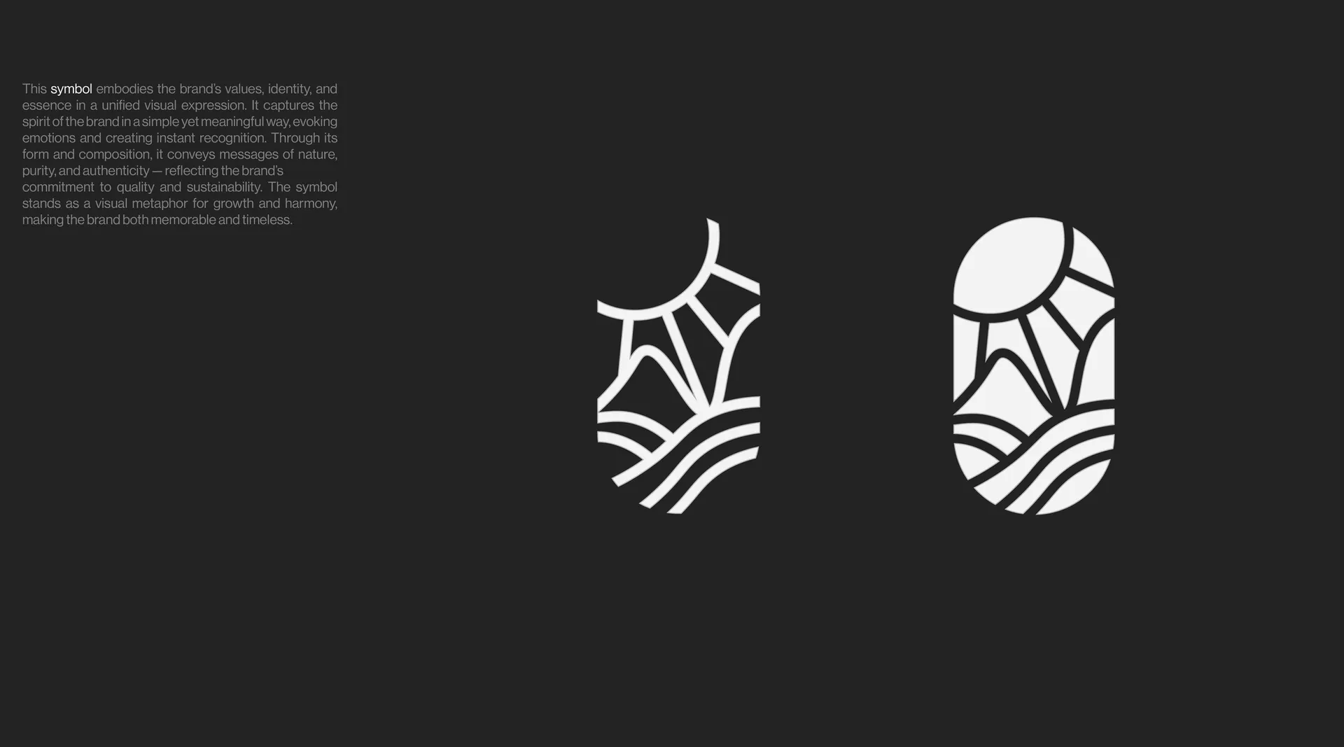
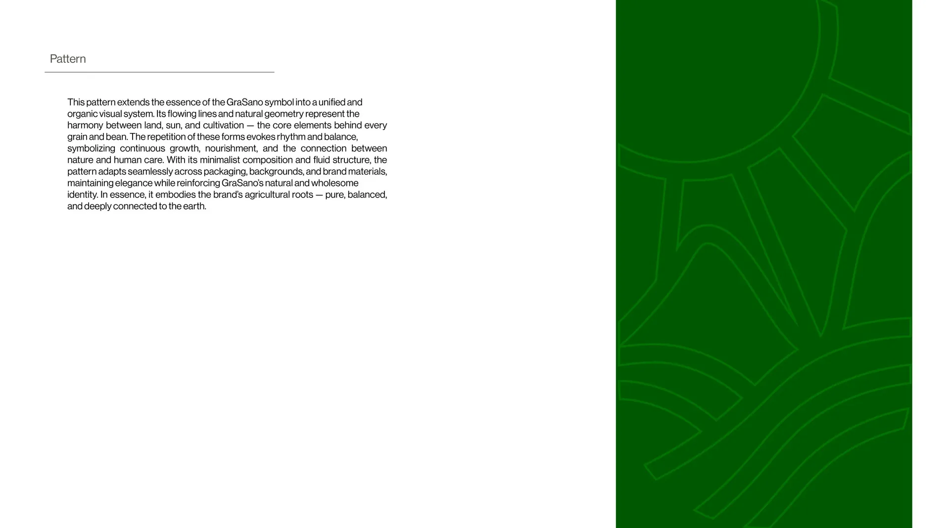
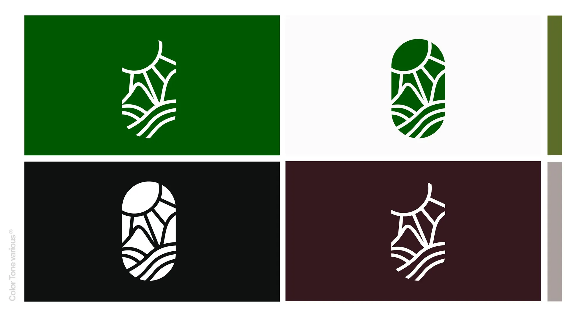
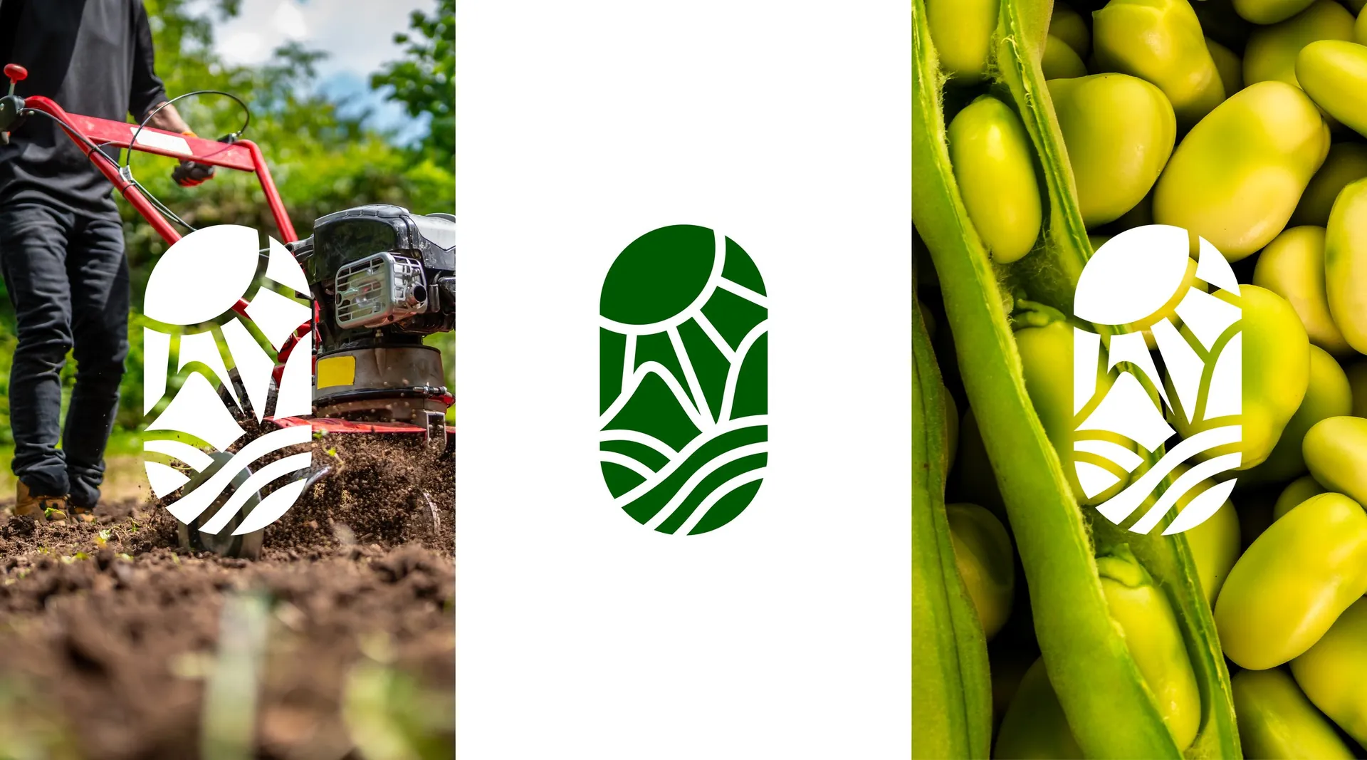
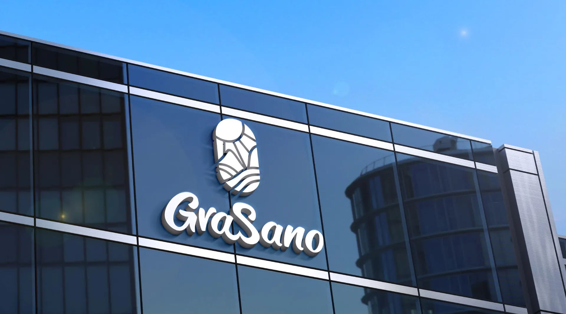
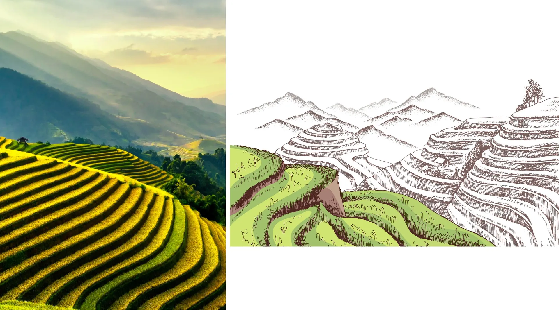
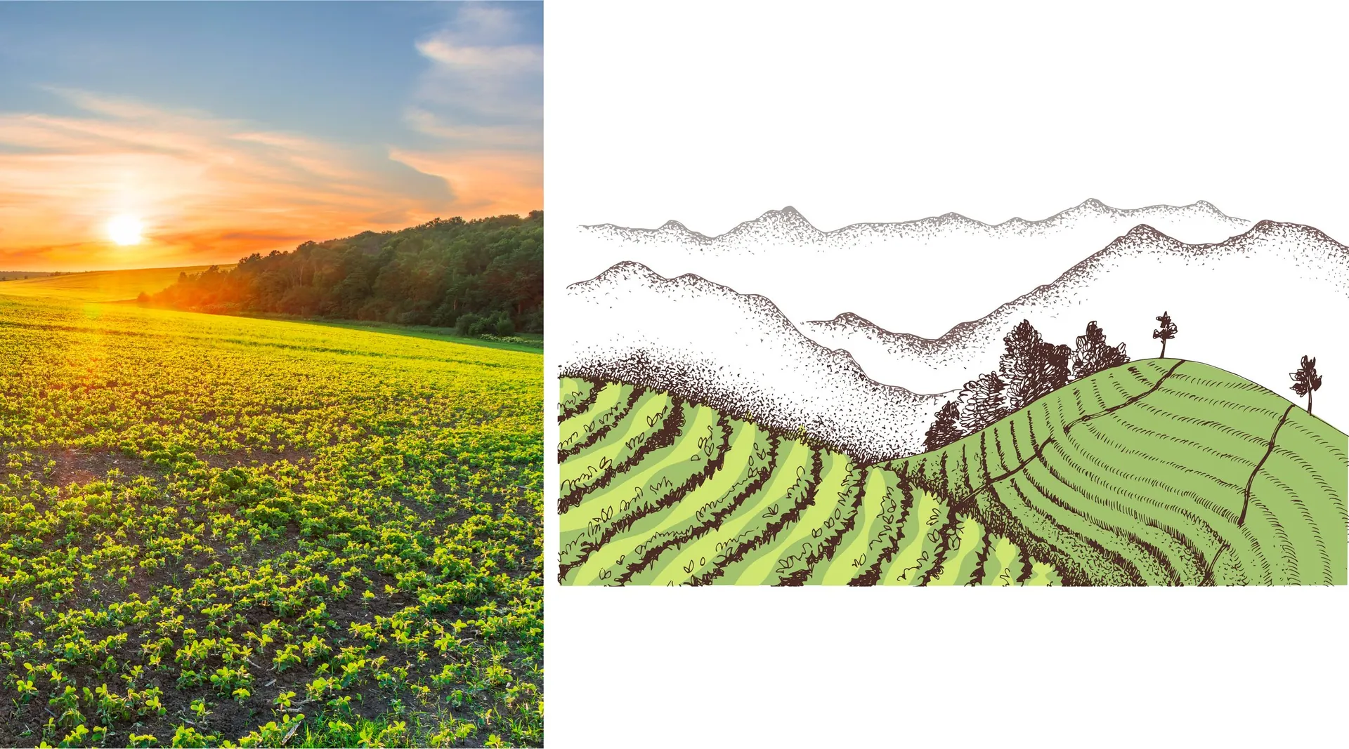
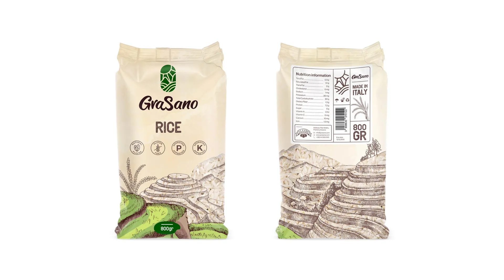
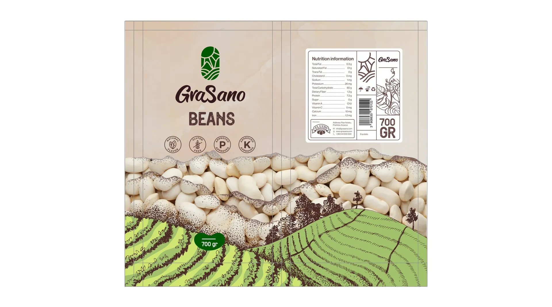
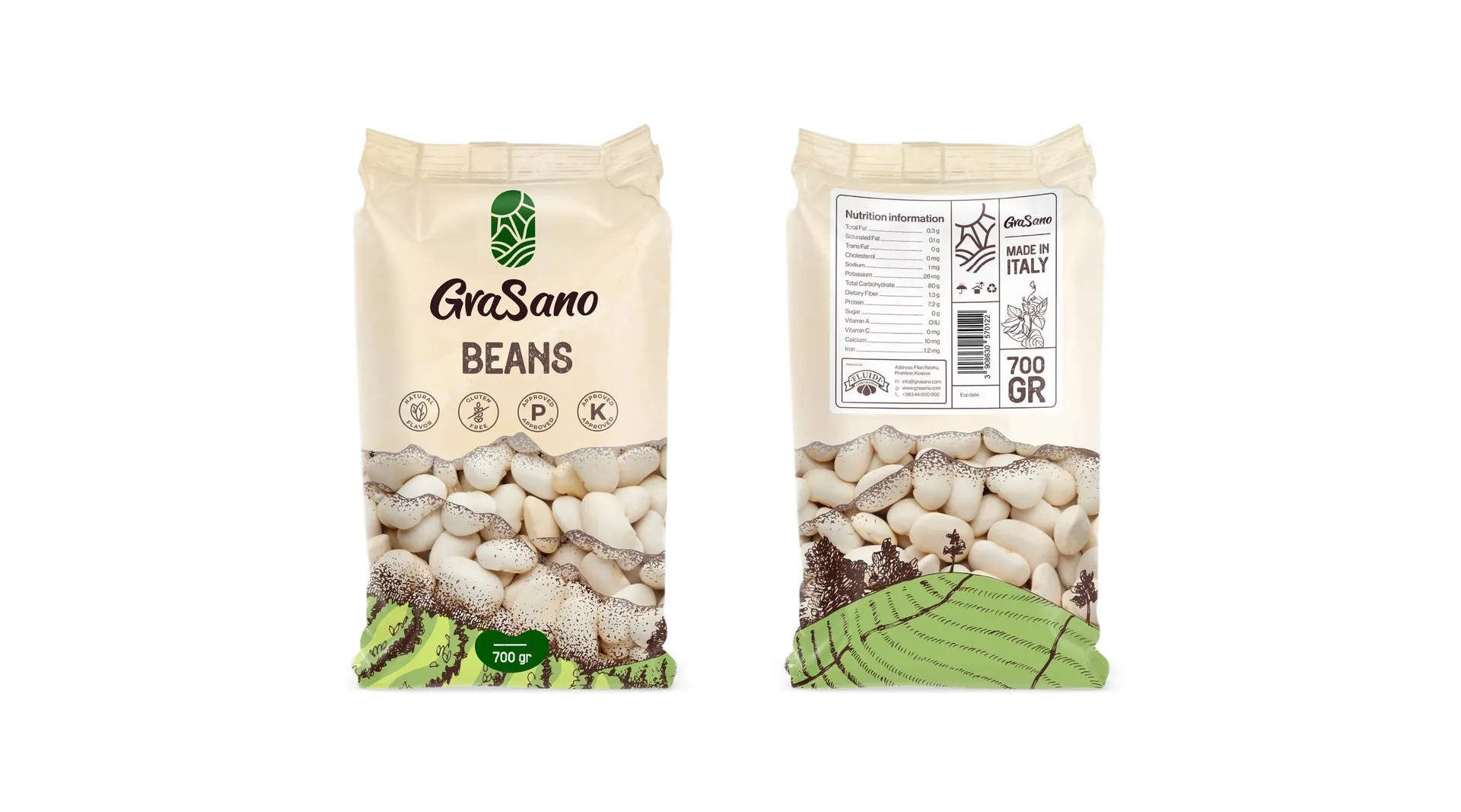
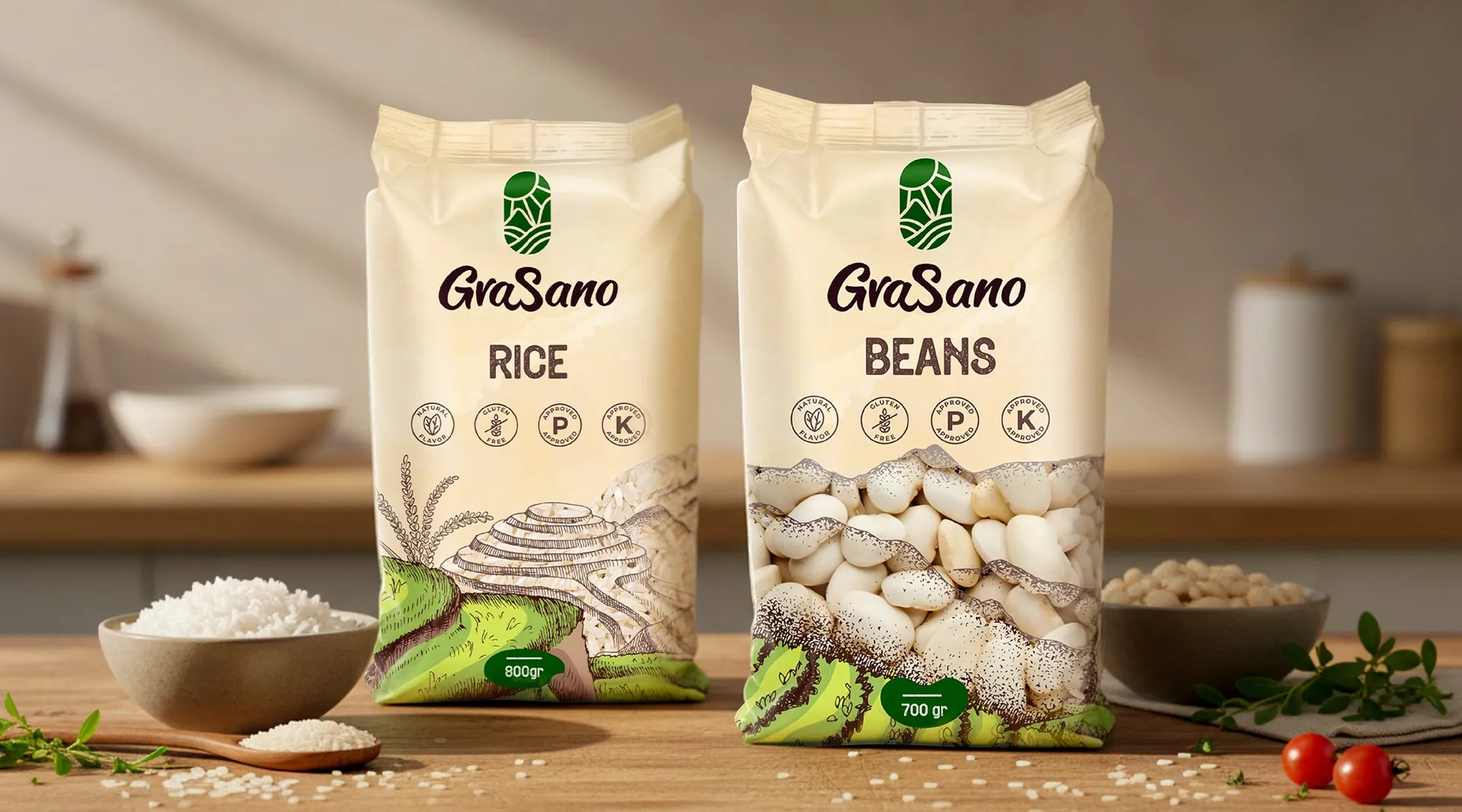
The symbol is a seed. Inside it sit a rising sun, ploughed fields and the outline of a heart, drawn from the brand’s values: quality, excellence, growth, tradition and nourishment. The wordmark is hand-lettered, with the G and S sharing a stroke. Deep green, soft cream and dark earth-brown carry the identity, and pencil-drawn terraces of farmland wrap the packs.
The result
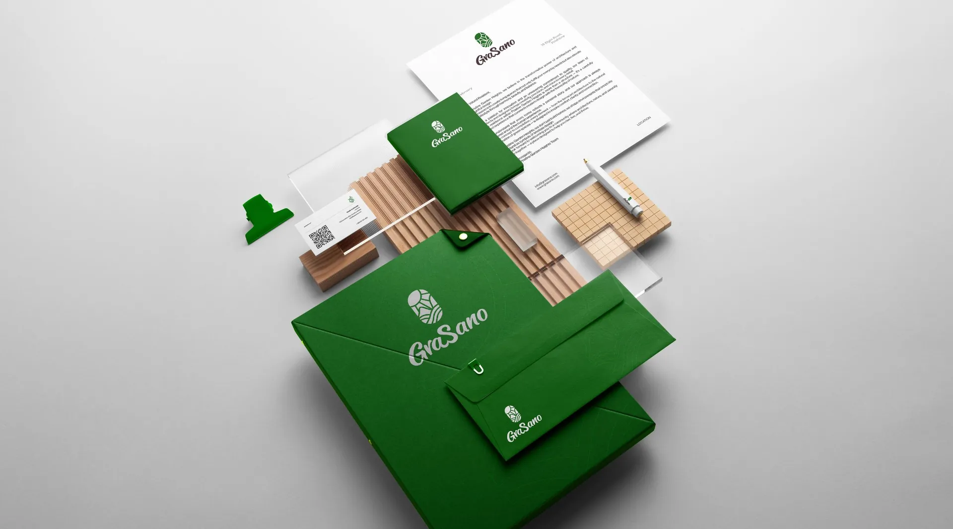
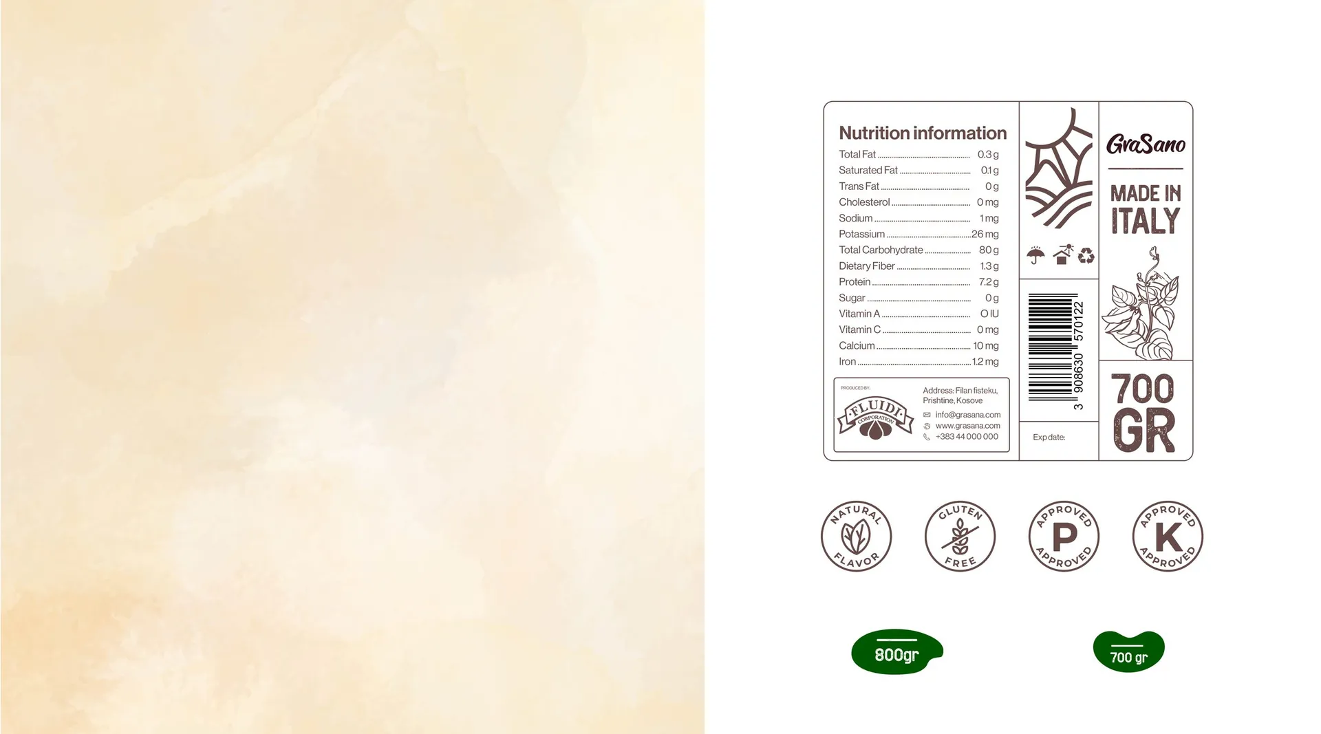
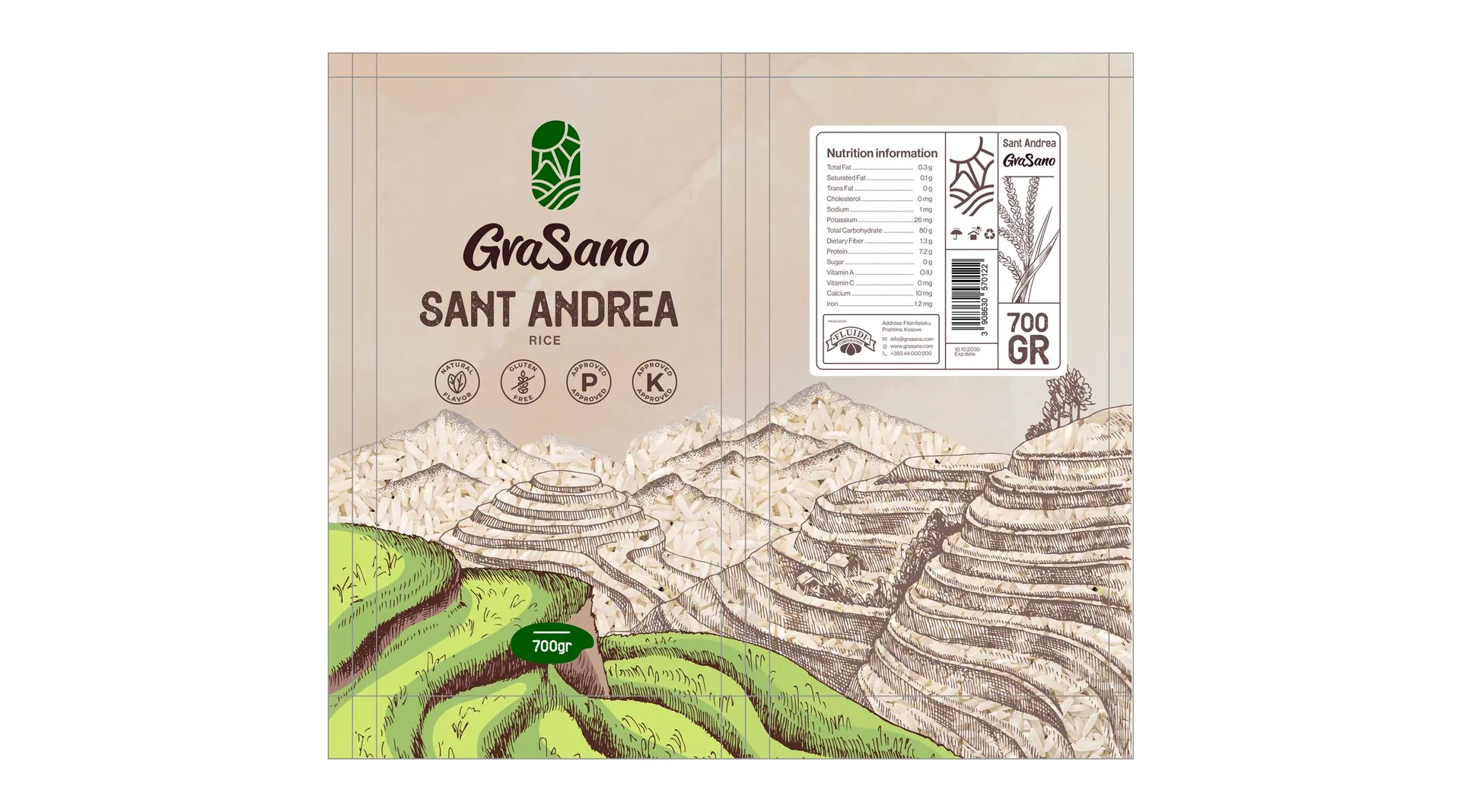
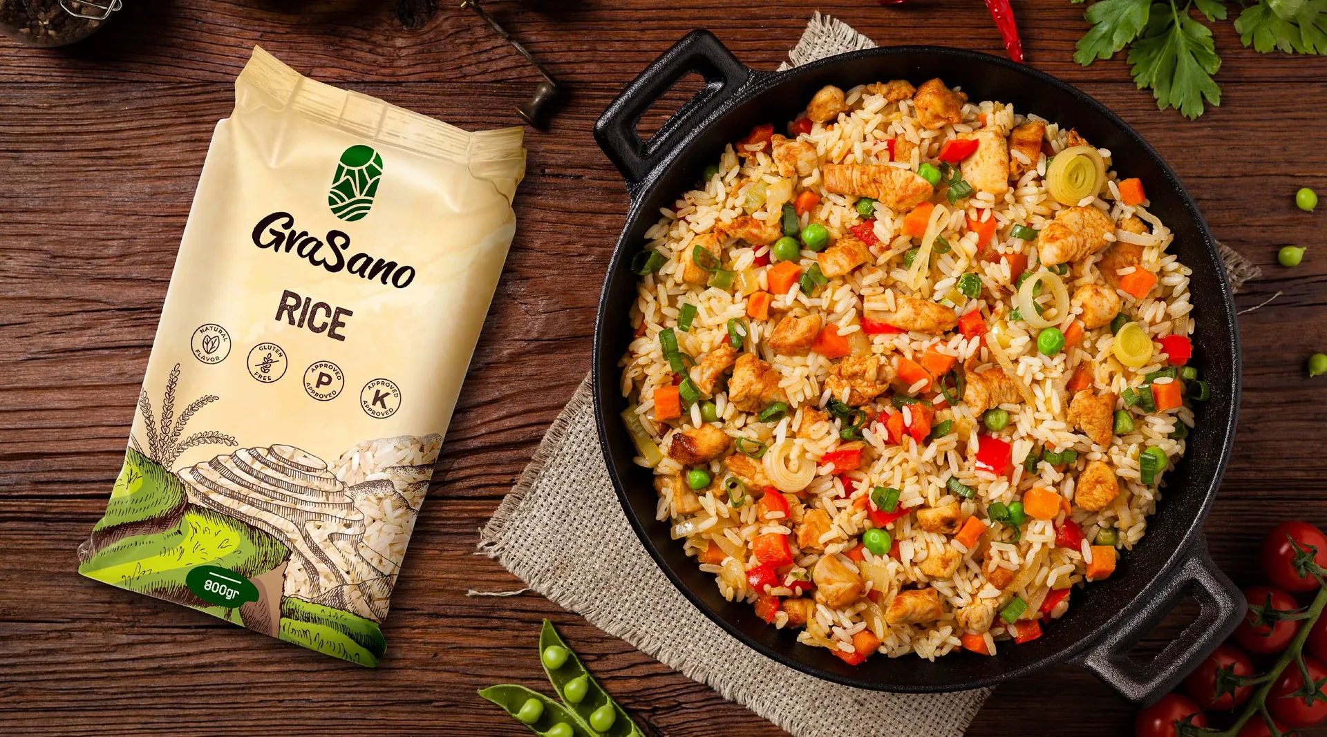
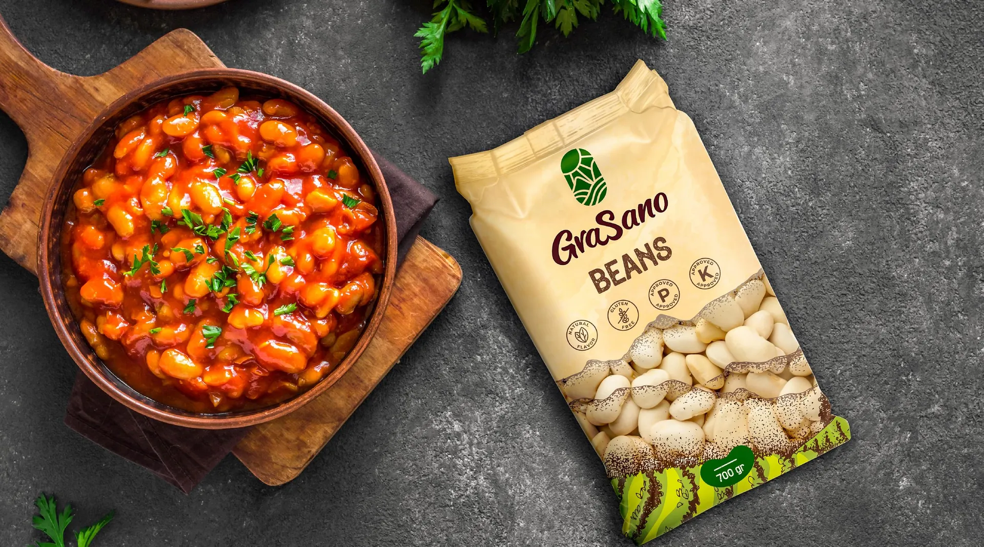
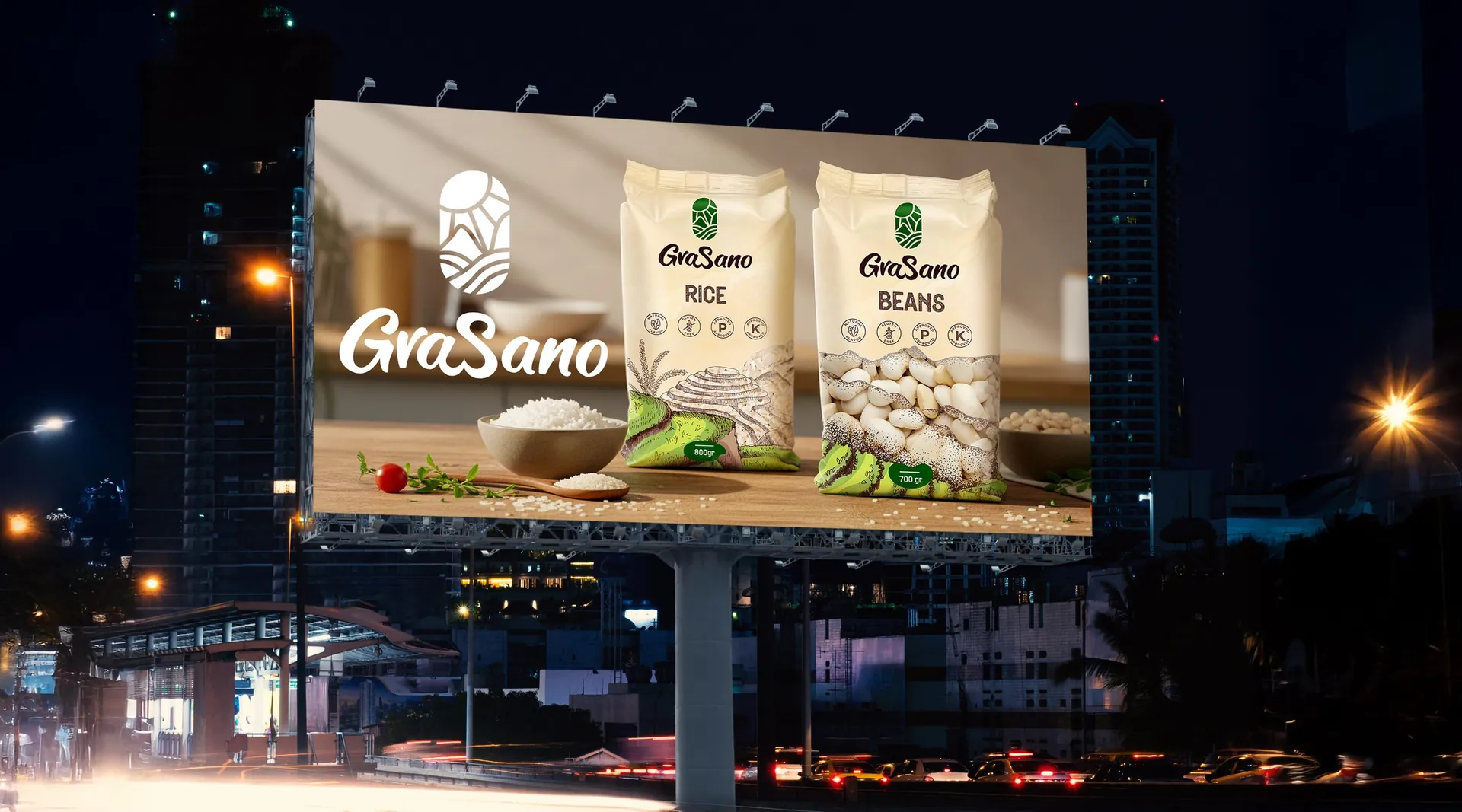
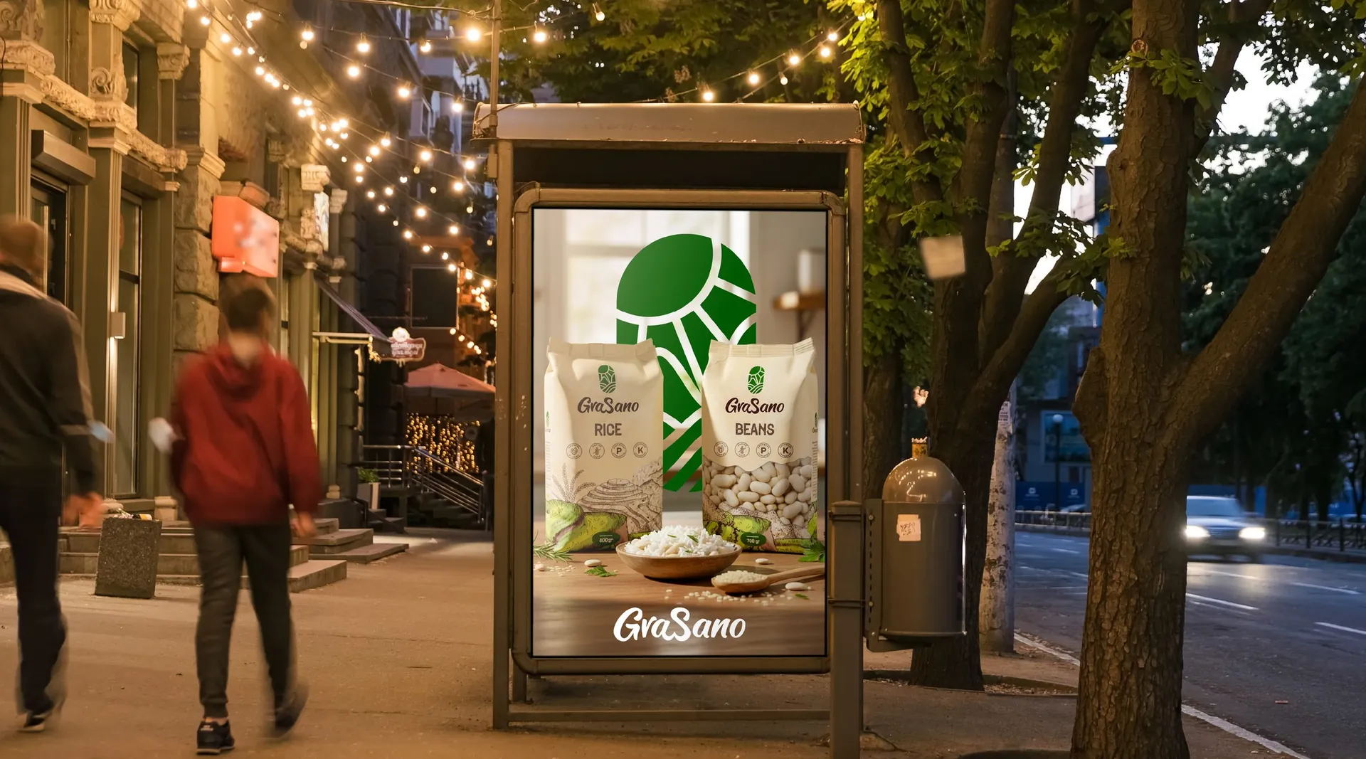
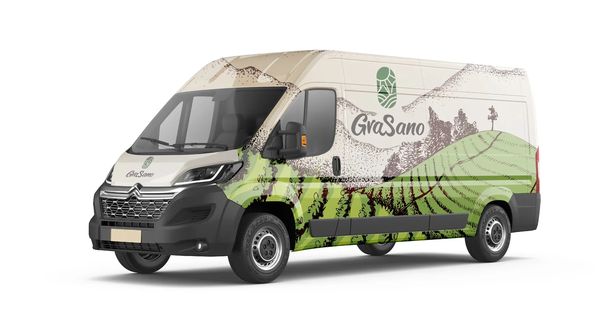
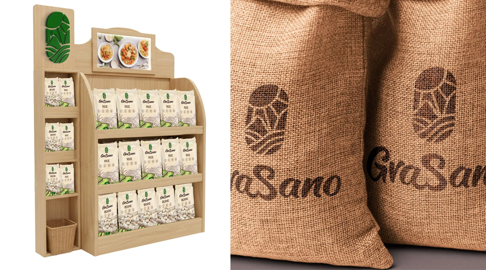
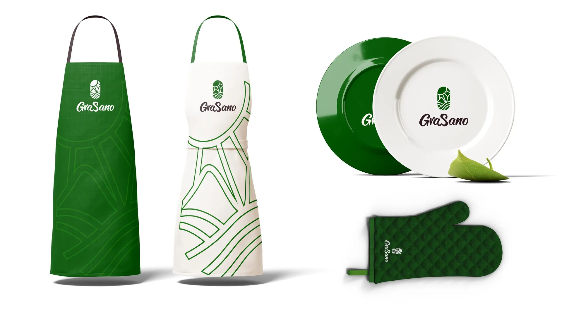
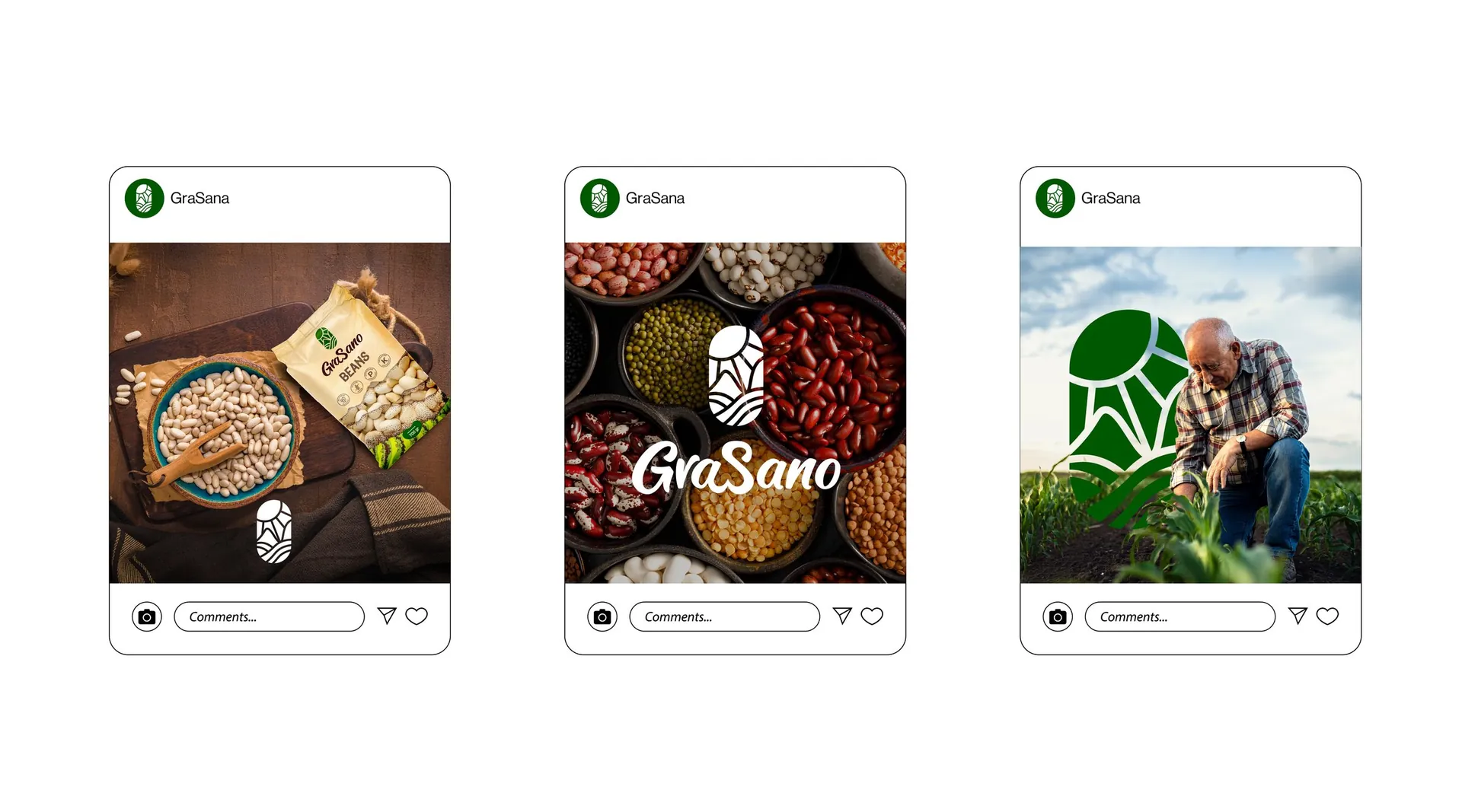
Logo and construction, colour system, pattern, stationery, packaging for rice and beans with nutrition panels, point-of-sale display, billboards and bus shelters, vehicle livery, aprons and tableware, and social media templates. The ketchup range and the social media work are shown as separate projects.

01 / 28

02 / 28

03 / 28


04 / 28

05 / 28

06 / 28

07 / 28

08 / 28

09 / 28

10 / 28

11 / 28

12 / 28

13 / 28

14 / 28

15 / 28

16 / 28

17 / 28

18 / 28

19 / 28

20 / 28

21 / 28

22 / 28

23 / 28

24 / 28

25 / 28

26 / 28

27 / 28

28 / 28