Logo design
- Client
- Ambero
- Year
- 2022
- Scope
- Logo, monogram, identity guidelines
- Industry
- Furniture & woodcraft
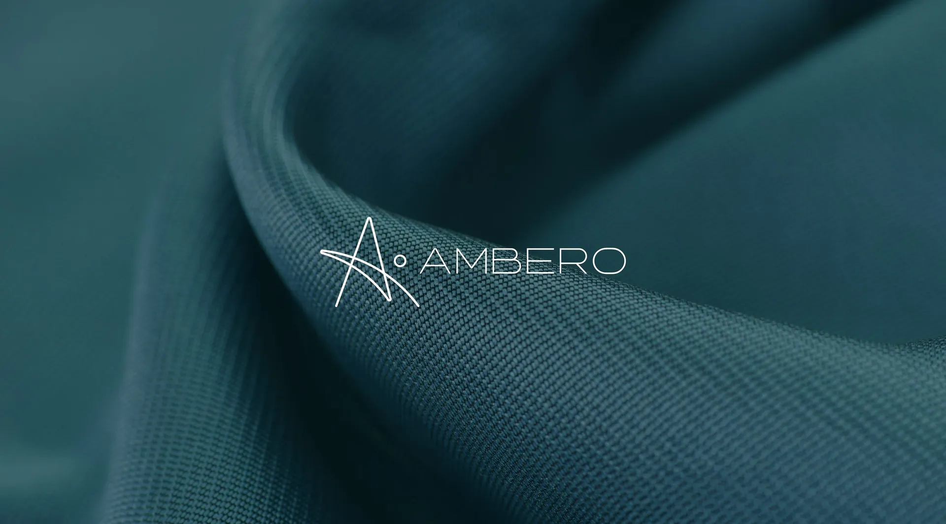
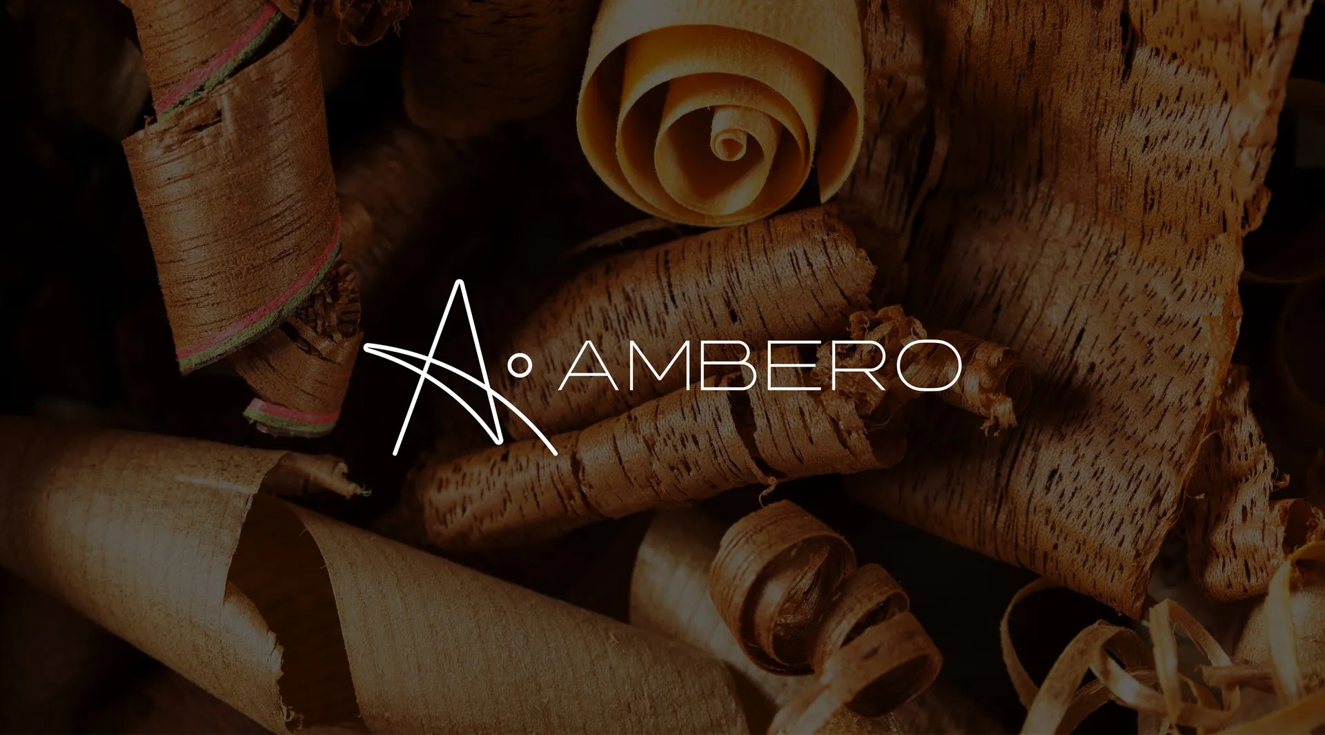
Ambero a mark drawn in a single line
The brief
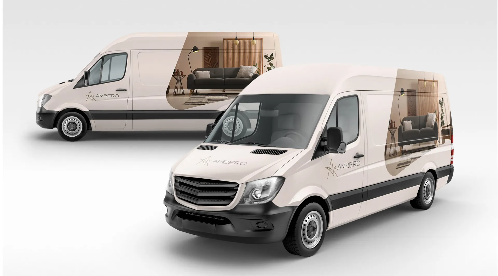
Ambero makes furniture from wood, and the brief was to give it a mark that feels made by hand rather than by machine. Wood stands for home, history and care; the identity had to carry that warmth and still look precise enough for a showroom facade, a product catalogue and a delivery van.
The idea
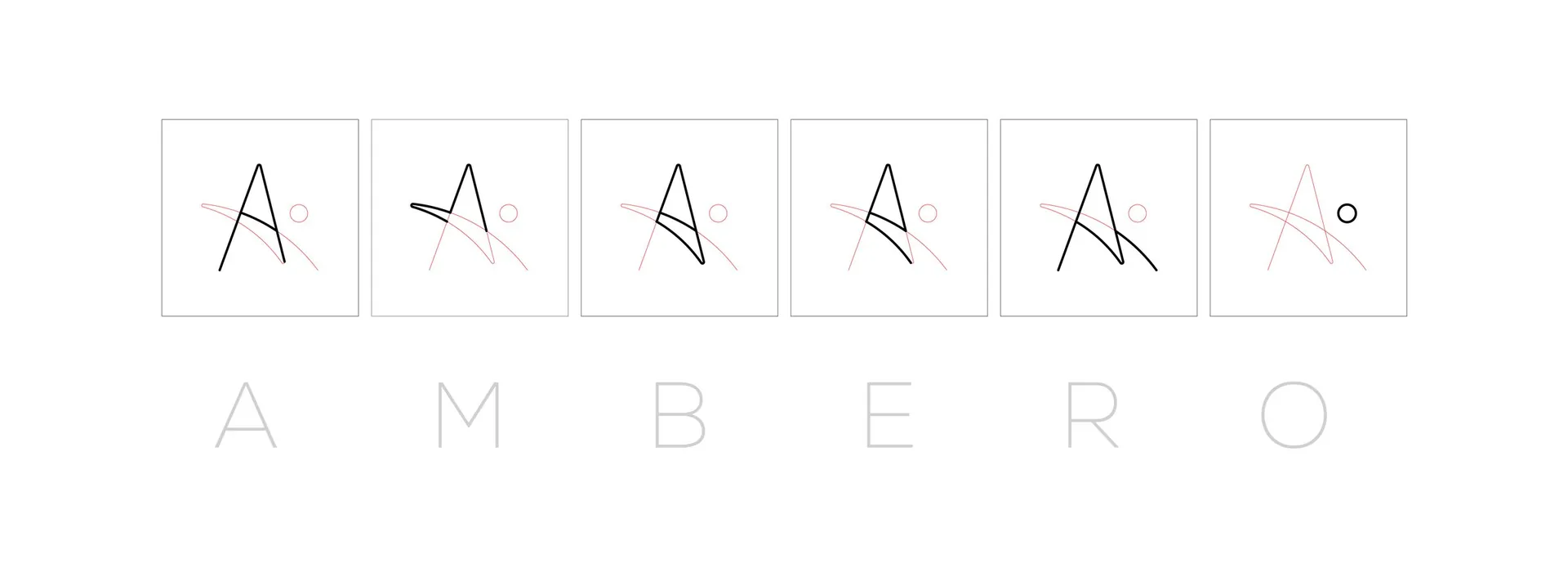
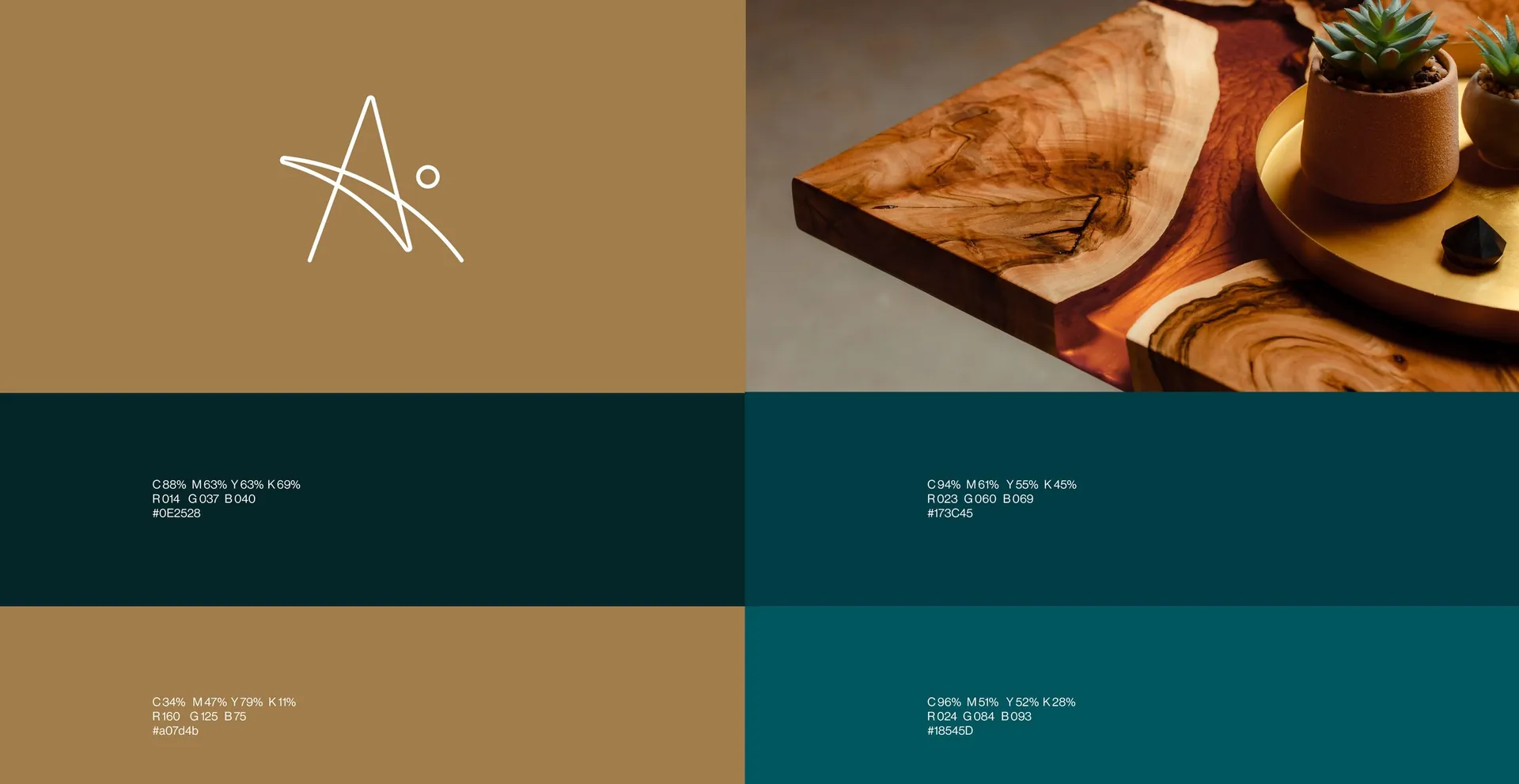
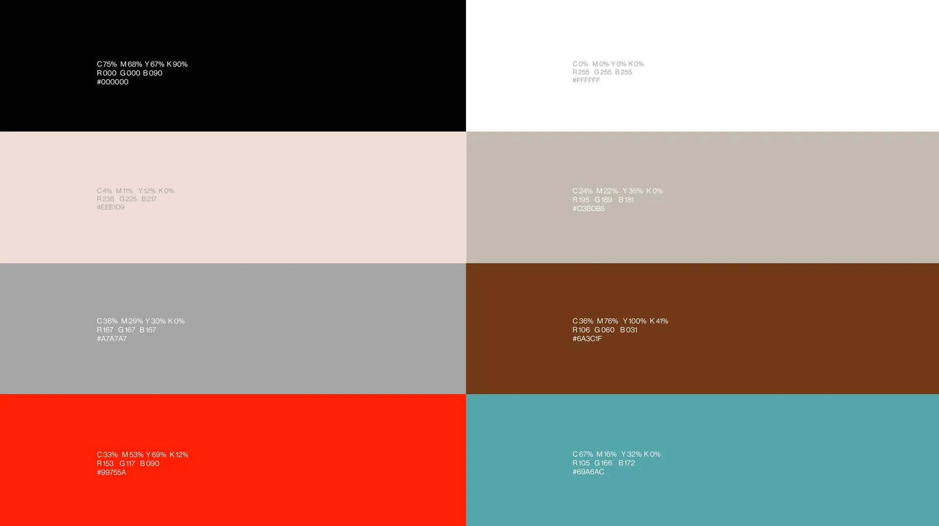
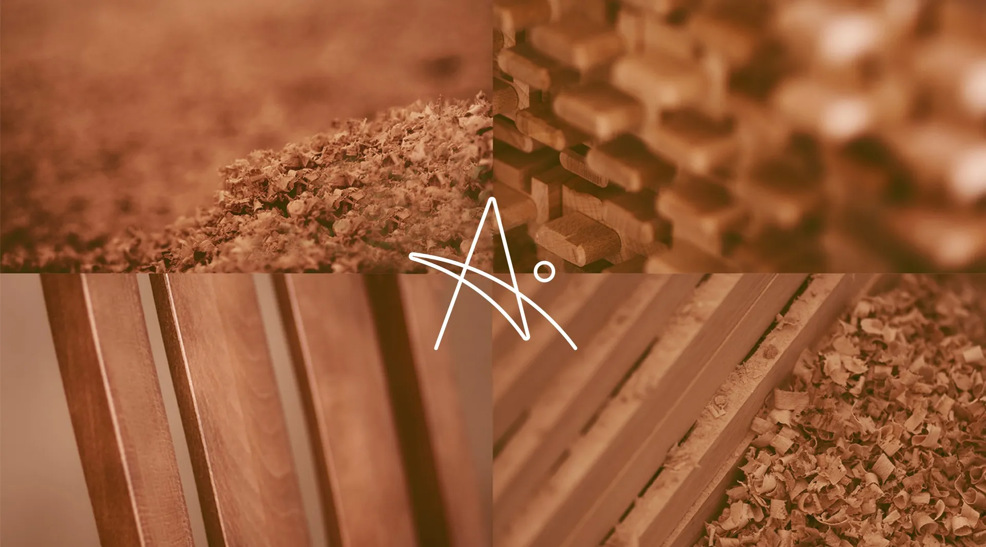
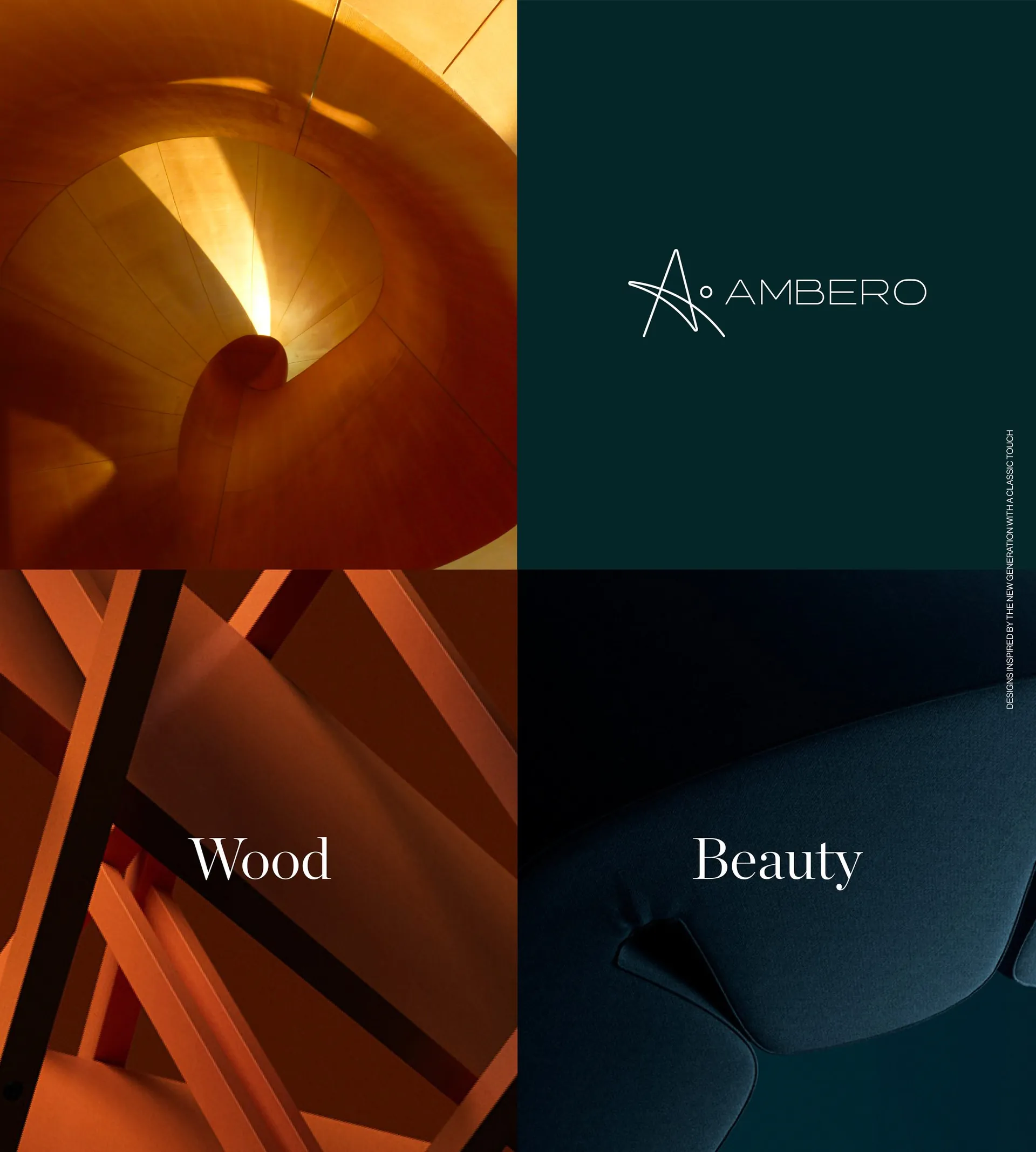
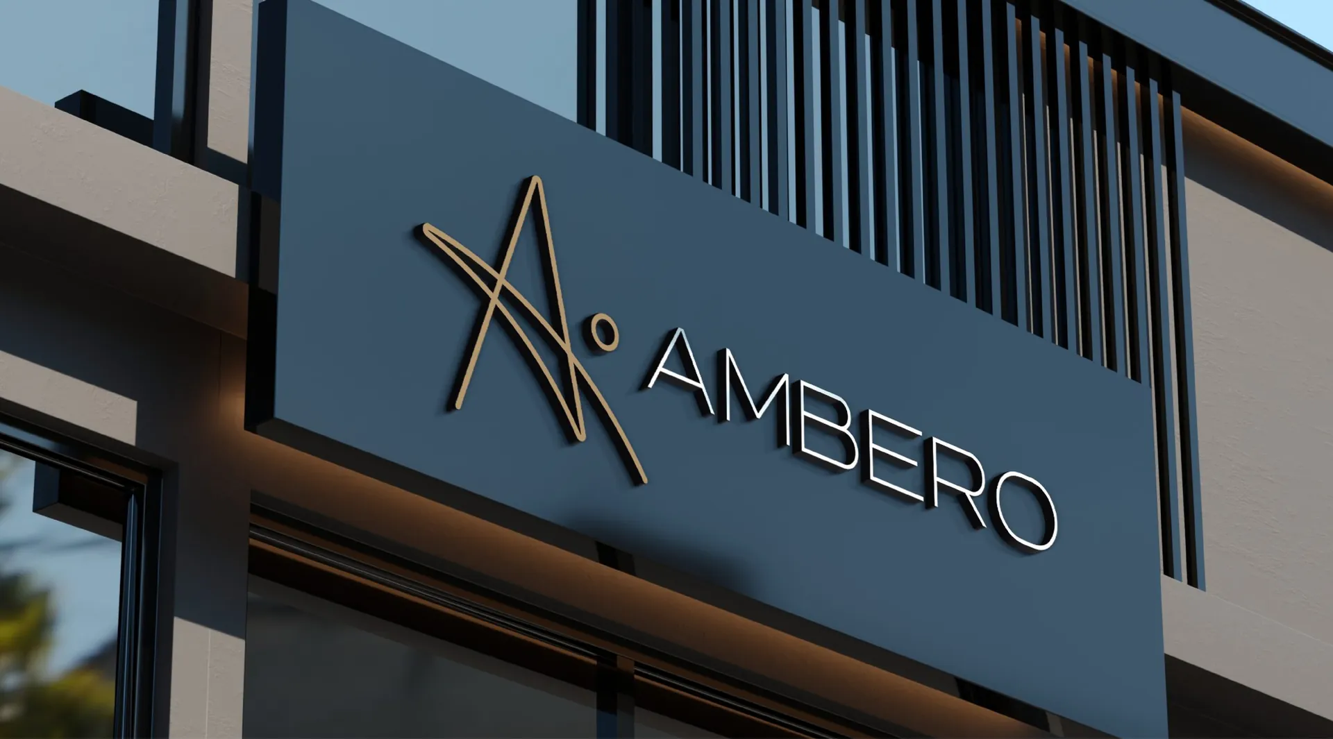
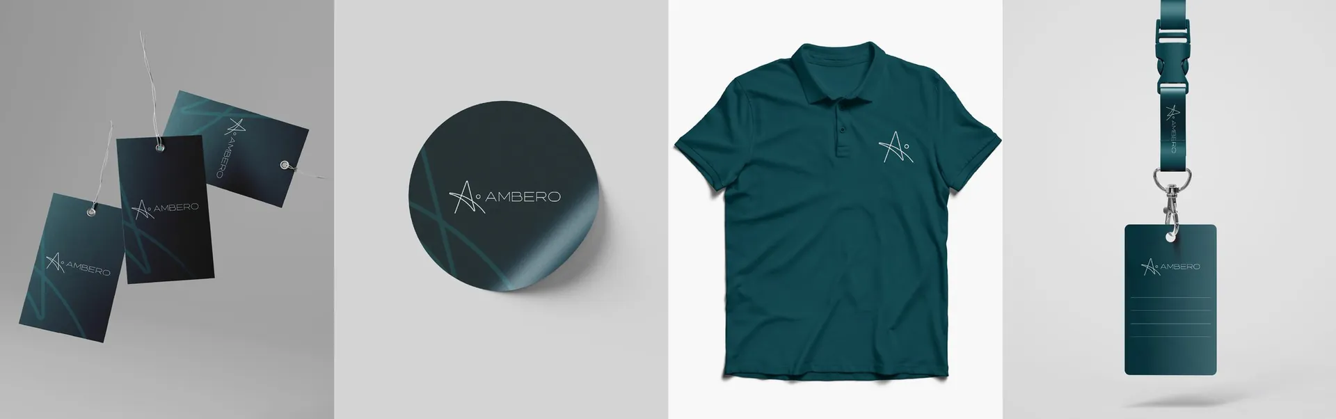
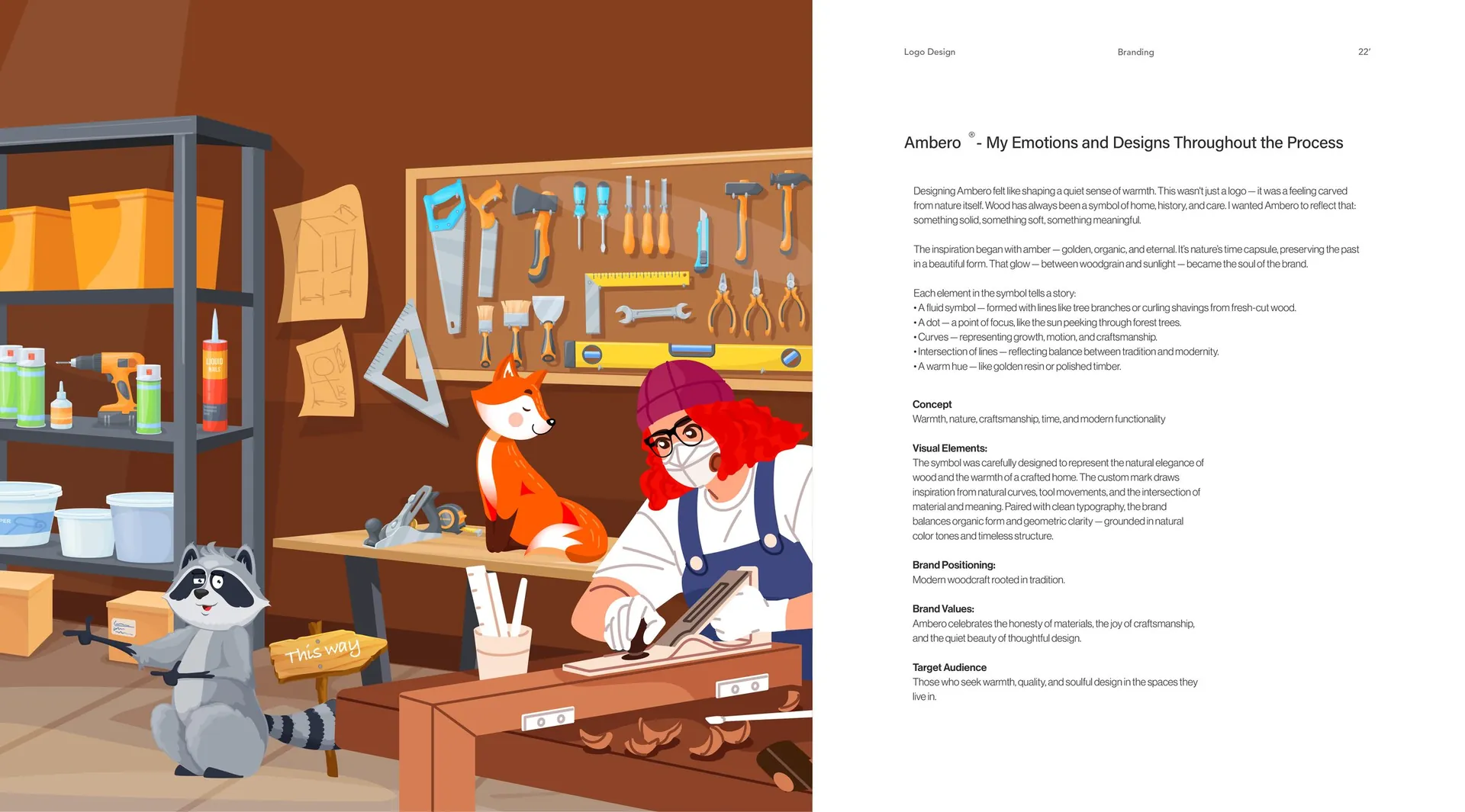
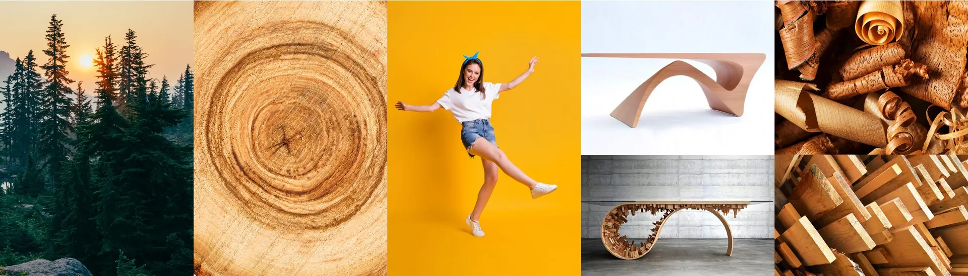
The name comes from amber, the golden resin that holds time still, and the symbol follows it: an A drawn in one fluid line, like a curl of fresh-cut wood, with a single dot where the sun breaks through the trees. The curves stand for growth and craft, the crossing lines for the balance between tradition and modern making. The palette pairs amber gold with deep teal and natural timber tones, and a light, widely spaced wordmark lets the symbol do the talking.
The result
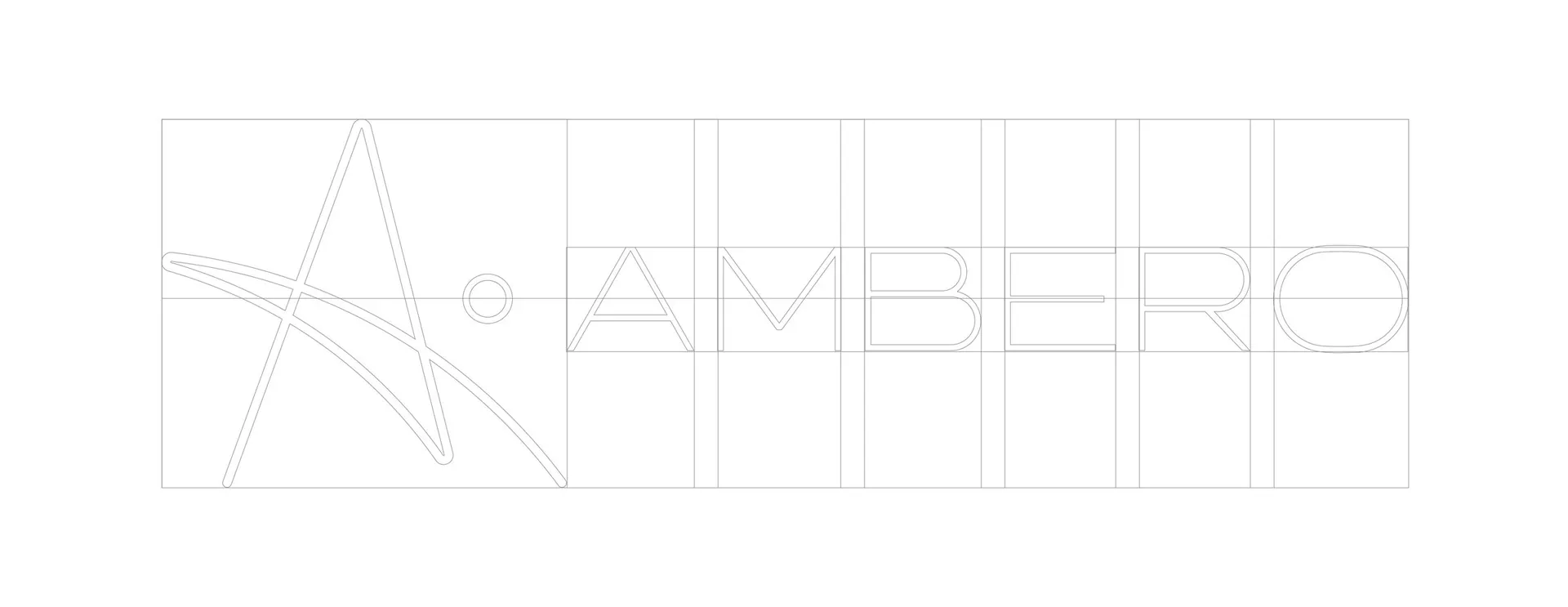
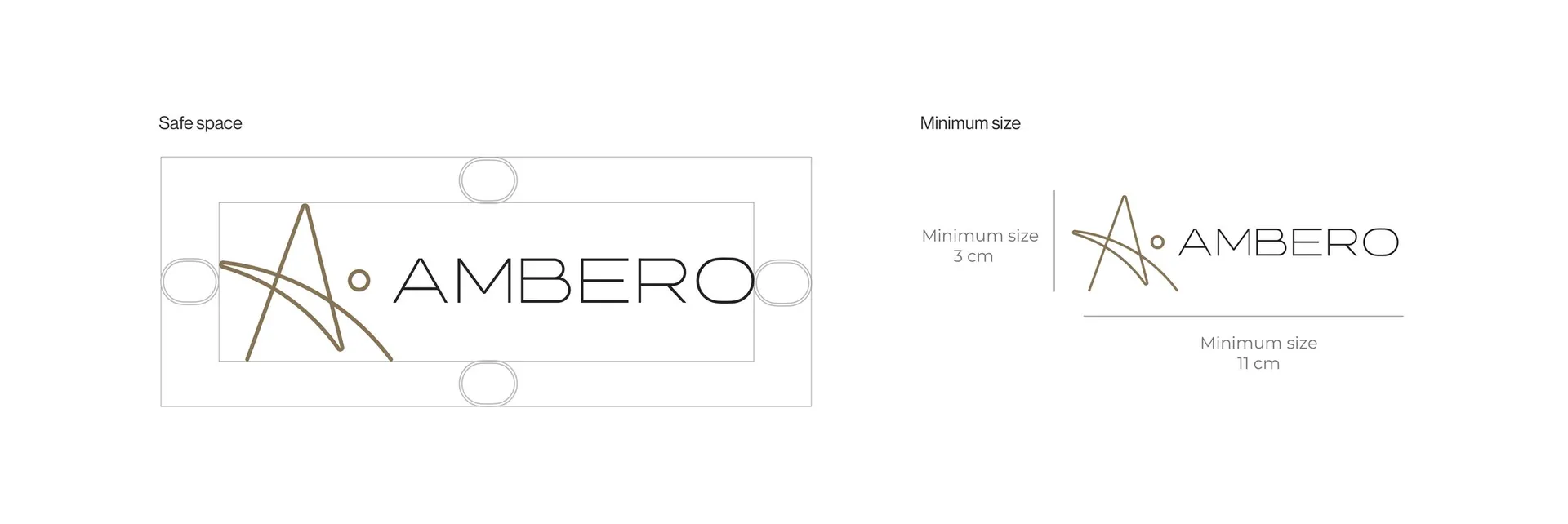
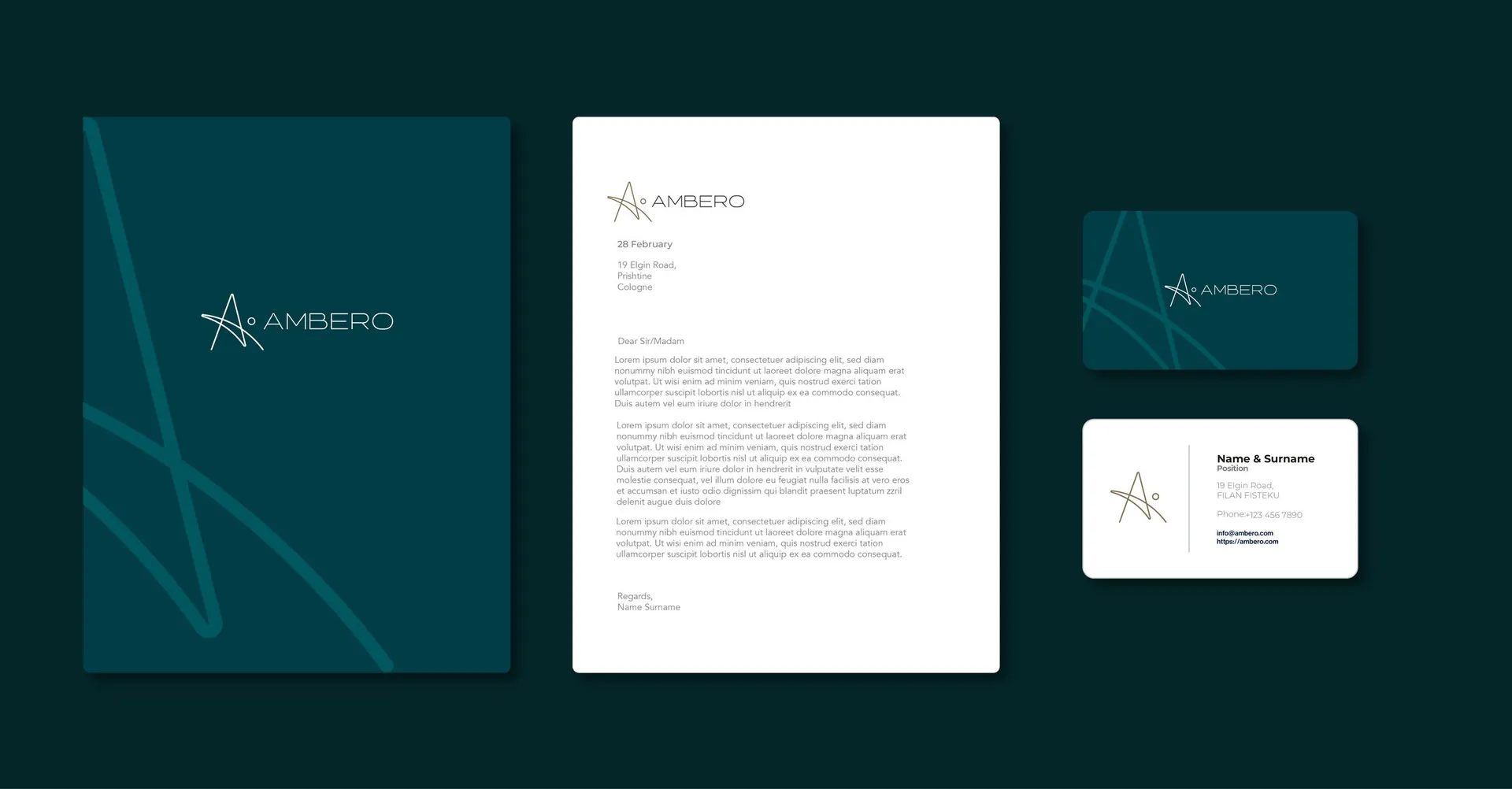
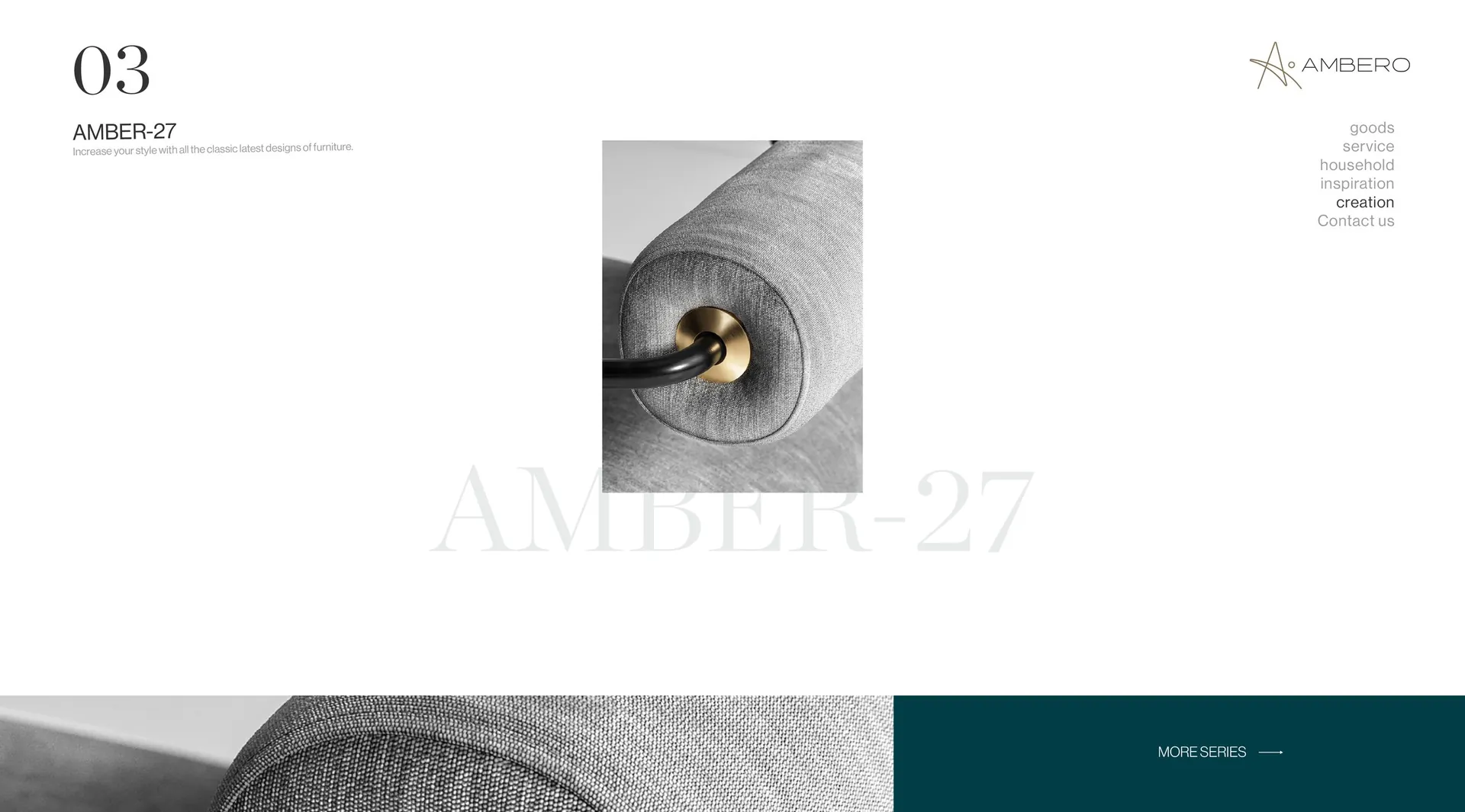
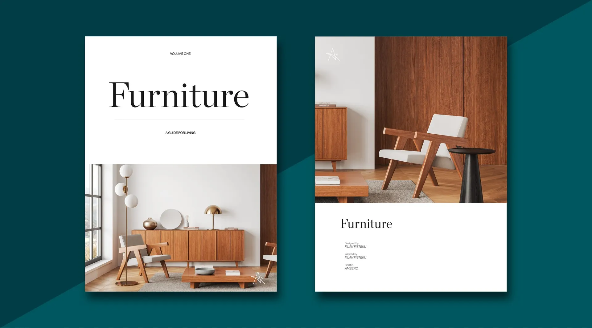
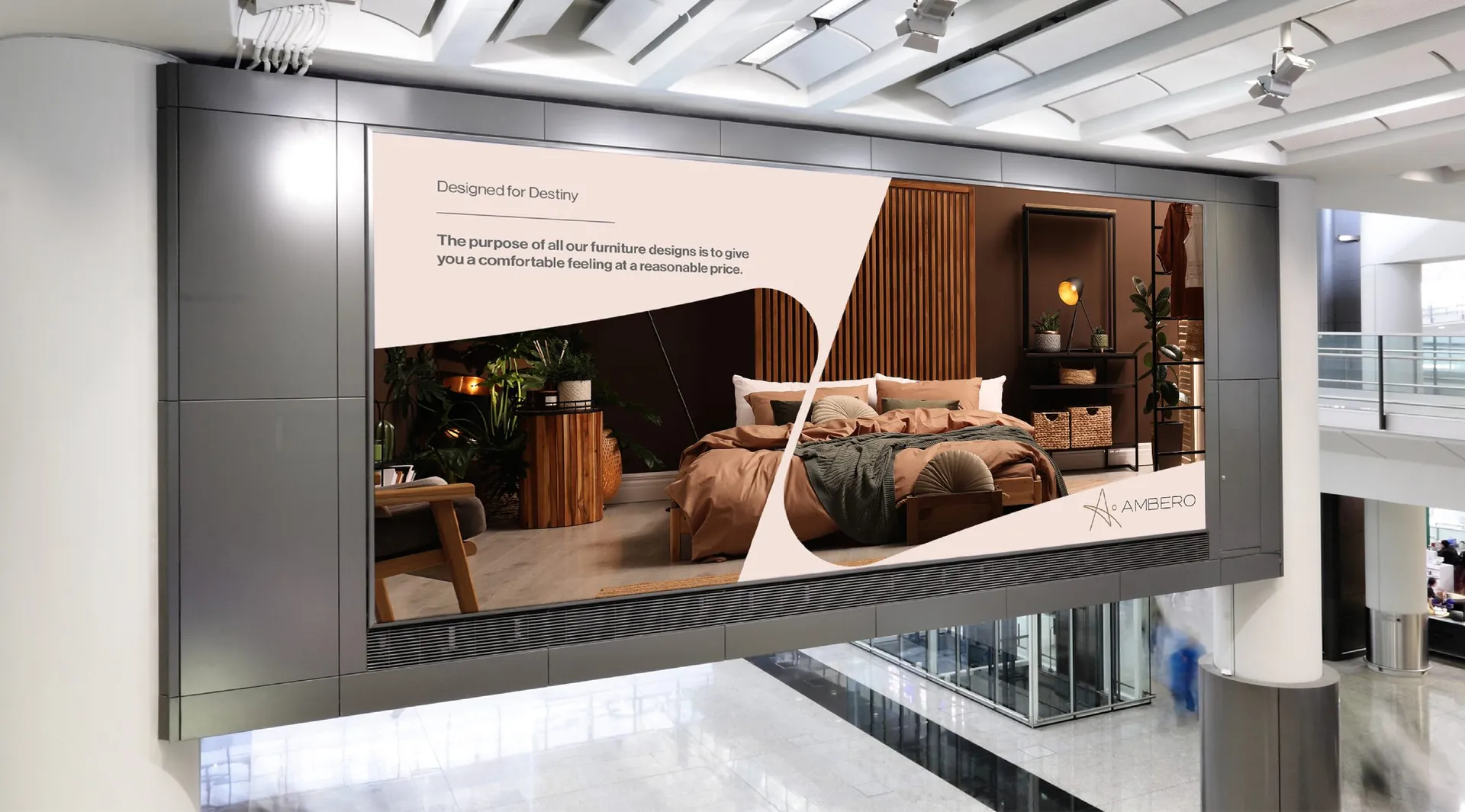
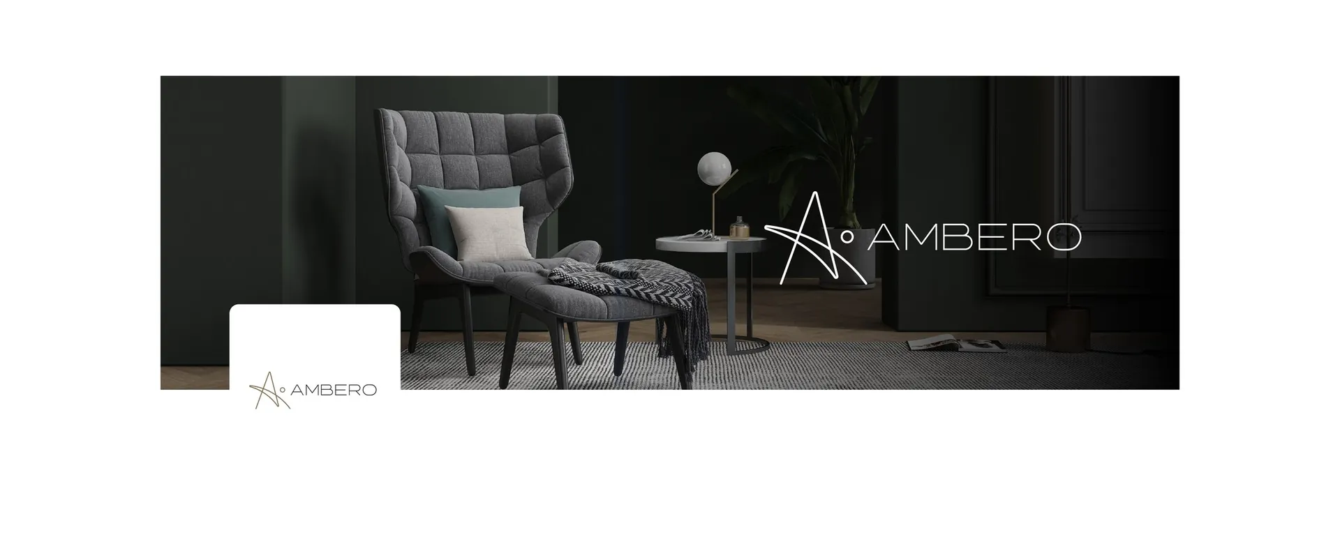
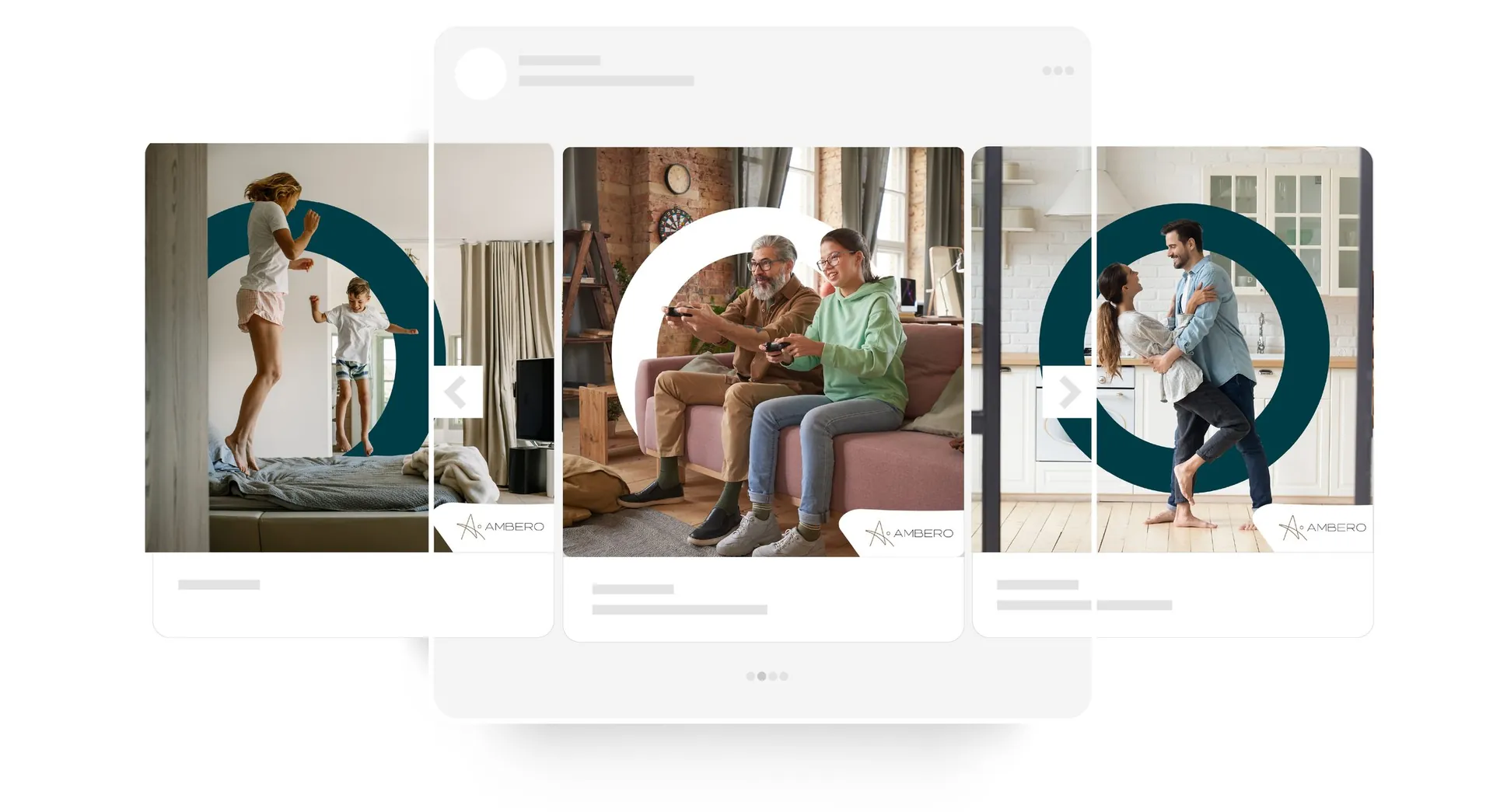
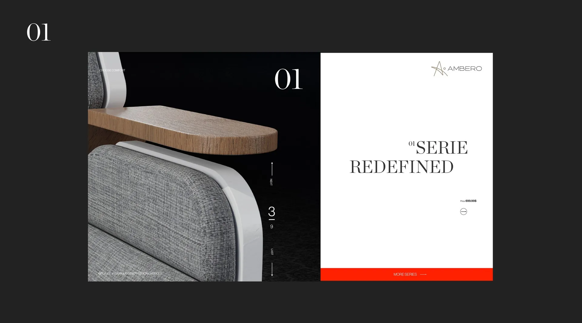
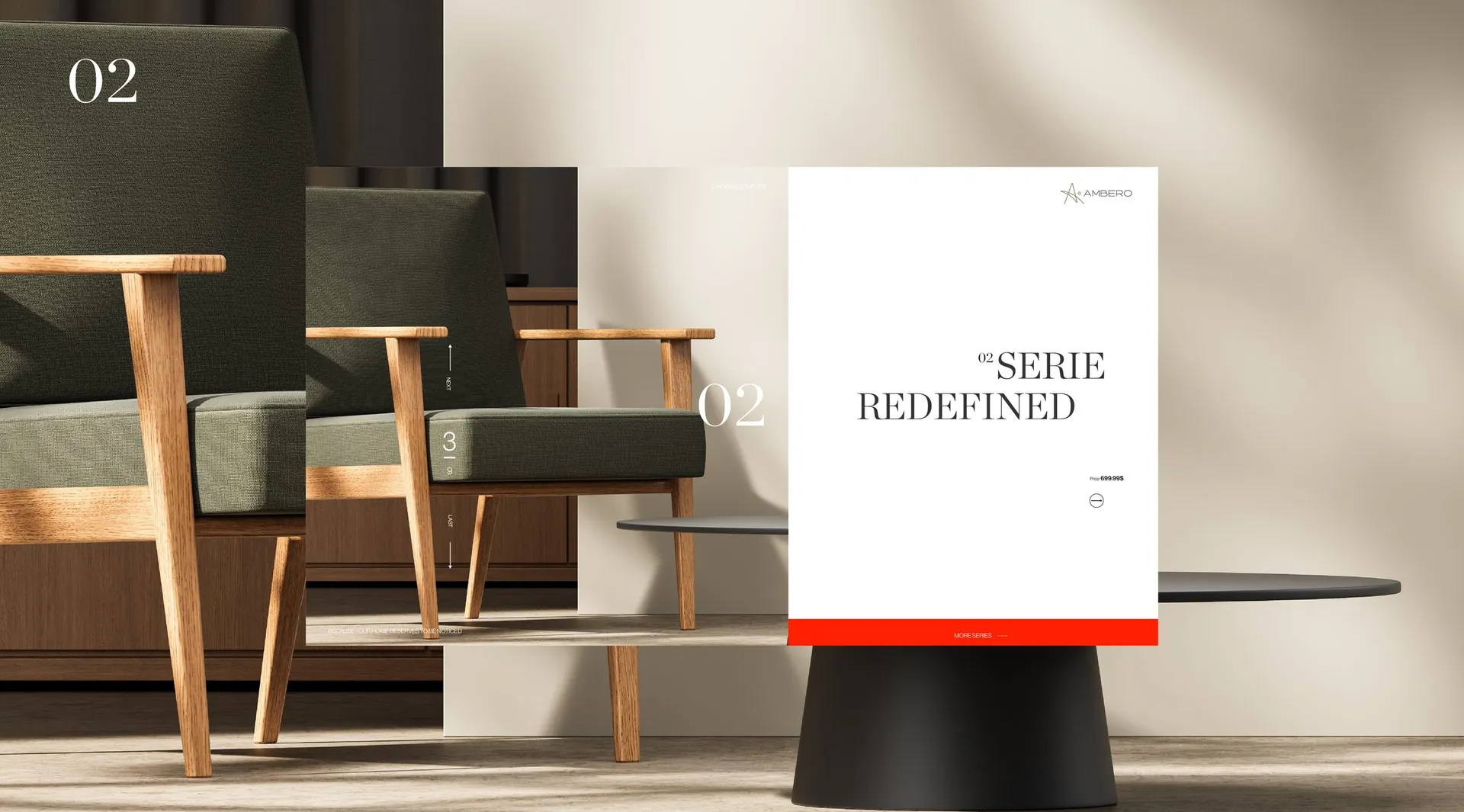
A complete identity: logo and construction grid, clear space and minimum sizes, colour system, textures and pattern, stationery, catalogue layouts for the furniture series, showroom signage, vehicle livery, billboard, workwear and digital templates. Positioning in one line: modern woodcraft rooted in tradition.

01 / 24

02 / 24

03 / 24

04 / 24

05 / 24

06 / 24

07 / 24

08 / 24

09 / 24

10 / 24

11 / 24

12 / 24

13 / 24

14 / 24

15 / 24

16 / 24

17 / 24

18 / 24

19 / 24

20 / 24

21 / 24

22 / 24

23 / 24

24 / 24