Logo design
- Client
- Go
- Year
- 2025
- Scope
- Logo, identity, packaging, campaign, signage, digital
- Industry
- Sexual health & contraception
Go two letters locked into one bold mark
The brief
Go is a condom brand, and it wanted to talk about protection the way people actually talk about sex: direct, playful, a little provocative. The identity had to work on a small foil wrapper and on a billboard, and feel like nightlife rather than pharmacy. The line that holds it together: Safe is sexy.
The idea
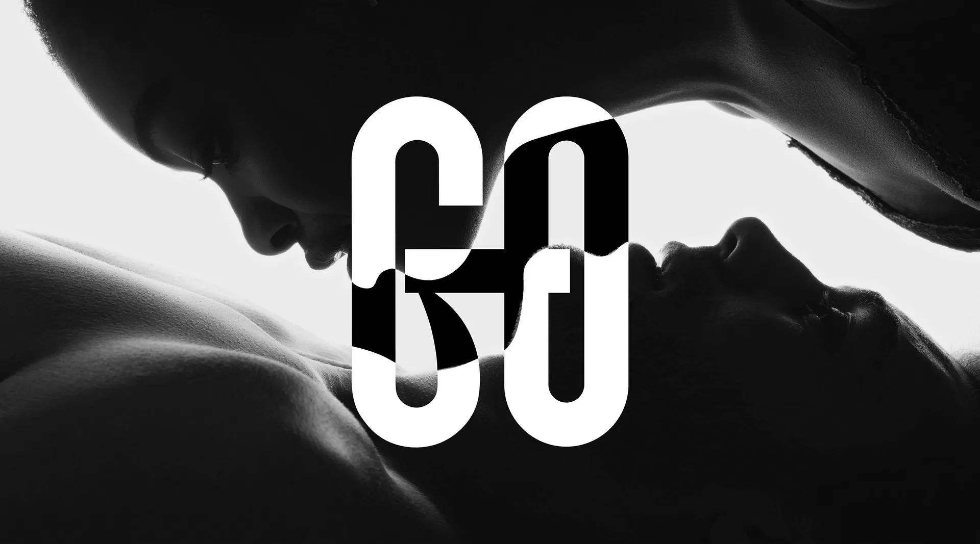
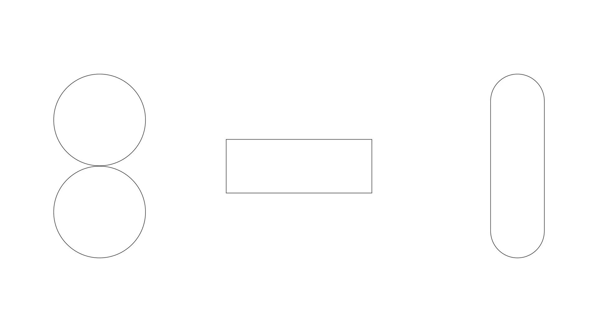
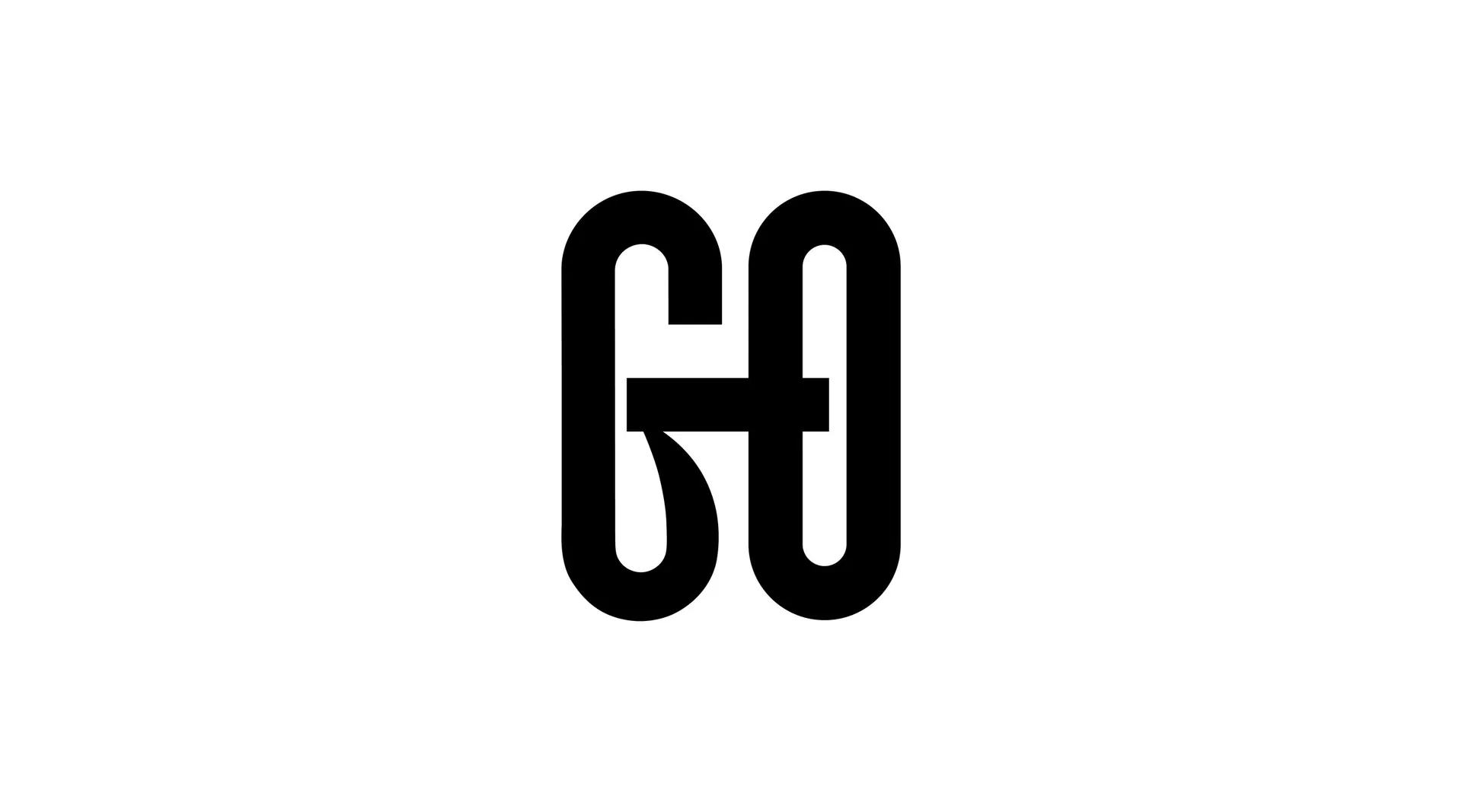
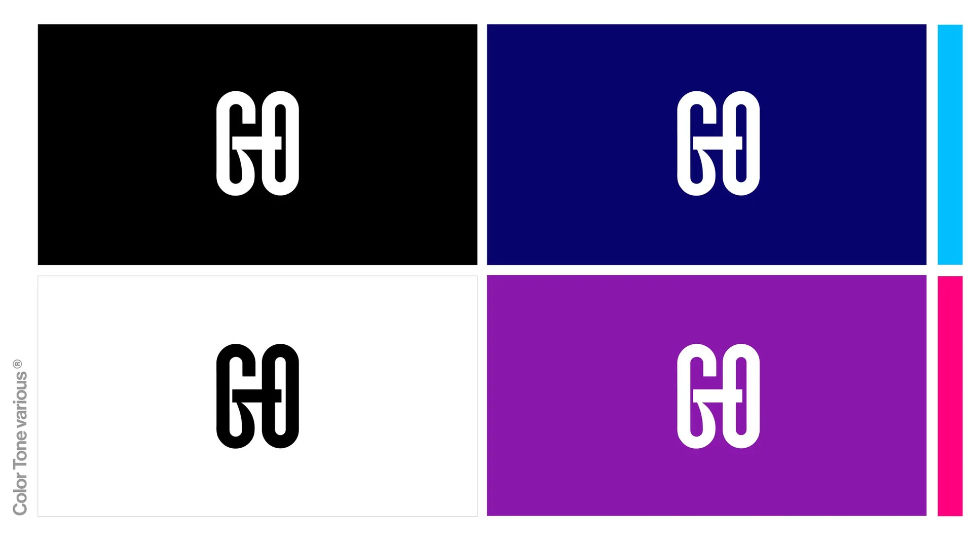
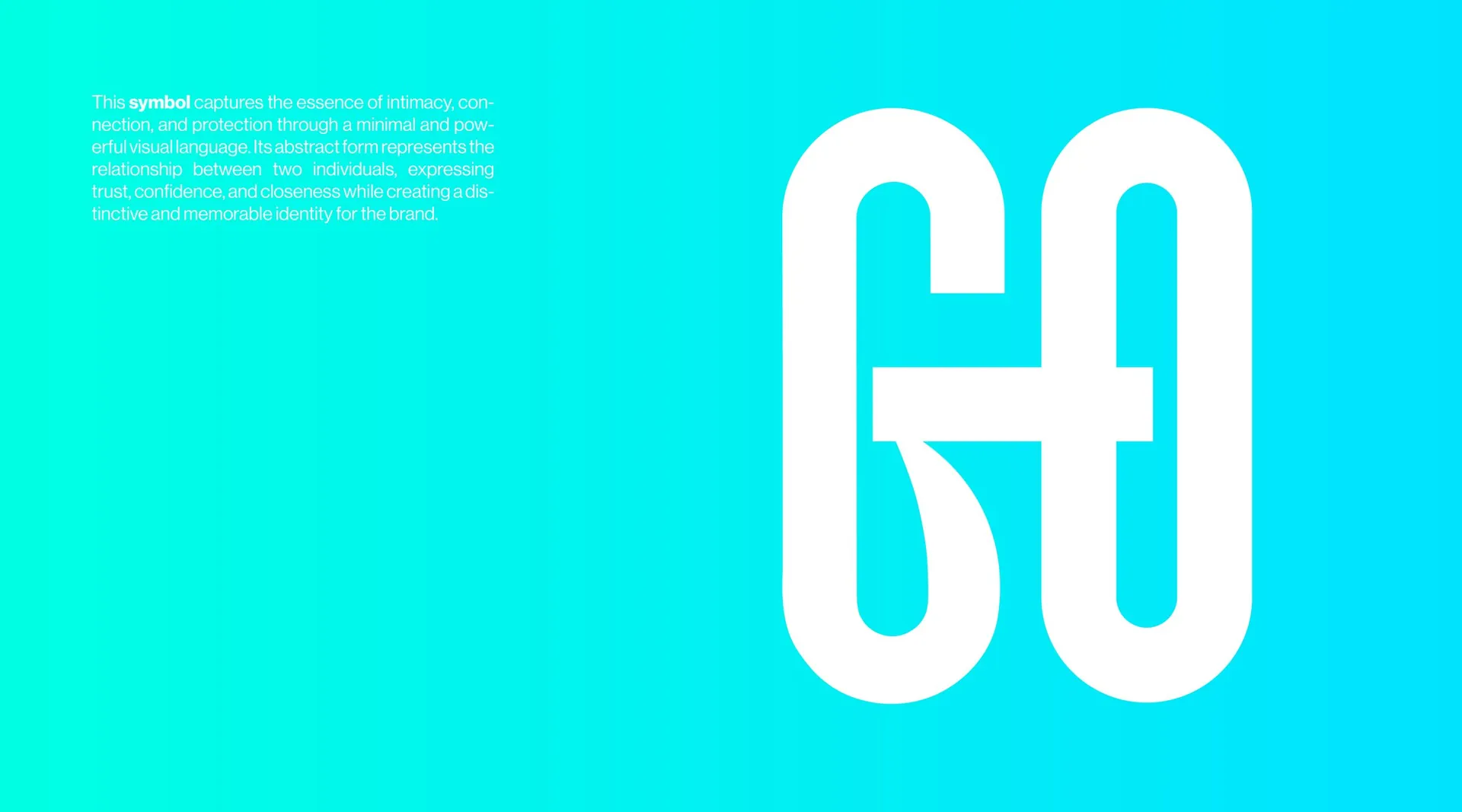
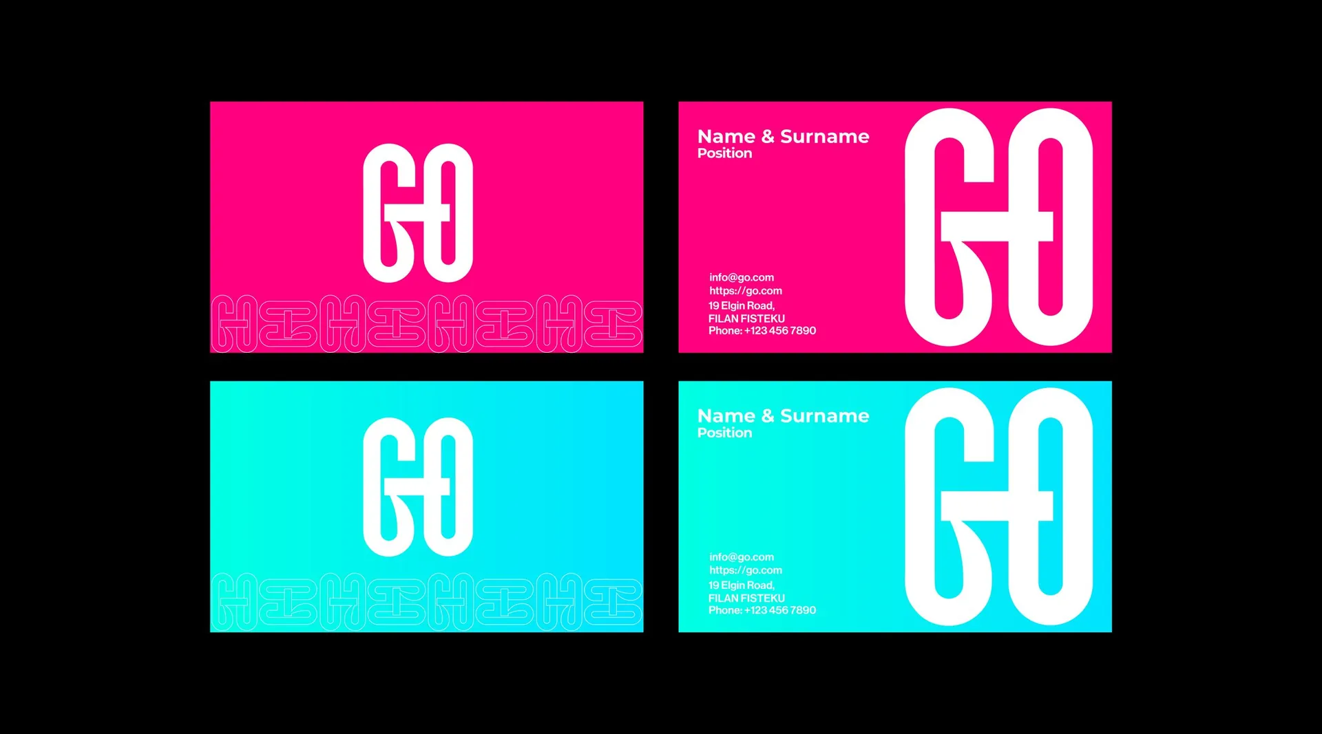
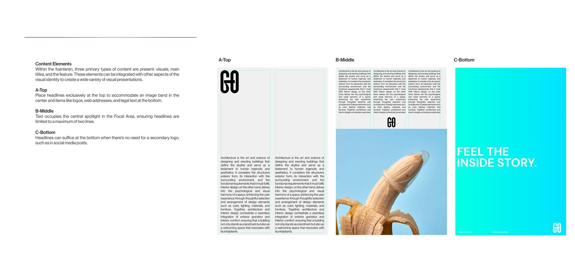
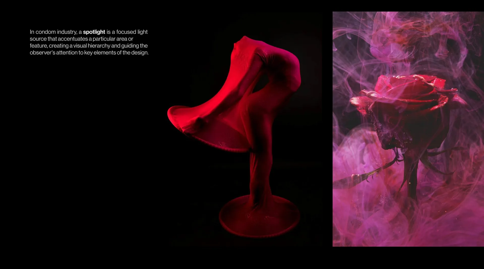
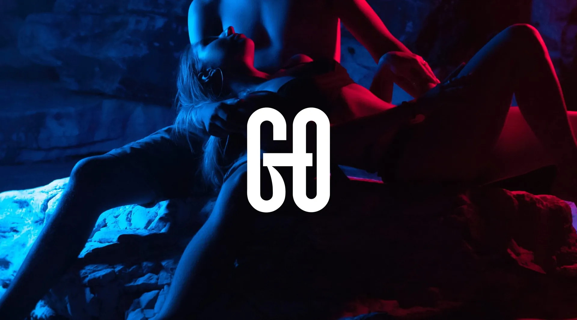
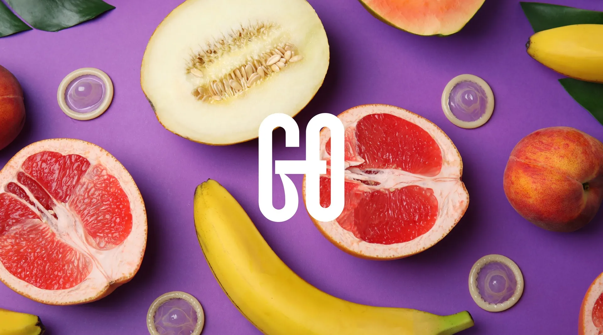
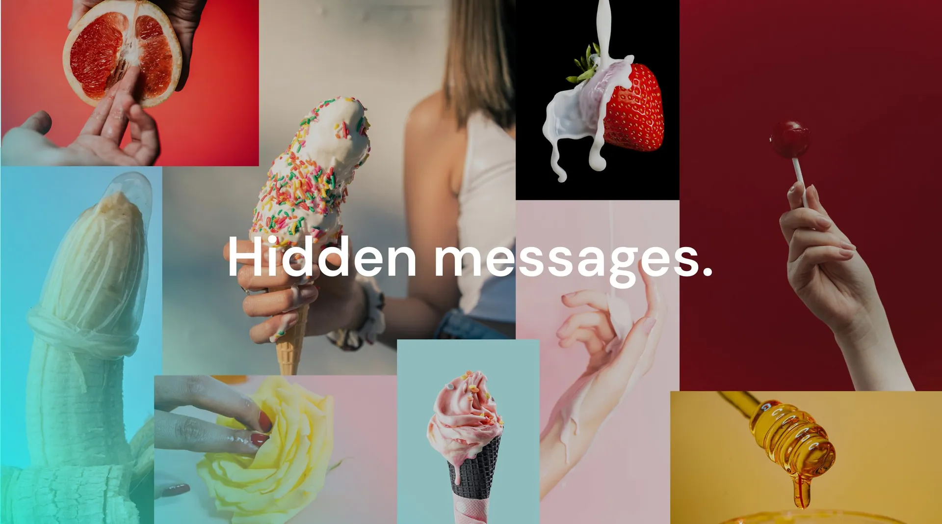
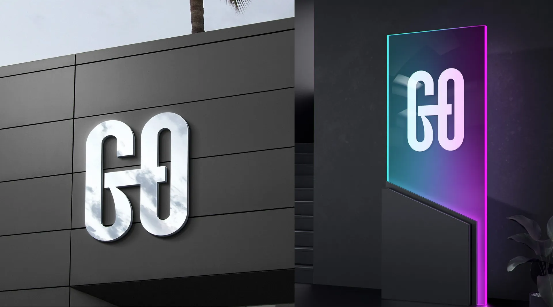
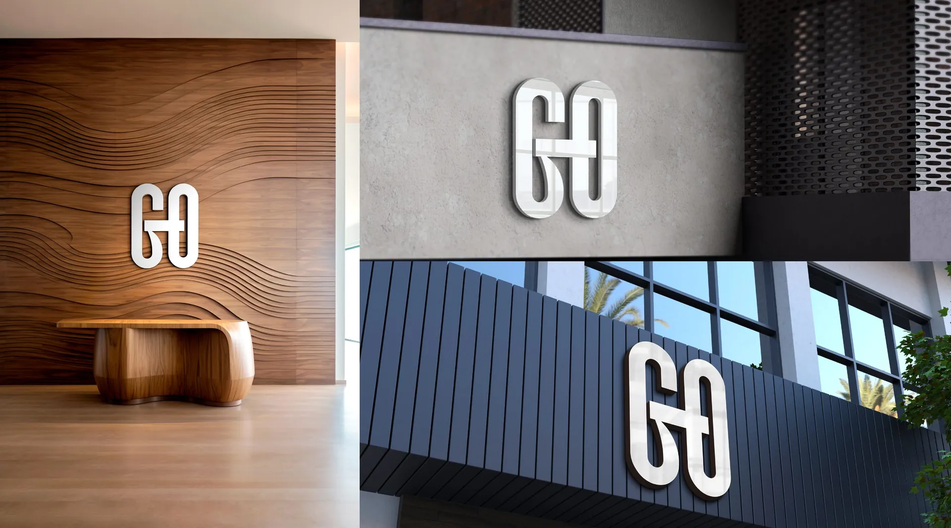
The mark locks a G and an O into one shape, two forms holding each other: intimacy, connection and protection in a single gesture. The symbol works in plain black and white, then switches to cyan, magenta and purple for campaign work. Photography stays in shadow and neon, and a series of visual double meanings, fruit, hands, silhouettes, gives the brand its wink.
The result
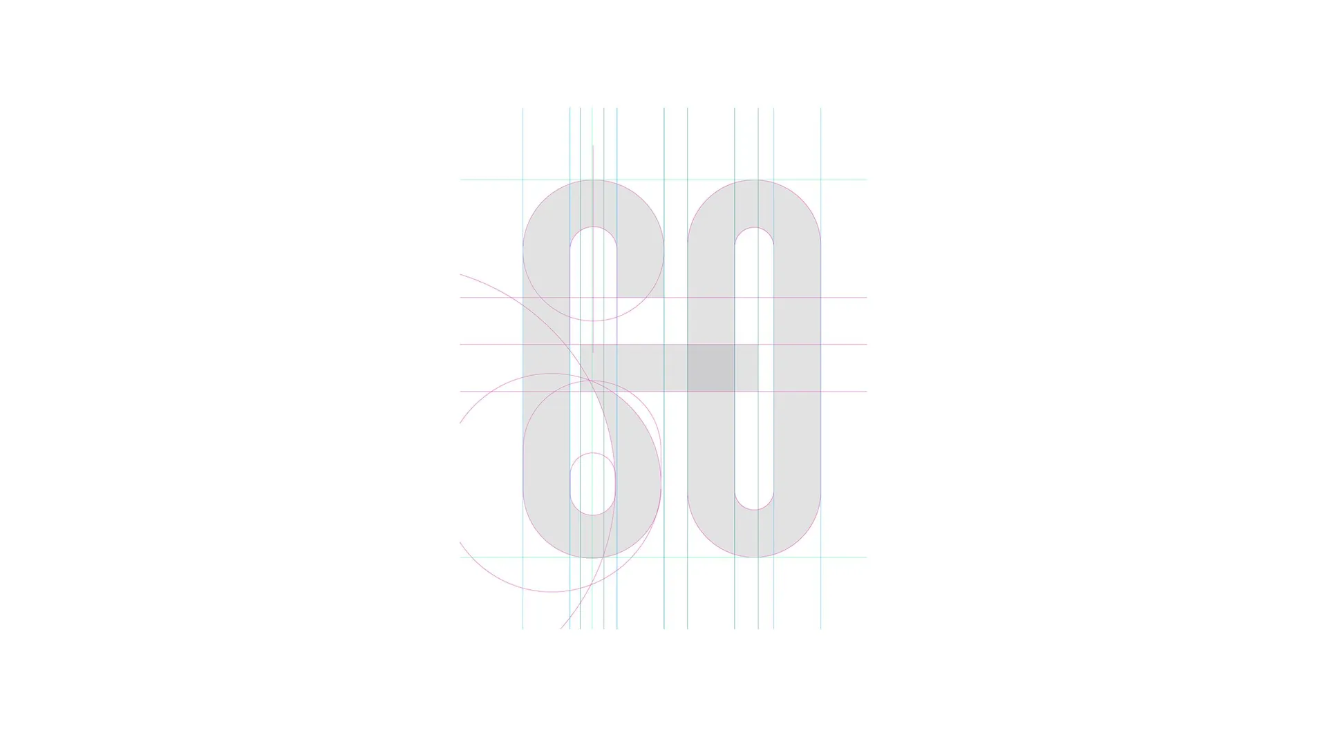
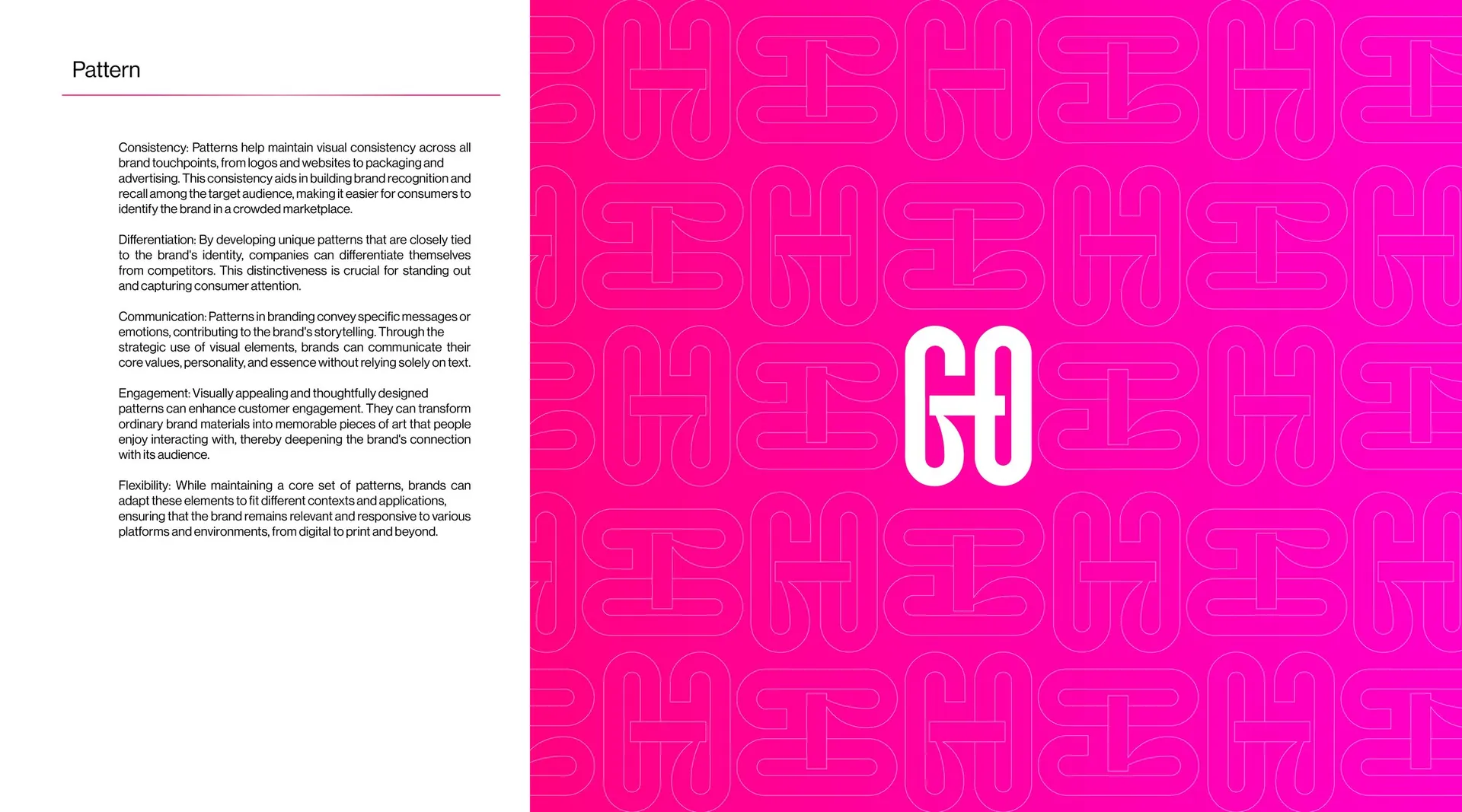
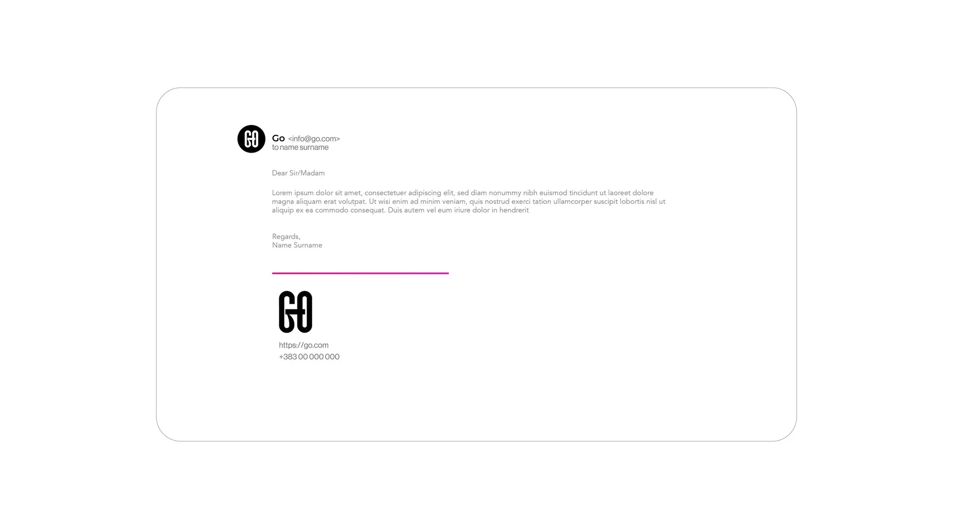
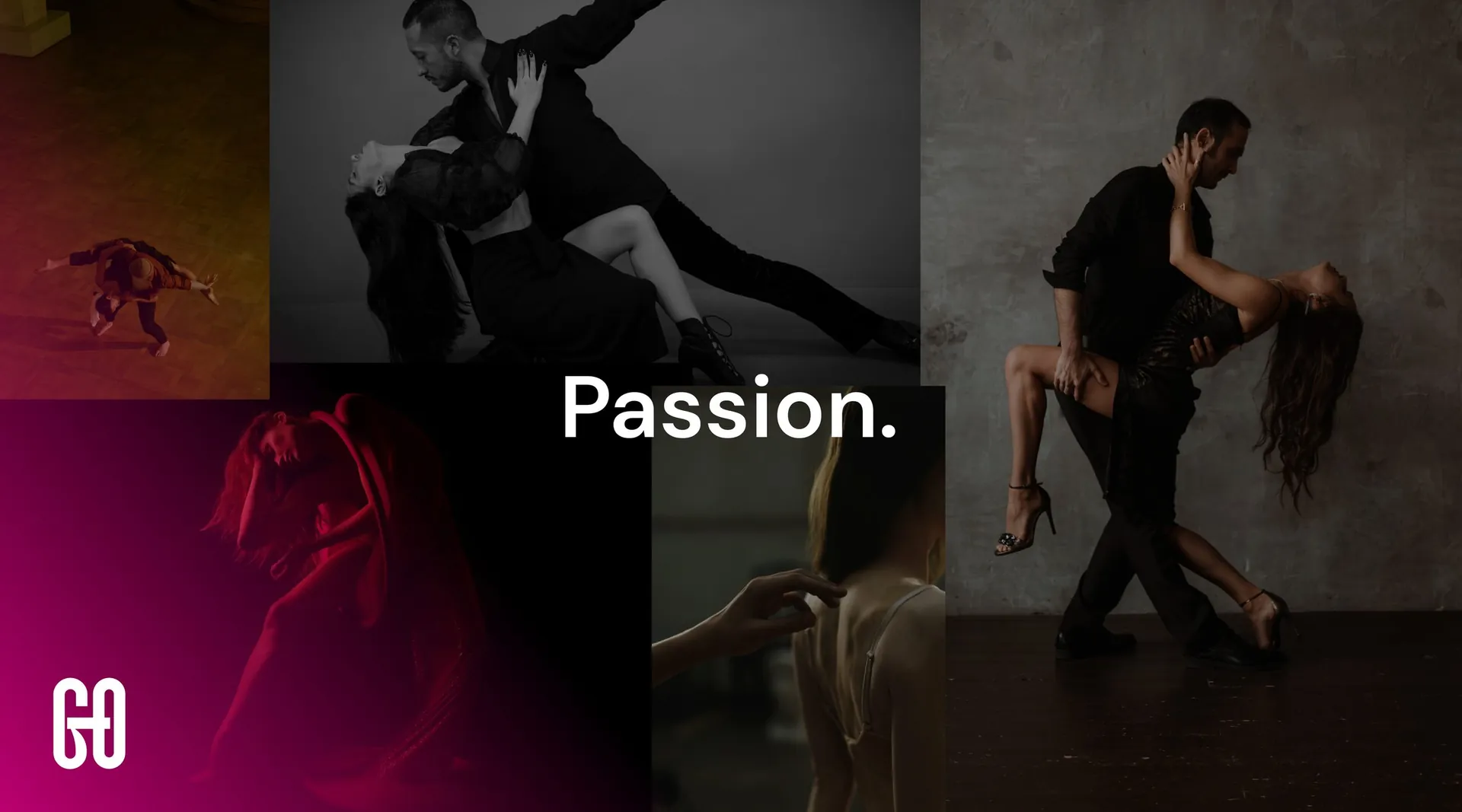
Logo and construction, colour system, pattern, stationery, brochure, signage, digital templates and a campaign toolkit of moods: Passion, Call to action, Hidden messages. The packaging range and the website are shown as separate projects.

01 / 22

02 / 22

03 / 22

04 / 22

05 / 22

06 / 22

07 / 22

08 / 22

09 / 22

10 / 22

11 / 22

12 / 22


13 / 22

14 / 22

15 / 22

16 / 22


17 / 22


18 / 22

19 / 22

20 / 22

21 / 22


22 / 22