Logo design
- Client
- Albadent
- Year
- 2023
- Scope
- Logo, identity, print, signage, social
- Industry
- Dental care
Albadent a tooth built from circles, a brand built on trust
The brief
Albadent is a dental clinic, and dentistry often feels cold and clinical. This brand had to feel human. The starting point was a smile, and the audience was described in the brand platform with a wink: anyone with teeth, or those aspiring to have them.
The idea
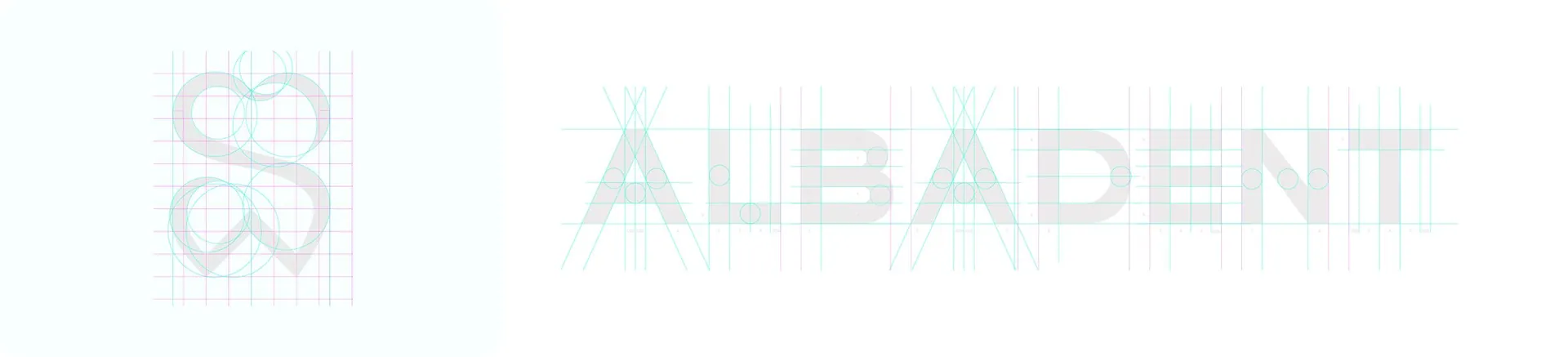
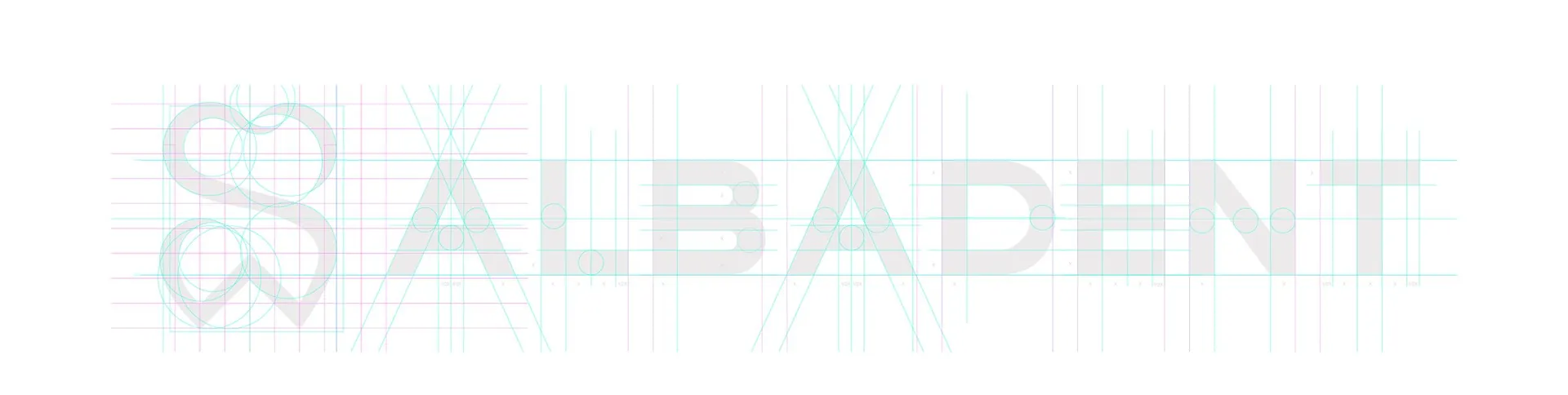
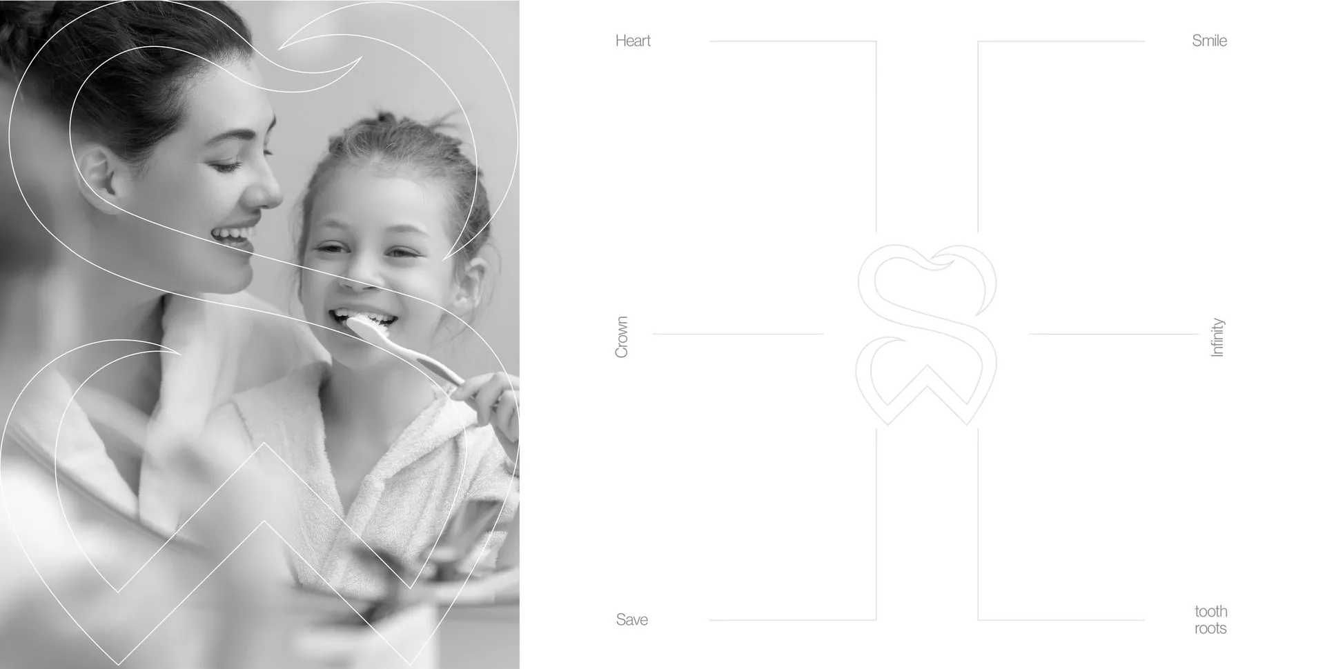
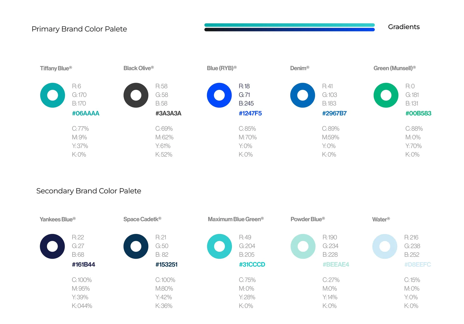
The symbol is a tooth drawn as one continuous loop, and it reads in several ways at once: a smile, a heart, an infinity sign for lasting care and a shield for saving every tooth. The construction page shows that sequence step by step. A fresh turquoise leads the palette, backed by deep navy and blues, and a bespoke typeface keeps the wordmark clear at small sizes.
The result
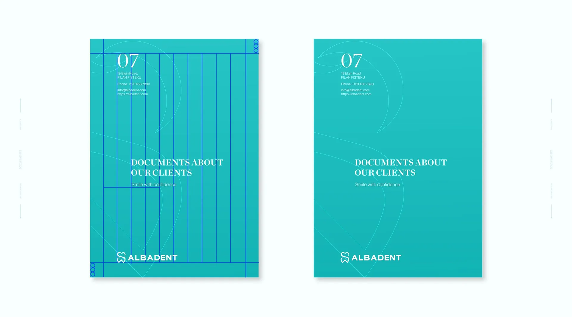
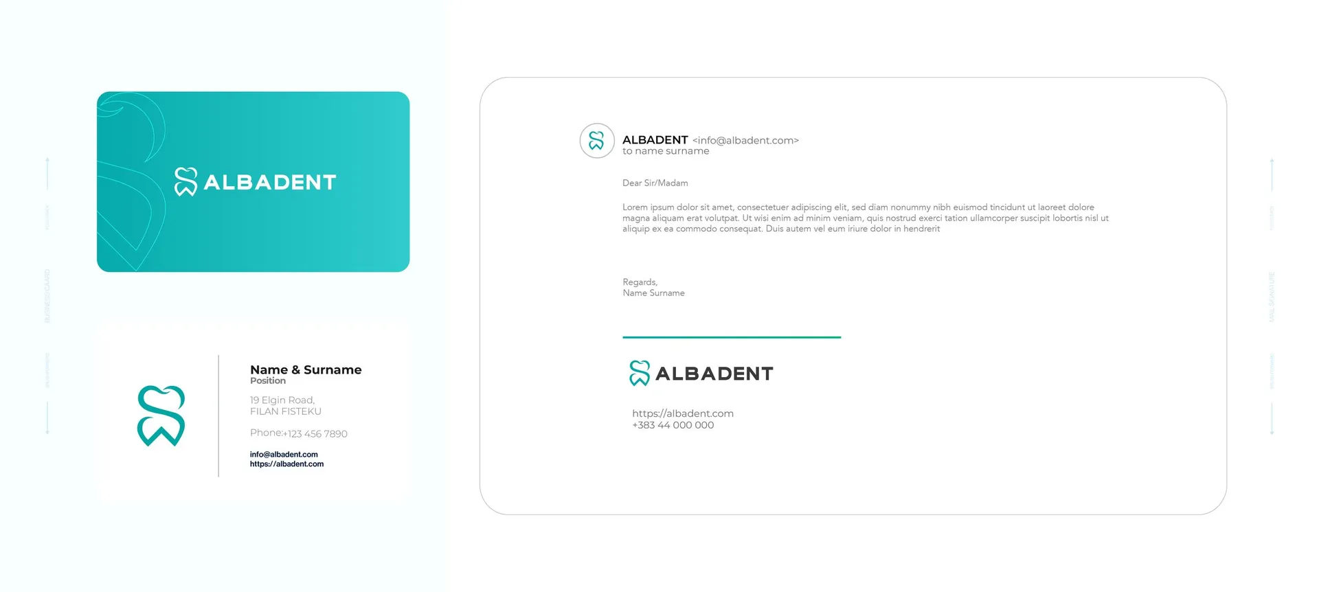
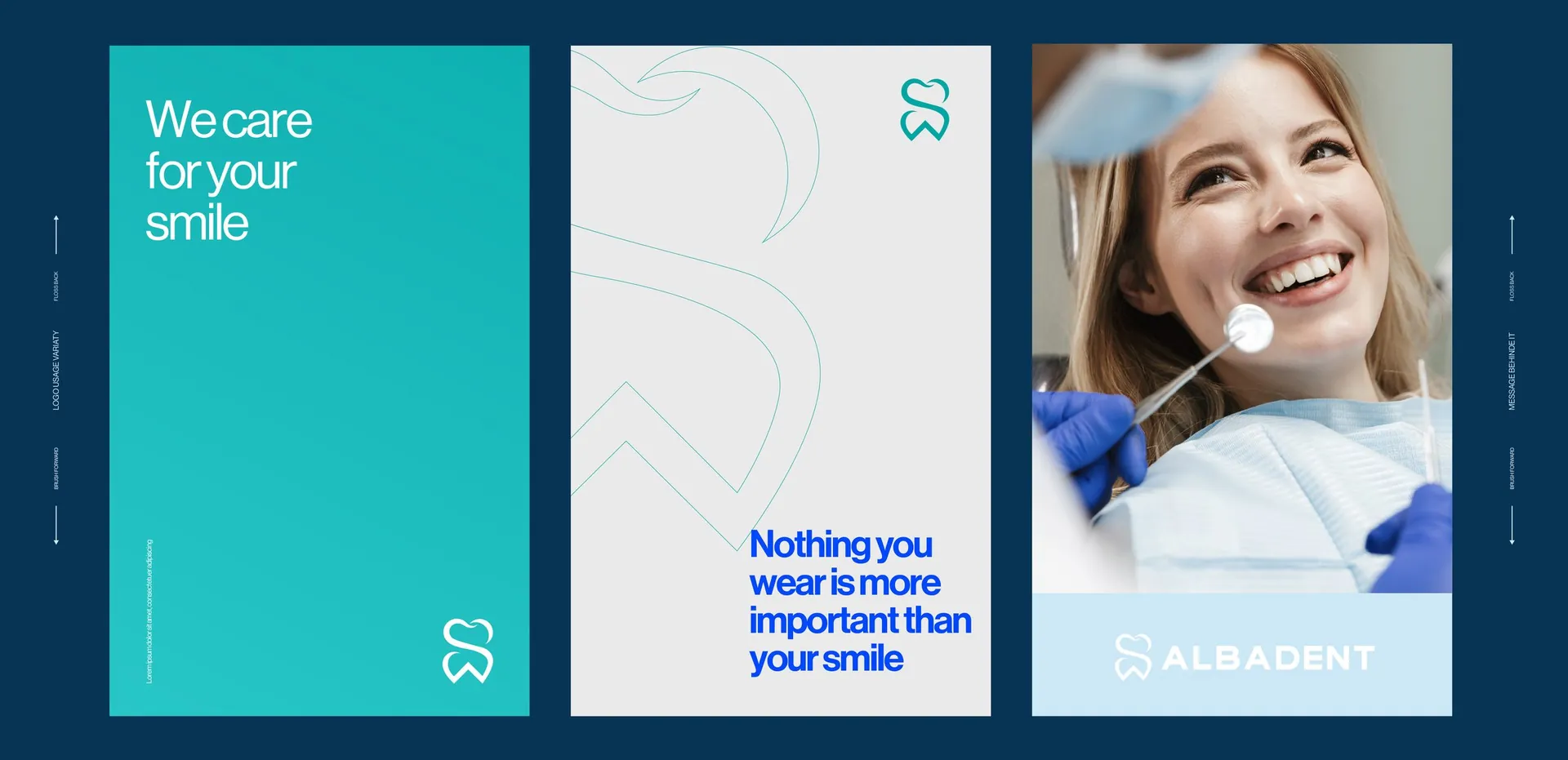
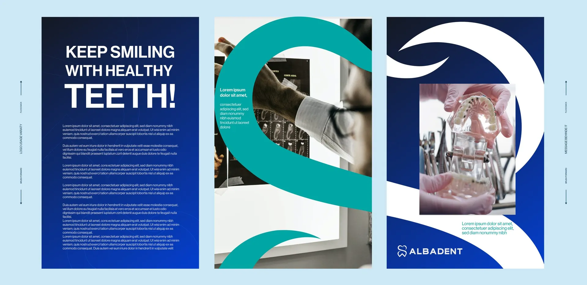
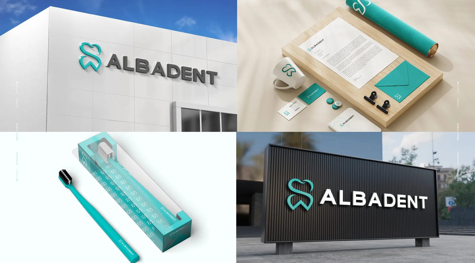
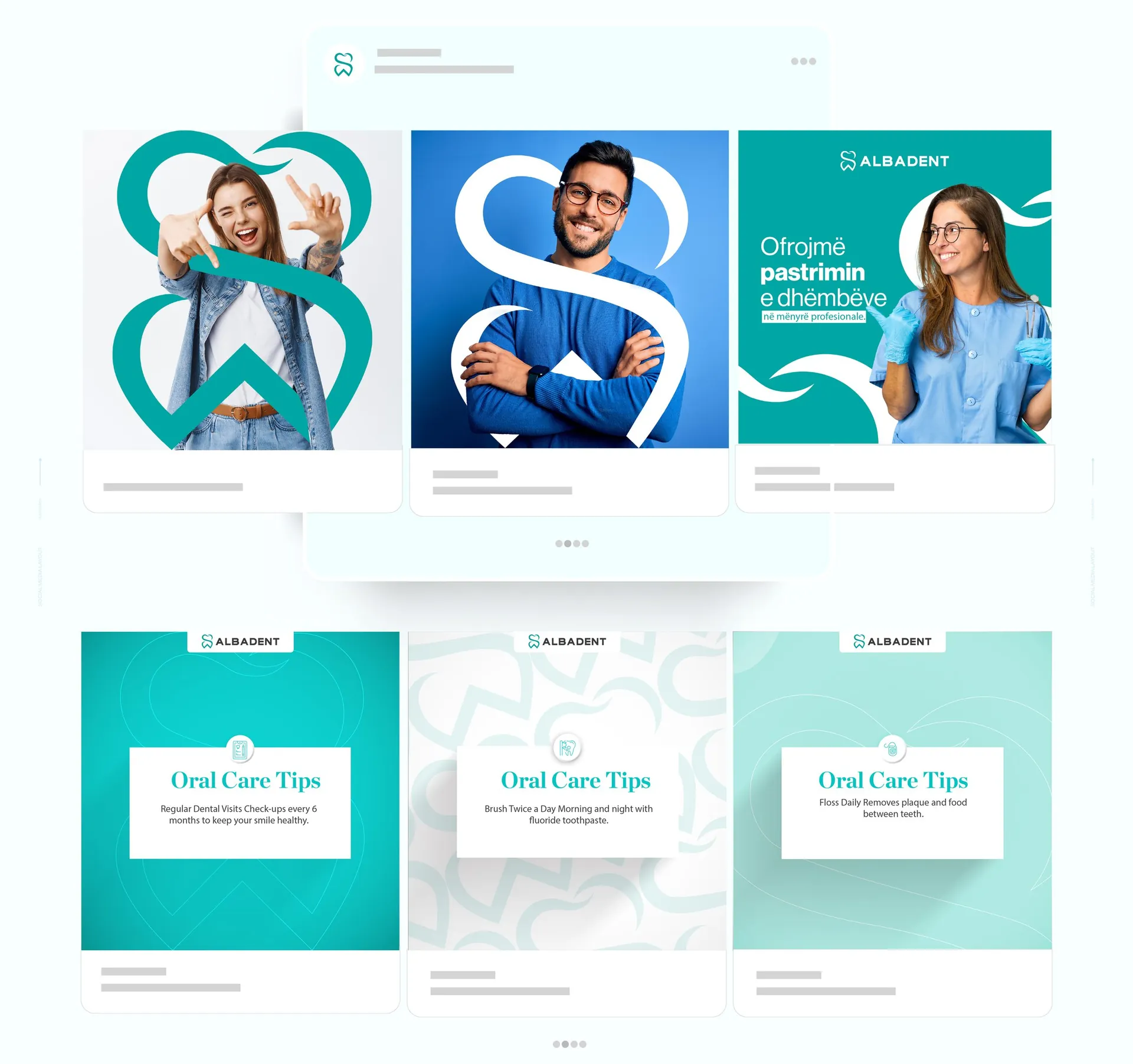
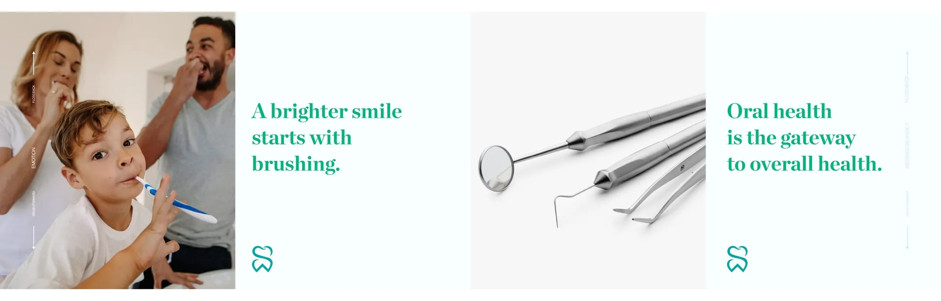
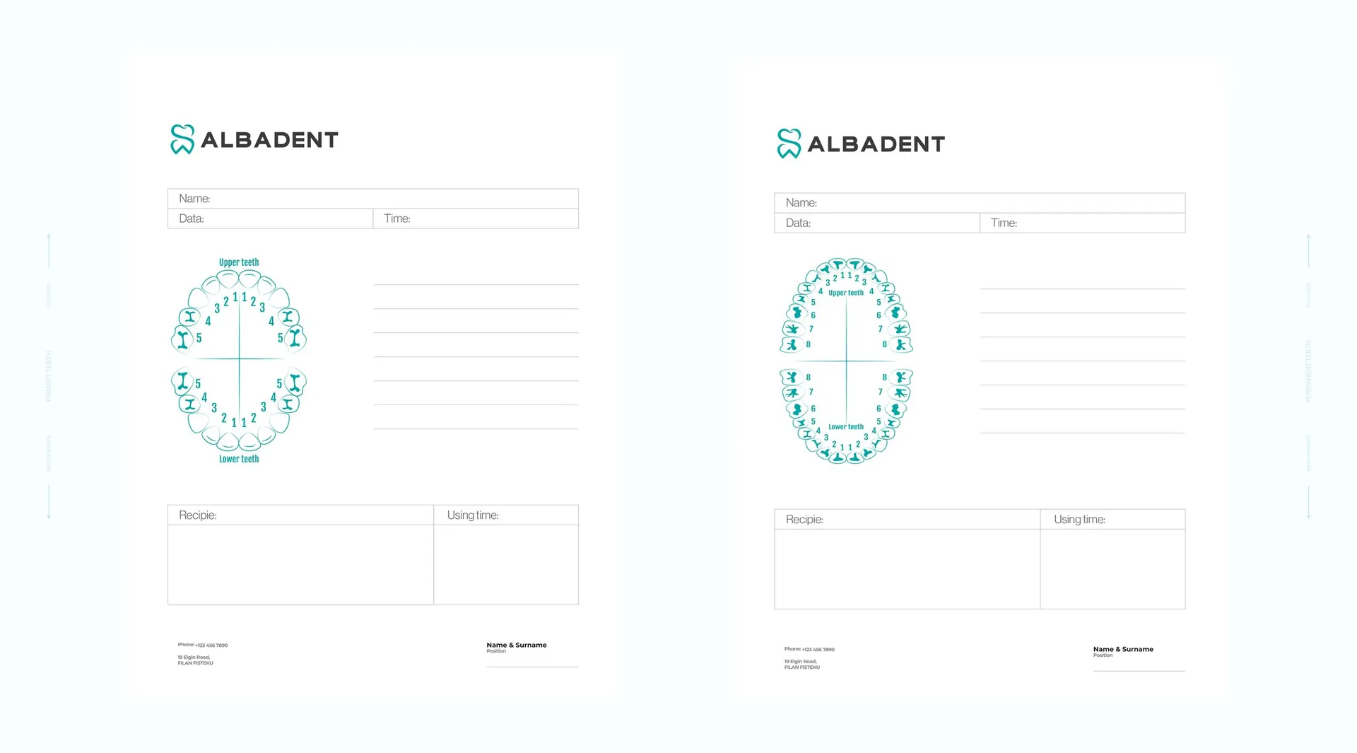
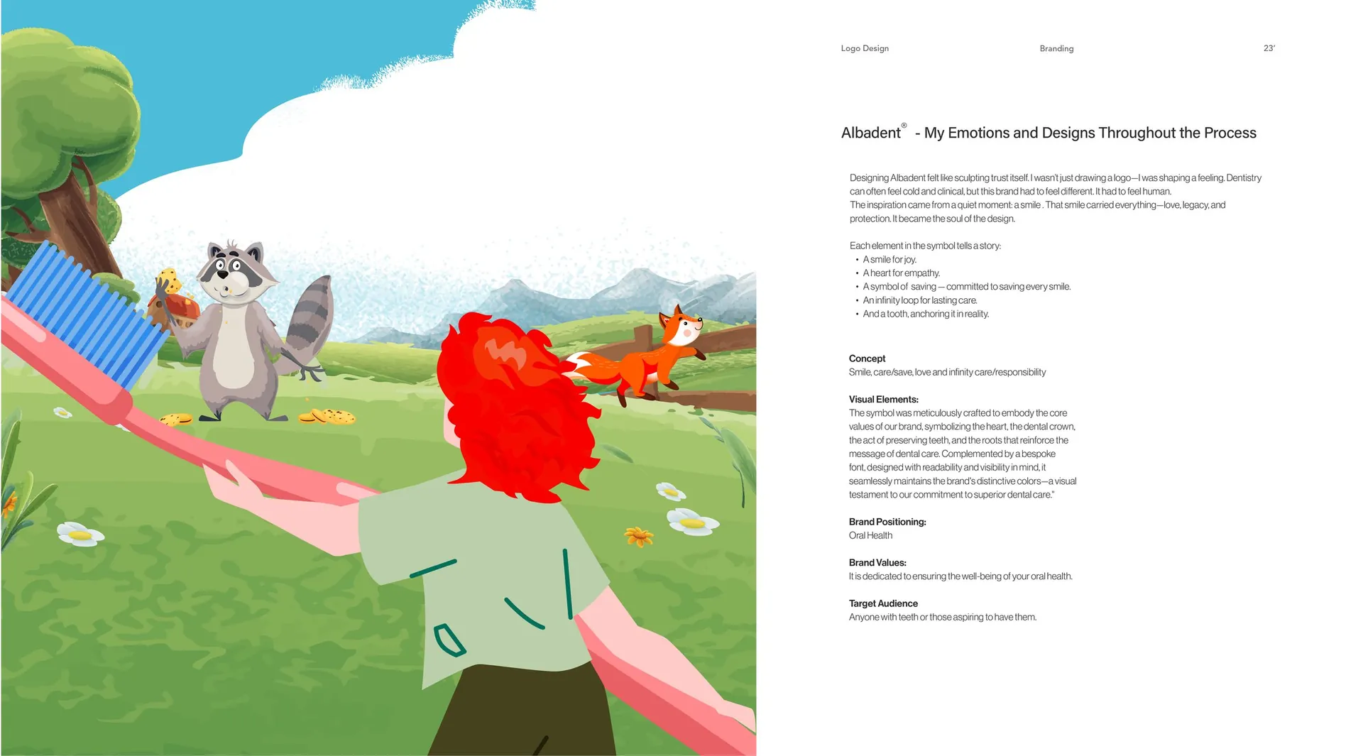
Logo and construction, primary and secondary colour palettes, stationery and folders, patient forms with dental charts, posters and brochures, signage, toothbrush packaging, social media templates and a photography direction built around real smiles.

01 / 17

02 / 17


03 / 17

04 / 17

05 / 17

06 / 17

07 / 17

08 / 17

09 / 17


10 / 17


11 / 17

12 / 17

13 / 17

14 / 17


15 / 17

16 / 17

17 / 17