Logo design
- Client
- Ace of Digital (AOD)
- Year
- 2025
- Scope
- Logo, identity, print, packaging, social
- Industry
- Fashion & digital
Ace of Digital a fashion mark with a full stop
The brief
Aod is short for Ace of Digital. The brief asked for a wordmark with the poise of a fashion label: something that looks at home on an editorial spread, a shopping bag and a phone screen, and that can carry a seasonal series without being redesigned each time.
The idea
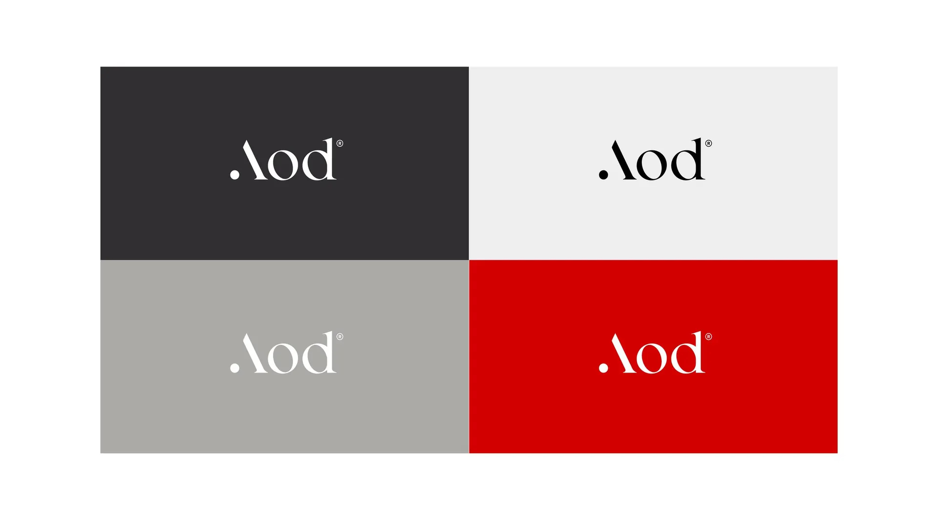
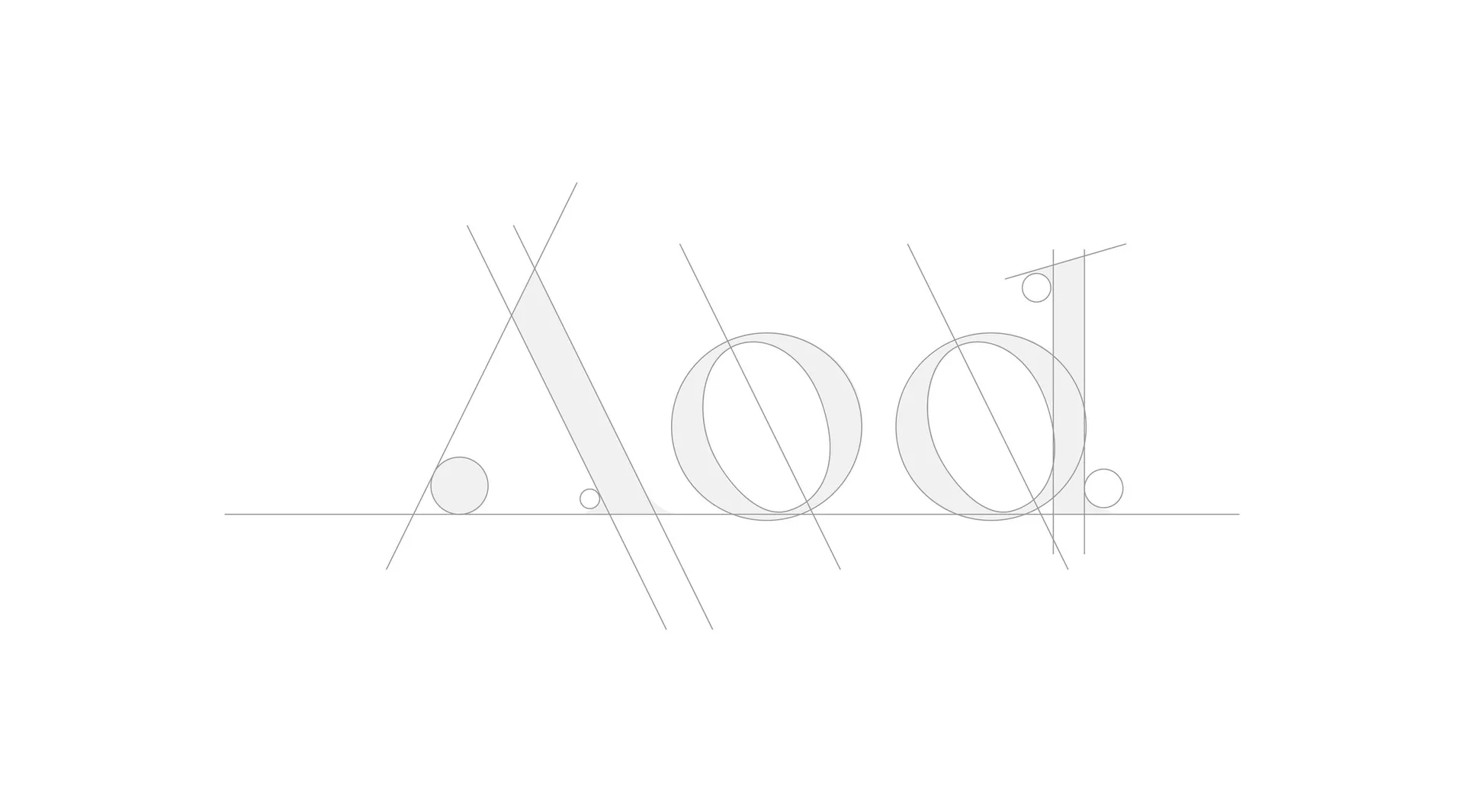
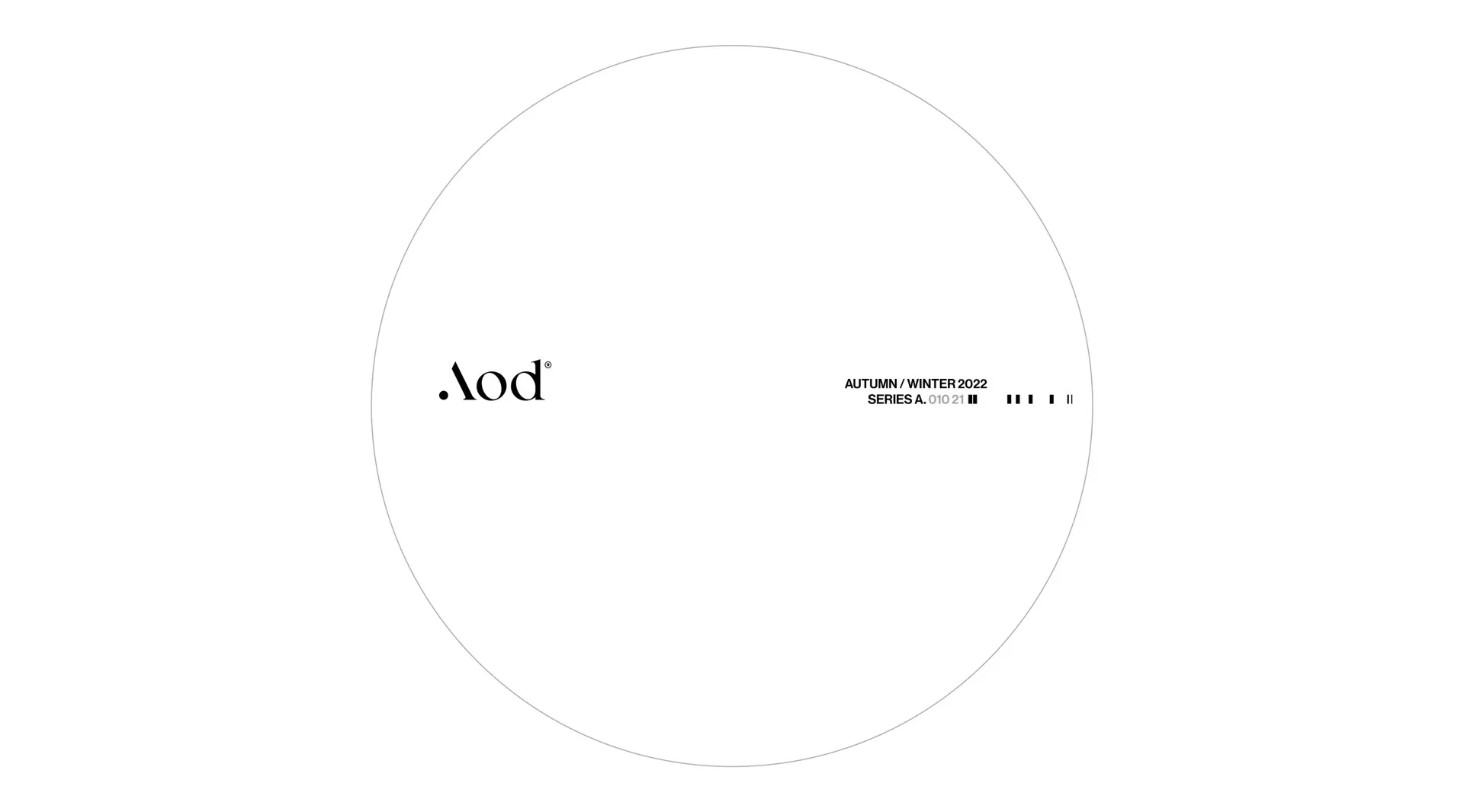
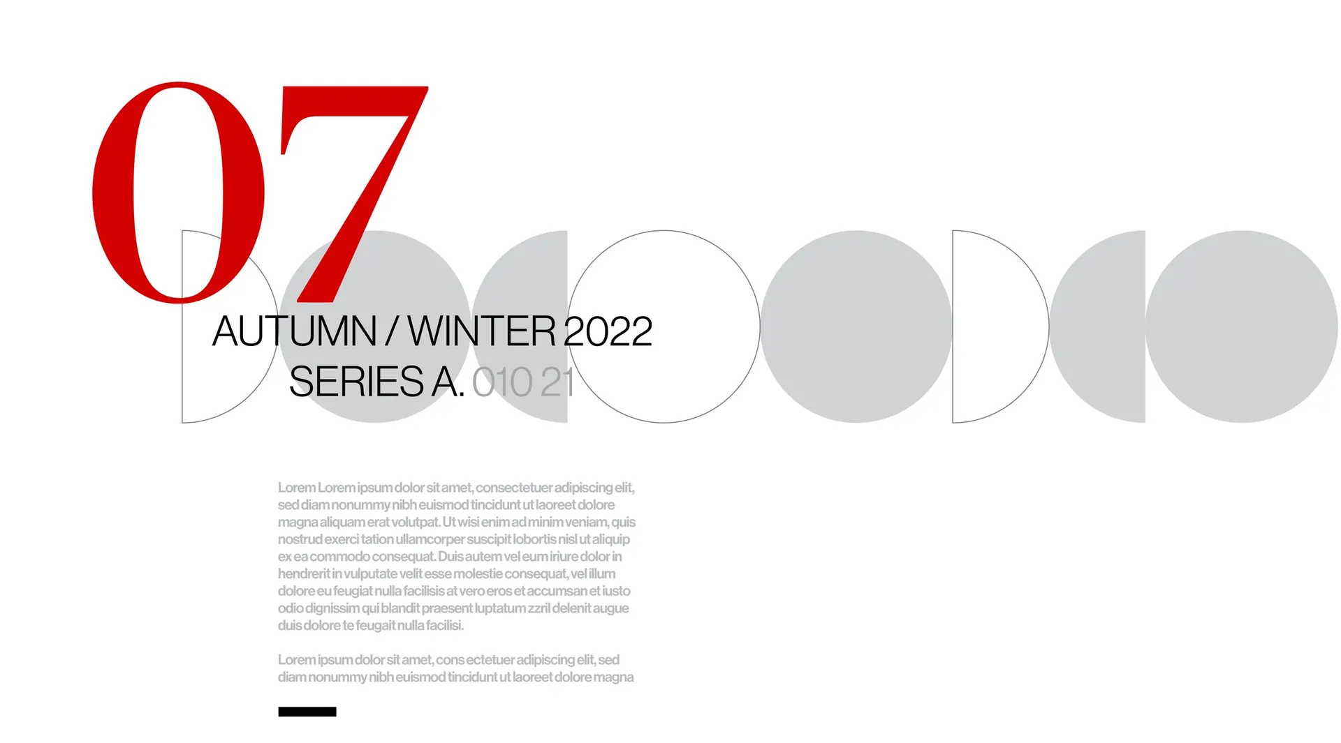
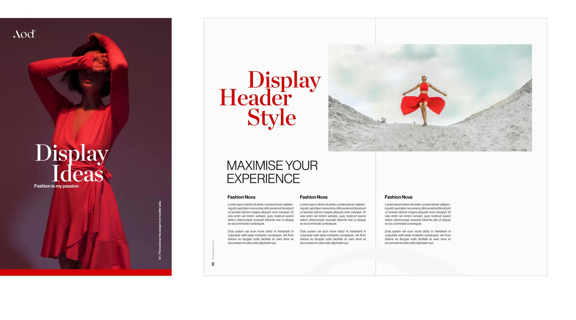
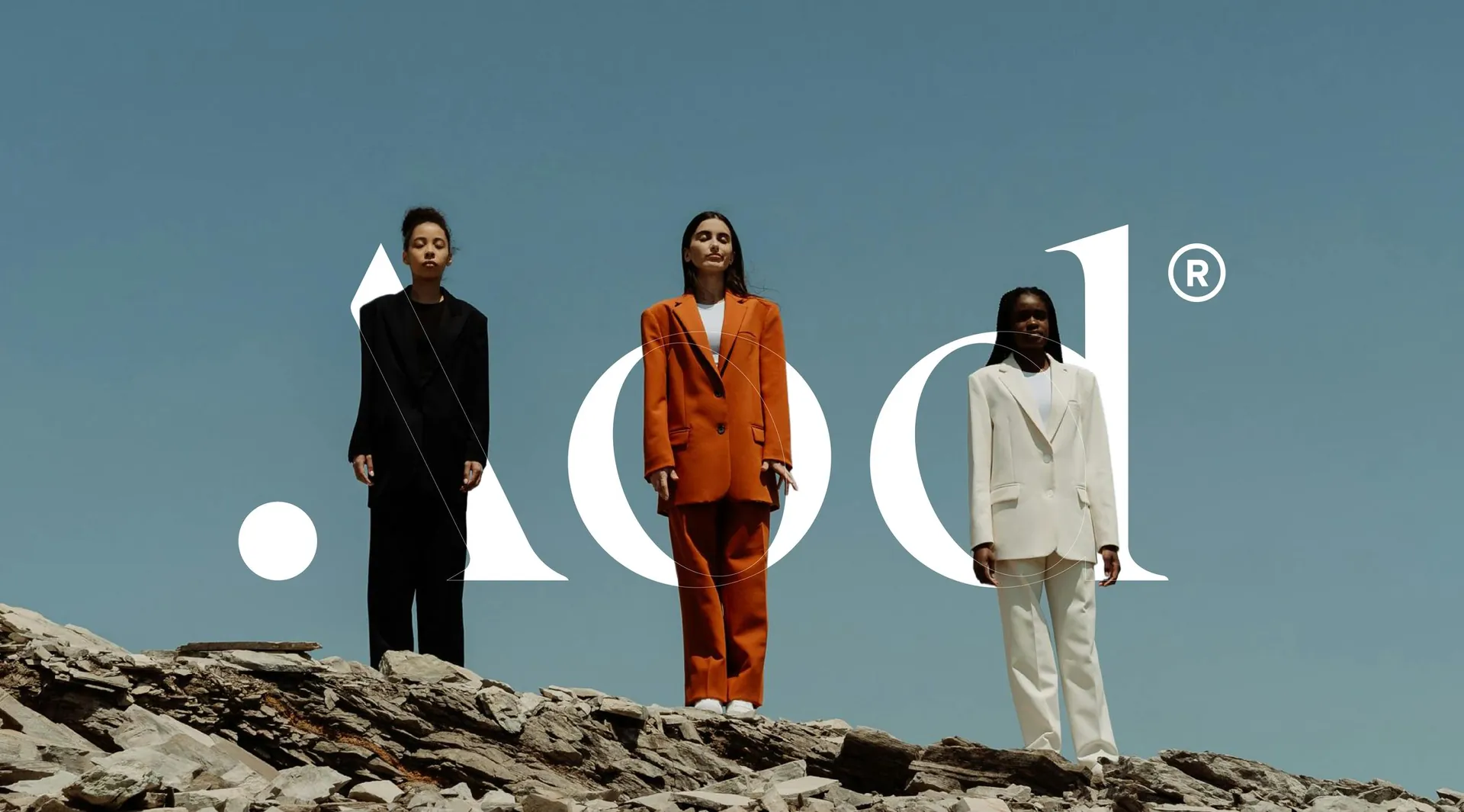
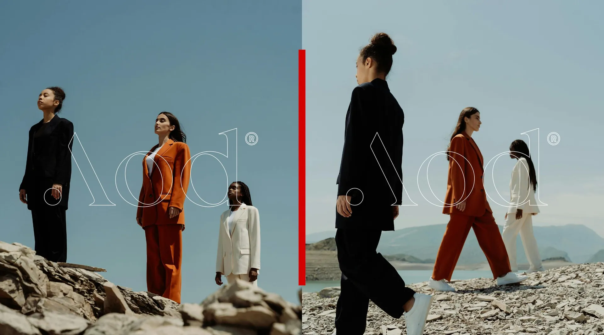
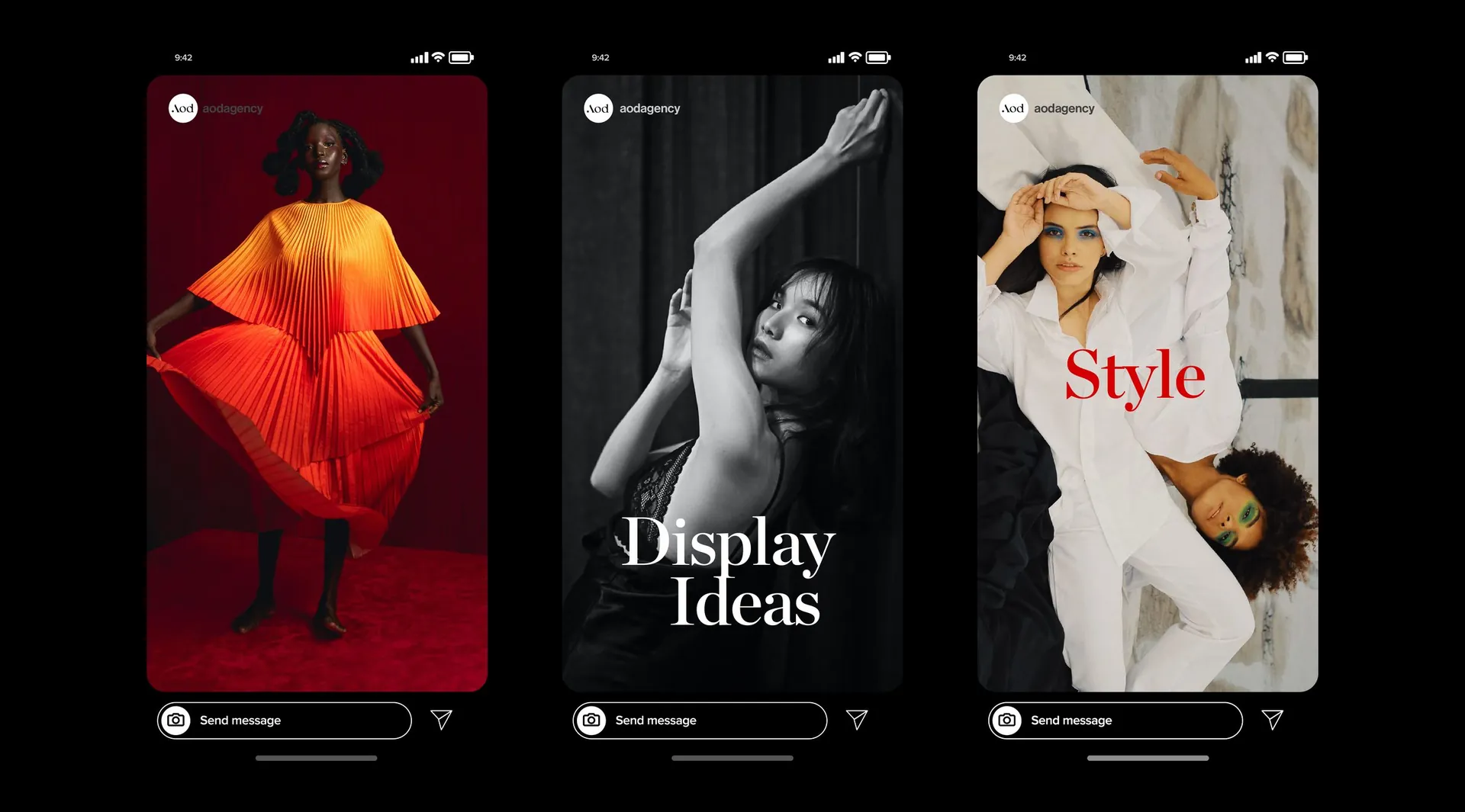
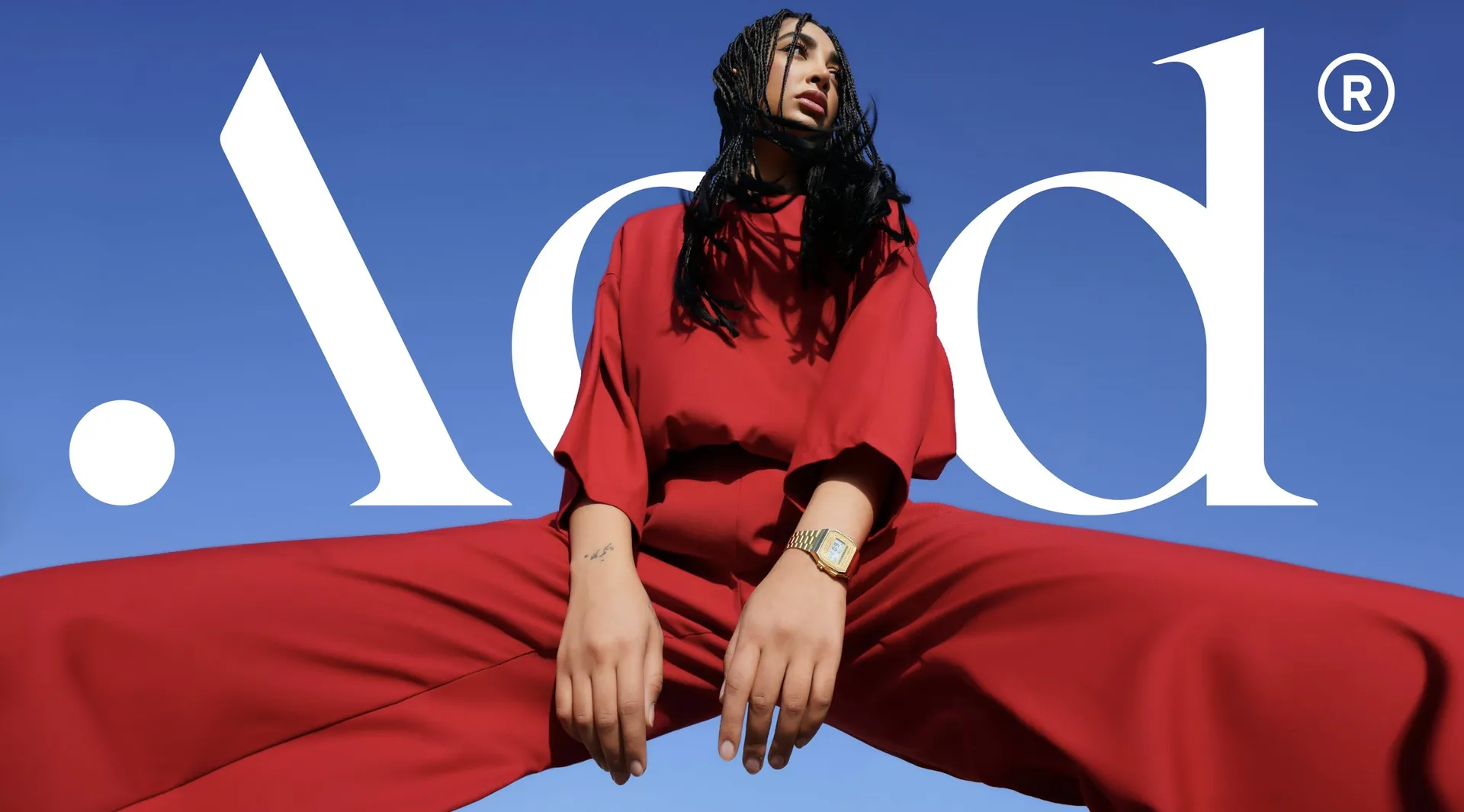
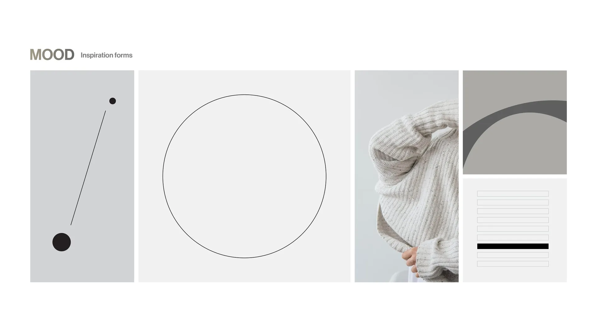
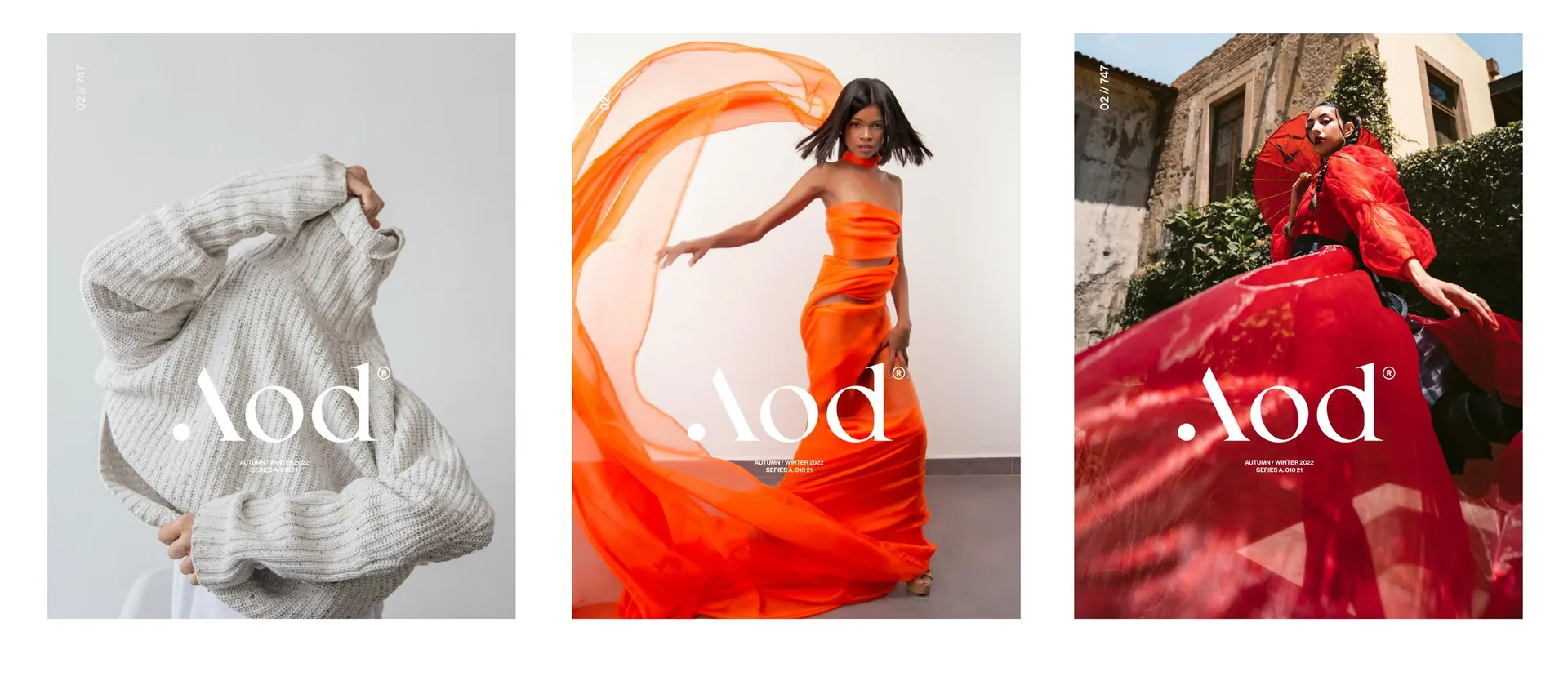
A compact serif logotype with a single dot at the foot of the A: the ace, the one point everything else follows. Charcoal, light grey and white make up the palette, with one signal red used sparingly for emphasis. Circles and half-circles from the construction become the layout language, and the photography is styled like a campaign: strong colour, open landscapes, people in motion.
The result
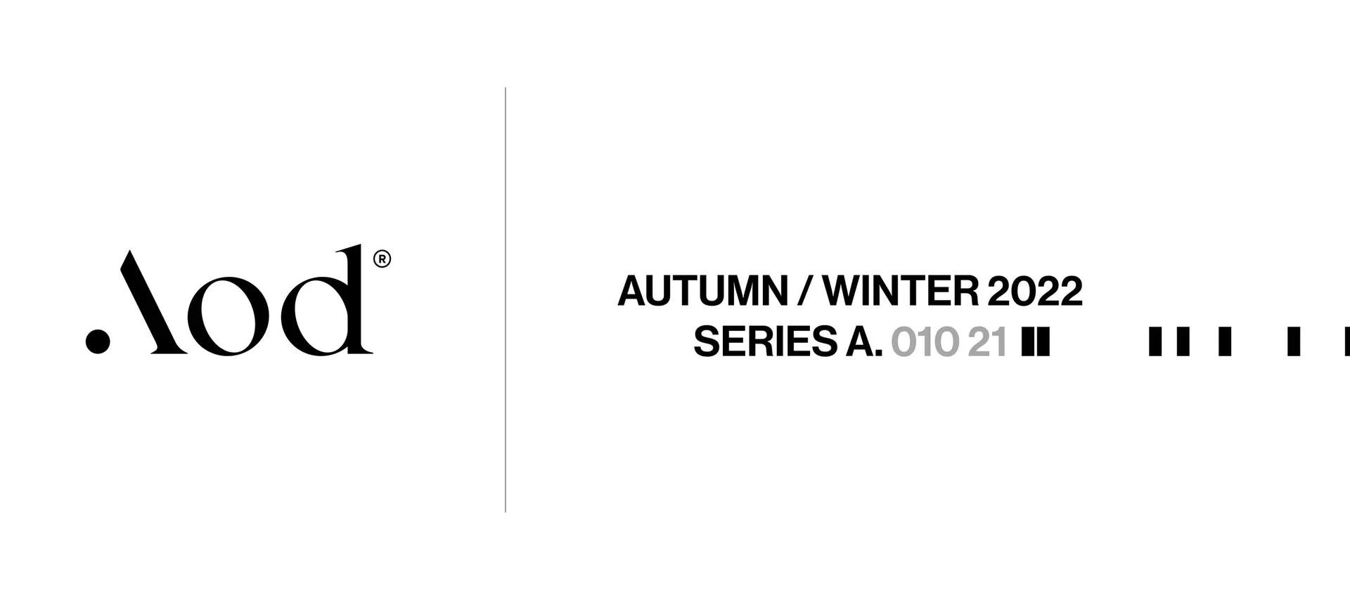
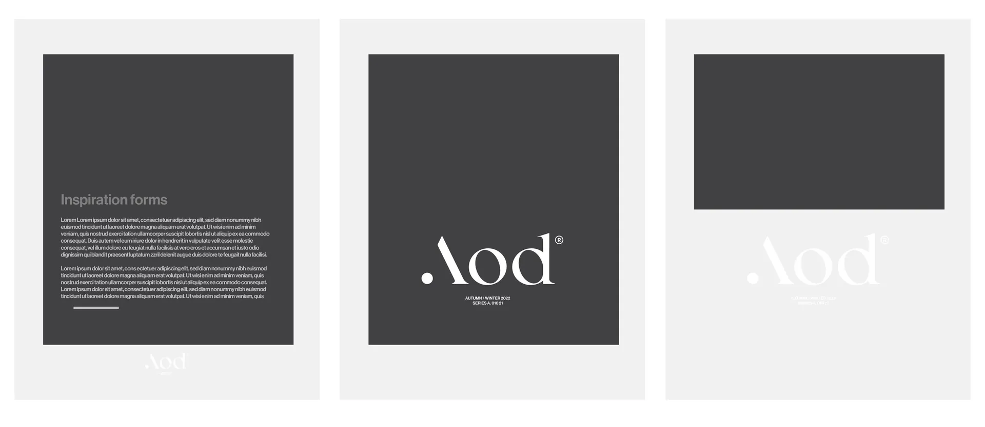
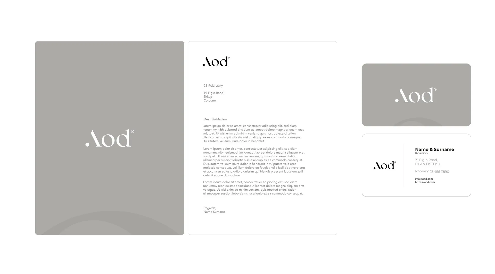
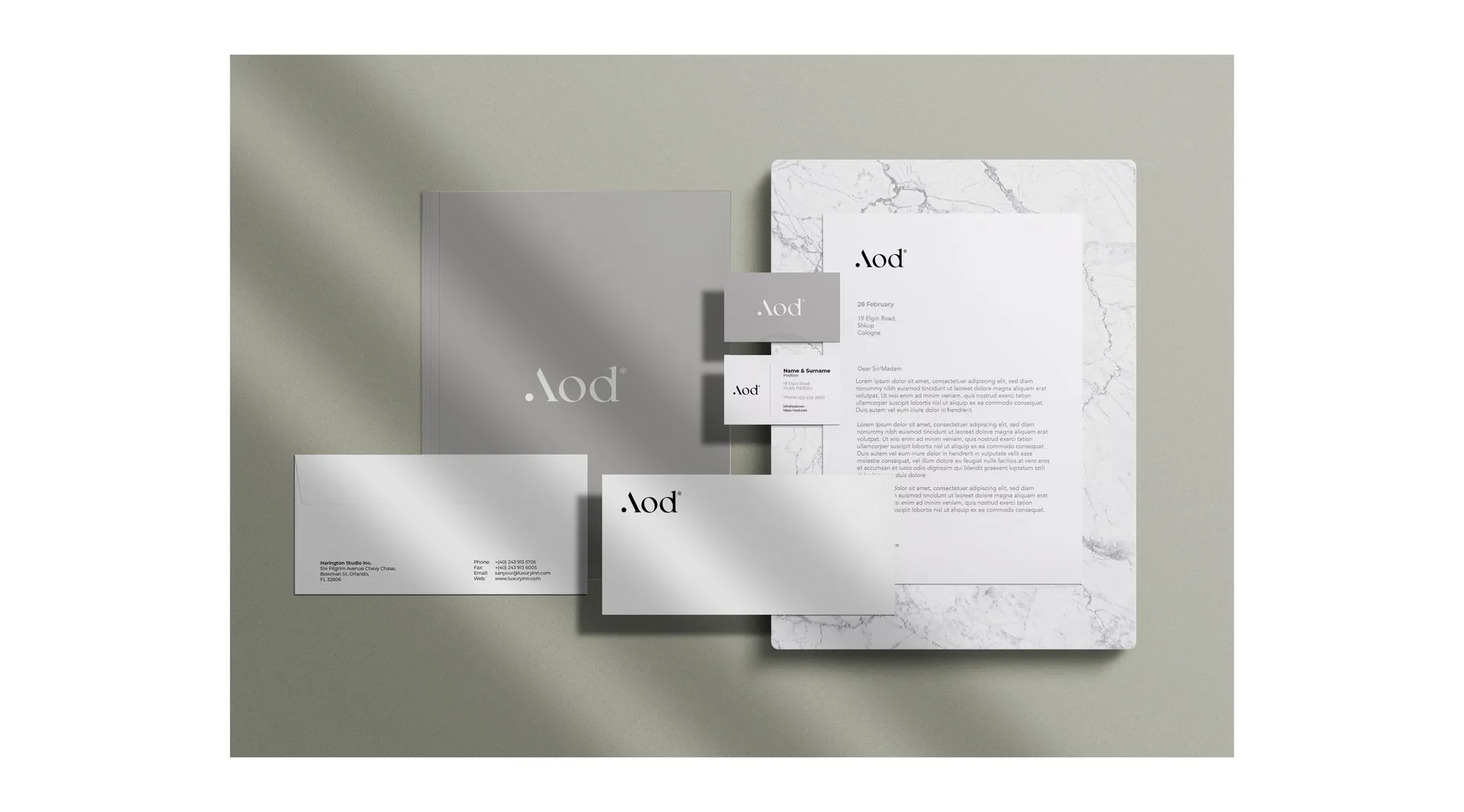
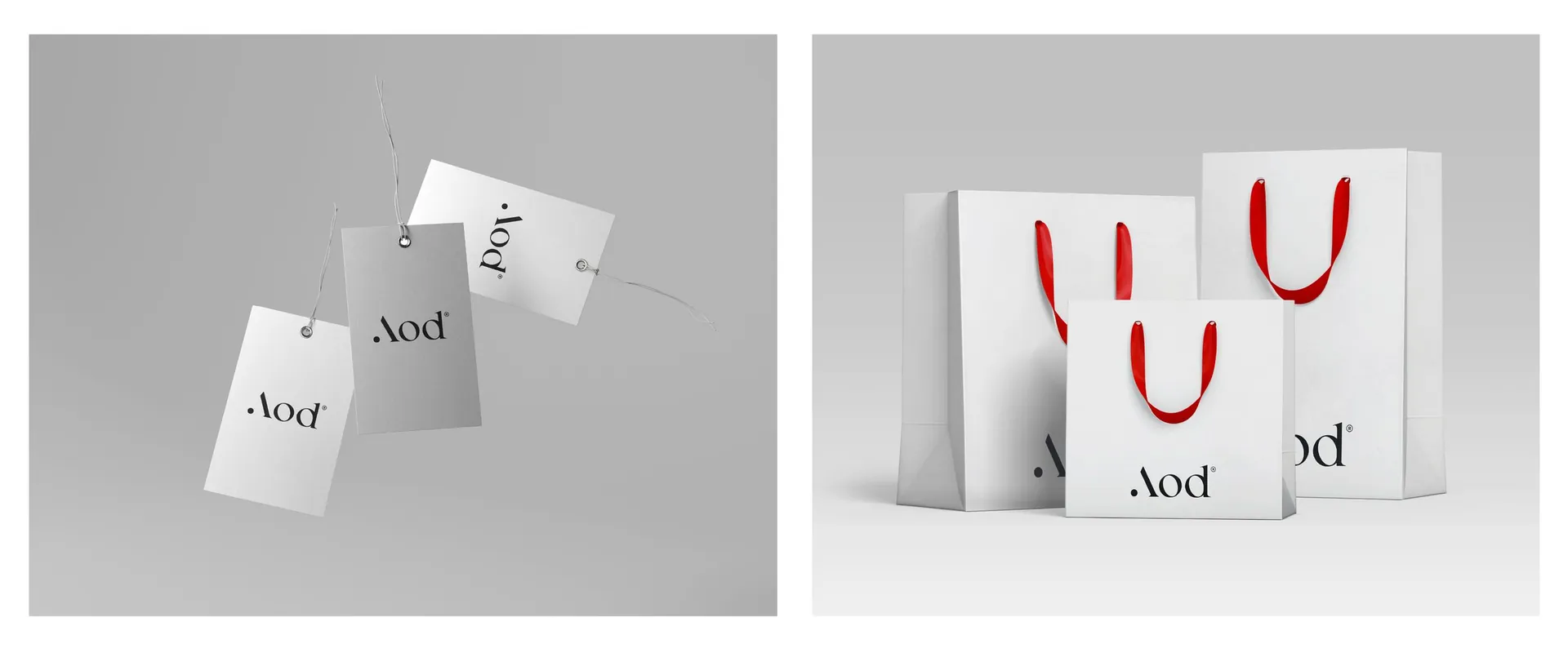
Logotype and construction, colour versions, stationery, shopping bags and tags, an editorial layout system for seasonal series, social media templates and a mood board that sets the direction for photography.

01 / 16

02 / 16

03 / 16

04 / 16

05 / 16

06 / 16

07 / 16

08 / 16

09 / 16

10 / 16

11 / 16

12 / 16

13 / 16

14 / 16

15 / 16

16 / 16