Print & packaging
- Client
- GraSano
- Year
- 2025
- Scope
- Packaging, labels, campaign, point of sale, social
- Industry
- Food & beverage
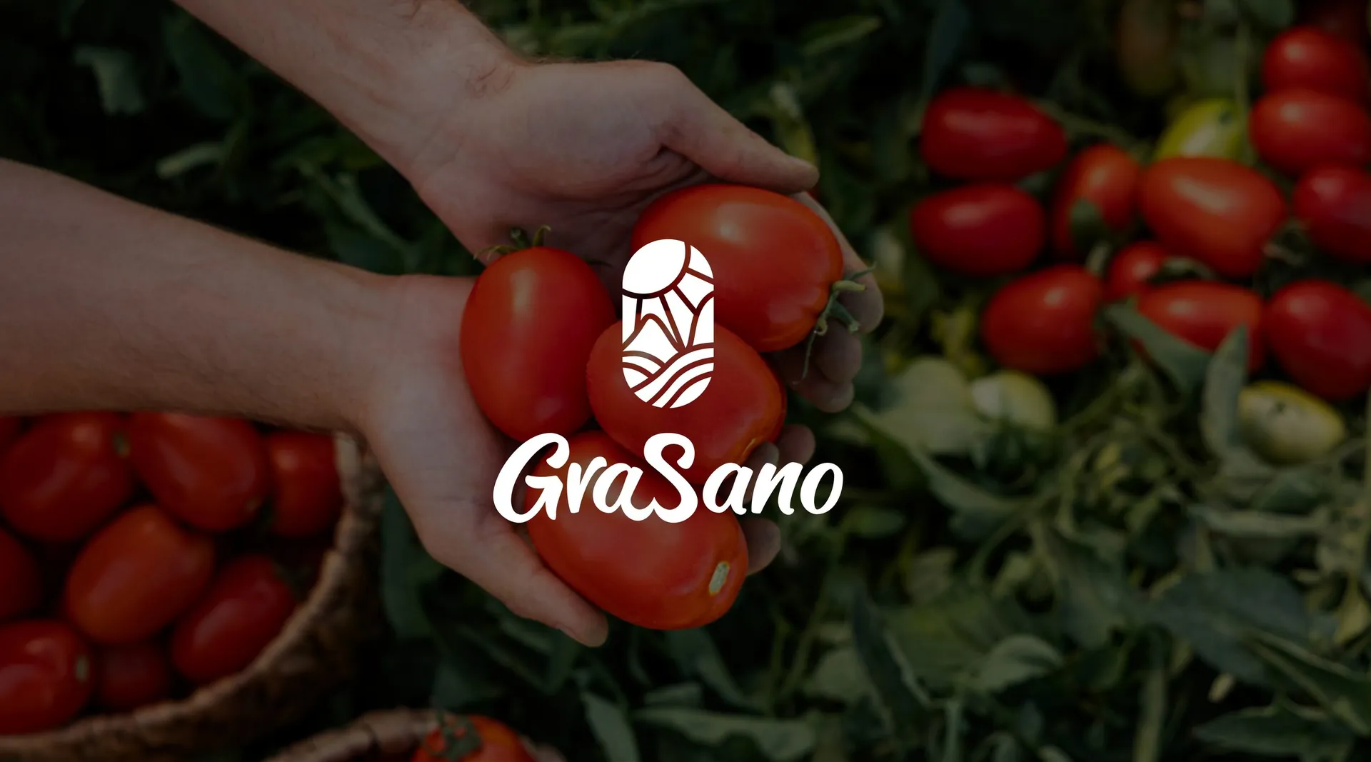
GraSano tomato perfection, from label to shelf
The brief
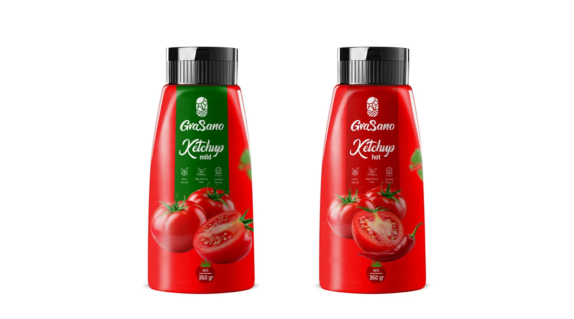
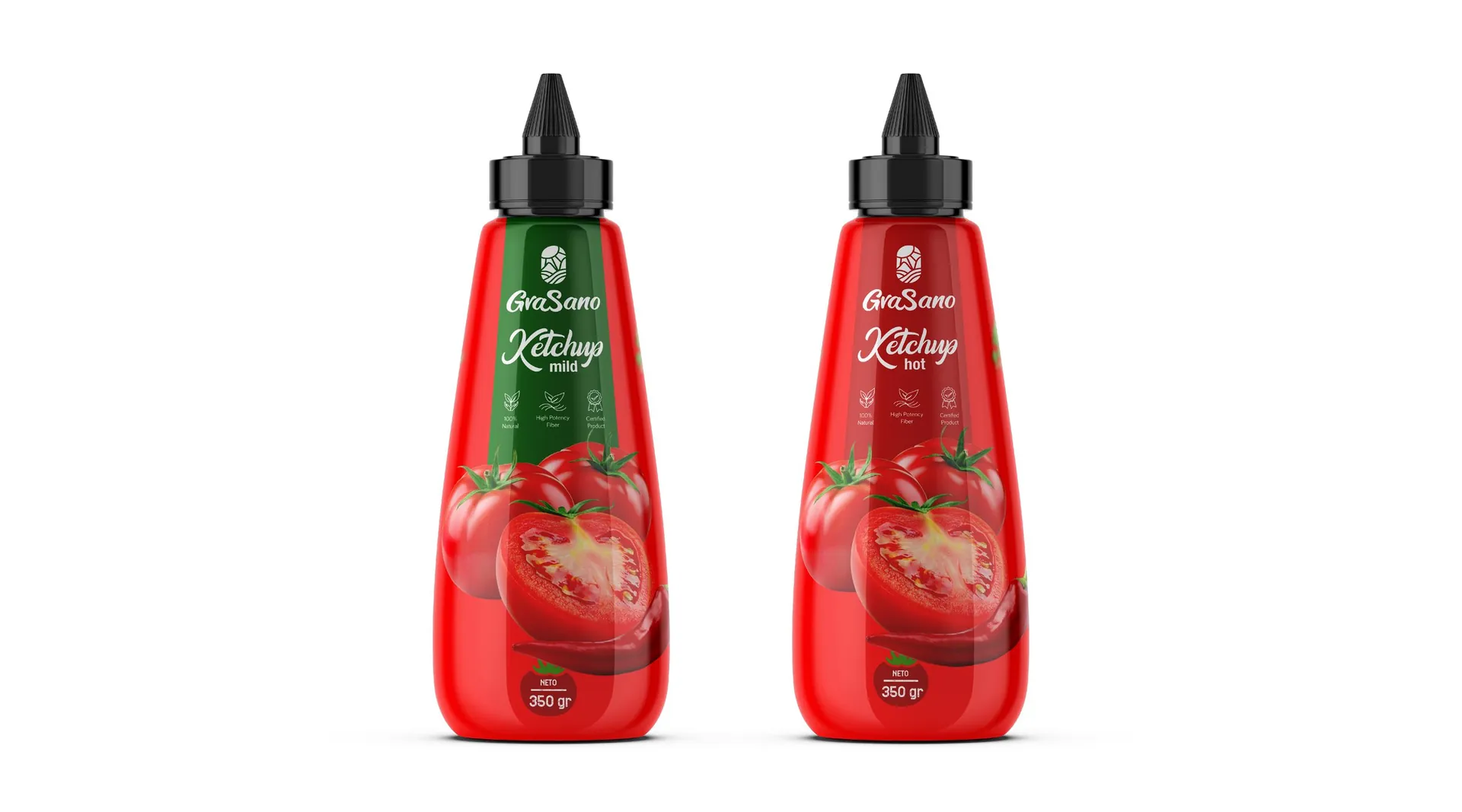
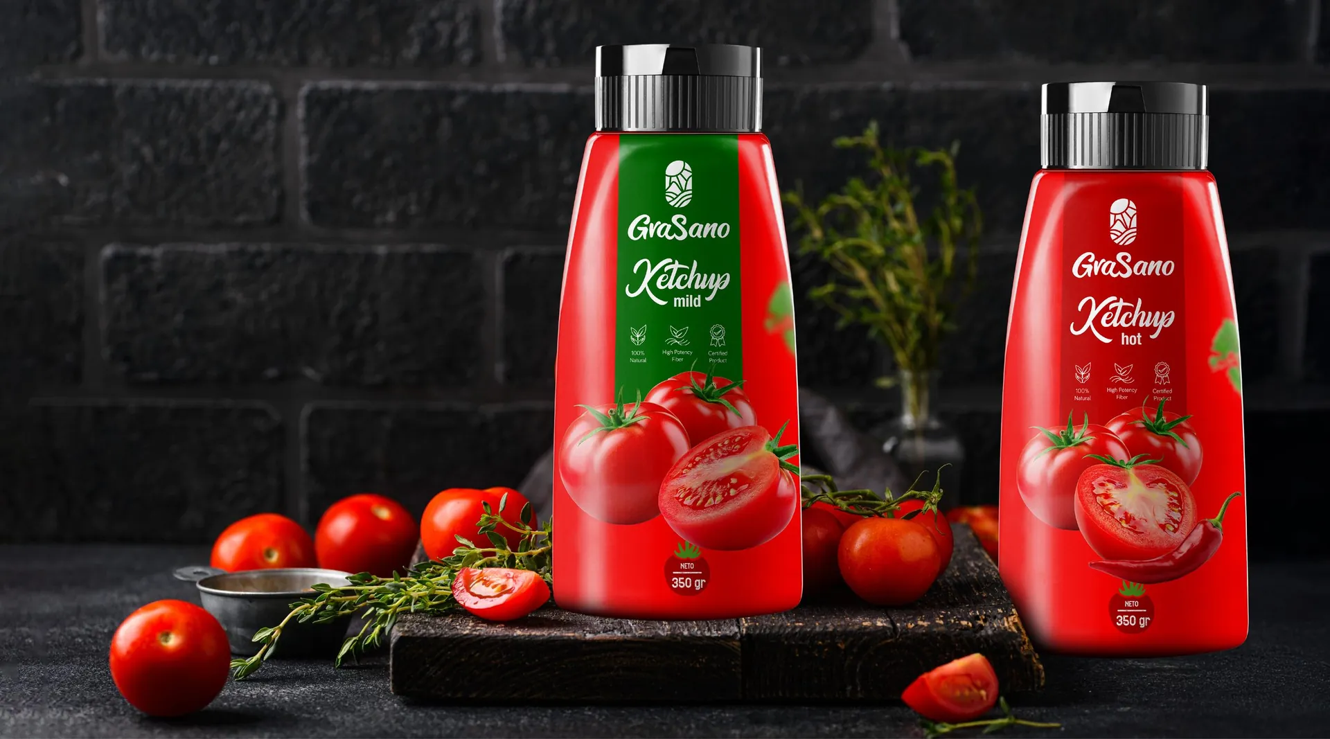
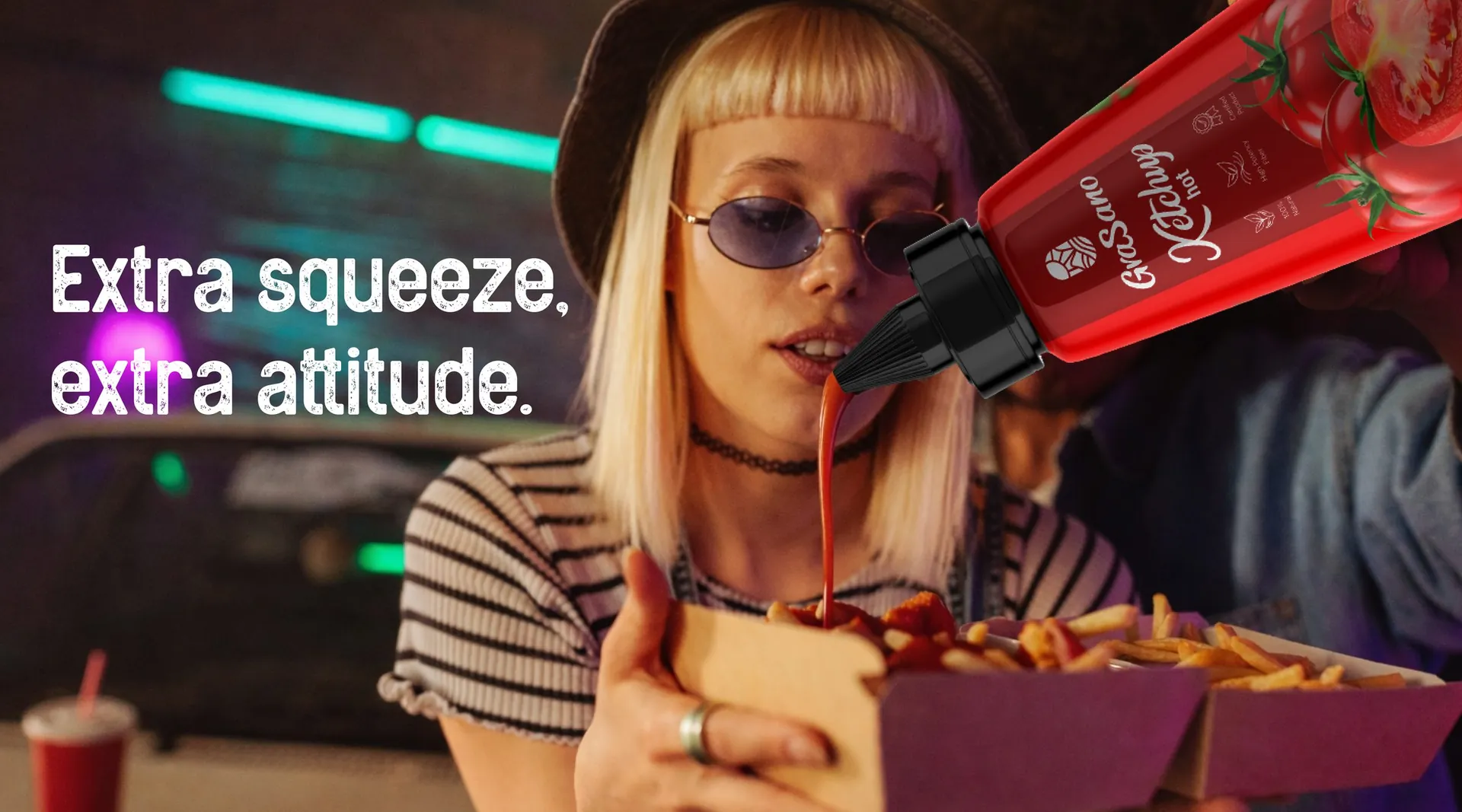
GraSano’s ketchup extends the brand from the pantry to the table. The brief: two variants, mild and hot, that look unmistakably GraSano, sit well next to the rice and beans, and bring a bit of humour to a very crowded shelf.
The idea
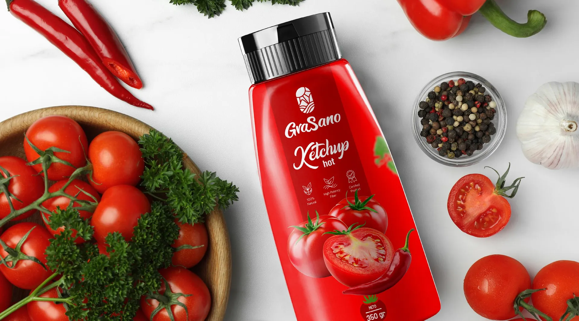
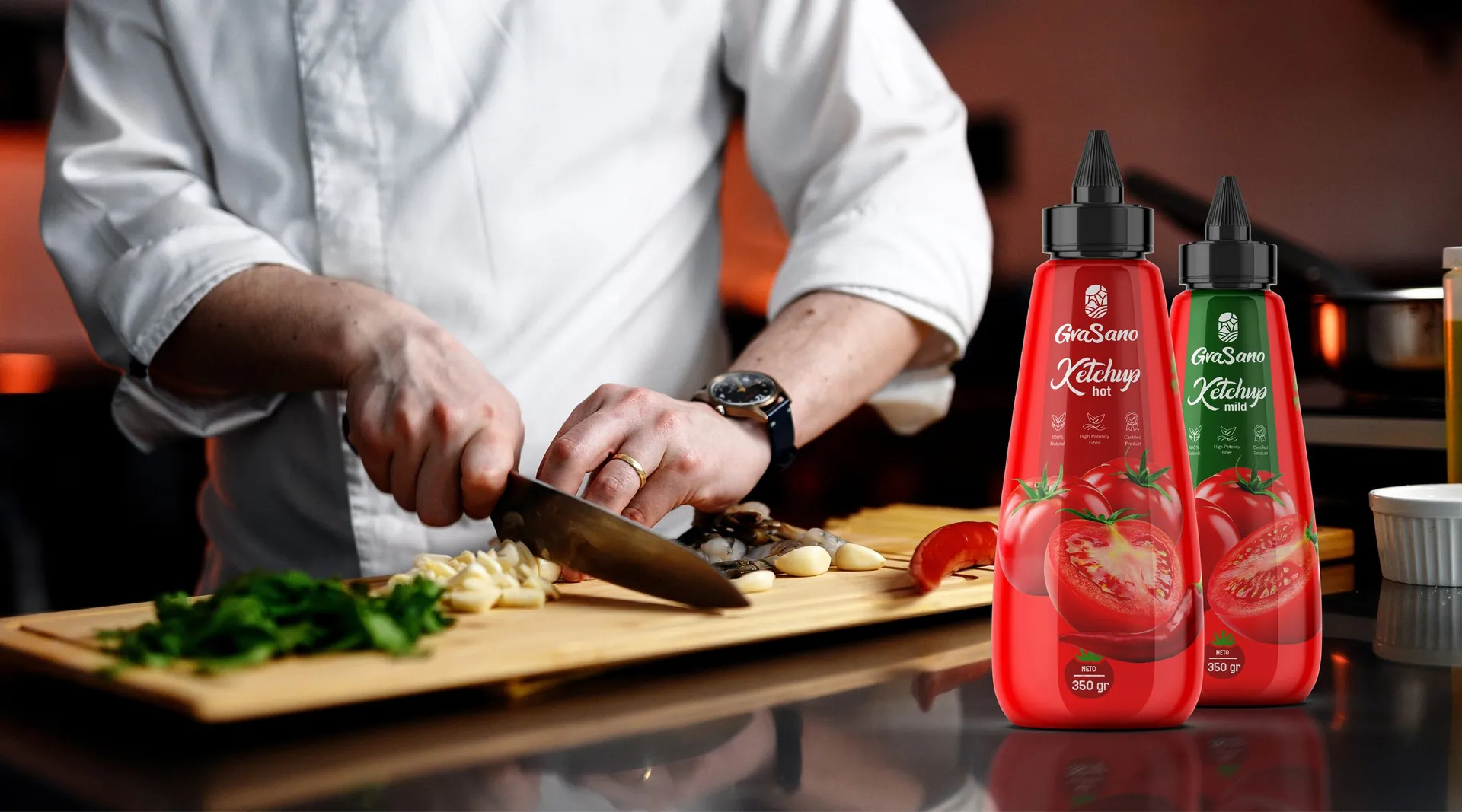
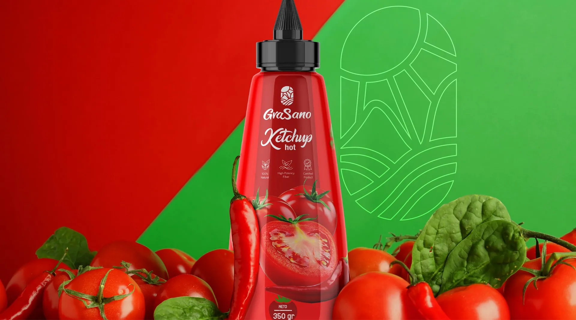
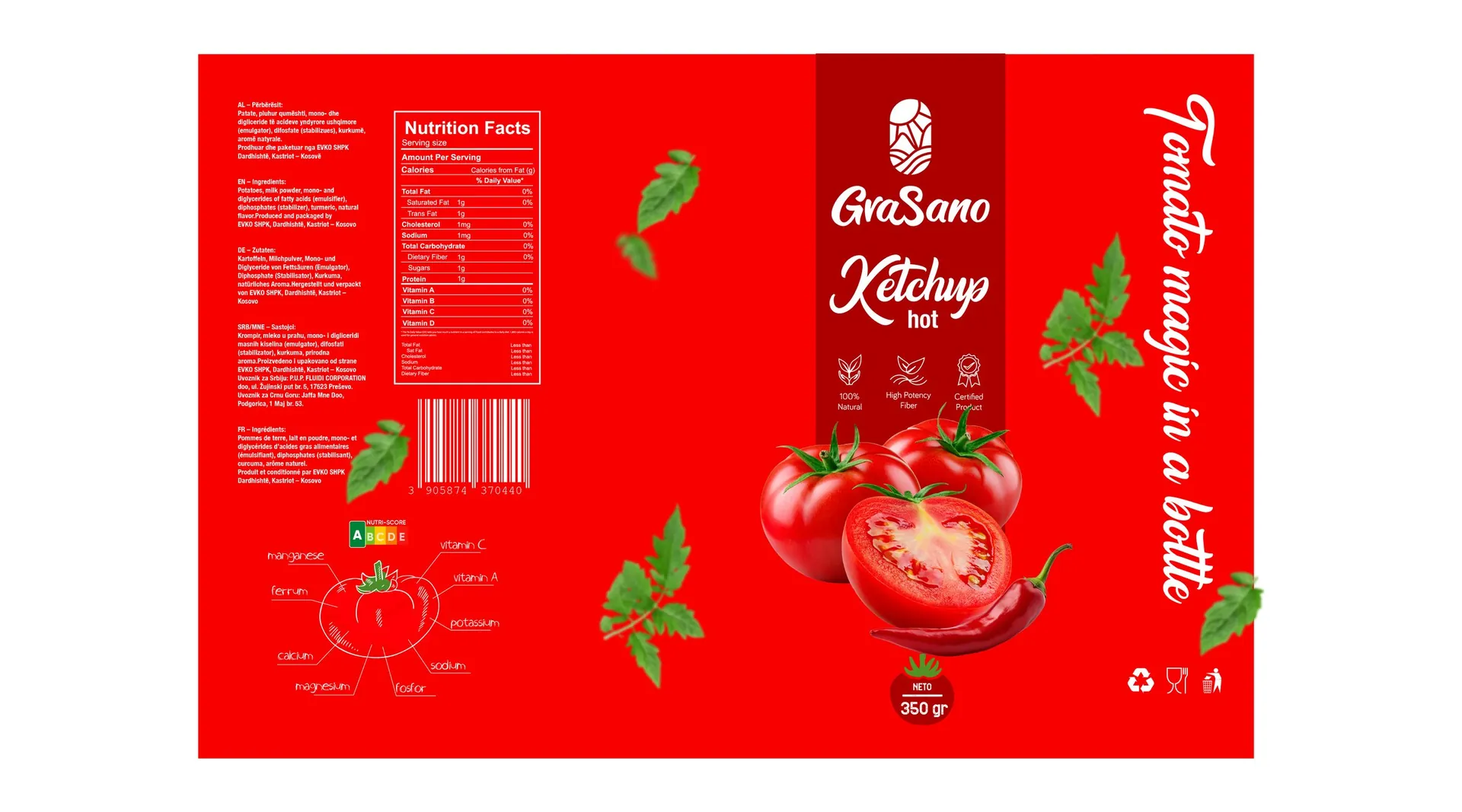
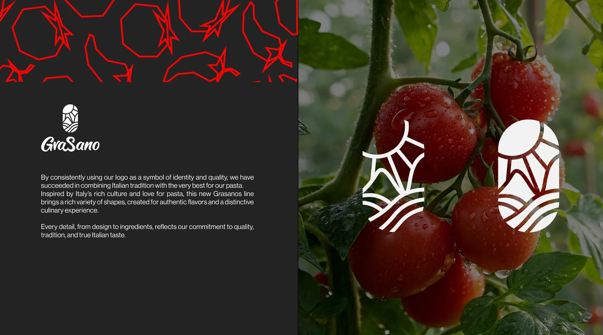
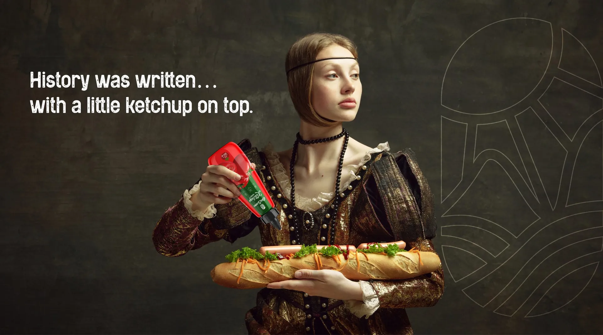
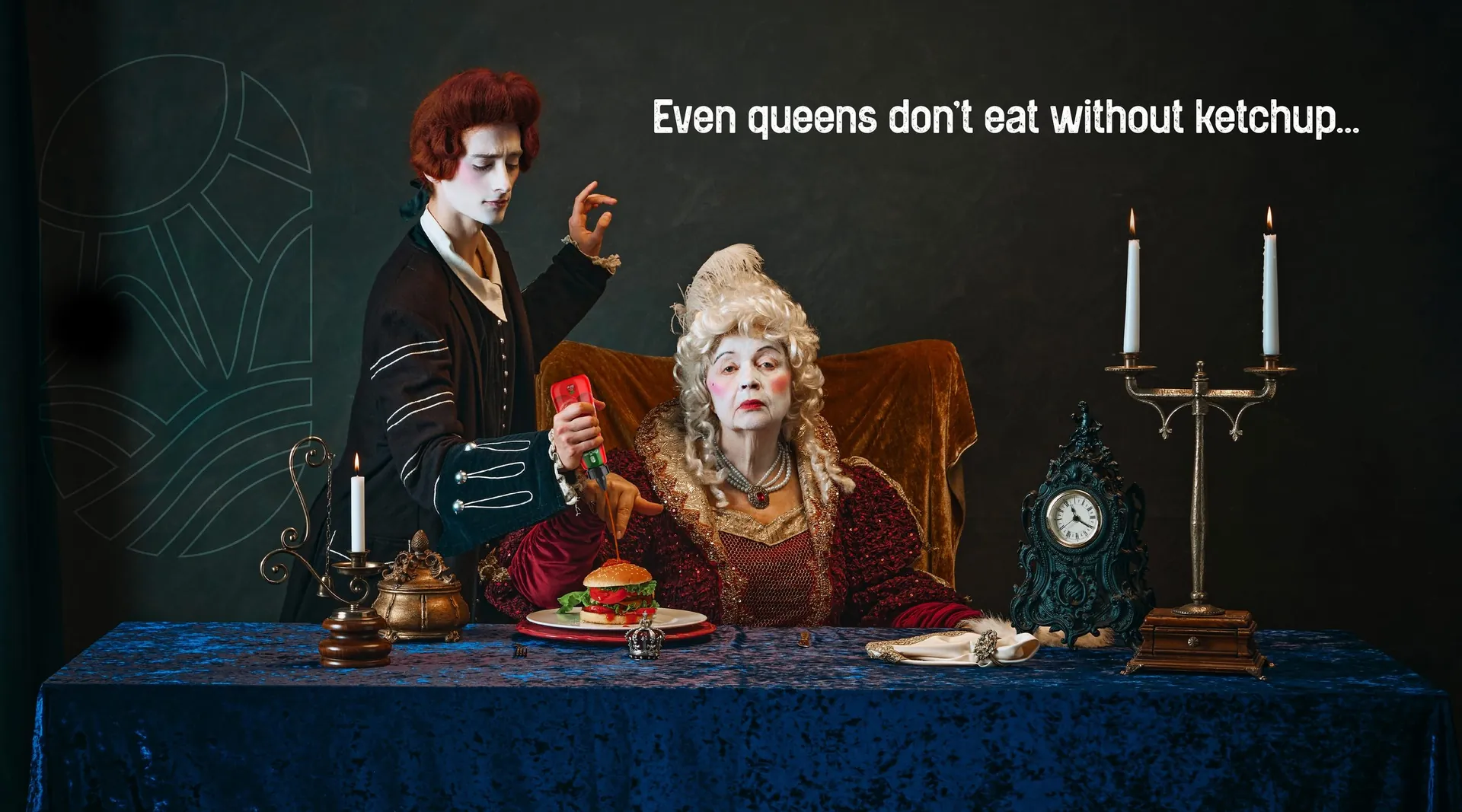
A red bottle with the seed mark on top and the tomato drawn in the same hand as the brand’s field illustrations. Green marks mild, dark red marks hot. The campaign plays with art history: Renaissance portraits caught mid-squeeze, with lines like History was written, with a little ketchup on top.
The result
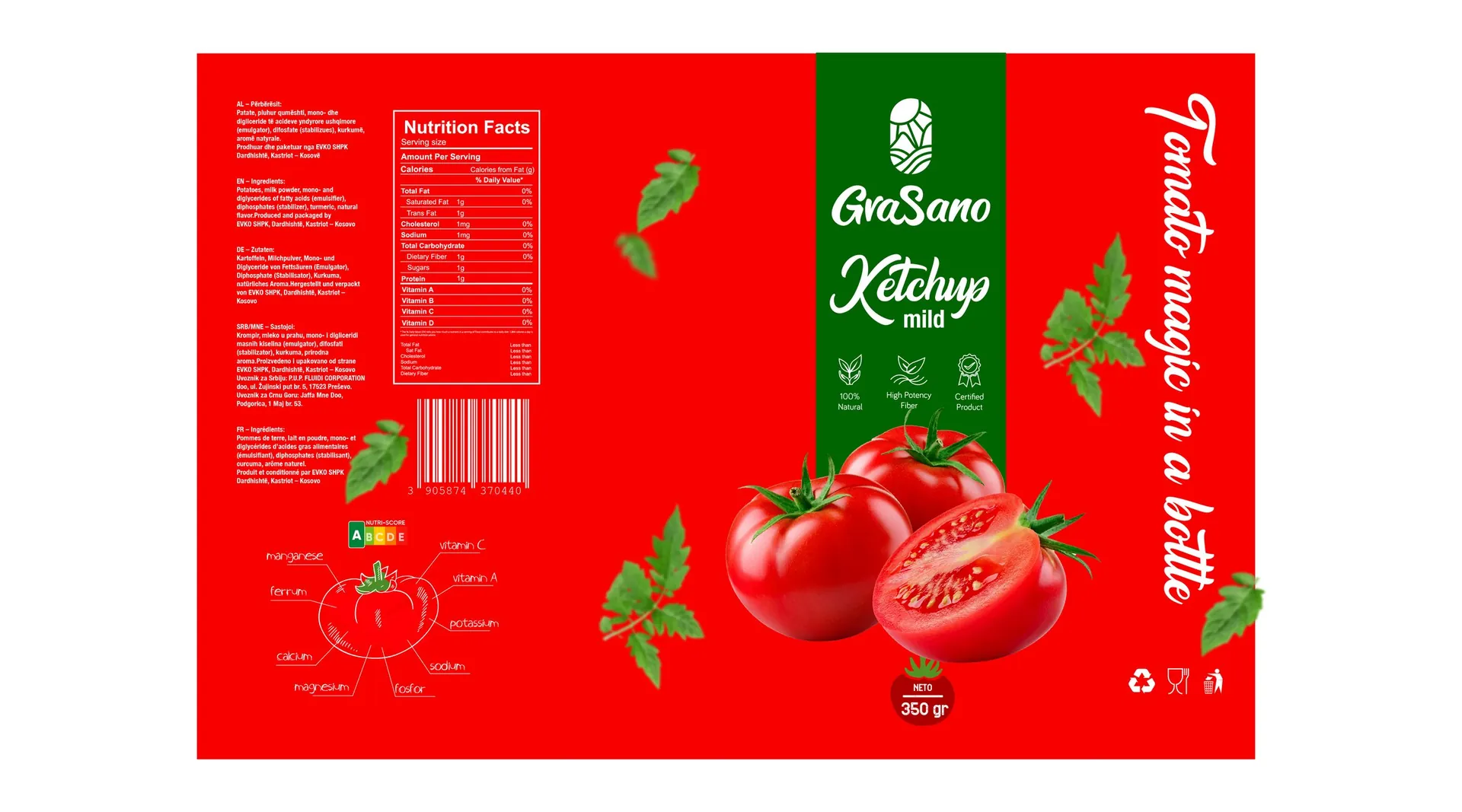
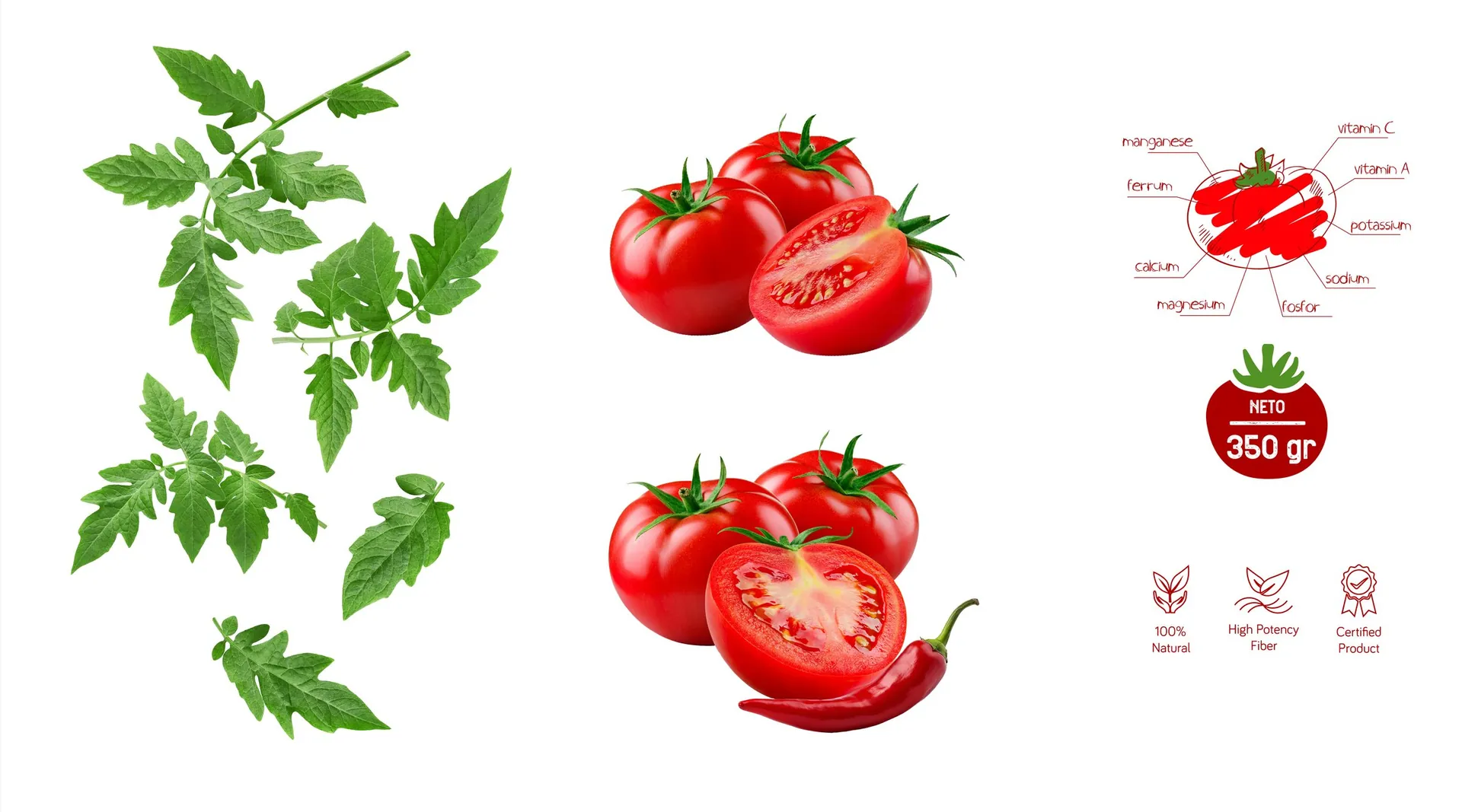
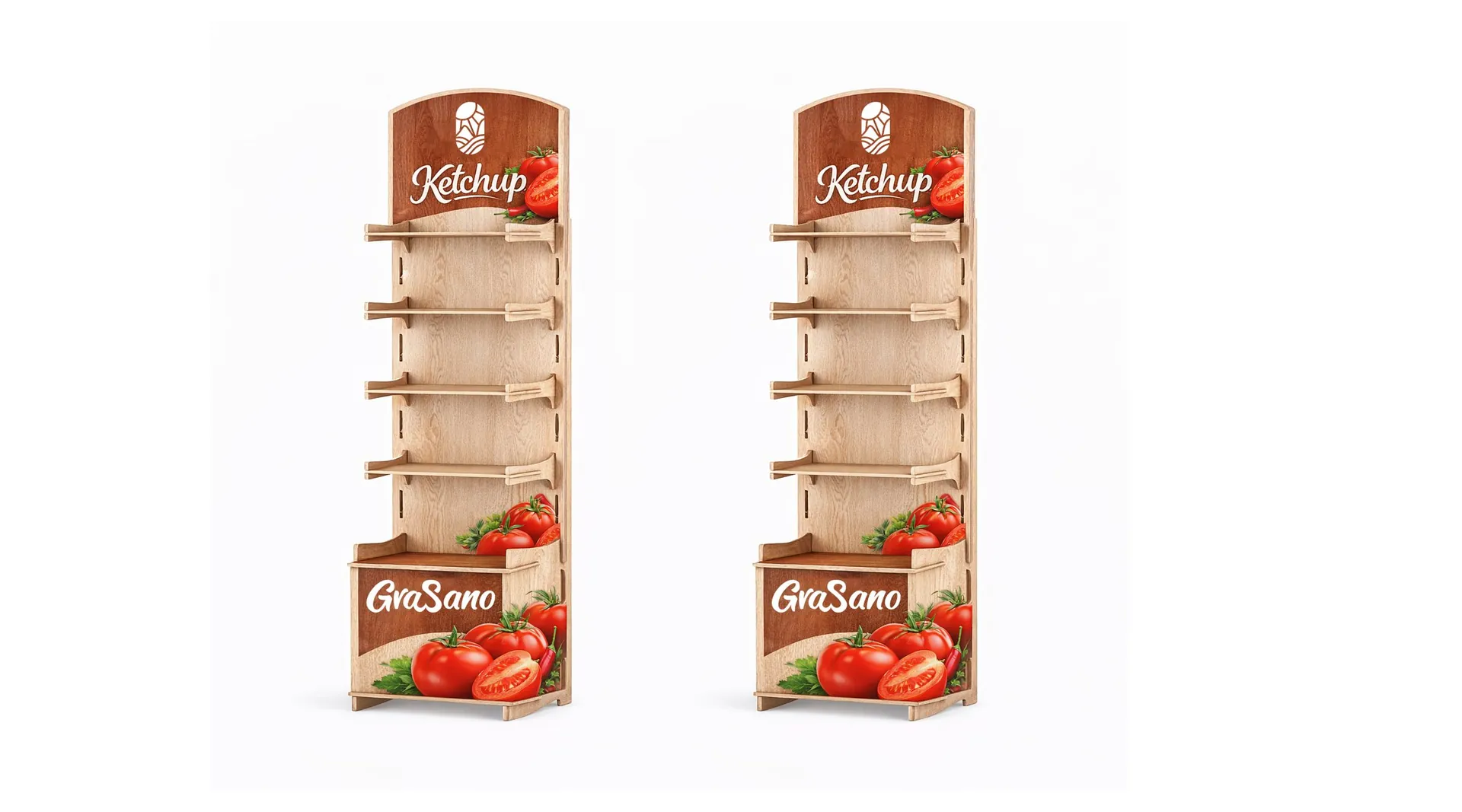
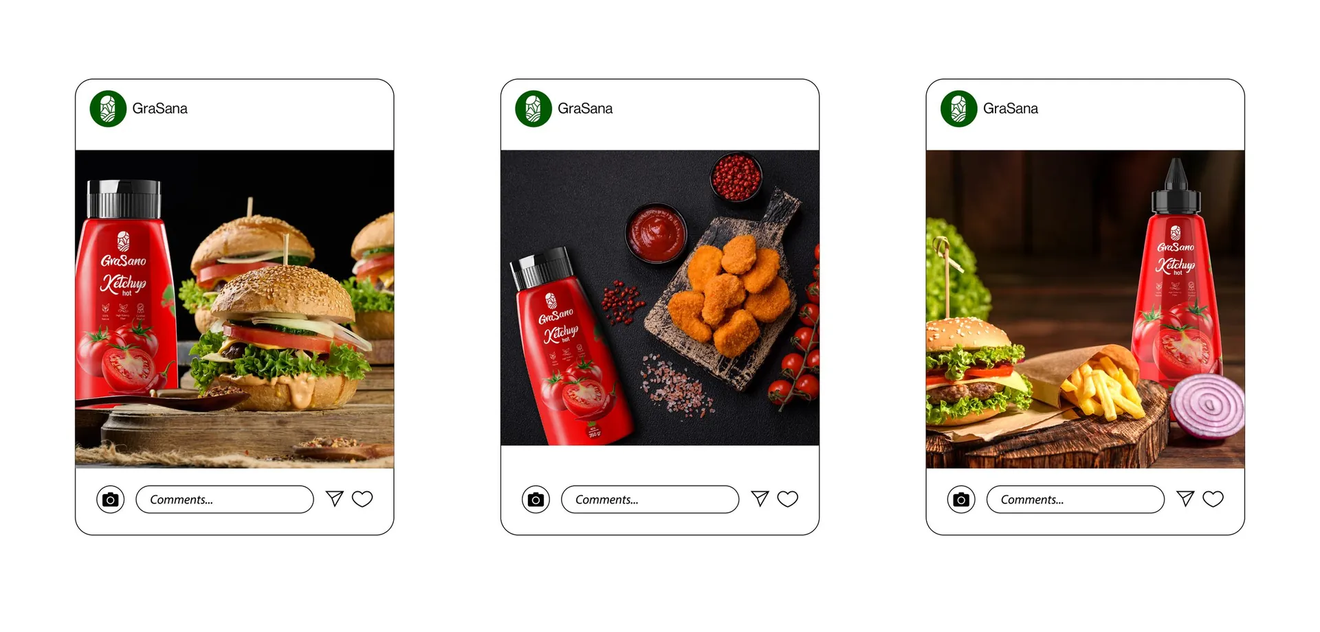
Bottle and label design for both variants with nutrition panels, an illustration set, campaign visuals, point-of-sale display and social media posts.

01 / 18

02 / 18

03 / 18

04 / 18

05 / 18

06 / 18

07 / 18

08 / 18

09 / 18

10 / 18

11 / 18

12 / 18

13 / 18

14 / 18

15 / 18

16 / 18

17 / 18

18 / 18